Download presentation
Presentation is loading. Please wait.

1
Logo Definition: A recognizable graphic design element, often including a name, symbol or trademark, representing an organization or product

2
3 Types Font-based logos consist primarily of a type treatment. The logos of IBM, Microsoft and Sony, for instance, use type treatments with a twist that makes them distinctive. Literally illustrate what a company does, such as when a house-painting company uses an illustration of a brush in its logo. Abstract graphic symbols-such as Nike's swoosh-that become linked to a company's brand Or a combination "Such a symbol is meaningless until your company can communicate to consumers what its underlying associations are," says Americus Reed II, a marketing professor at the University of Pennsylvania's Wharton School, who's conducted research on the triggers that lead consumers to identify with and become loyal to a brand. But building that mental bridge takes time and money. The Nike swoosh has no inherent meaning outside of what's been created over the years through savvy marketing efforts that have transformed the logo into an "identity cue" for an athletic lifestyle.

3
Look at the logos of other businesses in your industry
Do your competitors use solid, conservative images, or flashy graphics and type? Think about how you want to differentiate your logo from those of your competition.

4
Focus on your message Decide what you want to communicate about your company. Does it have a distinct personality-serious or lighthearted? What makes it unique in relation to your competition? What's the nature of your current target audience? These elements should play an important role in the overall design or redesign.

5
Make it clean and functional
Your logo should work as well on a business card as on the side of a truck. A good logo should be scalable, easy to reproduce, memorable and distinctive. Icons are better than photographs, which may be indecipherable if enlarged or reduced significantly. And be sure to create a logo that can be reproduced in black and white so that it can be faxed, photocopied or used in a black-and-white ad as effectively as in color.

6
Your business name will affect your logo design
If your business name is "D.C. Jewelers," you may wish to use a classy, serif font to accent the letters (especially if your name features initials). For a company called "Lightning Bolt Printing," the logo might feature some creative implementation of-you guessed it-a lightning bolt.
. For a company called Lightning Bolt Printing, the logo might feature some creative implementation of-you guessed it-a lightning bolt.")
7
Use your logo to illustrate your business's key benefit
The best logos make an immediate statement with a picture or illustration, not words. The "Lightning Bolt Printing" logo, for example, may need to convey the business benefit of "ultra-fast, guaranteed printing services." The lightning bolt image could be manipulated to suggest speed and assurance.

8
Don't use ClipArt However tempting it may be, clip art can be copied too easily. Not only will original art make a more impressive statement about your company, but it'll set your business apart from others.

9
Avoid trendy looks If you're redesigning your old logo, you run the risk of confusing customers-or worse, alienating them. One option is to make gradual logo changes. According to Priester, Quaker Oats modified the Quaker man on its package over a 10-year period to avoid undermining customer confidence. But don't plan to make multiple logo changes. Instead, choose a logo that will stay current for 10 to 20 years, perhaps longer. That's the mark of a good design. In fact, when Priester designs a logo, he expects never to see that client again.

10
Watch Your Colors One thing you need to be careful of as you explore color options is cost. Your five-color logo may be gorgeous, but once it comes time to produce it on stationery, the price won't be so attractive. Nor will it work in mediums that only allow one or two colors. Try not to exceed three colors unless you decide it's absolutely necessary. Your logo can appear on a variety of media: signage, advertising, stationery, delivery vehicles and packaging, to name just a few. Remember that some of those applications have production limitations. Make sure you do a color study. Look at your logo in one-, two- and three-color versions.

11
1. Your logo should reflect your company in a unique and honest way
2. Avoid too much detail 3. Your logo should work well in black and white (one-color printing). 4. Make sure your logo's scalable. 5. Your logo should be artistically balanced.
. 4. Make sure your logo s scalable. 5. Your logo should be artistically balanced.")
13
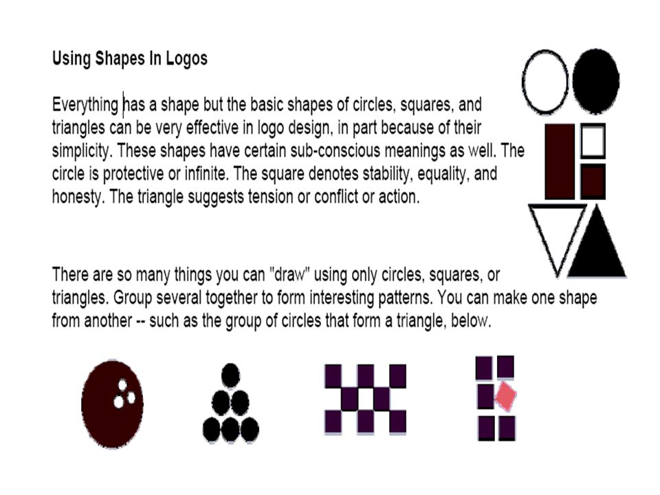
Using Lines In Logos Lines come in a variety of shapes and sizes
Using Lines In Logos Lines come in a variety of shapes and sizes. Don't get stuck in a rut. Vary the thickness. Make lines of dots, dashes, or combinations. Look at the patterns that a series of lines make. Use lines to direct eyeflow, form barriers, indicate connections, show movement. Be aware of what the shape of lines can convey. Sharp edges could indicate tension, crispness, hardness, formality, or high tech. Soft edges and curves may be softer, flowing, more casual, or more personal.

14
Even small changes in line thickness, endings, or shape changes can alter the look and feel of a design. In the second example, the lines that make up the triangle (letter A) go from thick at the bottom to thin at the top. They also suggest a set of steps (advancement) leading upward.
 go from thick at the bottom to thin at the top. They also suggest a set of steps (advancement) leading upward.")
15
Notice how the round line endings give this hammer -- drawn freehand with straight and curved lines -- a softer feel.

16
The second version of the ifiche logo uses rounded line endings and more curves (in the fins/lashes). Notice that a different typeface is chosen for each, to match the style of lines.

17
You can also create interesting patterns with a series of repeating lines. None of these designs rely on color -- although changes in color can further change the appearance of the lines.

19
Alternating direction or color, disrupting a pattern with another shape or a shape out of alignment can add interest or suggest abstract ideas. A triangle alone or a series of overlapping ones can "point" in one or more directions.

20
Replace letters in a word or name with shapes that suggest those letters. A triangle for A or V is obvious. Less obvious is the E made of squares (above) or perhaps two stacked circles for an S or a pair of triangles (one up, one down) for an N. Logos don't need to be elaborate -- and usually work best when they are kept simple. So simple shapes work beautifully.
 or perhaps two stacked circles for an S or a pair of triangles (one up, one down) for an N. Logos don t need to be elaborate -- and usually work best when they are kept simple. So simple shapes work beautifully..")
21
Who needs clip art? A circle, a triangle, a square (the highlight), and a curvy line make a nice balloon. Repeat it a few times, changing the color and add a triangle bow. You could vary it even more by using an elongated ellipse for one or more of the balloons.
, and a curvy line make a nice balloon. Repeat it a few times, changing the color and add a triangle bow. You could vary it even more by using an elongated ellipse for one or more of the balloons..")
22
The checkerboard of squares is a versatile pattern
The checkerboard of squares is a versatile pattern. It could be a tile floor, a racing flag, or a tablecloth. Can you pick out the shapes used for the different eating utensils?

23
The SpiroBendo logo is nothing more than a rectangle, some circles, and some very thick lines with round ends (filled rectangles with rounded corners could work too).
.")
24
Letters with a tail are fun
Letters with a tail are fun. The tail on this Q (the circle) is a curvy line that does triple duty. It underscores the name, is the tail on the Q, and its curves suggest water -- an obvious tie-in with the surf supply company.
 is a curvy line that does triple duty. It underscores the name, is the tail on the Q, and its curves suggest water -- an obvious tie-in with the surf supply company.")
25
Again, a simple shape (triangle) does more than just sit there
Again, a simple shape (triangle) does more than just sit there. Can you tell what they represent in the above logo?
 does more than just sit there. Can you tell what they represent in the above logo")
26
Remember the stack of circles from earlier
Remember the stack of circles from earlier? Turn 'em purple, add a "leaf" that is really just a distorted polygon shape, a squiggly line, and some text for a nice logo. No art lessons needed.

Similar presentations