Download presentation
Presentation is loading. Please wait.

1
Creating your own logo

2
A logo is a graphic or emblem commonly used by organizations and even individuals to promote instant public recognition.

3
Logos are either purely graphic (symbols/icons) or are composed of the name of the organization (a logotype or wordmark).
 or are composed of the name of the organization (a logotype or wordmark).")
4
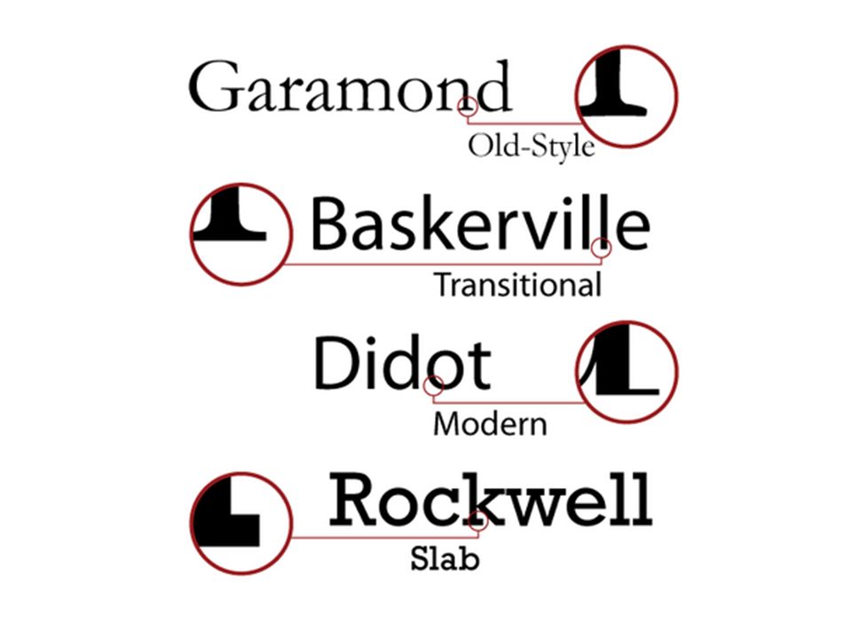
Understanding logos requires understanding type: Oldstyle Modern Slab Serif Sans Serif Script Decorative

6
Oldstyle Based on the handwriting of scribes, think of a wedge-tipped pen in hand. Have a transition from thick to thin on the ends. If you draw a line threw the thinnest parts, you will have a diagonal line. (diagonal stress) Serifs on lowercase letters are slanted. Best for writing big groups of words.
 Serifs on lowercase letters are slanted. Best for writing big groups of words..")
7
Modern Horizontal serifs instead of slanted, but very thin. Draw a vertical line between thinnest parts (vertical stress) Thick to thin transition of strokes Not good for large amounts of body. The thick lines are prominent, and the effect on the page is “dazzling.”
 Thick to thin transition of strokes Not good for large amounts of body. The thick lines are prominent, and the effect on the page is dazzling. .")
8
Serifs on lowercase letters are horizontal and thick. Very little or no thick transition Vertical stress Often used in children's books Slab Serif

9
Sans Serif No serifs anywhere No stress because there is no thick/thin No thick transition in strokes For creating eye-catching pages

10
Script Appear to be handwritten with a calligraphy pen. Use sparingly, never as long blocks of texts, and never as all caps. Can be stunning when set very large !

11
Decorative Depending on how you use them they can carry obvious emotions If the thought of reading an entire book in that font makes you want to puke, it’s probably decorative. Since they are so distinctive, their use is limited.

12
Type Contrasts

13
S ize Weight Struc ture F orm Dire Color ction

14
DON’T BE A WIMP To make S ize contrast work, don’t be a wimp. Make it obvious—don’t let people think it’s a mistake.

15
To affect Weight, change the thickness of the strokes. Bold Semi Bold Semi Bold Extra Bold Light Remember, Don’t be a wimp. StrongContrast Weight is one of the best ways to organize info.

16
Structure Structure Structure Struc ture is how a letter is built. Avoid two of the same styles on the same page, they will conflict. Try combining Serif with San Serif Sometimes you have to enhance the contrast with weight or size.

17
Dire Change in direction can sometimes be a good thing. Try an extended type with a tall type. ction

18
CAPS vs. lowercase Each lowercase letter is different from caps, but also the whole word has different form! ROCKY MOUNTAIN Rocky Mountain CAPITAL LETTERS ARE HARD TO READ, but use them if your design needs them despite the reduced legibility

19
Roman vs. Italic Roman stands straight up Italic and script slant Don’t combine two different italic, two different scripts or an italic with a script. They are two similar and will create a conflict.

20
Work Hard there is no short cut Work Hard there is no shortcut

21
Color. Warm colors (reds, oranges) pop out!!! It takes very little red to create contrast. Color. Cool colors (greens, blues) tend to recede. You can get away with larger areas of cool colors.
 tend to recede. You can get away with larger areas of cool colors..")
22
Scarlett FLORENCE Scarlett FLORENCE Scarlett FLORENCE Scarlett FLORENCE Which combination is the most well balanced?

23
Scarlett FLORENCE Even though scarlett is smaller, it is dominant because of the warm color.

25
What makes a good logo?

26
What do each of these imply?

27
1. Appropriate A good effective logo should represent the business it identities. Logo symbols do not have to directly relate to the products. “The atmosphere a logo generates can often be enough.” The Toys R Us logo would not be appropriate for a company that specializes in banking. The colors and typography aims for children who want to have fun. You can compare it to The Children’s Place logo which is targeted to sell quality children’s clothing. The goal of the logo is to sell clothes to the children’s parents. Appropriate

28
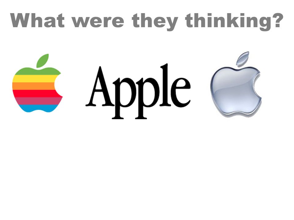
Simple “It’s an apple with a bite taken out…yet it is in fact unique.” The principle of a logo’s simplicity is the ability to describe it in words. The apple logo is a superb logo example because of its simplicity.

29
3. Memorable “A logo’s simplicity and memorability go hand in hand.” If you can describe a logo then you can remember it. This is why simplicity is imperative. Many people think that a logo should directly relate to the business it represents. Memorable

30
Effective Logos can become timeless. Will your logo stand up for 5, 10, 15, or even 20 years?

32
Think about white space. What is not there is important in these examples.

33
What were they thinking?

35
Milwaukee Brewers

36
What were they thinking?

40
Expectations: Come up with your photography company name. (_____ Photography) Make a new document on photoshop (file new 20X20 inches) Make 10 different type contrasts for your company name. On your own paper, make 4 different sketches for a logo.
 Make a new document on photoshop (file new 20X20 inches) Make 10 different type contrasts for your company name. On your own paper, make 4 different sketches for a logo..")
Similar presentations


 fonts and font styles to produce professional looking publications the art of using (text) fonts and font styles to.>")


