Download presentation
Presentation is loading. Please wait.

3
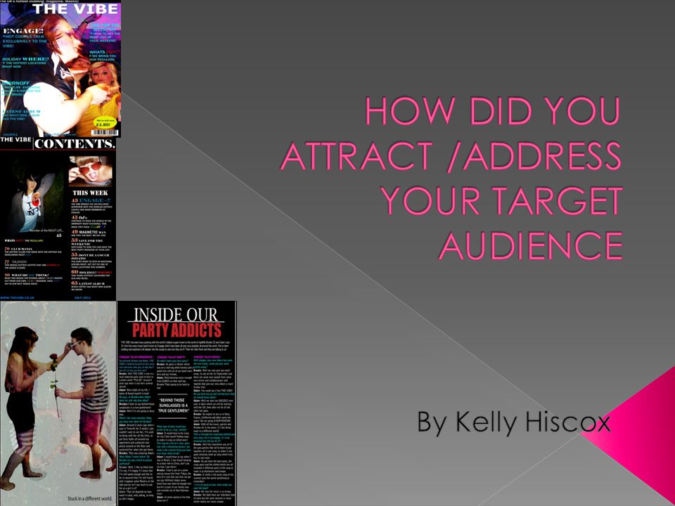
I attracted my target audience on my contents page by having a bold title, by doing this it immediately draws attention towards it, also the colour of my title against the background of the page made it very visible and prominent on the page. The lines in which are placed around the title separate it from the rest of the page and adds and organised structure to my magazine, which attracts my audience as it allows it to look professional. Also including my title on the contents page reminds my audience of the name of my magazine which in the future allows them to remember it and purchase it again in the future. The images which have been used on my contents page are also addressed to the audience and suitable with the genre of my magazine and the audience which will be attracted to it. The piece of text which is on the images will encourage people to read the articles that they are related to and the page numbers makes searching for the articles a lot easier for my audience. I addressed my audience my using language within the subheadings which would address my audience such as personal pronouns like “You” would give the audience a feeling of involvement within the magazine, by including words which would be familiar to them and articles which would attract my audience. The articles which I have including in my contents page would be at importance my audience and make them want to read through the articles as they are related to their age group and the genre of the magazine so it would interest them. Also due to the age range a good range of 18-30 year olds would be interested to know about some of the articles included on my contents page which is why I included it within my magazine. I attracted attention towards my page and grabbed the readers attention by adding a range of colours on the contents page, but not too many to make it look unprofessional. Instead of all my subheadings being plain and white and for example the colours of brazil on the word “Brazil” which is included in one of my articles brightened the page and made it look more appealing to my audience. By also adding a separate colour to the title of my main article meant that it would attract the most attention, along with this I made it a larger font to fill this purpose. on my contents page I added a website which meant the readers can become interactive with my magazine, it also reminds them of it from my front page, which would keep them interested in my magazine as the audience could have a greater feeling of involvement with my magazine. By adding a date of issue to my magazine made my magazine have an organised look and would attract my audience to my magazine again, it allows the audience to keep track of issues and know when the copy that they have is last weeks.

4
My double page spread is an interview featuring a question and answer article with a famous couple who are involved in the overall genre of my magazine (dance music) this would immediately attract my target audience as it would be a topic that would interest them. My audience would want to know about the people featured in my article which would encourage them to want to purchase my magazine. The title would immediately attract my audience towards the article, used white and red to make it visible against my background and have a large impact on the audience. The line separating the two parts of the title meant that my article was assured to be important which would attract my audience. Having a one page image on my magazine attracted my audience to my double page spread, immediately it draws attention to my double page. The props and positioning of actors on my page encourages the audience to want to read on through the article to find what relevance it has to the article. The style that the picture has been edited attracts the audience to the article do to the interesting colours, and also due to the quote at the bottom of the pages relevance to the editing style. The colour of the second page of my double page spread is bold and means that the colours I used on the page stand out to the reader and attracts them to my page. I used a range of exciting colours on my double page spread so that it would make it exciting to read for the audience. The bright pink colour of the main 3 subheadings attracts my audience to my page and the following colours used by the interviewer draws the readers attention down the page of my article with the main quote in the middle adding structure to my page. The first 4 lines of writing underneath the title of my page is welcoming and inviting to the audience and addresses them by explaining what will be included within the article.

Similar presentations


. The dominant image of this superstar Ozzy Osbourne instantly catches the attention of the reader. The quote underneath.>")

