Download presentation
Presentation is loading. Please wait.

3
Evaluation of Q in General. The main colour theme on every Q magazine is red. This is a very bright colour and is effective in grabbing your attention and making you take notice of the magazine. Q also has its own logo to show people what magazine they are buying. This logo is on every Q magazine and is also on every contents page in Q magazines. This logo helps a reader know that this represents Q as it is practically on every page of the magazine. This would also help a reader as then in the future you would recognise the Q logo and associate it with whether or not you liked the magazine. The genre of Q is not just a rock music magazine but a magazine about music in general It features many different music genre’s and that’s what makes the magazine appealing to many different audiences. So over all Q does not have a target audience, it has to make the magazine cater to everyone’s needs, this would properly make it very difficult to the editor of the magazine as he has to think of many target audiences instead of just one. On the front cover there is usually one main image that takes up most of the page, this is usually the main focus of attention and is mostly in the centre of the page. The band/ artist in the image are nearly always looking out to the reader, keeping eye contact with the audience is a good way for the magazine to be eye catching and looks good to a viewer. Also on the front cover there is usually a separate text box at the top for separate information. This makes the information seem and look more important as its outlined and separated away from the rest of the page. Text box's are a good idea to use, and i may take the idea to my own magazine, this would be a good idea to use as then my magazine may look more professional like a professional magazine.

5
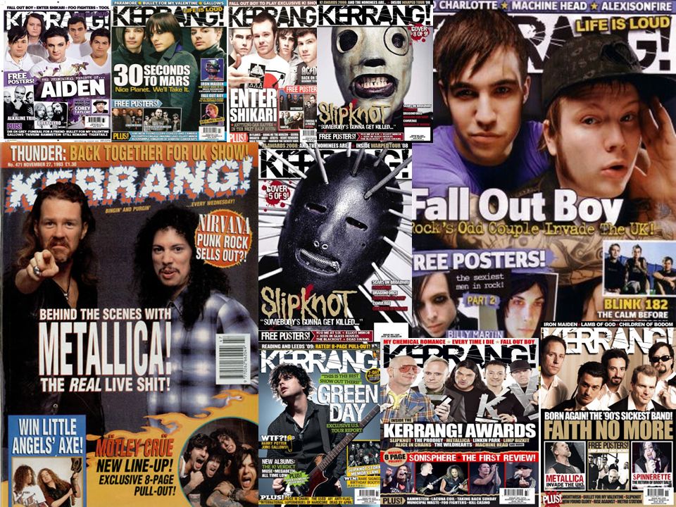
Evaluation of Kerrang in General. The title of the magazine “Kerrang” in all the magazines are the same, they all have a cut up writing style, and they are also big and bold. Also the title name is mostly situated behind the main image showing that the “band” or “artist” are almost more important that the magazine its self. This shows that even though the magazine is mostly recognised for the name “Kerrang” it is also recognised for the band that it includes inside the magazine as well. All the band names that are featured always look the same on every magazine, the band names featured are always big and I also noticed that they are also always nearly coloured in white to contrast with the background which is nearly always dark colours or so I've noticed. The bar code is very nearly always featured at the bottom left hand corner, along with the price, the date and the issue numbers. Featuring band names are always in an extra text box at the top of the page and the box runs from one side of the page to the other. This extra text box makes the information in it stand out and makes you want to take notice of what’s in it, this is because it is different to the rest of the front cover. Extra text box’s are also used to put extra images in so that it doesn’t distract from the main image being used as a back ground. In the main image of the band or artist you find that the person/ people are always looking towards the audience. The fact that the people are keeping eye contact with the audience, this grabbed the audiences attention and would make them want to read the magazine as they feel like they are being looked at by the artists on the front cover. Also all the images that Kerrang uses are very loud and in your face, this makes them eye catching to the audience because it is more eye catching to the audience it is more likely that people would take more notice. Inside the cover of Kerrang the colour theme is yellow, black and white. The colour theme is bright, loud and eye catching. It never fails to grab the audiences attention making the pages seem more interesting, and I think that if the pages are more interesting and different then people are more likely to pay attention more to what's on them.

6
Evaluation of Kerrang in General (continued). On the contents pages the text is set out in a asymmetric layout to make all the information look neat and in line. After looking at the contents pages in a asymmetric and also looking at other magazines which aren't in a neat set up you do find that you pay attention more if the information that you are reading. The asymmetric layout is a constant throughout all of kerrang’s contents pages and so when you so this type of layout on a contents page you think of Kerrang. Another thing that is also constant throughout Kerrang on the contents pages is that lots of pictures are included, unlike the front pages and double page spreads in the magazine.

7
Q V’s Kerrang. Q -Bright colour – red. -Main images stands out but is always behind the magazines title as its only one letter and doesn’t take up much space. -Title – one word in a block – red – bright – stands out to the picture. -The band names are bold and stand out. Kerrang -Dark colours. -Black and white are usually the main colours -Main images stand out are usually in front of the title. -Title very blocky and cut out, makes it stand out more. Usually title is black.

8
Kerrang and Q.

9
Colour theme – Red. Eye catching. Bold. Band name is in CAPITIALS and is big and yellow/orange to stand out on the background. Asymmetrical layout. Same writing all over. Featuring names of other bands – in bold and CAPITALS. “The essential music guide” In a separate text box, makes it stand out. Extra text box of information. Barcode, date, issue number and price – all kept together. Smaller images surrounding the big and main image. A reason to buy the magazine. Words in bold to grab your attention. Eye catching. Makes you want to read on. Eye contact. Looking at the audience. Q logo. Bold image. Eye catching. Grabs your attention. White writing over the image. Eye catching. White background in the background. On every front cover and also on the contents pages.

10
Evaluation. On the front cover of the Q magazine I noticed that the main image of the band was used as the background, this effectively grabs your attention and makes the image stand out more. Also the in the main image is as if all the band members have had their photo taken as if they were staring out of the page looking at the reader, keeping eye contact, which would stand out and make you want to buy and read the magazine, because of this it makes you keep eye contact with them effectively letting the magazine grab your attention and keep hold of it. The main colour theme on the front cover (like most of Q magazines front covers) is red. This is a very bright and vibrant colour that is eye catching and attention seeking. Because they magazine has used such a vibrant colour it means that it would stand out on a magazine rack and would grab peoples attention as they walked by, also because it is that particular shade of red that is used on every Q front cover you would start to recognise it as Q and associate the colour red with the Q magazine. Main band name goes across the page, its a different colour to the rest of the page so it stands out and is eye catching. It also goes across the image so this indicates that the image is something to do with the head line. All other information that is not on the band is in separate text box’s this makes it stand out and look eye catching. It makes it so it grabs the audiences attention but it does not take away the focus from the main image and the main information on the page. By using separate text box’s it makes the page look interesting and different, more appealing to the audience.
 is red. This is a very bright and vibrant colour that is eye catching and attention seeking. Because they magazine has used such a vibrant colour it means that it would stand out on a magazine rack and would grab peoples attention as they walked by, also because it is that particular shade of red that is used on every Q front cover you would start to recognise it as Q and associate the colour red with the Q magazine. Main band name goes across the page, its a different colour to the rest of the page so it stands out and is eye catching. It also goes across the image so this indicates that the image is something to do with the head line. All other information that is not on the band is in separate text box’s this makes it stand out and look eye catching. It makes it so it grabs the audiences attention but it does not take away the focus from the main image and the main information on the page. By using separate text box’s it makes the page look interesting and different, more appealing to the audience..")
11
Colour scheme: black, white and green. Featuring names of other bands – in bold and CAPITALS. Title (same all the time) Extra text box of information. Black background. Makes image stand out. Slogan. “Free poster” in separate text boxes. Featuring well known bands. Same writing all over. 2 smaller images situated at the side, of 2 bands about the free posters inside. Bar code. Bottom right corner. “And more” Makes you want to read on. Wearing black. Band name is in CAPITIALS and is big and white to stand out on the background. Mixture of CAPITALS and lower-case. Asymmetrical layout. Picture almost as background. Eye contact. Looking at the audience. Bold picture. Grabs your attention. Title cut up making it look rough. Informal language.
 Extra text box of information. Black background. Makes image stand out. Slogan. Free poster in separate text boxes. Featuring well known bands. Same writing all over. 2 smaller images situated at the side, of 2 bands about the free posters inside. Bar code. Bottom right corner. And more Makes you want to read on. Wearing black. Band name is in CAPITIALS and is big and white to stand out on the background. Mixture of CAPITALS and lower-case. Asymmetrical layout. Picture almost as background. Eye contact. Looking at the audience. Bold picture. Grabs your attention. Title cut up making it look rough. Informal language..")
12
Evaluation. On the front cover of the Kerrang magazine I noticed that the main image of the band was used as the background, this effectively grabs your attention and makes the image stand out more. Also the in the main image the person is staring out towards the audience, keeping eye contact, which would stand out and make you want to buy and read the magazine. Any other pictures were in separate text boxes of information this indicates that they aren’t as important as the main images which is set as the background. In the pictures all the bands seem to be wearing black although this is a dark colour it makes the images stand out and grab your attention. All information about other bands are in CAPITALS and bold making them stand out showing that the magazine isn’t just about one good band but about many good bands. On the front cover of the magazine it has informal language and the text throughout the cover and inside the magazine doesn’t change signifying continuity throughout the magazine. There is also a mixture a capitals and small case on the front cover, it seems to be that the more important information is in capitals, for example the band names. It made me think about what I want to do with my magazine and having the main image as the back ground is an idea I really like and I may take that idea for my own magazine. I think that it would be a good idea to have the band members or artist of my band looking at the audience to grab the audiences attention and make them interested in reading.

13
Title : same writing on every issue. Eye contact. Looking at the audience. Keeping their attention. “Free Poster’s” in separate text boxes. To grab audiences attention. Same writing all over. Extra text box of information. Smaller images advertising more bands in the magazine. Bar code. Bottom right corner. Wearing black. Band name in CAPITALs and is big and white to stand out on the background. Title cut up making it look rough. Featuring names of other bands – in bold and CAPITALS. Bold picture. Grabs your attention. Pale background so that the band (in black) stand out. “Plus” makes you want to read on. Mixture of CAPITALS and bold text. Mixture of big and loud colours. Yellow, white and black. The word FREE is in red. Bold. Eye catching. Emphasizes it.
 stand out. Plus makes you want to read on. Mixture of CAPITALS and bold text. Mixture of big and loud colours. Yellow, white and black. The word FREE is in red. Bold. Eye catching. Emphasizes it..")
14
Evaluation. The title of the magazine ”Kerrang!” is behind the band “you me at six” indicating that they are the most important thing on that page. The image of the band “You me at six” shows that all the band members are looking out of the page, as if they are keeping eye contact with the audience that are reading/ looking at the magazine. Also the image of the band members are done in an interesting way for example, they are not standing in a straight line which would be quite boring to look at but they are standing behind one another making the image look more 3D and interesting making an audience want to read on. Like many other “Kerrang!” front covers apart from the main image (which is usually used as the background) another images are in separate box’s, this effectively does do the job of tearing the audiences attention away from the main image because the other pictures are in a different format on the page and it does grab your attention in a good way. On the front cover it also advertises “Free Posters”, the word “Free” is in bright Red, making it stand out and grab your attention. This is a very cleaver as knowing that something comes free with the magazine may just sway you to buy it as an audience would make likely to buy a magazine when something comes free with the magazine.
 another images are in separate box’s, this effectively does do the job of tearing the audiences attention away from the main image because the other pictures are in a different format on the page and it does grab your attention in a good way. On the front cover it also advertises Free Posters , the word Free is in bright Red, making it stand out and grab your attention. This is a very cleaver as knowing that something comes free with the magazine may just sway you to buy it as an audience would make likely to buy a magazine when something comes free with the magazine..")
15
Kerrang and Q.

16
Asymmetric layout. Colour theme red. Continue from the front cover. Makes it a theme. Title of the page is big and bold and eye catching. On all the contents pages of Q are the same. With the Q logo. Only two images on the whole page. One main images – very large takes up most of the page, very eye catching. Separate text box for information. More appealing to the eye this way. Makes it look cleaner and less messy. The page numbers are in red. Makes it bold. Stands out. Headings of the sections are in red – a bold colour – showing that they are important as they are he things that stand out the most. Split into different sections – makes it look neater and its then more easy to read and understand. Mixture of CAPITALS and lower case. More important pieces of text are in bold. Text box over the image In white

17
Evaluation. Continuing on from the front pages of Q the colour theme is still the same. The colour theme on all of Q front covers and contents pages are red, using the colour red is a good idea as its a bright colour that grabs your attention, its eye catching and bright, its a cheerful colour that makes people want to read on. The first thing you really notice on this page of the image, its the biggest thing on the page, its eye catching and its the first thing you notice when you look at the page. The image is bright, and as it takes up most of the page its eye catching and not boring to look at. I think that its a good idea not to use to many images on the page, it looks to me as if they have chosen these to images for a certain reason and they seem to maybe be the most important ones. I think its a good idea to make the page look less crowded and make he images stand out more rather than cram them all on in one place. The writing on the page is in a asymmetric layout. All the writing is on the left hand side of the page and because it is in a asymmetric layout which makes the information easy to read and understand as its in a very simple layout. Also by having a asymmetric layout it makes the information more appealing to the audience because it looks neat and more readable. On all of Q’s contents pages they have a features column which is followed by a column that is about the magazine every month, because this is set up in a asymmetric layout it is easy to read and understand, also because of the layout it makes the page look cleaner and more simple, making it look more appealing to a audience.

18
Title of the page is big and bold and eye catching. On big image with smaller images of bands surrounding it. Colour theme is yellow. Stands out. On all the contents pages of Kerrang are the same. Asymmetric layout. Bright. Notes from editor. In every magazine. About what's in the mag. Quote from a member of a band. Interesting and different. Issue number and cover date. 8 smaller images. 7 of band members/ artists one of the cover of an album. The yellow theme is an all kerrang contents pages. “This week” Black text Stands out on the yellow. Bold and big. What’s in this issue. Split into sections. 9 sections. Easy to read and understand. “order your mags” Featured in every magazine. Mixture of CAPITALS and lower case. All page numbers are in bold.

19
Evaluation. This contents page uses many images to advertise what is going to be in the rest of the magazine. I think that the editors use a lot pictures instead of lots of writing because people are more likely to look and glance at the picture if they are choosing to buy the magazine rather than read than all the information given on the page. This means that to make the magazine appeal to the audience more then including many pictures is the way to do that. On every single “kerrang” contents page they feature a note from the editor. I think that this is very interesting and a good thing to do. I think that the magazine includes a “note from the editor” to introduce the magazine and to also set the tone of the magazine. A “note to the editor” may also be included to make the magazine more personal to the audience that is reading it. When you first look at this contents page the first thing that jumps put at you is the main image on the left hand side of the page. A part from that the other major thing that manages to grab your attention is the contents page title. The reason that it does grab the audiences attention is because the title is written in yellow and because it is placed on a black background it really makes the title stand out which is very eye catching. On the right hand side of the page all the information about what is going to be in the rest of the magazine is in a asymmetric layout which makes the information easy to read and understand as its in a very simple layout. Also by having a asymmetric layout it makes the information more appealing to the audience because it looks neat and more readable.

20
Yellow is the main colour. Bright and loud. Asymmetric layout. “this week” Big and bold. Black text stands out to the yellow. Order your magazine. On every single magazine. 8 images. Subtitle goes across some of the images. 2 big ones – main ones that grab your attention. An image of an album. Advertising the album before the magazine has even really started. “Plus” in the star. Eye catching. Big and bold. Big subtitle. Loud and bold. Note from editor. In every magazine. Yellow theme is on all the kerrang contents pages. Quote at the top. Different and interesting. Big and bold. Yellow text stands out on the black.

21
Evaluation. The colour theme to this contents page is yellow, white and black as it is with all “kerrang” contents pages. This colour theme is bright and colourful as well as being eye catching, especially when the yellow is placed on top of the black, this makes it eye catching and loud to a reader. A thing on this page that does get your attention is the contents page title. The reason that it does grab the audiences attention is because the title is very eye catching as it is written in yellow and because it is placed on a black background it really makes the title stand out which is very eye catching. This would be a good idea to take to mind for my own work so that my own titles to my pages stand out to grab the audiences attention and make them want to read on. On the right hand side of the page all the information about what is going to be in the rest of the magazine is in a asymmetric layout which makes the information easy to read and understand as its in a very simple layout. Also by having a asymmetric layout it makes the information more appealing to the audience because it looks neat and more readable. Another thing that does grab your attention on this page is the star at the bottom of the page with the big and bold “PLUS” init. I think that this was included to get the audiences attention on it so that the audience pays attention to what information is in the star. By using the big and bright star it doesn’t fail to grab your attention and because incidentally the background to the star is black it makes it stand out even more than it would of if it had been on a white back ground.

22
Kerrang and Q.

23
The pink on the black background stands out. Eye catching. Mixture of different colour writing. Lots of different images used. All in black and white. Asymmetric layout. Makes it easy to read and understand. Massive arrow to show that there’s more to read. Pink out lines to make it stand out. Massive headline that goes across the page. Eye catching. Out lines the pictures more. Makes text stand out more 3 different colours on the whole page: Pink, white and black.

24
Evaluation. The colour theme on this page is very eye catching, its bright and would grab your attention as soon as you turn the page. It looks really effective and is very appealing to an audience. This is then used as the colour theme through out the whole page, which make it follow through and it looks good, it looks very eye catching. All the text is set out in a asymmetric layout, this makes it easy to read, and this way its more appealing to look at. Its a good way to set out your page as it looks more professional and thought out this way. The head line that goes across both of the pages, helps break up the page and gives the page more dynamics. It looks interesting and different, it catches your attention and i think that this would be a good idea to take to my double page spread. I think that by using so many pictures on the page it does look very effective, it doesn’t look crowded all though there is a lot to look at.

25
Main colour is green. Quote is BIG and bold. Main image. Used as background. Interesting. Punctuation is big. Makes the audience want to read the rest of the information. Eye catching Bold. Quote in the middle of the page. Makes layout interesting. Better to look at. Makes audience more interested. Even though the people in the image are in sunglasses they are looking out to the audience. Eye contact. To get attention. colours Green, white and black. Quite plane colours. But eye catching and doesn’t distract from the information. Asymmetric layout. Some parts of the text are in BOLD. Making it stand out. Background to the picture is white.

26
Evaluation. You can clearly tell that the main colour them to this page is green and white. The green was a good colour to use on this page as it really stands out against the white, it makes it appealing to look at and because the green is quite soft it isn't harsh on your eyes. The image on the page is big and bold, in just black and white it is really eye catching, it stands out to the audience and really makes an impact to what you are seeing. I think that by using a black and white image, however plain it may seem i do think that it is very cleaver and it grabs your attention in a way that a colour image does not. The information on the page is set out in a asymmetric layout making it look neat and able to read easy. The text is also in columns which i think makes the page look neater than it would is the information was every where. I also think that because on this double page spread the image seems bigger than the information it seems less daunting ti read through where as if it were the other way round and the amount of information on the pages were bigger than maybe the images it would seem daunting to look at and then the reader may not then read through the information printed and an editor would not want that as it may seem like the writers time and effort has been wasted if the piece is not going to be read. The quote that goes across one side of the page is eye catching to an audience as it is big and bold. I think that its a very interesting layout the way that the quote goes all across the page, across both the text and the image. Its a different layout to other double page spreads and i think that the creativity works in the layout, the quote doesn’t look out of place and its fitting with the rest of the page.

27
Title at top of the page. Big and bold. Stands out. Main image goes all over one page. Image is cut up into box’s. Looks interesting and different. No writing. Pages are very plain. But that makes it effective. All black and white. No colour makes it bold. Eye catching. Even though its plain its still nice to look at as well as being interesting. Asymmetric layout. Looks neat. Quote at the bottom. Its in white and against the dark background makes it stand out. Big and stands out. In a different font to the rest of the information.

28
Evaluation. The fact that the page is all in black and white is the first thing that gets your attention from this double page spread. Even though many people think that black and white is boring and plain its a very effective in grabbing your audiences attention. Even though they are two very bland colours they manage to work brilliantly together and compliment each other really well to make what effectively is a very captivating image that if amazing to look at. The image on the left hand side of the page, (in the block of pictures style) works really well. It looks interesting and better yet effective. The image looks cut up and this technique seems to work really well and after looking deeply at the image I think that I would like to take the idea to my own magazine. All the text on the page is in blacks, because the text is in a asymmetric layout all the information looks neat and easy to read. Also the page looks interesting because the text looks like its in boxes, and just like on the other side of the page the image is in blocks it works really well that the information is also in a box format. I also think that the use of the title on the page is very effective, its a cleaver idea to change the font on the title, this makes it stand out from the rest of the text to grab your attention and make you take much more notice of that piece of information that all the rest. I think that the editors have done this because an audience can tell from the title whether or not they will like an article and if you make the title eye catching and different people are more likely to read the article as well as just the title. What I also think is interesting on this page is the use of the quote. The white quote on the dark coloured back ground really stands out, it looks cool and eye catching.
 works really well. It looks interesting and better yet effective. The image looks cut up and this technique seems to work really well and after looking deeply at the image I think that I would like to take the idea to my own magazine. All the text on the page is in blacks, because the text is in a asymmetric layout all the information looks neat and easy to read. Also the page looks interesting because the text looks like its in boxes, and just like on the other side of the page the image is in blocks it works really well that the information is also in a box format. I also think that the use of the title on the page is very effective, its a cleaver idea to change the font on the title, this makes it stand out from the rest of the text to grab your attention and make you take much more notice of that piece of information that all the rest. I think that the editors have done this because an audience can tell from the title whether or not they will like an article and if you make the title eye catching and different people are more likely to read the article as well as just the title. What I also think is interesting on this page is the use of the quote. The white quote on the dark coloured back ground really stands out, it looks cool and eye catching..")
Similar presentations


 have produced and distributed in the past. MEDIA STUDIES: MAGAZINE ANALYSIS The.>")

