Download presentation
Presentation is loading. Please wait.

1
Lots of funny looking graphs

5
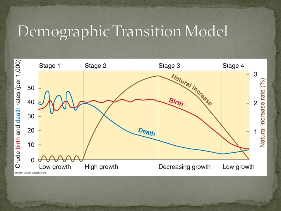
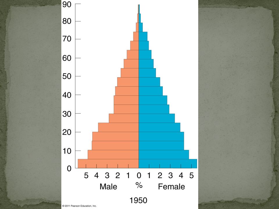
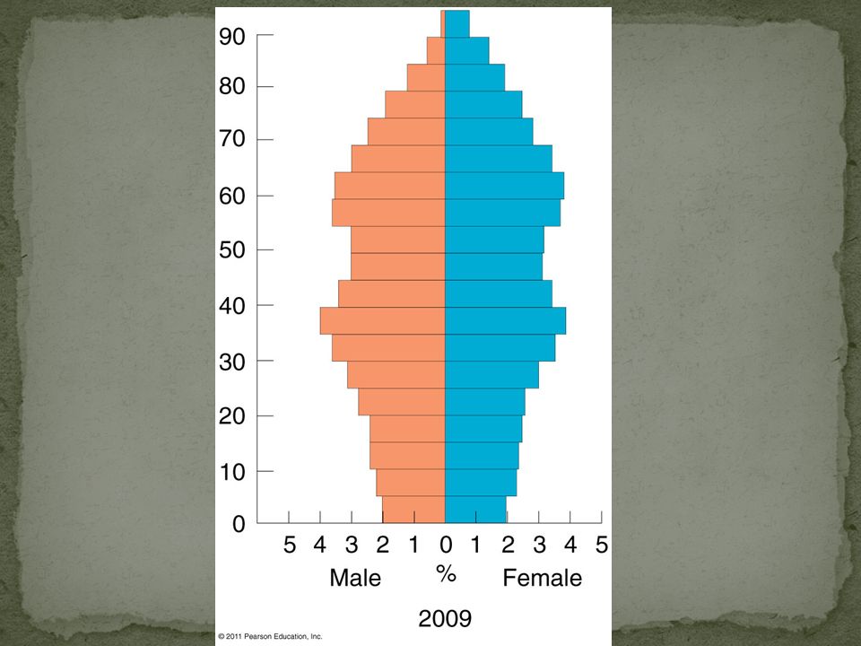
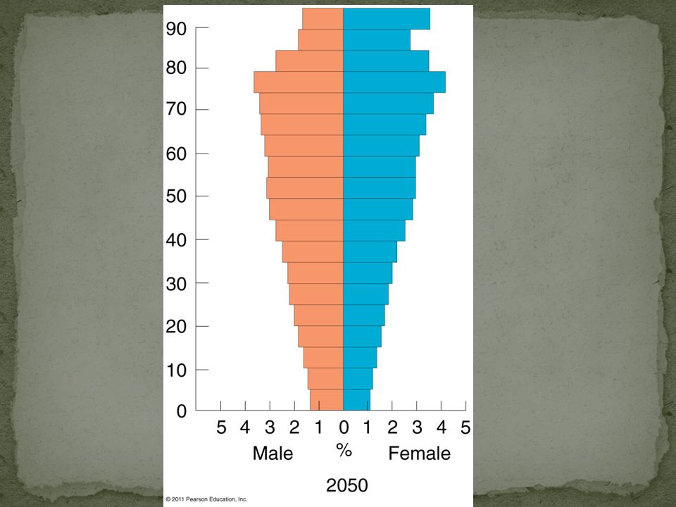
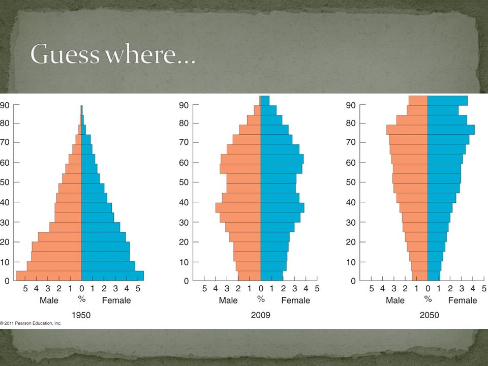
Age distribution Dependency ratio: number of people who are too young/old to work compared to the number of productive people. 0-14 and 65+ are dependent 15-64 are productive Sex ratio Number of females and males in a population

8
Notice the very large gap between birth and death rates since 1950. Indicative of Stage 2.

9
Notice the very large gap between birth and death rates 1930-1960 and the corresponding decrease in birth rate in 1960. Indicative of Stage 3.

10
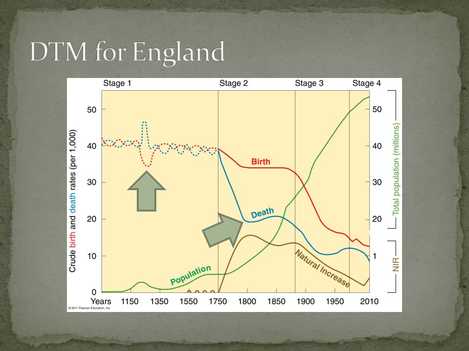
Notice the very large gap between birth and death rates 1830-1890 (Stage 2); decline in birth rate 1890-1970 (Stage 3) and “zero population growth” since 1980.
; decline in birth rate (Stage 3) and zero population growth since 1980.")
Similar presentations


 # Surviving from Birth (I)>")


 Mr Elliott SSOT.>")


