Download presentation
Presentation is loading. Please wait.

1
POWERPOINT DESIGN creating a truly well-designed PowerPoint is easy
Introduction This workshop will help you design well readable and easily understandable presentations for lecturing and presenting. There are other types of PowerPoints, but this workshop has to do with just the lecturing and presenting aspect.

2
Executive Summary Presenting in front of students is a constant fight for their attention from Tweets, Snapchats, and texts from their friends/family. Using graphic design and presentation rules, you can better engage your audience using PowerPoint presentations. Before we start, please raise your hand if you’ve ever sat through a presentation and felt completely bored. The reason for is PowerPoints can be really boring. You’ve probably heard the expression “Death by PowerPoint”. This workshop is designed show you how to dazzle students using animations, visualizations, and graphic design concepts. After this workshop, you will have a better understanding of how to engage your audience through the psychology of human attention.

3
Question to the Audience
Think of some bad PowerPoints you’ve had to sit through – what were the problems with it?

4
Table of Contents PowerPoint Design by Dean Davis Adam Voyton’s Tips
Further reading

5
What We’ll See Variables Tools Rules Examples
Here’s what we’ll discuss. The variables you may encounter before you even start your presentation. The tools that you can use to help your lecture or presentation. Some general rules to follow, although each presentation is different, these are the basics to good design and good readability. We’ll also have some examples showing the good and not so good.

6
Main Kinds of PowerPoints
Lecture Presentation to colleagues The two kinds of PowerPoints you will most likely use as an adjunct are for lecturing and possibly a presentation of some kind to other faculty.

7
Other Kinds of PowerPoints
Tutorial Game-based Interactive The other kind of PowerPoints you can make are for tutorials, game-based learning like Jeopardy, and an interactive piece that may involve a touchscreen. The design aspect you will be shown in this workshop will not always apply to these types of PowerPoints.

8
The Objective It’s a visual aid not a foundation
Possibly meaningless without you Have it fit your use Your PowerPoint presentation is a visual aid to your lecture. It is not meant to carry the whole thing. Please do not flood the slides with text. Your skill as an adjunct is to lecture and convey the information, not have them read slides while you recite the text verbatim. Since you are limiting your text, some PowerPoints may be worthless without the lecture supporting it. You can still have these presentations on Blackboard along with a study guide that you use when giving the lecture. Have it fit your use. Putting stuff that does not pertain to the chapter or lecture will only clutter the presentation.

9
Know Your Audience and Location
Gear your material to your audience Technical surprises or limitations Get there early Gear the look of your PowerPoint to your audience. If the are college students, a over colorful theme like on a video game is not appropriate. Think of PowerPoints you’ve had to sit through and what you saw as problematic. Please be aware of the equipment in your classroom. Ask tech support for an orientation if you’ve never used it before. You can bring up your PowerPoint through Blackboard. If you students see you using it, they will use it also and they’ll know where everything is located. Also, have a flash drive with your material on it in case the Internet is down, you can still have class. If you are presenting at a location other than your normal classroom, like a conference or symposium, contact the technical staff a week or so before the event to see what the facility is like. Nothing worse than showing up with a flash drive only to find out they don’t have a laptop or projector. It’s happened before. On the day of the event get there early and see if you can practice or at least see the room.

10
Templates Make your own Download Watch the busy background
If you are skilled in PowerPoint you can design your own template so you are not using something everyone has seen before. The Microsoft Office site has free templates you can download. If you make your own template please watch that the background is not too busy that you can read the text.

11
Good Backgrounds

12
Not So Good Backgrounds
While visually these graphics are interesting, the backgrounds will not contrast well with the text. “Many times, the graphic or pattern has areas where the background color changes shade from dark to light or from light to dark. This means that the background is not actually one uniform shade and it makes picking a contrasting text and graphic color very difficult. “

13
Fonts Choose ones that come with template
Choose ones that are universally available No more than two Easy to read You can mix serif and sans serif In working with fonts (typefaces) it’s best to choose a basic one that is loaded on every laptop and computer so you are covered. If you are using your own computer you can use any doable font since you don’t have to worry about it being loaded on the other machine. Choosing one that comes with the PowerPoint template or if you are making your own, use one that is universally on every PC. Use no more than two fonts. Headline and bullets. You can use some specialty fonts for special slides or to get a point across, but the norm is two slides throughout the presentation. Make sure they are easy to read and that the point size is not too small. The size of your font in a classroom, is not always the same size for an auditorium (depending on the screen size). Minimum of 30 point font. It is okay to mix serif and sans serif fonts.
 it’s best to choose a basic one that is loaded on every laptop and computer so you are covered. If you are using your own computer you can use any doable font since you don’t have to worry about it being loaded on the other machine. Choosing one that comes with the PowerPoint template or if you are making your own, use one that is universally on every PC. Use no more than two fonts. Headline and bullets. You can use some specialty fonts for special slides or to get a point across, but the norm is two slides throughout the presentation. Make sure they are easy to read and that the point size is not too small. The size of your font in a classroom, is not always the same size for an auditorium (depending on the screen size). Minimum of 30 point font. It is okay to mix serif and sans serif fonts.")
14
Good Fonts Anything that is clearly readable

15
Not So Good Fonts Used for special effects is okay, but not all text
This text is hard to read

16
Colors Stick with solids or smooth gradations
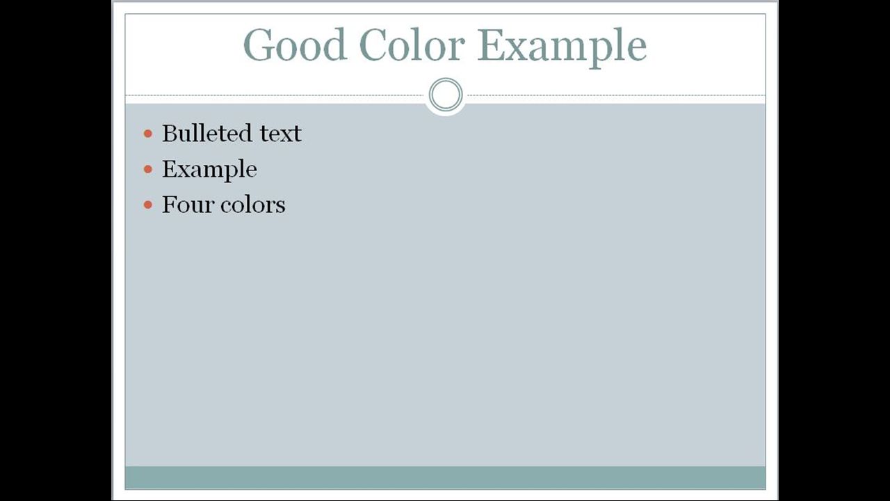
No more than three of four Good combinations Be aware of audience members Sticking with solid colors or smooth gradations is best. You should use no more than four throughout the whole template. Again, unless it is a specialty slide. Trying to use too many colors to stimulate your audience is not the way to keep you’re their attention. It will actually do the opposite. Use good combinations. Again, a multitude of colors will only distract your audience from the lecture. Some audience members may have issues seeing certain colors so having an overly complicated template may hinder their ability to enjoy and learn.

19
Images & Multimedia Copyright allowable Use your own
Microsoft site and library Use them only when needed Multimedia files must travel with show In using video and audio multimedia, please make sure it is copyright allowable. We have a workshop on copyrighted material. Using your own pictures, video, or audio is perfectly allowable, since I doubt you would sue yourself. If you use the library in Microsoft Office, please be aware the computer you are presenting on must also have the library loaded on it. Otherwise, your media will not show. Multimedia that is audio and video that you supply yourself, must travel in a folder with the PowerPoint presentation. It normally does not embed itself in the presentation file unless you save it that way. Any pictures you insert are embedded.

20
Charts Important information only Break it up if needed Conventional
Creative When using charts, please use only the most important information. Break it up into multiple charts if needed. You can do it in sections or prioritize the material being delivered. Use conventional pie charts or bar graphs, especially if you are not comfortable with using and making charts. Yes, you can be creative in making a chart, but the most important part is that it is readable.

21
Good Charts

22
Good Charts

23
Good Charts

24
Good Charts

25
Not So Good Charts

26
Not So Good Charts

27
Not So Good Charts

28
Not So Good Charts This chart is probably the best example of a crowded slide. If you think it looks like a government program, yes, it was used by the Pentagon.

29
How to Create Effective Visualizations
Your chart should tell a simple story. It should be able to be understood ‘at a glance’ If the data is not easy to understand, summarize any trends or noteworthy points Learn more at

30
The Rules (most likely)
Seven and seven Consistent transitions and animations Sound…probably not Well balanced Use negative space, less is more When designing your slides use no more than seven bullets per slide and seven words per bullet. Stay consistent with your slide transitions and bullet animations. You can use different ones for specialty slides, but if you keep changing it every slide, you will lose your audience. They won’t pay attention by the material, they will be looking for what special effect is next. Using silly sounds for each transition or bullet is cheesy. Use them only, and we do mean only, if needed. A slide full of material is not using space wisely. The type may be too small and will be hard to read. Crowding it with pictures isn’t always the best option. Keeping the slides well designed will keep your audience’s attention. Of course there will be times that maybe a quote or sentence from the material will have to be used in a slide. That is fine, but don’t make a bad habit of it.

31
Help and Support Wilmington University Classroom Help
Microsoft Office Templates Free Microsoft Office Artwork Free Templates Here are some websites to help you with your PowerPoints and lectures. The first one is any questions you have about the hardware or software in a WilmU classroom. The rest are websites for PowerPoint.

32
Table of Contents PowerPoint Design by Dean Davis Adam Voyton’s Tips
Further reading

33
Executive Summary The Executive Summary should tell the real message
Distills the complex ideas down to its simple most basic terms Do the thinking for the audience. Make it simple. Say what you want to say clearly and without ambiguity –so everyone is on the same page. It’s amazing how many misunderstandings can arise when people don’t articulate their ideas well

34
Parts of an Executive Summary
Background – the minimum knowledge required to appreciate the idea Table of Contents (HOW) Key Take Away – if they forget everything but one idea, what would it be? Why is it worth remembering? It’s a busy world. Many students have kids or job responsibilities. People have limited attention span, so do their thinking for them.
 Key Take Away – if they forget everything but one idea, what would it be Why is it worth remembering It’s a busy world. Many students have kids or job responsibilities. People have limited attention span, so do their thinking for them.")
35
Why Create a Table of Contents?
Manage the audience’s expectations Provide a high level overview of the content Make a good impression Easier to discuss Make your presentation digestible into logical chunks. People will know how far into the presentation you are. With any questions from the audience, it’s easy to remember a section. A document with a table of contents has a more professional appearance Your audience may be more interested in a certain section of your presentation – the TOC lets them know when they need to pay extra attention.

36
Images should serve a Purpose
Add impact Human faces help people connect Images should not clutter the slides Images should have a consistent look They say a picture’s worth a thousand words.

37
Lots of text

38
One version use images to reinforce the idea behind the words
One version use images to reinforce the idea behind the words. Also the customized design template may capture the audience’s attention more than the out of the box PPT template

39
Anticipate Questions When presenting, have too much knowledge.
Then cut back and show only the most essential information. You can always have extra slides at the end of your presentation, with answers to questions that may come up Your presentation is a statement of excellence.

40
Be Brief Don’t waste time - use a minimum of words for the maximum impact. It’s okay if you finish early. We live in a society of hustle and bustle. Your audience will be happy to have an extra 10 or 15 minutes open up in their busy schedule

41
Repetition is a Key Part of Learning
On the questions slide at the end, share the key take aways When you’re answering questions, the rest of the audience will be able to review the main ideas for your presentation and then ask you related questions.

42
Questions or Comments? Final Take Away:
Presenting in front of students is a constant fight for their attention. Using a well designed PowerPoint is one way you can better engage your audience. This workshop will help you design well readable and easily understandable presentations for lecturing and presenting.

43
Table of Contents PowerPoint Design by Dean Davis Adam Voyton’s Tips
Further Reading

44
Presentation Design Techniques from the Masters

45
10 Dos and Don'ts of Presenting with PowerPoint
Hold up your end with compelling material. Keep it simple Minimize numbers in slides. Don't parrot PowerPoint Time your remarks Give it a rest Use vibrant colors Import other images and graphics Distribute handouts at the end—not during the presentation. Edit ruthlessly before presenting. Source:

46
PowerPoint Operational Tips by Drew Cline
Use F5 to start your presentation Always load your PPT files onto the desktop before class, then remove your thumb drive and put it back in your bag this way you won’t leave it behind Use a PowerPoint remote Use Presenter mode

47
John Maxwell Love how we talks about connecting with your audience and communicating using simple words and ideas, so people actually comprehend what you’re saying.

48
Anticipated Questions

49
How to Embed YouTube Videos in Your PowerPoint Presentations
Embedding a YouTube video into a PowerPoint is tricky. This article explains a few of the most common ways to add a video. I recommend a simpler approach: add the link to a slide, then simply click the link and watch the video on YouTube

50
Embedding YouTube videos still not work all the time

51
However, there is an App you can install which does allow you to embed a YouTube video into a PowerPoint!

52
How to Download a Microsoft Template

53
Choosing Colors “Studies have shown that different colors evoke different general feelings in many people. This can be important when selecting colors for your presentation slides since you will want to avoid colors that will negatively impact the message you are delivering. Given these general interpretations, you would want to steer away from using too much of colors such as black, orange, gray, red and brown, since they can either be too passive or too aggressive.” Source: More info at

Similar presentations


 Effective PowerPoint Enhancing classroom presentations Next.>")


 Chicago Chapter.>")


