Download presentation
Presentation is loading. Please wait.

1
The Elements of Art & Principles of Design
Study Guide for Success

2
The Elements of Art The Elements Of Art are line, color, shape, form, texture, space, and value. These are the artist tools.

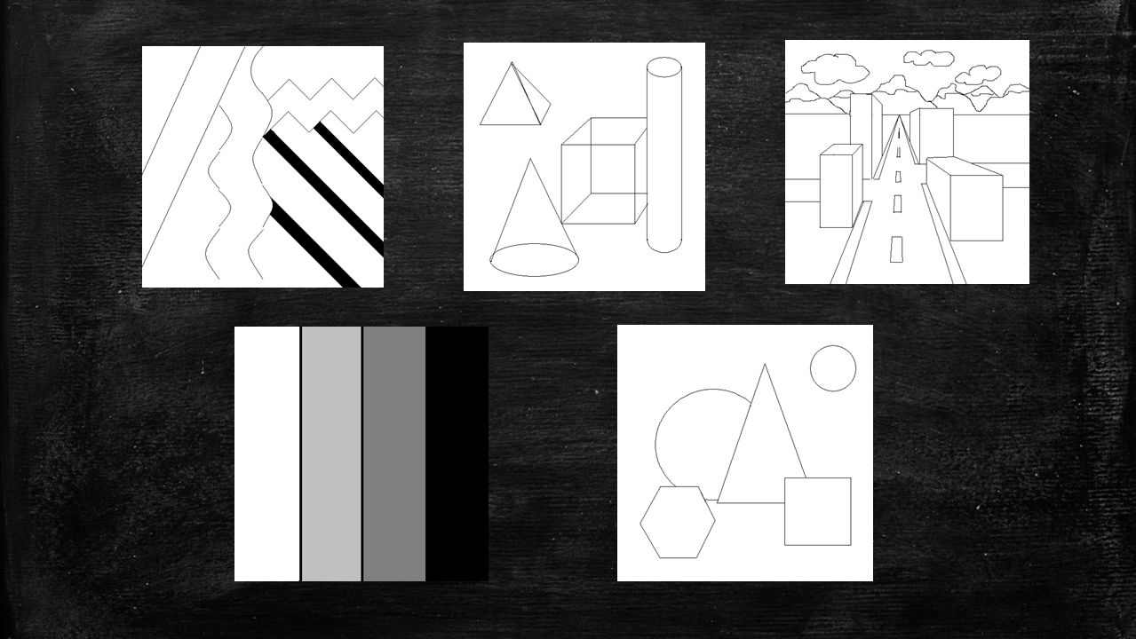
3
LINE A line is an identifiable path created by a point moving in space. Lines can outline forms and can be used to express moods or ideas as follows.

4
VERTICAL LINES Vertical lines often communicate a sense of height because they are perpendicular to the earth, extending upwards toward the sky. In Ansel Adams’ photograph of Aspens, vertical lines suggest dignity, growth, and strength.

5
Horizontal lines suggest a feeling of rest because objects parallel to the earth are at rest. In this landscape of Lake George by Georgia O’Keefe, horizontal lines also help give a sense of space. The lines delineate sections of the landscape, which recede into space. HORIZONTAL LINES

6
THICK LINES Thick, dark and rigid lines can be foreboding and express a heavy feeling. Heavy, thick lines generally portend menace and emphasis such as these in Picasso’s Nude and Still Life.

7
SHAPE & FORM Shape and form define objects in space. Shapes have two dimensions—height and width—and are usually defined by lines. Forms exist in three dimensions, with height, width, and depth. Forms can also be implied in 2-D art by using shading.

8
SHAPE – FLAT TWO-DIMENSIONAL
Shape has only height and width. Shape is usually, though not always, defined by line, which can provide its contour. In Matisse’s Blue Nude, the shapes are flat areas. If defined at all by line, it is the line created in the white spaces around the blue shapes.

9
FORM – THREE-DIMENSIONAL
Form has depth as well as width and height. Three-dimensional form is the basis of sculpture. Three-dimensional forms can be seen from more than one side, such as in Degas’ Little Dancer.

10
GEOMETRIC SHAPES & FORMS
Geometric shapes and forms include mathematical, named shapes such as squares, rectangles, circles, cubes, spheres, and cones.

11
ORGANIC SHAPES & FORMS Organic shapes and forms are typically irregular or asymmetrical. Organic shapes are often found in nature.

12
COLOR Color is often the element that immediately attracts our attention. Color has four main characteristics: hue (red, green, blue, etc.), value (how light or dark it is), intensity (how bright or dull it is), and temperature. Colors can be described as warm (red, orange, yellow) or cool (blue, green, violet), depending on which end of the color spectrum they fall.
, value (how light or dark it is), intensity (how bright or dull it is), and temperature. Colors can be described as warm (red, orange, yellow) or cool (blue, green, violet), depending on which end of the color spectrum they fall.")
13
COLOR WHEEL Primary Colors (red, yellow, blue) when mixed make secondary colors. Secondary Colors (orange, green, violet) when mixed with a primary make tertiary or intermediate colors Monochromatic is a color scheme that uses only ONE color and black and white. Analogous is a color scheme that uses three to four colors next to each other on the color wheel. Complementary colors are opposite of each other on the color wheel. Neutral colors are brown, black, white, and gray. A neutral can usually be made by mixing two complements.
 when mixed with a primary make tertiary or intermediate colors. Monochromatic is a color scheme that uses only ONE color and black and white. Analogous is a color scheme that uses three to four colors next to each other on the color wheel. Complementary colors are opposite of each other on the color wheel. Neutral colors are brown, black, white, and gray. A neutral can usually be made by mixing two complements.")
14
TEXTURE TEXTURE: is the element of art that illustrates how something feels to the touch. Artists use color, line, and shading to imply textures.

15
TEXTURE In Toulouse-Lautrec’s Seated Dancer with Pink Stockings, texture is implied by using scratchy lines in the tulle of the costume and dark heavy lines under the seat of the figure. Even the straight, vertical lines in the background imply a texture in the wall.

16
SPACE Real space is three- dimensional. Space in a work of art refers to a feeling of depth or three dimensions. It can also refer to the artist's use of the area within the picture plane. The area around the primary objects in a work of art is known as negative space, while the space occupied by the primary objects is known as positive space.

17
OVERLAP Overlap is used as a tool to make us assume that one object is in front of the other. Overlap demonstrated by Cezanne

18
DIMINISHING SIZE Diminishing Size gives us a sense of depth because distant objects appear smaller than near objects. Diminishing Size demonstrated by Hopper

19
VERTICAL PLACEMENT Vertical Placement shows depth because we perceive similar sized objects that are placed lower in the image as closer to us, and objects that are placed higher as being further away. Vertical Placement demonstrated by Seurat

20
ISOLATION Isolation shows importance to a subject or a portion of a subject. It can be achieved by leaving large amounts of space around an object or by emphasizing a portion of an artwork. Isolation demonstrated by da Vinci

21
VALUE VALUE: is the range from white to black or light to dark. Value is what makes drawings and paintings look “real.” High value is on the light end of the scale and suggests tinting. Low value is on the dark end of the scale and suggests shading.

22
SUPEREALISM WITH PENCIL VALUES
Chuck Close makes these drawings of Chuck on the left and Bob on the right look “real” by using values!

23
Below, Michelangelo’s The Hand of Adam also demonstrates the use of values.

25
PRINCIPLES OF DESIGN The Principles Of Design, balance, movement, rhythm, unity, variety, and emphasis, are the guides he follows to use his tools.

26
BALANCE BALANCE: describes how artists create visual weight in an artwork. There are three types of balance: symmetrical, asymmetrical, and radial.

27
SYMMETRICAL BALANCE Symmetrical (formal) balance means both sides of an imaginary line are the same.
 balance means both sides of an imaginary line are the same.")
28
ASYMETRICAL BALANCE Asymmetrical (informal) balance means each side of an imaginary line is different yet equal.
 balance means each side of an imaginary line is different yet equal.")
29
RADIAL BALANCE Radial balance means lines or shapes grow from a center point.

30
VARIETY VARIETY: occurs when an artist creates something that looks different from the rest of the artwork. An artist may use variety to make you look at a certain part of the artwork or simply to make the artwork appear more interesting. Jasper Cropsey painted a large tree to create variety in his landscape, “In the Valley.”

31
RYTHYM RHYTHM: Artists create visual rhythm by repeating art elements and creating patterns. In Okazaki, Ando Hiroshige’s bridge supports create a rhythm (through repetition) that leads your eyes through the landscape.
 that leads your eyes through the landscape.")
32
REPETITION Repetition: repeating lines, shapes, colors or patterns in a work of art.

33
EMPHASIS EMPHASIS: Artists use emphasis to make certain parts of their artwork stand out and grab your attention. The center of interest or focal point is the place the artist draws your eye to first.

34
EMPHASIS WITH COLOR In the first example, color emphasizes the woman’s head. The rest of the art is barely seen.

35
EMPHASIS WITH SIZE In the middle, the number 5 is huge and everything else looks as it is all the same scale.

36
EMPHASIS WITH TEXTURE In the last example, the absence of pattern on the letter & envelope emphasize them.

37
MOVEMENT MOVEMENT: refers to the arrangement of elements in an artwork organized in such a way to create a sense of motion.

38
ANTISIPATED MOVEMENT Anticipated Movement, as on the left, causes us to feel that motion is imminent. We know from past experience that some kind of movement will occur.

39
MULTIPLE IMAGES Multiple, overlapping images give us the impression of motion. We can see that the figure on the right has moved through a series of poses.

40
UNITY UNITY: is the feeling that everything in the work of art works together and looks like it fits.

41
THE END

Similar presentations