Download presentation
Presentation is loading. Please wait.

1
Creating Graphs in Excel

2
Step Summary Input data Highlight data to be graphed Insert Chart Decide what type of graph to use Finish!

3
Input Data Directly in Excel Imported from Access or Word – Import: to bring data in from another program – Export: to send data to another program

4
Highlight data Drag-click Ctrl-drag click for data in different places

5
Create the chart Click Insert Chart Or, press the chart button

6
The Chart Wizard A wizard is a small program to make life easier for you – Install wizard (when you add a new program) – Graphics wizard (to set up your monitor) – Query wizard (in Access!) – Chart wizard (what we will learn now!)
 – Graphics wizard (to set up your monitor) – Query wizard (in Access!) – Chart wizard (what we will learn now!)")
7
The Chart Wizard Decide what kind of chart you want

8
Column Chart

9
Bar Chart

10
Line Chart

11
Pie Chart

12
Scatter Chart

13
Chart Wizard – View Sample

14
Chart Wizard – Step 2 Here we check the data range Click to change the data ranges

15
Chart Wizard Step 3 Adding titles Adding axis names

16
Chart Wizard Step 4 Where you want the chart

17
Now you have a chart!

18
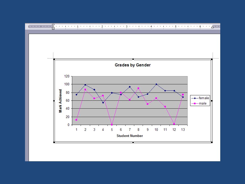
Basic Practice One Open “Student Grade exercise.xls” Make a bar chart showing how many As, Bs, Cs, Ds, and Fs students received in the class Make sure to have a good title, and label the axes!

19
Basic Practice Two Open “Student-Food exercise.xls” Create a Pie Chart showing the total percentages of different favorite foods. Remember to have a good title and a well- labeled key!

20
Exporting Data Here’s how MS Office can work together! Access: storing and searching data Excel: calculations using the data, creating charts Word and Powerpoint: presenting the information

21
Exporting Data from Access Find the data you want to export – Here is where you must design a good query! Choose File Export

22
Choose what program to export to

23
Click “Save Formatted” When moving to Excel, this will keep your columns and rows! Then click “Export All,” and your database will become a spreadsheet

24
Export Practice We have a student list with gender and grade. We want to see who the better students are: boys or girls! First, let’s think: what kind of graph would best show us the answer? Imagine what it would look like…

25
Export Practice 2 A line graph would show us the answer most clearly – 2 lines, one for boys, one for girls.

26
Export Practice 3 What EXACT data to we need to do this?

27
Export Practice 4 We need only the gender and grade fields. What do we need to do to display only the gender and grade fields?

28
Export Practice 5 Create a query. How do we do this?

29
Export Practice 6

30
Export Practice 7 Do it! Export one spreadsheet, with the boys and the girls grades on it. Remember: sort your query by gender, so all the boys’ grades are together, and all the girls’ grades are together.

31
Export Practice 8 Do you have a query that looks like this?

32
Export Practice 9 Now, export this data to Excel 2003 format.

33
Export Practice 10 Now we have this – what do we need to do next?

34
Export Practice 11 For a line graph with 2 lines, Excel must have the data in 2 columns. Copy and paste the data into two columns on the same spreadsheet.

35
Export Practice 12

36
Export Practice 13 What next?

37
Export Practice 14 Make a line chart. Remember – have a good title, and label the axes!

38
Export Practice 15

39
Export Practice 16 But what if you must write a report about this, or give a presentation?

40
Export Practice 17 We must get this chart into a Word or Powerpoint file. Do you know an easy way to do this?

41
Export Practice 18 Copy and Paste! Right click the chart, and choose “Copy” Open a new Word file Right click, and choose “Paste”

42
Export Practice 19

43
Export Practice 20 You can do the same thing in Powerpoint Open Powerpoint. Copy your graph onto the first slide.

45
Exporting: Final notes Remember, you can change anything you export – Data from Access can be copy and pasted into rows – Charts exported from Excel can be resized

46
Final Practice 1 We want to make a pie chart of students’ favorite foods. Open “Student Food Preferences” database Create a query to show only the data needed. Export this data to Excel

47
Final Practice 2 The data here cannot be used to make a pie chart – we need numbers! A useful function is COUNTIF – this will count the number of cells that contain a certain data value. The syntax is fx=COUNTIF(range,value) A real example: =COUNTIF(B2:B27,"Rice")
 A real example: =COUNTIF(B2:B27, Rice ).")
48
Final Practice 3 Create functions to total all the favorite foods. It should look like this: Use this data to create a pie chart

49
Final Practice 4 Create a pie chart out of the data, as you did in Basic Practice 2 Copy and paste this chart into a Word document.

Similar presentations

. Is a spreadsheet application designed to take advantage of the windows graphical interface MICROSOFT EXCEL.>")


 Excel Lessons 4 – 8 Press space bar to Advance Frame.>")


