Download presentation
Presentation is loading. Please wait.

1
Typography Style, selection, production, and psychology

2
The art of arranging type, which includes letters, numbers and symbols, so that it is pleasing to the eye. This includes not only the font that is used but how it is arranged on the page: letter by letter, size, line spacing, etc. Typography

3
Typeface vs. Fonts What’s the difference?

4
A typeface refers to a group of characters, such as letters, numbers, and punctuation, that share a common design or style. Examples include: Times New Roman, Arial, Helvetica and Courier. Typeface

5
refer to the means by which typefaces are displayed or presented (the way they look).means by which typefaces Font
.means by which typefaces Font")
6
Serif Sans-serif Script Display Geometric There are many other classifications that we will not go into any further. Styles

7
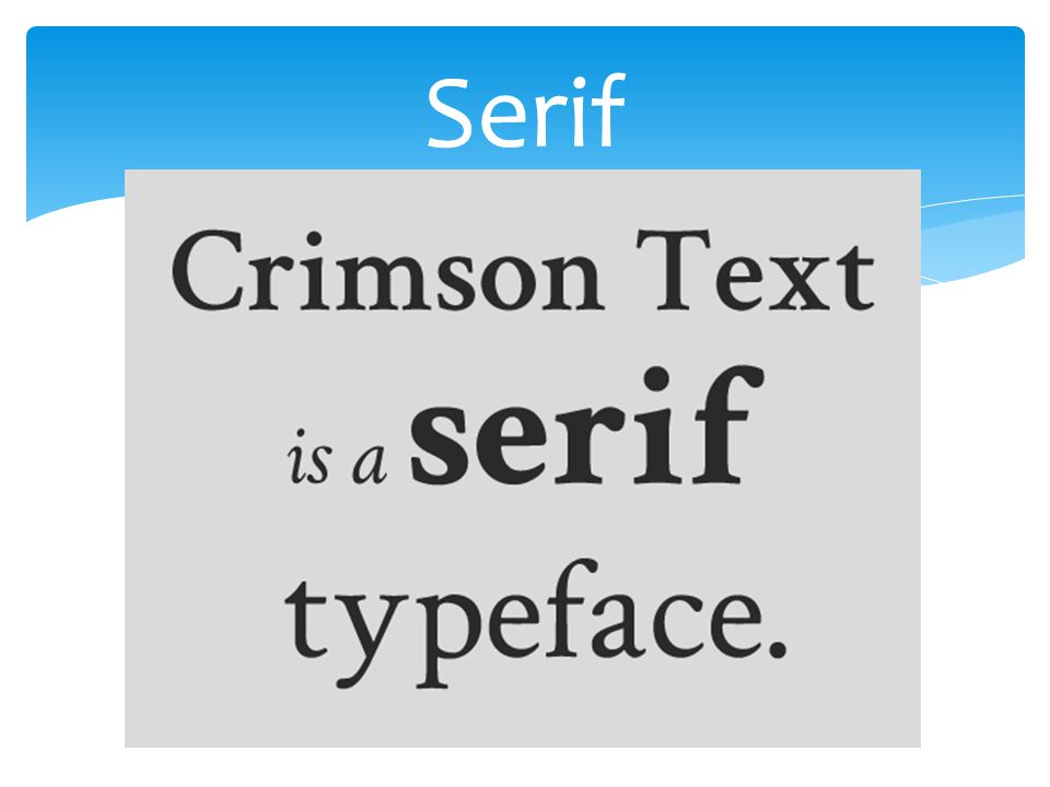
fonts that are recognizable by the small lines at the ends of the various strokes of a character. These lines make a typeface easier to read by guiding the eye from letter to letter and word to word, often used for large blocks of text, such as in a book. Serif

9
Refers to typefaces without lines. Sans serif fonts are often used when a large typeface is necessary, such as in a magazine headline. These can be easier to read on screen.headline San-serif

10
Sans-serif

11
Based upon handwriting and offer very fluid letterforms. There are two types: formal and casual. Script

12
Casual Script

13
Formal Script

14
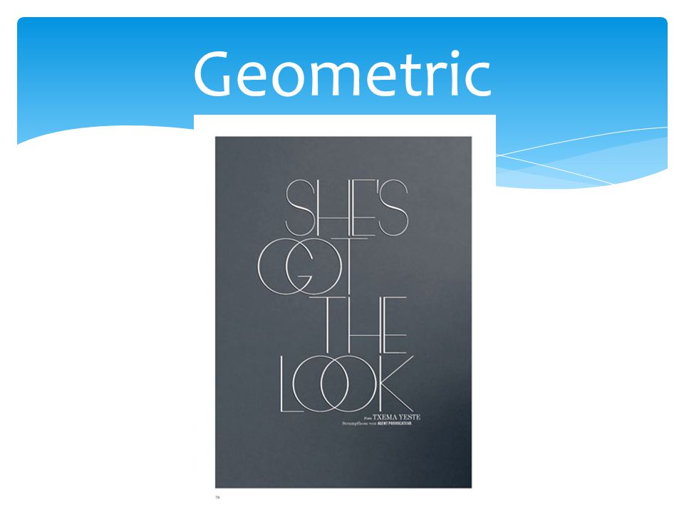
Based closely on geomnetric shapes: “O”s appear circular and letters are simple. Geometric

16
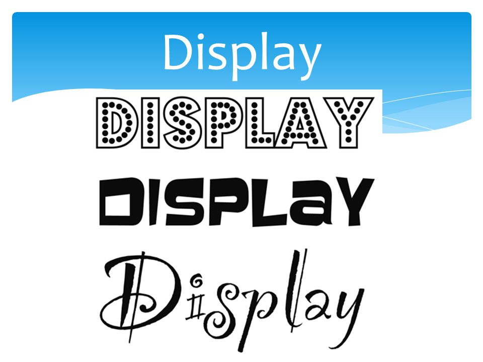
The main characteristic is that they’re unsuitable for body copy and are best reserved for headlines or other short copy that needs attention drawn to it. Display

18
Typography plays a huge role in developing a strong brand identity and a solid first impression. Different fonts convey different messages. The Psychology behind Typography

19
Serif Fonts Associations: authority, tradition, respect, and grandeur Top 5: Times New Roman, Bodini, Georgia, Garamond and Baskerville. The Psychology behind Typography

20
Serif Fonts When to use: On your resume, in the body text of an editorial, or when you want to give your research paper that extra assurance of success. When not to use: on your child’s birthday party invitations, as the heading for your health and beauty blog, or anytime you are out of the office, newsroom or university really… The Psychology behind Typography

21
Sans Serif Fonts Associations: clean, modern, objective, stable, and universal Top 5: Helvetica, Verdana, Arial, Century Gothic, and Calibri The Psychology behind Typography

22
Sans Serif Fonts When to use: as your corporate presentation header text, for extremely small body text (sans-serif fonts are more legible from far away), when you want to emphasise a single word, and as the body text on your website (sans-serif fonts are more legible than serif fonts when read on a computer screen). When not to use: There are very few instances in which it is not okay to use a sans-serif font. These mainly pertain to whether the text is read on screen or on paper. If you are unsure which font to choose, a Sans-serif may be your best bet. The Psychology behind Typography

23
Slab Serif Fonts Associations: Bold, Strong, Modern, Solid, and Funky Top 5: Rockwell, Courier, Museo, Clarendon and Bevan The Psychology behind Typography

24
Slab Serif Fonts When to use: on your next billboard ad, when printing on poor quality paper (slab serif fonts are known to be most legible in cases of poor quality printing), and when you want to attract attention in general When not to use: on your afternoon tea invitation or in the body text on your website. The Psychology behind Typography

25
Scrip Fonts Associations: feminine, elegant, friendly, intriguing, creative Top 5: Lobster, Zapfino, Pacifico, Lucida and Brush Script The Psychology behind Typography

26
Script Fonts When to use: on your holiday greeting card, on the place cards for guest tables at your wedding, and as the font for your creative company’s logo. When not to use: in body text, as a sub-header, or for anything even remotely corporate. The Psychology behind Typography

27
Modern Fonts Associations: exclusivity, fashionable, stylish, sharp, intelligent Top 5: Inifinity, Eurostyle, Majoram, Matchbook, Politica The Psychology behind Typography

28
Modern Fonts When to use: on your hipster photography blog header, for your designer sunglasses company logo, and when you want to attract the attention of Millennials. When not to use: as the body text in your report, in conjunction with a script font, and on anything you are giving to your grandmother. The Psychology behind Typography

29
How do you select the right font?

30
Know who your audience is and what they will feel is appropriate. 1. Dress for the occasion.

31
The clothing analogy gives us a good idea of what kind of closet we need to put together. 2. Know your families.

32
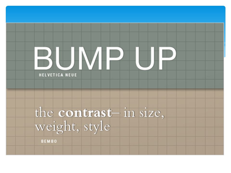
Depending on what you are doing, it is goo to have contrasting styles, such as a title of an article vs. the article itself. It is better to have a larger diffence in font style than small, because it messes with the readers head. 3. Don’t Be a Wimp: The Principle of Decisive Contrast

35
Heres another clothing analogy. Look a the photos below. Just like clothing, you can use a whole lot of something and look like a clown, or use a little bit of an accent and look fashionable. 4. A Little Can Go a Long Way

36
Look at this font chosen for a menu title. Nice huh? 4. Contined

37
Look what happens when you use it for the whole menu. 4. Contined

38
Now look at what happens when you combine bold with simple. 4. Continued

40
We’ll call them “guidlines”. Be creative. It just takes an eye for what looks good together. 5. Rule Number Five Is ‘There Are No Rules’

41
Design Process Decide what your design will be based off of. Decide which type family works with that idea. Decide how you can incorporate and combine style with emotion/feeling. Make several sketches to see what works best. Create the final typeface on an illustrator program. https://www.youtube.com/watch?v=eeKUeyT1eSo Production of Type

42
Link to a free online font creator: http://fontstruct.com/ http://fontstruct.com/ Production of Type

43
http://churchm.ag/font-psychology-typography/ http://churchm.ag/font-psychology-typography/ http://www.smashingmagazine.com/2010/12/14/what- font-should-i-use-five-principles-for-choosing-and- using-typefaces/ http://www.smashingmagazine.com/2010/12/14/what- font-should-i-use-five-principles-for-choosing-and- using-typefaces/ http://designinstruct.com/tools-basics/the-basics-of- typography/ http://designinstruct.com/tools-basics/the-basics-of- typography/ http://www.contentgroup.com.au/psychology- typography/ http://www.contentgroup.com.au/psychology- typography/ Sources

Similar presentations


.>")


![The Use of Typography in Print and Electronically. [typography] “exists to honour content” Robert Bringhurst, The Elements of Typographical Style.](/16/5069154/big_thumb.jpg "The Use of Typography in Print and Electronically. [typography] “exists to honour content” Robert Bringhurst, The Elements of Typographical Style.>")


