Download presentation
Presentation is loading. Please wait.

1
Typography (The study of font)
")
2
What is “Typography?” The study and “process” of typefaces, and the art and technique of printing “Study” Legibility or readability of typefaces and their layout Attractiveness of typefaces and their layout Functionality and effectiveness of typefaces and their layout How a typeface/layout combo “enhances” or “honors” content “Process” Artistic composition of individual type Setting and arrangement of type

3
Goals of typographic design
Typography plays an important role in how audiences perceive your document and its information. Good design is about capturing your audience’s interest and helping your audience gather information quickly and accurately. Typography creates relationships between different types of information, both organizing this information and keeping it interesting.

4
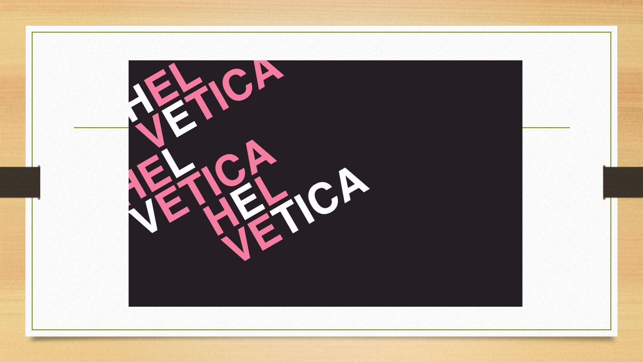
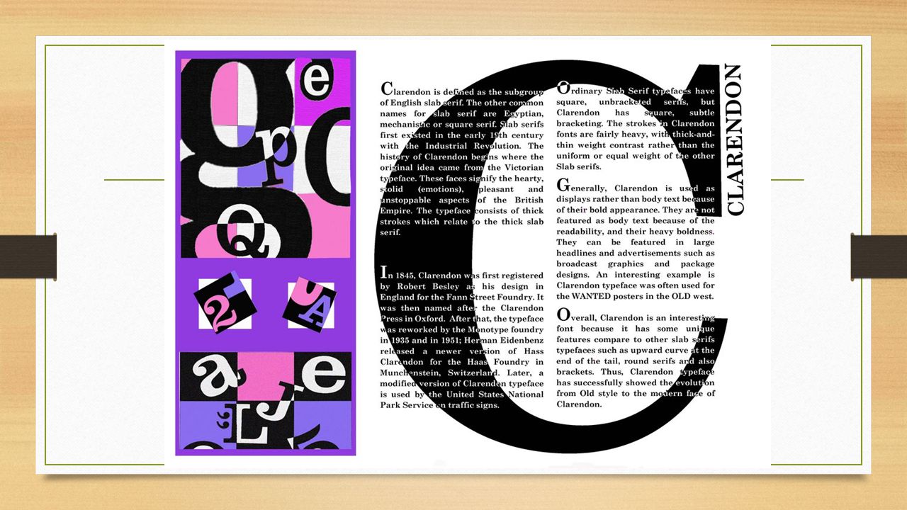
Typeface Each design has a name and is intended to convey a specific feeling. There are basically three types of faces: serif, sans serif, and script. Example Text Serif: has lines, curves, or edges extending from the ends of the letter. Sans Serif: is straight-edged or without lines. Script: looks like handwriting. (Serif)
")
5
Font Definition: A font is a specific member of a typeface family such as roman, bold, or italic. Changing the size also changes a font. EXAMPLE: Arial: abcdefghijklmnopqrstuvwxyz abcdefghijklmnopqrstuvwxyz Each set includes upper- and lowercase letters, numerals, and punctuation.

6
Serif vs. Sans Serif

7
Legibility and font families
Online Print Serifs create distinctions between characters (uppercase “I” and lowercase “L” ) Appears blurry Helps the reader follow text easily Serif fonts have contrasting strokes and lines Helps move reader’s eye character to character Sans serif fonts have uniform strokes throughout Helps readers easily read text Makes words in a sentence hard to follow Stroke Line For body text displayed in print, it’s often best to use a serif font. Serifs help create distinctions between characters, such as between upper case “I” and lower case “L.” However, with online text (which appears at a lower resolution), serifs may make text appear blurry. Serif fonts also have strokes and lines that contrast, which help readers’ eyes move from character to character. Examples of serif font families include Garamond, Times, Palatino, and Georgia. Sans-serif fonts, like Tahoma, often have uniform strokes throughout. With print, audiences can find these hard to follow. With online, audiences may find sans-serif fonts easier to read. 7 7
 Appears blurry. Helps the reader follow text easily. Serif fonts have contrasting strokes and lines. Helps move reader’s eye character to character. Sans serif fonts have uniform strokes throughout. Helps readers easily read text. Makes words in a sentence hard to follow. Stroke. Line. For body text displayed in print, it’s often best to use a serif font. Serifs help create distinctions between characters, such as between upper case I and lower case L. However, with online text (which appears at a lower resolution), serifs may make text appear blurry. Serif fonts also have strokes and lines that contrast, which help readers’ eyes move from character to character. Examples of serif font families include Garamond, Times, Palatino, and Georgia. Sans-serif fonts, like Tahoma, often have uniform strokes throughout. With print, audiences can find these hard to follow. With online, audiences may find sans-serif fonts easier to read")
8
Some Typeface Examples
Quick brown foxes jump – Arial Black Quick brown foxes jump - Times New Roman Quick brown foxes jump - Bookman Old Style Quick brown foxes jump - Courier New Quick brown foxes jump - Trebuchet MS Quick brown foxes jump - Comic Sans MS - Webdings

9
Size This is 48 point type. This is 36 point type.
Definition: Font size generally refers to the height of the font, usually measured in points. There are 72 points to an inch. This is 10 point type. This is 12 point type. This is 18 point type. This is 24 point type. This is 36 point type. This is 48 point type.

10
Match the Job Select a typeface that matches the document content.
To choose an appropriate typeface, generate adjectives that describe the mood or feeling that you want achieved. (Ex: masculine, strong, elegant, romantic, friendly, dramatic, etc.) Then choose a typeface with a personality that matches the adjectives. Remember that the typeface must be compatible with the content of the words and the document message. BULLDOZER (Appropriate) (Inappropriate)
 Then choose a typeface with a personality that matches the adjectives. Remember that the typeface must be compatible with the content of the words and the document message. BULLDOZER (Appropriate) (Inappropriate)")
11
Typography and Print Typography is defined in relation to print
History of (Western) printing Johannes Gutenberg Europe’s first printer (42-line Bible, 1455), first designer of typeface Gothic type: modeled after German script Goal: To replicate the look of a manuscript Bible Aldus Manutius Designed “Italic” type (“of Italy”) in the 1490s Modeled on handwriting of Venetian clerks Compact form allowed for printing of smaller books
 printing. Johannes Gutenberg. Europe’s first printer (42-line Bible, 1455), first designer of typeface. Gothic type: modeled after German script. Goal: To replicate the look of a manuscript Bible. Aldus Manutius. Designed Italic type ( of Italy ) in the 1490s. Modeled on handwriting of Venetian clerks. Compact form allowed for printing of smaller books.")
12
Typography and Print German Script Gothic Type Manutius’ Italic

13
Creating Type “Anatomy of a letter” - Some terms eventually associated with the potential features of type design

14
Movable Type Made of Cast Metal
One per character, space, punctuation, etc. A page would be filled with thousands of these

15
Movable Type

16
Typography and Print: Creating Type

17
Leading

18
Kerning

19
Alignment / Justification
Left-aligned text is the most legible, because it matches the way that we read left-to-right. Center-aligned text is considered less legible because the ragged starting edges make it difficult for the reader to track from one line to the next. Center-aligned is often used for titles. Small amounts of text on the right side of the page should be right-aligned. This text is difficult to read because of the ragged left edge.

20
Similarity and alignment
Aligned text creates a line in your design; such lines help readers draw connections between different parts of a document.

21
Readability Readers only want information that is easy to read, understand and use. Choose legible typefaces appropriate for the subject matter Ensure readability by making sure the type: is big enough to read is set at a line length that is not too long or too short provides a contrast to the background Use no more than two type faces per document (variety is accomplished by using styles such as bold, italic, etc.).
.")
22
Contrast and font families
To create contrast, you could use two font families, one serif and one sans serif. Heading is set in Impact—a sans serif font Subheading is set in Georgia—a serif font

23
Hierarchy and typography
Use typography to guide readers through the levels of your document. Use different headings by changing font family, font type, font size, font color. To promote uniformity and help your audiences navigate, keep typographic choices consistent for each subsection throughout the document.

24
Top-level headings can use unconventional fonts
Different levels use different font sizes, font families, font colors, and leading. These headings look the same because they express the same level of hierarchy

Similar presentations


![The Use of Typography in Print and Electronically. [typography] “exists to honour content” Robert Bringhurst, The Elements of Typographical Style.](/16/5069154/big_thumb.jpg "The Use of Typography in Print and Electronically. [typography] “exists to honour content” Robert Bringhurst, The Elements of Typographical Style.>")

 Robin Chin November 7, 2006.>")


 Color Font effects The first 3 of these can be set in the formatting toolbar, and all of.>")


