Download presentation
Presentation is loading. Please wait.

1
Using Google Sheets To help with data

2
Sheets is a spreadsheet program that can interface with Docs, or Slides A spreadsheet program has cells (little blocks) that we can put information and then relate the cells to each other.
 that we can put information and then relate the cells to each other.")
3
We can add text, numbers, or calculations To open Sheets, from “My Drive”, click “New” then “Google Sheets” Double Click on the “Untitled Spreadsheet” and type in a name of the document

4
Notice across the top are letters, and along the left side are numbers Each cell has its own address such as C14

5
Let’s start by typing “Distribution of Hair Color by Class” in B4 Create a table as shown

6
Click and hold the mouse on cell B5 and drag it to E9. There should be a block surrounding B5-E9

7
It may be important to know how many students there were total. –Click on E10 and type “=SUM(“ –You can now drag a box around all the cells you want to add up. Drag from C6 to E9

8
–Type “)” to close the parentheses –Press the Enter key Total students should show as 82
 to close the parentheses –Press the Enter key Total students should show as 82")
9
Let’s average each type of hair color –Click on F6 and type “=AVERAGE(“ and drag a box from C6 to E6 –Type “)” to close the parentheses –Press the Enter key
 to close the parentheses –Press the Enter key")
10
Pretty Cool huh?

11
Instead of typing that for each hair color, let’s copy the formula. The program will automatically adjust for the other rows. –Click in F6 –Click “Edit” from the menu at the top –Click “Copy” –Drag a box around the empty cells F7 to F9 –Click “Edit” then “Paste”

12
Types of Graphs A Picture is Worth a Thousand Words

13
Line Graphs Line graphs compare two variables (One is usually time) Given one variable the other can easily be determined Show trends in data and show how one variable is affected by the other as it increases or decreases They enable the viewer to make predictions about the results of data not yet recorded
 Given one variable the other can easily be determined Show trends in data and show how one variable is affected by the other as it increases or decreases They enable the viewer to make predictions about the results of data not yet recorded")
15
Bar Graphs Make comparisons between different groups (variables) very easy to see.
 very easy to see.")
16
Bar Graphs

17
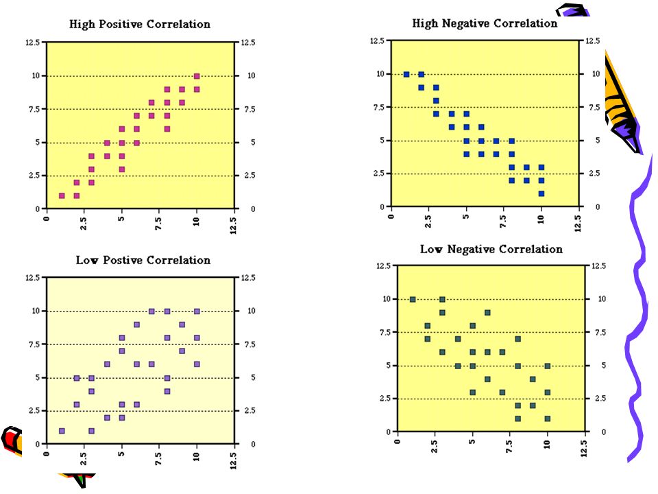
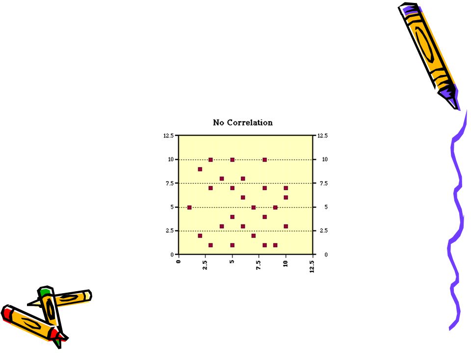
Scatter plot graphs Use horizontal and vertical axes to plot X-Y data points Scatter plots show how much one variable is affected by another. The relationship between two variables is called their correlation. Scatter plots usually consist of a large body of data. The closer the data points come when plotted to making a straight line, the higher the correlation between the two variables, or the stronger the relationship.

20
Scatter plot Graphs If there is absolutely no correlation present then R 2 = 0 The closer R 2 is to 1 or -1, the stronger the correlation, or the stronger the relationship between the variables The closer R 2 is to 0, the weaker the correlation

21
Scatter plot graphs A perfect positive correlation is given the value of 1 A perfect negative correlation is given the value of –1

22
Scatter plot graphs

23
Make a column that totals each of the hair types from G6 to G9 This is discrete data that requires what kind of chart? –That’s right, a bar chart –In Sheets, they call it a column chart

24
Highlight G6-G9 Click on the insert chart icon on the menu Click “Charts” In the ovals, choose “Column” by clicking on it Choose the “Clustered Column” which is the first choice of pictures of the charts

25
OK, you should have a chart now, but we need to clean it up.

26
Choose “Customize” from the tabs on the top. Double Click “Add Title” and fill in “Hair Color By Class”

27
Click on “Chart Title” and choose “Horizontal (Category) Axis Click in the block below (Click here to add title), and type “Hair Color”
 Axis Click in the block below (Click here to add title), and type Hair Color")
28
Click on “Chart Title” and choose “Vertical (Value) Axis Click in the block below (Click here to add title), and type “Counts”
 Axis Click in the block below (Click here to add title), and type Counts")
29
Right Click on the numbers that are on the X-axis to bring up a pop-up menu (or hold Control and click the numbers) Choose “Select Data …” Click the icon (square) at the bottom, right labeled “Category (X) axis labels:”
 Choose Select Data … Click the icon (square) at the bottom, right labeled Category (X) axis labels:")
30
Click on “Black” in the worksheet Click and drag B6 to B9 A box should be drawn around the various hair colors Press “Enter” Click “OK”

31
We can manipulate the data now and the chart will change accordingly Highlight from B6 to G9 Click “Data” from the top menu Click “Sort” Sort by “Column G” and click “Descending” Look what happened to the graph

32
Let’s copy the graph into a document

33
Type “Distribution of Hair Color by Class” at the top of the Word document Press the enter key

34
Click on any part of the Sheets spreadsheet to view it. Click on the graph once so it is enclosed by a box Click “Edit” then “Copy”

35
Click on the Word document and click “Edit” then “Paste” You now have the graph in Word.

36
How Awesome is that?!

Similar presentations
 Falkirk Council.>")
>")


 OR Click on Start All Programs Microsoft Office Microsoft Office Excel 2003.>")


