Download presentation
Presentation is loading. Please wait.

1
Design Process Ex: HUGO Boss Perfume Ad

2
1. Receive and Study the Creative Brief
Overview Specifications, Goals, Measurable Objectives, Deliverables Needed Primary Audience - Primary target audience Tone and Image - Funny and casual, or formal and buttoned-up, etc.? Messaging - Major points Budget and Schedule Budget? When is the project due? Outline project stages. Process Who is the main contact person? When comps are due, etc.? Anything else? Total Rounds of Revisions, etc.

3
Research your Target Market Choose a typical audience member or two and profile including occupation, age range, gender, his or her interests, etc. Ex: HUGO Man Perfume - Who is the consumer? Additional information about HUGO Man target audience

4
Who Is Your Target Audience?
Men who wear HUGO are spontaneous and original in everything they do. That’s why they choose HUGO. It’s the scent that says it all. HUGO fragrances continue to champion creativity with the new limited Spray Edition for HUGO Man. Created to encapsulate the urban life and environment of the young, upbeat men wearing HUGO fragrances, the new design celebrates a pure and irreverent display of self expression.

5
3. Brainstorm Ideas a) Research other designs that deal with the same subject matter, use similar medium, format, are from the same time period, etc. b) Write as many ideas down as come to mind Main Tagline - Examples: 1. Say It. Spray It. 2. It’s Just a Fragrance. The Rest Is Up To You! 3. Dare to Be Different! 4. Anywhere In Your Element! 5. Wherever You Go, Take Hugo! 6. Your Fragrance. Your Rules.
 Research other designs that deal with the same subject matter, use similar medium, format, are from the same time period, etc. b) Write as many ideas down as come to mind. Main Tagline - Examples: 1. Say It. Spray It. 2. It’s Just a Fragrance. The Rest Is Up To You! 3. Dare to Be Different! 4. Anywhere In Your Element! 5. Wherever You Go, Take Hugo! 6. Your Fragrance. Your Rules.")
6
3. Brainstorm Ideas Possible Taglines: Paint the town red!
Previous Theme: “Black & White and Red”. A list of useful idioms, expressions dealing with color red: Possible Taglines: Paint the town red!

7
3. Brainstorm Ideas c) Sketch your ideas on paper. Create thumbnails, also known as “roughs”. headline goes here image

8
4. Start the Elimination Process
a) Getting rid of the bad ideas. Illuminate clichés. b) Explain your concept to somebody else. c) Simplify the idea. d) How will you explain (“sell”) it to your client? Think what you will say to support your choice of images, text, etc.
 Getting rid of the bad ideas. Illuminate clichés. b) Explain your concept to somebody else. c) Simplify the idea. d) How will you explain ( sell ) it to your client Think what you will say to support your choice of images, text, etc.")
9
5. Look for Source Images Know what exactly you are looking for. Ex: A picture of a Man. What kind of man are you looking for: young, hip, how old, happy or grumpy, indoors or outdoors, color or black & white, etc.? Use royalty free image libraries such as Get owner’s permission to use photos for commercial purposes.

10
6. Start Working on a Computer
Decide on a layout Decide on a color palette Choose appropriate fonts Establish hierarchy (Which text is more important and why. Which elements should be large, which should be small, etc.)
")
11
Emphasis & Hierarchy

12
Hierarchy - Definition
HIERARCHY - the process of ranking elements (graphics and text) in order of importance. Hierarchy is the basis for every design decision. Ask yourself this question:
 in order of importance. Hierarchy is the basis for every design decision. Ask yourself this question:")
13
What Do I Want The Viewer to See 1st?

14
Using High Contrast Set items apart through the use of high contrast.
Make “bold” design moves - not subtle ones. Slight variations irritate the eye and confuse the viewer.

15
Key to Clear Hierarchy: Rank & Simplify
1. White space is your friend!

16
Key to Clear Hierarchy: Rank & Simplify
2. Don’t cram too much information, graphics on one page. Keep it simple!

17
Key to Clear Hierarchy: Rank & Simplify
3. Group related elements — bullet points, lists, names, etc… and isolate them for emphasis. It helps to brake up blocks of text and graphics.

18
Adding Contrast with Text
1. Bold, italics, UPPER CASE, underlined… 2. Size text, but don’t overdo it. Don’t use more than 3 different text sizes in the same composition.

19
Adding Emphasis Through the Use of Color
1. Use color to separate elements or establish a clear focal point. 2. Use colors sparingly - not too many.

20
Adding Emphasis Through the Use of Color
3. Saddle differences in color don’t work. Use good contrast, bold colors.

21
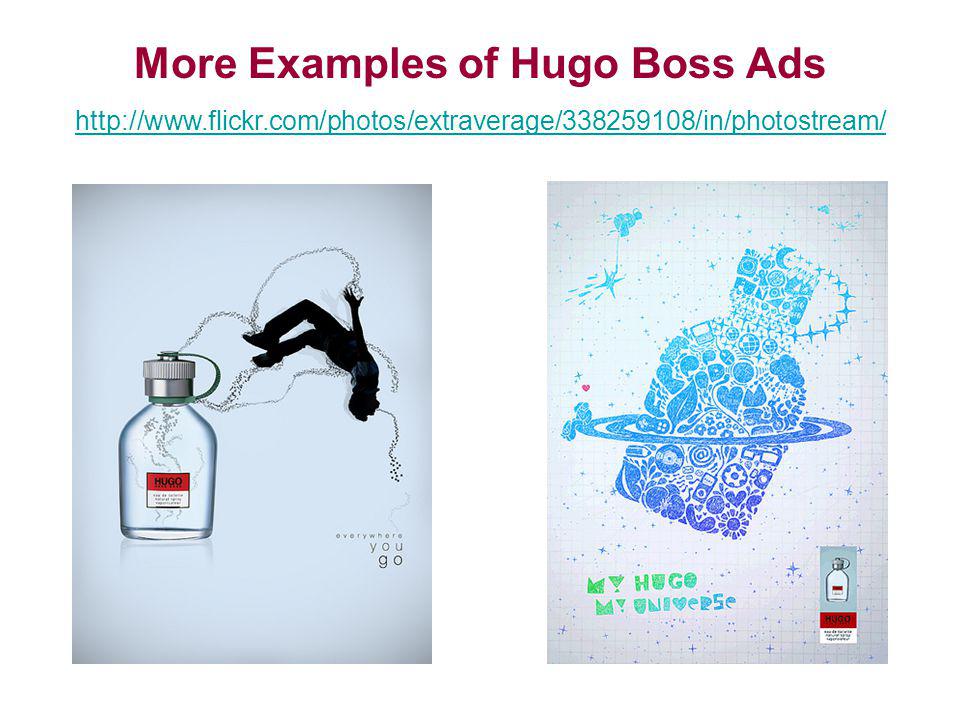
More Examples of Hugo Boss Ads
22
Black & White & Red (Current Round)
")
23
Film Noir Genre (Hollywood, 50s-60s)
Black & White Film Noir Genre (Hollywood, 50s-60s)
")
24
Traditional, Classic & Documentary B&W photography
Black & White Traditional, Classic & Documentary B&W photography

25
Organic and Geometric Patterns, etc.
Black & White Organic and Geometric Patterns, etc.

26
Black & White Light and Shadow

27
Chess pieces, chess board, etc.
Black & White Chess pieces, chess board, etc.

28
Red Color and Its Symbolism
“Red carpet treatment”, red as a symbol for passion, etc.

29
Artists using similar color palette
Barbara Kruger

30
Art Movements using similar color palette
Russian Avant-garde, El Lizzitsky ( s)
")
31
Art Movements using similar color palette Russian Avant-garde Posters

32
Target Ad Campaign

33
Examples of Student Projects:
34
Current Design Contest Details:
35
Prominent Graffiti, Street Artists:
Banksy Banksy Documentary Swoon Keith Haring Barry McGee

36
Berlin Street Art Fan Group on Flickr:
Similar presentations


