Download presentation
Presentation is loading. Please wait.

1
EXECUTING THE BIG IDEA

2
Sharpen your pencil

3
“All art is a series of recoveries from the first line. The hardest thing to do is put down the first line. But you must.” — Nathan Oliveira, artist (1928-2010)
.")
4
Then, go for quantity. Quality comes later.

5
Fill that page. Fill the wall. No idea is left unwritten. If you need one headline, write 100.

6
Before you begin creating:

7
What’s the objective?

8
Before you begin creating: What’s the objective? What needs to be said first?

9
Before you begin creating: What’s the objective? What needs to be said first? Then what?

10
Think about how you want the viewer’s eye to flow through the page:

12
“Dullness won’t sell your product, but neither will irrelevant brilliance.” –William Bernbach, DDB’s founder

15
ELEMENTS OF DESIGN

16
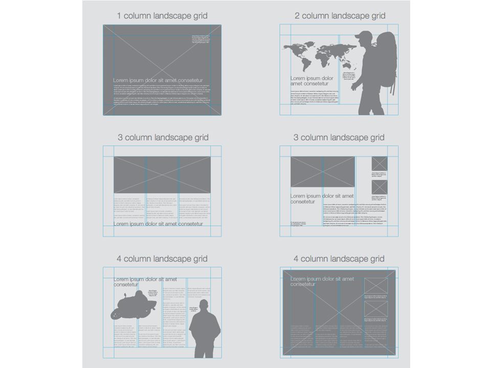
USE A GRID

17
Grids are a method of creating organization and consistency in all areas of design. A layout grid is the invisible force that gives the visible its structure and holds everything in its proper place.

21
What people think it looks likeWhat it really looks like The Advertising Design (Process)
")
22
Thumbnails

23
Roughs

24
Comps

25
(In his Stanford University commencement speech he said, “If I had never dropped in on that single course in college the Mac would have never had multiple typefaces or proportionally spaced fonts.”) Typography AKA, one of the only college courses Steve Jobs took
 Typography AKA, one of the only college courses Steve Jobs took")
26
Serifs are the feet used to finish off the main strokes of some letters.

27
Sans serif literally means “without serifs”

28
We are family

29
The term “type family” or “typeface family” is used to describe a range of designs that are all variations of one basic typeface. Find a typeface with multiple variations such as bold, extra bold, black, regular, light, light italic, and regular italic. Sticking to a single type family will help add variation to your designs, while keeping it consistent and uniform.

30
Using various styles within one family creates a sense of hierarchy. Design so that the most important elements, such as headlines and quotes, stand out above the rest of the text.

31
On the left, the natural space you see between two letter T’s looks a little too snug, right? By customizing the spacing between just these two letters, you'll be able to increase readability. Kerning Modification of the space between two letters

32
(This is an extreme example, if you were modifying tracking for readability it would not be to this degree.) Tracking Adjustment to the spacing between all letters in an entire word
 Tracking Adjustment to the spacing between all letters in an entire word")
33
Increasing leading, creates more space between the baselines, and decreasing leading, pushes lines of text closer together. Wider leading can increase readability, or draw emphasis to an area of copy. Leading Distance between baselines

34
SOLVING THE PROBLEM VISUALLY

35
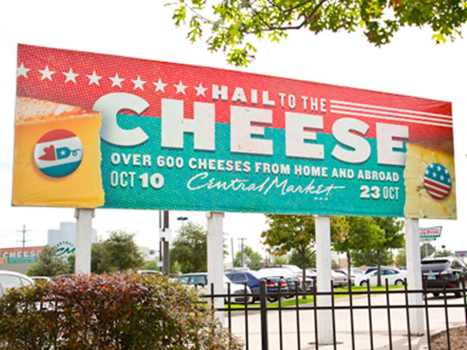
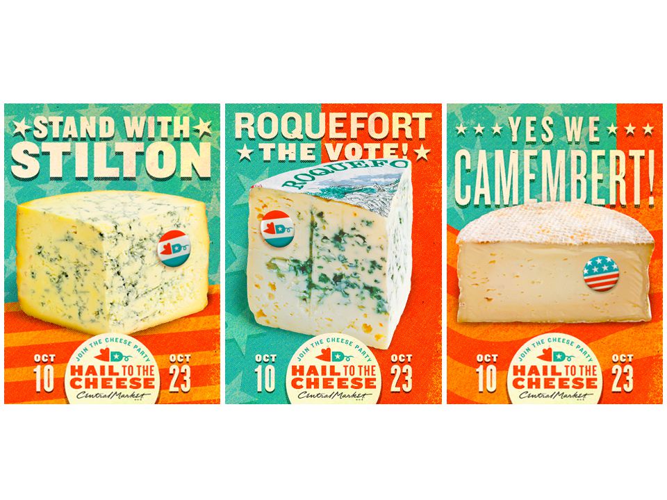
Show the product

38
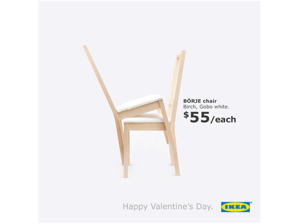
Show the benefit

39
Y&R Panama

40
Show it in use

43
Show comparisons

45
Show the negative

47
Show the positive

49
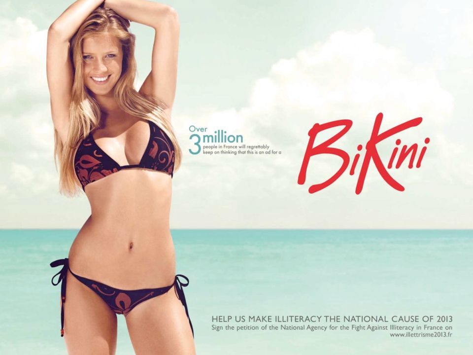
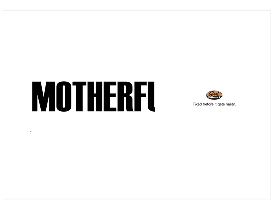
Be provocative (when it can help, not just for the sake of being provocative)
")
52
Bring it all together

53
Layout should illustrate the big idea Design with your audience in mind Prioritize the elements Art and copy must work together Design needs to attract attention Keep it simple

54
Consider your use of white space, use it to your best advantage Make sure your font matches your message and the tone of the campaign/brand

55
Sometimes an ad needs little or no copy

57
Sometimes an ad needs little or no art

59
Winston Churchill, one of the most persuasive people of all time, had 5 rules for successful speech writing. These rules apply quite nicely to the process of creating advertisements: 1.Begin strongly1.Begin strongly 2.Have one theme2.Have one theme 3.Use simple language3.Use simple language 4.Leave a picture in the listener’s mind 5.End dramatically5.End dramatically

60
It all comes down to being able to express yourself. To your team. To the client. To the audience.

61
“New media, untraditional media, integration—they may be the buzzwords we read every day in the hype that surrounds our business. But so far as I know, they’ve yet to come up with a powerful form of communication that does not at least begin life as words. Failure in advertising most often comes from the lack of this basic skill in finding the right words. The ability to find the words to write down an idea or to present an idea in the most compelling way possible.” – Alex Bogusky, designer, marketer, author, consumer advocate

Similar presentations


.>")


>")


