Download presentation
Presentation is loading. Please wait.

1
VISUAL STRATEGIES

2
WHY USE VISUAL STRATEGIES?

3
HELPFUL in receptive and expressive communication...

4
ENHANCE memory and visual reminders.

5
REMAINS present after words are spoken...

6
INCLUSION is about ALL of US.

7
Photos Keeps telling in story even without the story teller.

8
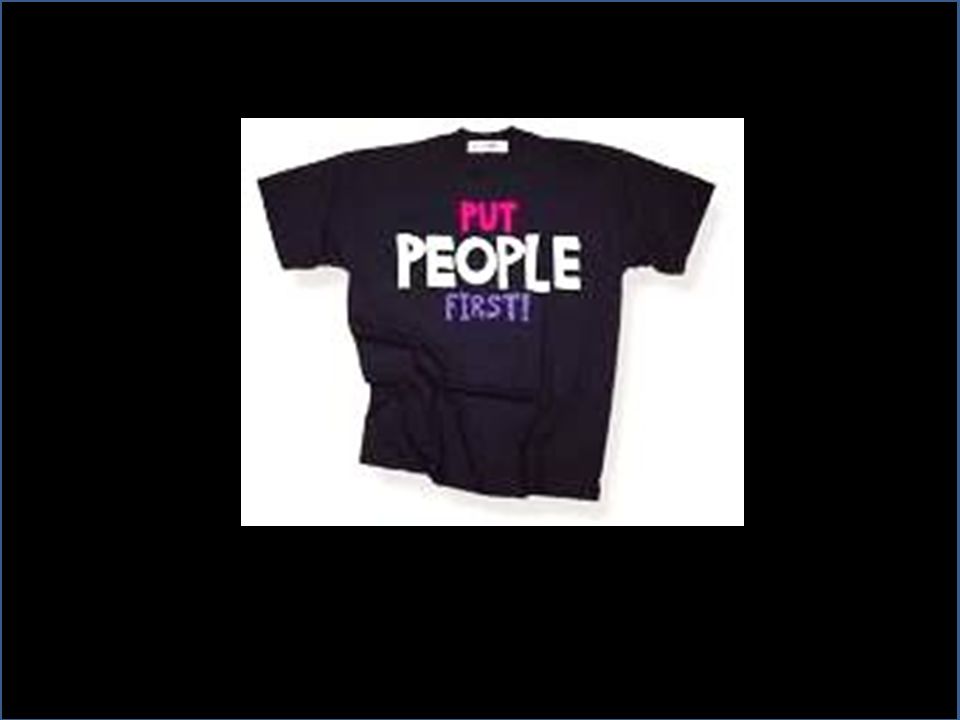
CAMPAIGN T-SHIRTS are effective visual communication tools.

9
CAMPAIGN T-SHIRTS

13
Save OUR Eagles!

15
An effective visual material will help YOU... ENGAGE COLLEAGUES IN CONVERSATION

16
... GET your main point(s) ACROSS to as many people as possible.
 ACROSS to as many people as possible.")
17
An effective visual material is... FocusedFocused on a single message. Graphic Lets graphs and images tell the story. Uses text carefully. Ordered Keeps the sequence well-ordered and obvious.

18
source of information conversation starter promotion of issues summary of your work effective visual message. An effective visual material operates on multiple levels...

19
1.Remember that different audience communicate and understand at different levels. 2. Determine your audience’s “visual stage” Object Stage use of actual objects and items Photo Stage use of real photographs Drawing Stage use of drawings (hand-drawn or commercially produced paintings) Text Stage use of written words and/or numbers 3. Use written text along with photographs, pictures, and line drawings to promote reading. 4. Present visuals from left to right. (Note: Some are vertical scanners - present visuals from top to bottom.) 5. Use contrasting background and try to use photos from the audience’s perspective. PICTURE TIPS
 Text Stage use of written words and/or numbers 3. Use written text along with photographs, pictures, and line drawings to promote reading. 4. Present visuals from left to right. (Note: Some are vertical scanners - present visuals from top to bottom.) 5. Use contrasting background and try to use photos from the audience’s perspective. PICTURE TIPS.")
20
Many ineffective materials suffer from easy-to-fix problems, including... main point(s) hard to find text too small poor graphics poor organization
 hard to find text too small poor graphics poor organization.")
21
Visual Grammar An effective material uses different visual grammar…

22
Define Your Message ALL visuals and text should have concise MESSAGE.

23
The GOAL is to convey a clear message and support it with a persuasive combination of images and text. Know your message! What is the one thing you want your audience to learn?

24
FOCUS on your message! If it doesn't reinforce your message, leave it out!! Simple messages are more memorable. Details can sometimes distract the reader from the main point. Edit ruthlessly! Simplify. But make the audience understand why the message is important. And why they should care.

25
Know Your Audience! You should make your message accessible to your target audience.

26
Each of the following aspects of poster creation is considered in detail... Creating effective t-shirt campaign require planning, art, science, and attention to detail. Planning Before starting your material, consider… message, space, budget, format, and deadlines. Focus Stay focused on your message and keep it simple. Layout Use a clearly defined visual grammar to move readers through your poster. Headings Use headings to orient readers and convey major points. Graphics Clear graphics should dominate your poster. Text should be minimized in favor of graphics, and use large fonts. Colors can make a poster attractive and improve readability, but be cautious. Editing Edit ruthlessly to reduce the amount of text and focus on a results-oriented message.

27
PLANNING What is the purpose of your t-shirt? Who is the audience? Know and Understand them… (the educational level, age, community background and many different factors will affect the kind of material you produce) Get the idea!
 Get the idea!.")
28
Plan the content or message The headline: a simple slogan is called for in most t-shirts, posters, leaflets, stickers or banners. Fewer words used to get the message across is better; the main thing is not to waste any space or time. But make sure that the slogan you choose reflects the message of the campaign, and is not simply a clever "gimmick" and also check that it does not offend the reader. PLANNING

29
Tips for Colors Use dark colors next to pastel colors for contrast. Blues, reds, dark greens and black are great for viewing. The darker your colors, the longer your message will be seen. Add a second color. A second color can really set off your text. This can be done by making the image a different color from the text. Even something as simple as adding a different colored border can make the difference. Like BLUE RED USE DARK COLORS OR DARK GREEN

30
Checklist IDEA Check whether the theme can be brought out in a single brief slogan. IMMEDIATE IMPACT A viewer will decide at a quick glance whether they will read on - does your design and text grab their attention? INTEREST Have you made the information interesting and relevant to the reader? Are they drawn in on the human-interest or human rights angle? INFORMATION Are the facts introduced logical, updated and well illustrated? IMPULSION Will the material inspire and encourages the reader to act or feel? Is the viewer called into action?

Similar presentations