Download presentation
Presentation is loading. Please wait.

3
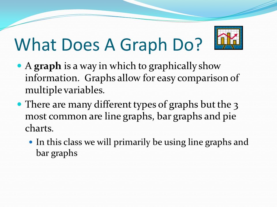
What Does A Graph Do? A graph is a way in which to graphically show information. Graphs allow for easy comparison of multiple variables. There are many different types of graphs but the 3 most common are line graphs, bar graphs and pie charts. In this class we will primarily be using line graphs and bar graphs

5
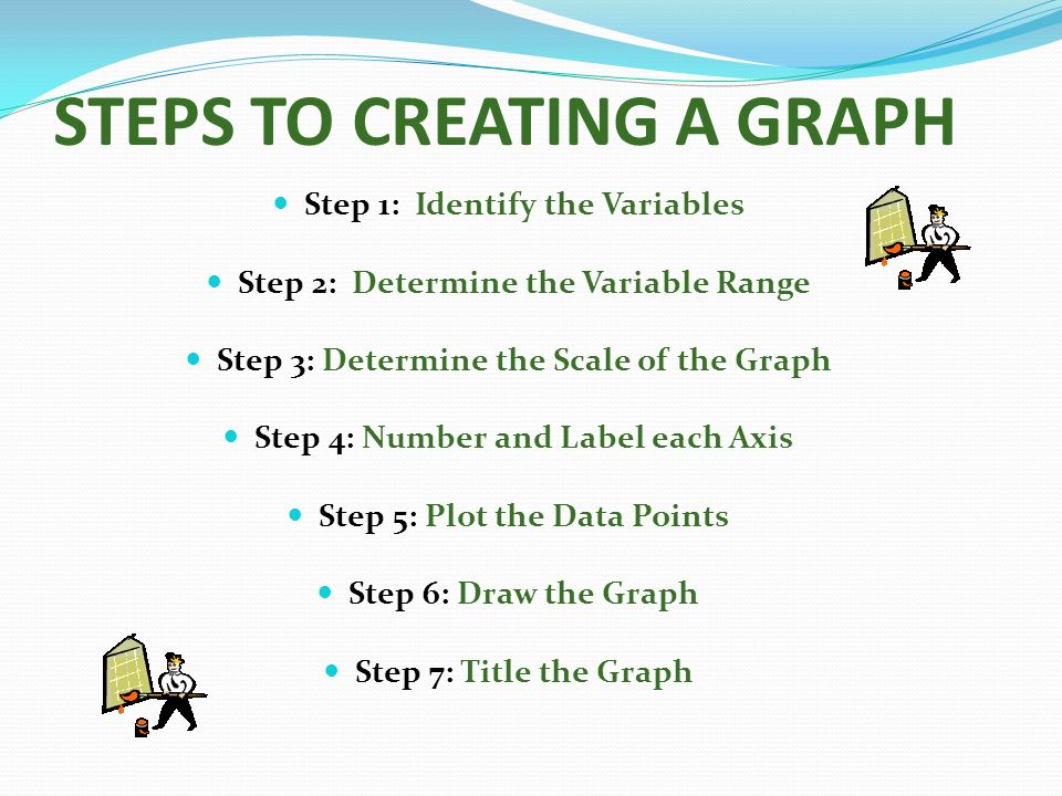
STEPS TO CREATING A GRAPH Step 1: Identify the Variables Step 2: Determine the Variable Range Step 3: Determine the Scale of the Graph Step 4: Number and Label each Axis Step 5: Plot the Data Points Step 6: Draw the Graph Step 7: Title the Graph

6
Step 1: Identify the Variables Draw and label the x and y axis. The y axis is the vertical axis and the x axis is the horizontal one Label what variable is on each of the axis The IV should always be on the x-axis The DV should always be on the y-axis

7
Decide on what intervals you will be using on each axis by first determining their range. (SUBTRACT the loswest data value from the highest) (Do each variable SEPERATELY) and write those in Be sure that the intervals are appropriate to the measurements you have taken Ex. If you are measuring growth of a plant each week, you shouldn’t use meters on your graph Step 2 & 3: Determine the Variable Range and Determine the Scale of the Graph.
 (Do each variable SEPERATELY) and write those in Be sure that the intervals are appropriate to the measurements you have taken Ex. If you are measuring growth of a plant each week, you shouldn’t use meters on your graph Step 2 & 3: Determine the Variable Range and Determine the Scale of the Graph..")
8
Step 4: Number and Label each Axis This tells what data the lines on your graph represents.

9
Step 5: Plot the data points that you collected on the graph.

10
Step 6: Draw the Graph If it is a line graph, connect the points with as smooth a line as possible.

11
Step 7: Title the Graph Your title should clearly tell what the graph is about. If your graph has more than one set of data, provide a “key” to identify the different lines.

12
Answer the following… What is the independent variable in this graph? What is the dependent variable? What might you title this graph? What was John’s weight in 1995? How much weight was gained between 1992- 1993?

13
Practice.. Graph the following data by following the steps for constructing one. T ( o C )V ( ml ) 100317 80297 60288 40278 30252 20243 10236 0233 Graphing Gas Volume The volume of a gas decreases as the temperature of the gas decreases. A sample of gas was collected at 100 degrees Celsius and then cooled. The changes in the volume of the sample are shown below.
V ( ml ) Graphing Gas Volume The volume of a gas decreases as the temperature of the gas decreases. A sample of gas was collected at 100 degrees Celsius and then cooled. The changes in the volume of the sample are shown below..")
14
Types of Relationships Direct Relationship In a direct relationship, y-values increase as x-values increase, producing an upward sloping line or curve. Data points often do not fall exactly on a straight line, but are scattered about an ideal line, which is drawn to show the general relationship..

15
Inverse Relationship In an inverse relationship, y-values decrease as x- values increase, producing a downward sloping line or curve.

16
MAKING SCIENTIFIC GRAPHS Graphs are a useful tool in science. The visual characteristics of a graph make trends in data easy to see. One of the most valuable uses for graphs is to "predict" data that is not measured on the graph. Extrapolation: extending the graph, along the same slope, above or below measured data:

17
Interpolate: predicting data between two measured points on the graph.

18
When might you predict something in graphing? Think of at list two things you might extrapolate when graphing? Think of at list two things you might interpolate when graphing?

Similar presentations


 The Independent Variable. A change in this variable affects the y variable. >")


