Download presentation
Presentation is loading. Please wait.

1
Level 3 Writing Bar Charts / Line Graphs Part 1 Information Transfer 1 Preparation Your class test for Information Transfer 1 is in Week 2. Get ready! For the test, you will have to write a report about a bar chart or line graph in just 20 minutes. You will have to write at least 150 words.

3
1) Gapfill: Use information from the graph to complete the gaps in this report. 2) Paragraph organisation The bar chart shows the average cost per month of _____________, _____________ and cable television in Al Ain from 1980 to 2000 in UAE Dhs. As an overall trend, the cost of both _____________ and _____________ _____________ rose, while the cost of _____________ fell over the 20 year period. 1.__________________shows__ _ 2.______________________ 3._________/____________ 4.______________________ electricitywater electricity cable television water graph/chart what When/where overview of trends
 Paragraph organisation The bar chart shows the average cost per month of _____________, _____________ and cable television in Al Ain from 1980 to 2000 in UAE Dhs. As an overall trend, the cost of both _____________ and _____________ _____________ rose, while the cost of _____________ fell over the 20 year period. 1.__________________shows__ _ 2.______________________ 3._________/____________ 4.______________________ electricitywater electricity cable television water graph/chart what When/where overview of trends.")
4
Looking at the average monthly cost of electricity, it is clear to see that it increased over the 20 years. In 1980, it stood at about 70 Dhs. Then, from 1980 to 1985 it increased slightly to 80 Dhs. From 1985 to 1990 the cost of electricity fell moderately to approximately 50 Dhs, which was the lowest figure in the 20 years. After that, it rose dramatically to just under 140 Dhs in 2000. 1.______________________ ______________________ 2.______________________ ______________________ Introduce topic, overview info again Description: - start - changes - end

5
Similarly, the cost of cable television went up during the same 20 years. It stood at just over 40 Dhs in 1980. Following this, it increased steadily to approximately 75 Dhs in 1990. Between 1990 and 1995 the average monthly cost of cable television remained constant. Finally, there was a moderate rise in costs to slightly over 100 Dhs in 2000, which was the highest in the 20 years. 1.______________________ ______________________ 2.______________________ ______________________ Compare topic with Para 1 overview info again Description: - start - changes - end

6
Unlike the cost of electricity and cable television, there was an overall decrease in the cost of water. It started at 20 Dhs in 1980, after which it rose steadily to just over 40 Dhs in 1985. From 1985 to 1995 the monthly cost of water fluctuated up to a peak of slightly under 60 Dhs. Finally, in 2000, there was a moderate decrease in the cost of water to just under 20 Dhs, which was the lowest figure in the 20 years. 1.______________________ ______________________ 2.______________________ ______________________ Compare topic with Para 1 & Para 2, overview info again Description: - start - changes - end

7
INTRODUCTION Sentence 1: The line graph shows the price of coffee from 2010 to 2013, in dollars per ounce. Sentence 2 – some possible styles: a)As an overall trend, the price of coffee increased from 2010 to 2013. or b) Overall, the price of coffee rose during the three-year period. or c) Overall, we can see that the price of coffee went up between 2010 and 2013 or d) As an overall trend, we can see that there was an increase in the price of coffee during the period. Dollars per ounce Price of Coffee
As an overall trend, the price of coffee increased from 2010 to or b) Overall, the price of coffee rose during the three-year period. or c) Overall, we can see that the price of coffee went up between 2010 and 2013 or d) As an overall trend, we can see that there was an increase in the price of coffee during the period. Dollars per ounce Price of Coffee.")
8
1000s INTRODUCTION Line 1: The line graph shows the sales of abayias from 2010 to 2013, in thousands. Line 2: As an overall trend, the sales of abayias ______________from 2010 to 2013. or ___________________________________________________________. or ___________________________________________________________

9
INTRODUCTION Line 1: _________________________________________________ Line 2: (choice a) _________________________________________________. or (choice b) _________________________________________________. or (choice c) _________________________________________________ Passrate of L3 students, by percentage
 _________________________________________________. or (choice c) _________________________________________________ Passrate of L3 students, by percentage.")
10
Intro phrases Coffee price = price of coffee Sales of abayias – abayia sales Overall, = As an overall trend in the three years = in the three-year period Throughout the period = During the time period The coffee price increased = There was an increase in the coffee price.

11
JIGSAW activity In class task – group 1.With a group, choose ONE graph and write an intro. Make sure each student writes, and that everyone has a correct paragraph ( you can work together) 2.When your teacher indicates, switch to a new group. Read them your paragraph while they write it. Listen and write the paragraph when they read it.
 2.When your teacher indicates, switch to a new group. Read them your paragraph while they write it. Listen and write the paragraph when they read it..")
12
Parts of Speech (Word Forms) NOUNSVERBSADJECTIVESADVERBS Increased Rose fallfell
 NOUNSVERBSADJECTIVESADVERBS Increased Rose fallfell")
13
Sentence Styles What? Use different styles to give th einfo Why? – More interesting to read (and write) – Higher score How – let’s see – Two basic styles for line graph – Verb + adverb or adjective + noun
 – Higher score How – let’s see – Two basic styles for line graph – Verb + adverb or adjective + noun.")
15
verb + adverb adjective + noun decreased declined dropped went down fell dramaticallysharplyrapidlysuddenly The price of gold (medium amount): (a little) (a lot): increased went upup climbed rose There was a dramaticsharprapidsudden increase climb rise Subject (topic/title of the graph) Sentence Styles Style #1 Sentence Style #2 Sentence moderatelygraduallysteadily slightly or + (topic/title of the graph) the price of gold fluctuated upwardsdownwards peaked plateaued decrease decline drop fall in “in” subject/ verb/”a” moderategradualsteady slight upwardsdownwards fluctuation peak plateau at
: (a little) (a lot): increased went upup climbed rose There was a dramaticsharprapidsudden increase climb rise Subject (topic/title of the graph) Sentence Styles Style #1 Sentence Style #2 Sentence moderatelygraduallysteadily slightly or + (topic/title of the graph) the price of gold fluctuated upwardsdownwards peaked plateaued decrease decline drop fall in in subject/ verb/ a moderategradualsteady slight upwardsdownwards fluctuation peak plateau at")
16
Dialog to practice Sentence Styles Example: price of gold / increased moderately 1.Percentage of students who passed the IELTS – did not change - last quarter 2.Number of traffic accidents in Al Ain – declined slightly –2020 - 2015 3.Number of Emirati girls who played sports – rose dramatically – last 10 years 4. population of Dubai – dropped sharply – in 2010. 5.Percentage of people who used the metro in Dubai – increased steadily – 2014 6.Number of Volvos sold in UAE – dropped sharply Make mini conversations with your partners, using different line graph titles. You may need to use add words (prepositions, articles) here or there. Alternate turns for who is A / B. Student A. I heard that the price of gold increased dramatically yesterday. Student B: Oh, yes, there was a dramatic increase in the price of gold yesterday. Student. That’s really interesting. Student B: I know right? I thought so too!
 here or there. Alternate turns for who is A / B. Student A. I heard that the price of gold increased dramatically yesterday. Student B: Oh, yes, there was a dramatic increase in the price of gold yesterday. Student. That’s really interesting. Student B: I know right. I thought so too!.")
17
Task 1.With a partner, shoose two of the prompts (topics) from dialogs (or make your own), and write the dialogs. – You can be creative, but make sure the grammar is correct, and that you switch roles between A and B. 2.If needed, give them to your teacher to check 3.Finally, use an audio app, like Smart Recorder, to record them on your ipad.

18
We use ADVERBS (following the verb) to describe to what extent (how much) the verb of change happened.
 to describe to what extent (how much) the verb of change happened.")
21
We use ADJECTIVES (before the noun) to describe to what extent (how much) the related nouns happened.
 to describe to what extent (how much) the related nouns happened.")
27
Listen to the sentences again and fill in the missing words: Graph A In 1970, the number of cars __________ __________ 5. After that, the number __________ __________ __________ 50 in 1990. Finally, it __________ __________ 40 in 2000. Graph B In 1970, the number of cars __________ __________ 20. Then, from 1970 to 1980, it __________ __________ 40. In 1990, the number of cars __________ __________ 30. After that, in 2000, the number __________ back to 40.

28
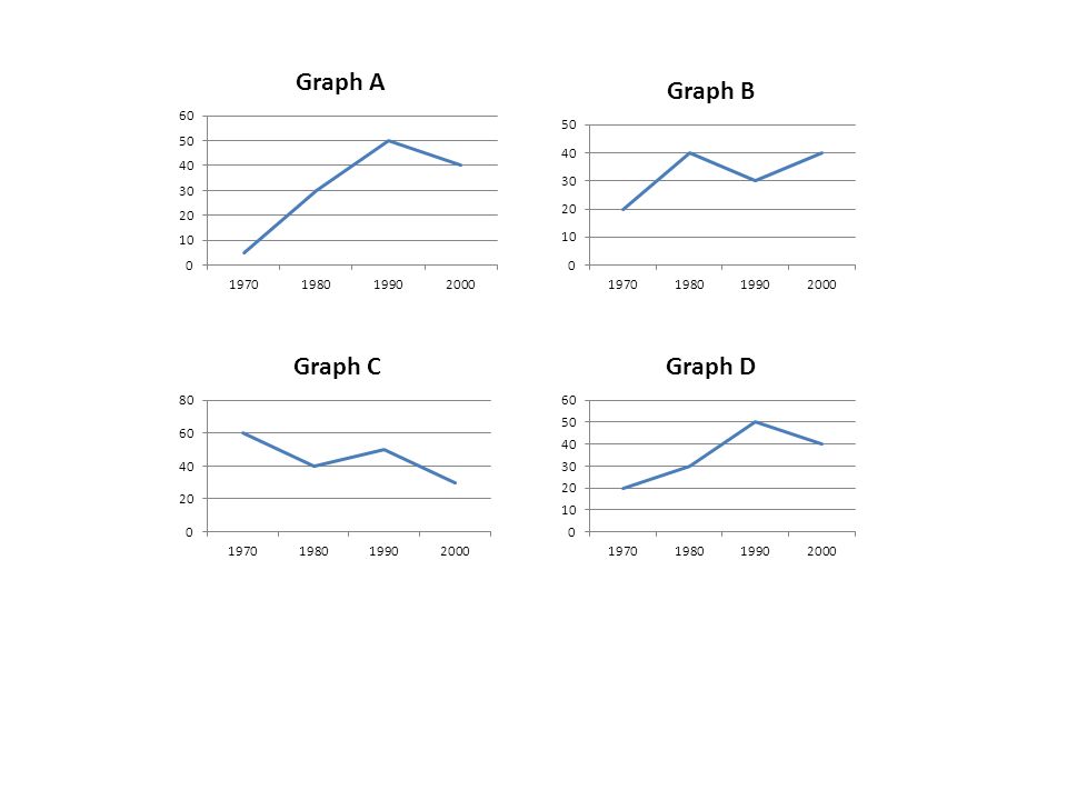
Graph A In 1970, the number of cars stood at 5. After that, the number went up to 50 in 1990. Finally, it dropped to 40 in 2000. Graph B In 1970, the number of cars stood at 20. Then, from 1970 to 1980, it increased to 40. In 1990, the number of cars dropped to 30. After that, in 2000, the number rose back to 40. Graph C In 1970, the number of cars started at 60. From 1970 to 2000, there was a downwards fluctuation to 10. Graph D The number of cars stood at 20 in 1970. Then, there was an upward trend to 50 in 1990. From 1990 to 2000, the number of cars dropped from 50 to 40.

29
Graph E The number of cars began at 10 in 1970. From 1970 to 1980, it increased and peaked at 60 in 1990. In 2000, the number of cars reduced to 30. Graph F In 1970, the number of cars began at 40. The number plateaued at 60 between 1980 and 1990. Finally, the number in 2000 was 20. Graph G The number of cars began at 60 in 1970. Then, there was a decline in the number of cars to 40 in 1980. This figure leveled out at 40 for the next 20 years. Graph H The number of cars started at 10 in 1970. Then, from 1980, it remained constant for the next 10 years at 30. It then fluctuated upwards to 60 in 2000.

31
Change the following from (verb + adverb) to (there was a + adjective + noun) a)Exports from Africa fluctuated dramatically throughout the period. __________________________________________________________________________ Change the following from (there was a + adjective + noun) to (verb + adverb) f)There was a rapid rise in the price of food in third world countries. __________________________________________________________________________
 to (verb + adverb) f)There was a rapid rise in the price of food in third world countries. __________________________________________________________________________.")
Similar presentations


 Objectives: to understand kinds of illustrated information to familiarize with tables, graphs or charts to read.>")


 By Mark.>")


>")
. a downward trend (a falling trend)>")


