Download presentation
Presentation is loading. Please wait.

1
Jordann Long

2
Genre: R&B Target audience: My magazine will be targeted at teenagers/adolescences from the age of 14 to 18 year olds, and those who enjoy R&B music. It will appeal to both male and female. Cost: £2 Language: English

3
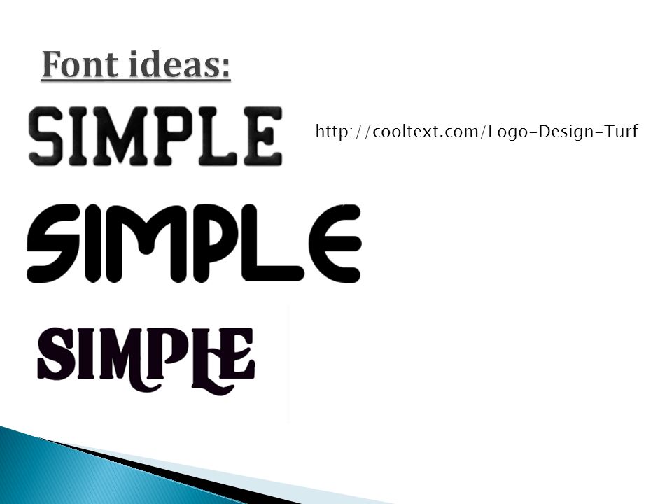
TOTAL MUSIC SIMPLE REMIX LISTEN JUMP HIT MUSIC SOUND

4
Out of all the names I brainstormed for my music magazine, I chose to have ‘Simple’ because the front cover of the magazine will be simple; an extreme close-up of my model, a bright, bold and large title, and just one sell line. I do not want my magazine to be covered with quotes, sell lines, and tags lines because this is too much on one page, the audience wouldn’t know what to read first. Therefore the front cover will be kept simple yet stylish. The name simple also contradicts the idea of a simple magazine, because obviously magazine are not simple to plan, design and produce, and this encourages the audience to buy the product.

5
Big, bold and bright title. The font will be simple, just as the name. Large close up image will be used, only half the face will be shown and the model will not be looking directly into the camera because this gives a secretive approach to the magazine, making the audience to know more about the girl. The image will take up the whole page. The sell line will be short and sharp, but persuading.

6
The image I will use for the content page will represent R & B music, and will be a full body image of the model. The title will be at the bottom of the page, where as most magazine commonly put the title at the top of the page. I have done this because I don’t not want my magazine to be completely simple, I want it to have some originality. The categories on the page will be: Features News Reviews There will be approximately 4 topics under each category. The font used will be the same as the title on he front cover. The colour of the font will link and match the rest of the image.

7
The image I have chosen for the double page spread of my magazine shows that the model is a singer but in a humourous way. The double page spread will consist of an interview with the model herself. The image of the model will take up one whole side of the page. There will be a quote directly from the interview at the top of the page, in big, bright and bold font. Before the interview starts, there will be a small introduction, to give the audience an insight.

8
http://cooltext.com/Logo-Design-Turf
9
The main article in the magazine will be about the star on my front screen. There will be an introduction about the model, leading on to an interview, asking a series of questions. Discussion topics for the interview will include: New boyfriend, Tom. Release of debut album. Sell out tour. Inspirations.

10
The title of this front over is large and bold as most are, but the colour is the same colour as the background, therefore a shadow has been added to the text in order for it to be seen. This medium close-up of the model is the main focus of the front cover. The model is looking directly at the audience, looking serious yet seductive. This magazine cover is very simple yet persuading, due to the little amount of information it makes the audience want to know more about the model. The small sentence gives away only brief information, the models name and what the magazine is actually about; fashion. This little insight attracts those who are into fashion.

11
Title is bright and bold at the top of the page, therefore it is one of the first things the audience will see, it doesn't’t cover any of the models face. The close up of the model is the main focus of the magazine, the model is not looking directly into the camera, this shows secretiveness. Colours around the eyes are bright but do not distract the attention to the eyes and how powerful they are, the colours also link to the title. Barcode to scan the price of magazine

12
Big, bold and bright, catching the audiences eye. Colour scheme is clear and organized. Barcode to scan price of the magazine. Central, large image of star, making it clear that he is the main part of this magazine, and the main focus. Gives direct quotes from T.I allowing the audience to have a taste of what will be inside the magazine.

13
Barcode to scan prize of the magazine. Al colours used on this front cover, including what the model is wearing, background colour and font colour gives this page a natural look and feel. The title of the magazine is bold, although it is not very large compared to other magazines I have analysed. The font is very light just as the background colour is fairly light. The colours used give the magazine a natural and calming look. However, the model is biting his t-shirt suggesting anger and tension. The quote used gives the audience a small insight to what the magazine will be like, the use of the word rock star and the title show the audience that the genre of music is rock and indie. Although, this front cover doesn’t look like a ‘typical’ rock and indie magazine, therefore this intrigues the people to purchase the magazine.

14
The title is large and bold, although the font is rather formal, giving the audience an impression that the magazine is classy. The model is starring straight at the audience and doesn’t have much expression on her face, therefore it is difficult to know how the model is feeling, and the hat she is wearing shadows her eyes, this makes the front cover look secretive, intriguing the audience to open the magazine. The front cover of this magazine is extremely neat, everything has its place and flows well. There is a clear use of the ‘Z’ technique. These two words are extremely powerful, the use of the word ‘force’ shows strength of fashion. The colour links and goes well with the rest of the front cover, although the font is completely different to the title, the title is formal and classy where as the sell line is quite original and bold, this completely changes the feeling of the magazine, showing that the magazine is in fact classy, although there is still originality there.

15
Title: The contents page usually has a title stating that it is a contents page, and is almost always at the top of the page. The font is large, bold, and white on a black background in order to stand out. Main articles are always stated in the ‘features’ column, because this is the main part of the magazine. Page numbers and a list shows structure and organisation, this enables the audience to understand the contents page and allows them to find the things they would like to read. The main image is linked to the main article, this it to highlight to the audience which page the main article is on. The image is a full body shot of the band, they are not standing completely next to each other they are slightly behind one another, this shows the one at the front is the leader and has more power than the rest of the group, the one nearest the back has the least power in the group. The main feature stands out to the rest of the articles because it is the main selling point for the magazine. It is also linked to the image on the right so to instruct the audience to the main article.

16
The way in which the background colour graduates from dark to light suggests that secrets that were hidden away are now being revealed in this magazine. The model laying on the floor shows weakness, as if she has lost a battle. This could show the audience that many things are to be revealed in this magazine. The word ‘contents’ is large and bold, the font is very clear and original. Although the word is broken up, this represents the different parts of the magazine.

17
The title is large and extremely bold. At the top of the page so it is the first thing the audience will read. The main focus of the page is the model, she stand directly in the middle of the page, holding a blow up mushroom which almost covers some of the title to suggest that the audience shouldn’t be bothered about the title and should have all eyes on her. This contents page only has one category; features. The contents are clearly displayed with page numbers. Even though this is the contents page, the actual contents is small and pushed over to the corner because the main focus is the model, she over powers contents on a contents page.

18
The title of the page is surprising not that large, or bold. It is a medium size and just blends in with the rest of the page and doesn’t actually stand out on its own. The page is very basic, including font and colours. There isn't anything particularly eye catching or interesting on the page. There is a clear display of contents and page numbers. The different categories are clearly shown. The main image isn't that interesting, it seems as the model is catching a pair of headphones, his facial expression is quite blurry.

19
The title of the contents page isn't large or bold but is still eye catching because there is quite a large about of blank space around it, so there is a lot of focus on the title. There is a clear list of contents with page numbers, and images. The page is neat and tidy, structured well. The largest image is clearly the main selling point for the magazine. The blood on her face suggests pain, and starring straight at the audience is intriguing. The other images give the audience an insight as to what is inside.

20
Large image that takes up the whole page, is clear to audience who the main star is. The double page is focused on her. Colours on model's clothes determine colour scheme and allow her to stand out. Plain colour background makes the star stand out, catching the audiences eye. Text is arranged in 4 columns and is much smaller then main text. Drop-cap Subtitle separates title and main text and gives them an insight of what the main text will be about. Extremely large text, taking up most of the first page. Use of upper and lower case letters catches the audiences and suggests that the star isn't ‘perfect’ like celebrities are made out to be.

21
The main star takes up the whole second page, making it clear who the main star of the double page spread it. The colours of her outfit do not link with the colour scheme allowing her to stand out and be different, it suggests that she doesn't’t want to be the same as everyone else and wants to show individuality. Pale coloured background allows the star to stand out and also determines colour scheme. The use of pink and yellow highlight makes pieces of texts stand out and are the pieces that they want the audience to see. Drop-cap shows the start of main text and draws the eye to the beginning of the section. Subtitle breaks up main text and title. Large, bold text catches the audiences eye and is the first thing they will see. The use of different colours half way through the main heading determines the colour scheme and emphasises what is said.

22
Quote directly from the star, the font is large and bold, different colours and font sizes are also used. Subtitle breaks up the main title and text, giving the audience a small brief as to what the article will be about. The double page spread is an interview with the model, the questions asked are highlighted to outline the different speakers. The model is standing casually as if he is not bothered. His facial expression shows relaxation, this suggests that the model takes place in photo shots and magazine interviews quite often. He is looking directly at the audience, making them feel more involved. His arms are covered in tattoos, giving us the impression that he isnt an innocent man and does have a dangerous side to him. Drop cap draws the eye to the text and shows the beginning. There is also an introduction before beginning the interview, to give the audience a brief insight to who the model actually is.

23
The word ‘now’ in the title is extremely big, drawing the eye to the word encourages the audience to read the article now. Subtitle separates the main title and the text, giving slight information of what the article will be about. Drop cap shows the beginning of the article and because of its colour and size, it draws the audience attention to start reading it. The band takes up half of the double page spread, it is clear that they are the main focus in the article. The image looks as if they are having fun by laughing, although there is a clear power structure in the band. The band member at the front has the most power over the rest of the band members, he also has the biggest smile on his face and is laughing the most, we could say he is the leader and top of the hierarchy. This continues, the order they are standing is the order of power, the one most to the back is least powerful. This magazine decided to use an article rather than an interview, this is rather interesting because most music magazines tend to interview their models but this magazine has gone for a different approach, this could be in order to be different and stand out of it may have just been the best way of writing.

24
Large image of model, taking up one side of the double page spread. The use of sunglasses and looking away suggests that she is shy and may be hiding something, she is looking at the title leading the audience to read it in order to find out what she might be hiding. The title is big and bold, although the question suggests that she is either rock or role and not both, the model is obviously not a queen but the use of the word indicates power. The use of a drop cap shows the start of main text and draws the eye to the beginning. The article itself is laid out neatly and is structured well. The text surrounds a quote from the model, this is obviously an important quote and the magazine want the audience to see such a quote.

Similar presentations


 have produced and distributed in the past. MEDIA STUDIES: MAGAZINE ANALYSIS The.>")


. The dominant image of this superstar Ozzy Osbourne instantly catches the attention of the reader. The quote underneath.>")

