Download presentation
Presentation is loading. Please wait.

1
Elements & Principles of design

2
Portfolio Expectations Each portfolio assessment must include: Background must be on a tan/cream colored cardstock. Boarders must be ¼” on black construction paper and they must have STRAIGHT edges. Sketches must be drawn in black pen and colored. ONLY the values assignment is painted!!! Descriptions must be typed. A title must be included (Try to be creative, like “A Night on the Town” or “A Day in the Sun”)! If you cut out your description, they must have STRAIGHT edges. Text must have an even boarder of white space around the text. You must use basic design details in your descriptions of the outfit. Be sure to explain WHERE on the design you created the concept you are assessing and underline the concept. LABEL the assignment next to title at the top.
. If you cut out your description, they must have STRAIGHT edges. Text must have an even boarder of white space around the text. You must use basic design details in your descriptions of the outfit. Be sure to explain WHERE on the design you created the concept you are assessing and underline the concept. LABEL the assignment next to title at the top..")
3
RHYTHM: Double Stitched Buttons This outfit is made by the extra care given to the detail of the straight let pant and fitted, short sleeve jacket. The jacket has short cuffed sleeves and a fitted waist. The buttons, used not only for a functional purpose, are repeated throughout the design of the jacket. Rhythm by gradation can also be seen in the different sizes of buttons throughout the design. The double stitching on the pockets, hem and side seams of the pants give a casual look to the straight leg pants. The large belt loops of the pants make way for the jacket matching belt. The boot style shoes also have a simple double stitching to complete the outfit. The accented neutral color scheme of brown and blue also give a sharp opposition in the design for a color break.

4
Each assessment will be worth 5 points: 2 points for the description 2 points for sketching & designing 1 point for professional mounting (single sided only) Tips: Use pencil on rough drafts… and PRACTICE!! Draw hair. The croquie looks stupid without hair. Do NOT draw a face. The croquie looks stupid with a face. Think about how clothing sits on the human form. It is not skin tight. The croquie looks stupid with skin tight clothing. Use the croquie forms I provided you with in the last unit. ONLY the values assignment it painted!!! ONLY the texture assignment uses fabric. You will be provided with 7 sheet protectors… put in the metal clasps. Be patient and have fun!!

5
The Relationship of the Elements and principles of design ELEMENTS OF DESIGN Line Texture Color Shape/Form Pattern PRINCIPLES OF DESIGN Balance Rhythm Emphasis Proportion/Scale Harmony Looking Good! TOOLSRULES To create

6
Elements of Design Line Texture Color Shape & Form Pattern TOOLS The elements of design are the tools we use to create a style or design.

7
Principles of Design Balance Proportion & Scale Emphasis Rhythm Harmony RULES The principles of design are the rules that govern how we use each of the elements of design in any given art work.

8
Color in Fashion

9
Color The power of color! -www.njagyouth.org/colortest.swf

10
Color Wheel Primary: – Red, Yellow, Blue Secondary: – Green, Violet, Orange Tertiary: – Red-orange, Red-violet, Blue-violet, Blue- green, Yellow-green, Yellow-orange.

11
Color Wheel Make your own color wheel! – Include: Each color, a tint of each color and a shade of each color. – Use the template I have provided for you.

12
Color Tints, Tones and Shades Tints: Any color plus white Tones: Any color plus gray Shades: Any color plus black

13
Tints, Tones, Shades

14
Color in Fashion (Color Schemes)
")
15
Color Schemes Monochromatic Analogous Complimentary Triad Neutral Accented Neutral

16
Monochromatic Mono means “one”, refers to the tints tones and shades of one color Possible color combinations are limitless! – Mint green and forest green Generally calming, however it depends on the hue

17
Monochromatic

18
Analogous Often referred to as adjacent. Two, three, or four hues that lie next to one another on the color wheel. All hues have one hue in common. Possible colors (Can include tints, tones & shades) – Yellow-green, yellow, yellow-orange, orange Feeling created: can be calming or exciting depending on whether they come from the cool or warm side of the color wheel. – This color scheme is most effective if one of the hues repeats some aspect of your personal coloring… eyes, hair…
 – Yellow-green, yellow, yellow-orange, orange Feeling created: can be calming or exciting depending on whether they come from the cool or warm side of the color wheel. – This color scheme is most effective if one of the hues repeats some aspect of your personal coloring… eyes, hair….")
19
Analogous

20
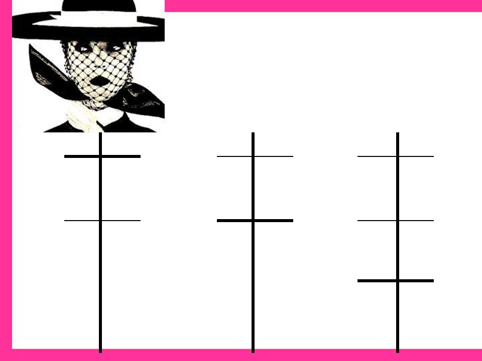
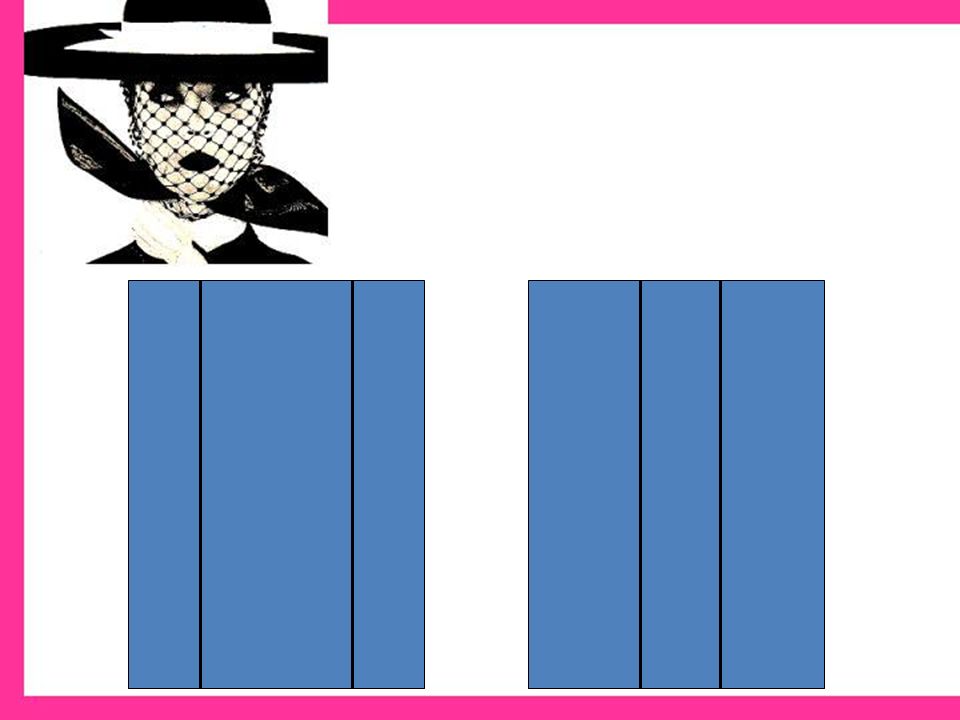
Complementary Combine two colors from the opposite side of the color wheel. Possible colors: red & green, blue & orange Feeling associated: stimulating due to opposite visual characteristics. By dulling the intensity or value, calming effect may be achieved. – Can be very flattering to personal coloring, and versatile

21
Complimentary

22
Triad Three colors equally spaced on the color wheel Possible colors: tints, tones and shades of primary or secondary colors Very exciting and stimulating if used in full strength.

23
Triad

24
Neutral One, two, or three achromatic neutrals, may or may not vary in the degree of warmness or coolness, lightness or darkness, brightness or dullness Possible colors: black and white, combination of browns Effect: vary in mood depending on the degree of light and dark value contrast – Are most effective if the degree of lightness or darkness in your hair and/or skin coloring is repeated in the lightness or darkness of the clothing

25
Neutral

26
Accented neutral One color added to other neutrals to form a scheme. Possible colors: black, white & red, browns with light blue Effect: draws attention to the one added hue

27
Accented Neutral

28
Color in Fashion (Uses)
")
29
COLOR To maintain or decrease attention and apparent size, to appear taller and slimmer – Cooler hues – Darker values – Duller intensities – Close contrasts Examples: navy, khaki, grape, charcoal, mauve

30
color To increase attention and apparent size, to appear shorter and heavier – Warmer hues – Lighter values – Brighter intensities – Strong contrasts Examples: shocking pink, pumpkin, tangerine, raspberry

31
Color To appear refined, romantic – Warm to cool hues – Lighter values – Dull, muted to medium intensities including pastels – Close contrasts, subtle Examples: shell pink, lavender, misty rose, orchid, blue, peach, all pastels

32
Color To feel and appear happy, youthful, sportive – Warmer hues – Light to dark values – Medium to bright intensities – Strong contrasts, bold Examples: coral, red, khaki, ivory, brown, camel, cinnamon, brick

33
Color To appear mature, serious, somber, classic – Cool hues – Dark values – Dull intensities Examples: navy blue, taupe, charcoal, maroon, gray, black

34
Color To feel and appear dramatic/exotic – Warm to cool hues – Dark values, deep – Bright intensities, rich – Strong contrasts, bold Magenta, fuchsia, emerald green, royal blue, regal purple, sapphire, amethyst

35
Line in Fashion

36
Power of Line Draw a picture in each of the boxes. You will only have a moment to do this. Then we will discuss what your lines (drawings) mean.
 mean..")
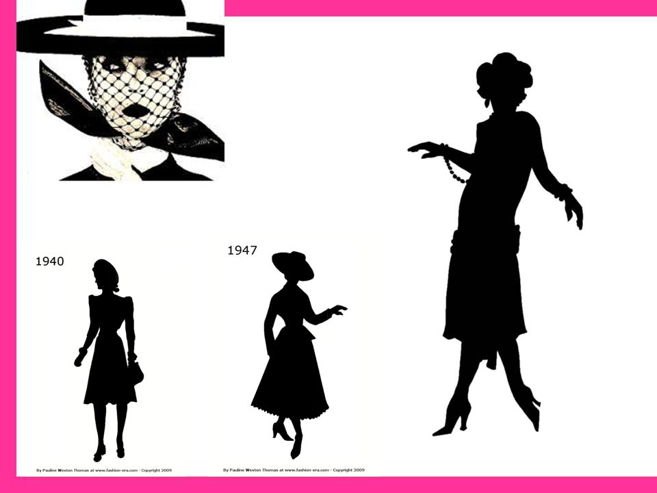
37
Illusions of Line Lines can deflect your gaze (arrows) Shorten/reduce the height of a person. Width can be added on top- broader shoulders. Can contain height. Make one look taller/longer. Lines can keep your gaze going. Can make things look slimmer, wider, or longer.

41
Line Types Straight: – Bold, severe, dignified, powerful, steady, stable, formal – Often found: bottom of hemmed skirts and pant seams.

42
Line Types: Curved: – Increases size, shape of figure, adds interest & softness, and is less conservative, formal and powerful than straight lines. – Often Seen: round scoop necklines and scalloped edges.

43
Line Types: Jagged: – Zigzags, if overused can be confusing and jumpy. – Often Seen: Rickrack, fabric prints, or intentional seaming.

44
Line Directions: Vertical: – Leads eye up and down, adds height and slimness. – For best effect put vertical lines over an area you want to look thinner in.

45
Line Directions: Horizontal: – Leads eye side to side, relaxed, restful feeling. – Put this type of line where you want to look wider.

46
Line Directions: Diagonal: – Slanted- vertical slant is slenderizing, horizontal slant adds width- versatile and interesting. – Chevrons: stripes on a fabric (on the diagonal grain) matched at seams.
 matched at seams..")
47
Line Applications: Structural: – Formed when parts of the garment are constructed. – Seams, darts, pleats, tucks, and the edge of a garment. – Most noticed when the garment is plain.

48
Line Applications: Decorative: – Applied lines- for decoration and interest. – Ruffles, braids, fringe, edging, top stitching, lace, tabs, flaps, appliqués, or buttons. – Too much causes competition between parts and can be confusing.

49
Pattern in Fashion Naturalistic Conventional Geometric Abstract

50
Naturalistic Prints of or from nature

51
Conventional Prints of real or stylized items.

52
Geometric Prints of lines, shapes or geometric shapes.

53
Abstract Prints that cannot be recognized as real.

54
Shape, Form and Texture in Fashion

55
Shape & Form Shape: – Is 2 dimensional (flat- silhouette) Form: – Is 3 dimensional (body)
 Form: – Is 3 dimensional (body)")
57
Texture Blindfold activity – Was it easy or hard to guess what type of fabric it was? – Why? What clues did you have?

58
Texture Where is texture found? – In the thickness and appearance of fabric. What is it? – The one element that you can see and feel What are the different textures we have here in class?

59
Texture What words describe texture? – Loopy, fuzzy, furry, soft, shiny, dull, bulky, rough, crisp, smooth, sheer… How is texture created? – By the fiber type, weaving or knitting process, or by the fabric finishes

60
Texture There are two types of texture: – TACTILE Texture that can be felt by touch. (rough, prickly) – VISUAL Texture that can be seen. (shiny, dull, matte)
 – VISUAL Texture that can be seen. (shiny, dull, matte).")
61
Texture Why is texture important in fashion? – It can increase or decrease the appearance of body size. – It can draw added attention to a design.

62
Increasing size Which do you think would increase the appearance of body size? – Shiny or glossy (reflect more light) – Thick – Bulky, shaggy, fuzzy, wrinkled
 – Thick – Bulky, shaggy, fuzzy, wrinkled.")
63
Decreasing size Which textures would decrease the appearance of body size? – Dull (because they absorb light) – Thin to mid-weight – Smooth, flat surfaces
 – Thin to mid-weight – Smooth, flat surfaces.")
Similar presentations


. INTENSITY -brightness.>")


