Download presentation
Presentation is loading. Please wait.

1
Assessment objective 2

2
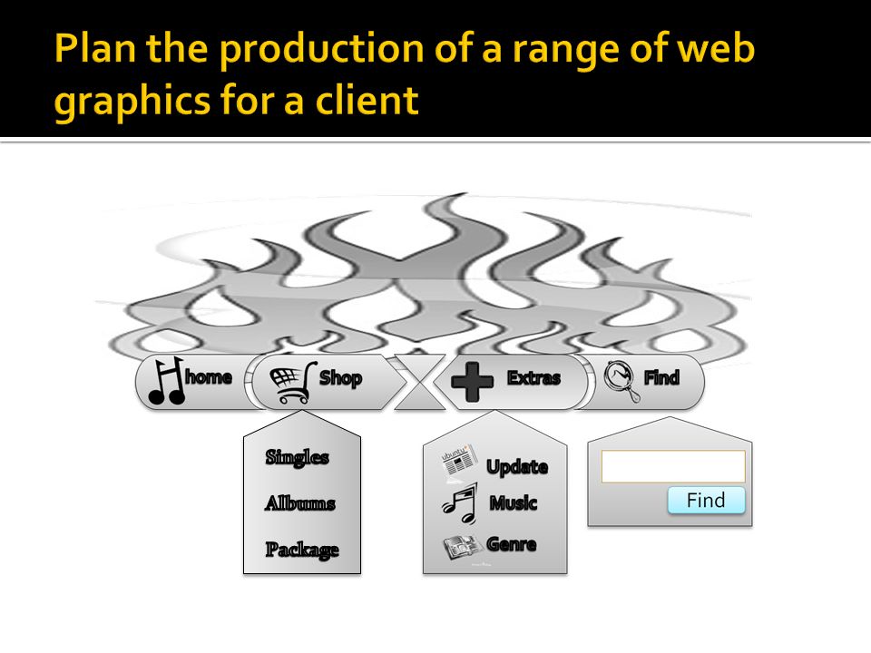
Navigation Button 1 sketch diagrams Annotation & Explanation home

3
Example The Sketch Plan

4
home Musical notes in form of the letter ‘H’ for Home. Also labelled home. Button will have the colour Blue (#7FFFD4) Width: 248 pixels Height: 118 pixels Size: 10.4 kb Font Size: 18
 Width: 248 pixels Height: 118 pixels Size: 10.4 kb Font Size: 18.")
5
The target audience will be music fans who like to check up on music updates and people who like to buy music resources online. This is because the colours involved will be mostly black and blue. In addition the background will be plain, to match common types of music.

6
The home button has plain colours (black, grey, and white) because it matches most types of music genres. The message is clear because of the formal (plain) colours used in the button.
 colours used in the button..")
7
Grey, black, and white colours for NavBar buttons Font size: 18 Font style: Constantia (body) Font colour: Black Logo as home button
 Font colour: Black Logo as home button")
8
Width: 248 pixels Height: 118 pixels Size: 10.4 kb 248 pixel 118 pixel

9
, Rollover The standard colour will be grey and black however when rolled over with mouse the colours will change from grey to blue.

10
As a picture the object has a File size; 11,520 bytes

11
Download time: 0.15secs

12
Navigation ‘Find button’ sketch diagrams

13
Navigation ‘FIND’ sketch diagrams Annotation & Explanation Has a magnifying glass to represent and enhance the find button. Has the same text style (house style)as the home button; Constantia (body) Font size; 16
as the home button; Constantia (body) Font size; 16.")
14
The find button like the home button is aimed at any music fans of any types of music from all different genres. This is because of the plain colours and because of the way the icon helps the user to interact freely without hesitation. How ever unlike the home button, the find button has a dropdown which lets you Search your criteria.

15
The find button has been created to help the user find what he/she is looking for in one easy place. It is made to make searching different criteria's easily, all in one place

16
The house style for the find button is the same as the home button; formal. Font colour: grey simplified colour Font style: Constantia (body) with a drop down menu; the find button is compact and clear. Font size: 16
 with a drop down menu; the find button is compact and clear. Font size: 16.")
17
Width: 247 pixels Height: 126 pixels Size: 247 pixel 126 pixel

18
Rollover The standard colour will be grey and black however when rolled over with mouse the colours will change from grey to blue.

19
Total Size: 16.8 KB (17,241 bytes) Size: 10.6 KB (10,858 bytes) Size: 5.98 KB (6,125 bytes)
 Size: 10.6 KB (10,858 bytes) Size: 5.98 KB (6,125 bytes)")
20
Download time: 0.27secs

21
Navigation ‘shop button’ sketch diagrams

22
Navigation ‘Shop button’ sketch diagrams Annotation & Explanation Has trolley icon to represent and enhance the shopping button for all audiences Has the same text style (house style)as the home button; Constantia (body) Font size; 16
as the home button; Constantia (body) Font size; 16")
23
The shop button, like the home button is aimed at any music fans of any types of music from all different genres. This is because of the plain colours and because of the way the icon helps the user to interact freely without hesitation.

24
The shop button has been created to help the user buy any music resources online in one place. It is made to make buying online easy and fun.

25
The house style for the shop button is the same as the home button; formal & grey. Font colour: grey simplified colour (blue when rolled over) Font style: Constantia (body) Font size: 16
 Font style: Constantia (body) Font size: 16.")
26
287 pixel 144 pixel

27
Rollover

28
286 x 114 pixels 267 x 302 pixels

29
Download time: 0.26sec

31
Find Quick home access Easy-to-use online music shop with options Quick and compact find area Extras in compact mode Icons to help enhance finding different options Find dropdown to enhance the compact features Normal colours: Grey Rollover colour: blue Font size: 16 Font: Constantia (body)
")
32
The navigation bar has been aimed at audiences from the age of 12+ This is because of the plain, formal colours used.

33
The purpose of the NavBar is to help people navigate from one page to another quickly and easily.

34
Formal, Logo is used on every page as a home button Plain colours are used (grey and plain) Sizes ranged: 16-18 are used Constantia (body) is used
 Sizes ranged: are used Constantia (body) is used")
35
1145 x 676 pixels 220 kb

36
Find

38
Advertising Bar sketch diagrams

39
Advertising Bar sketch diagrams Annotation & Explanation

41
Purpose/message

42
House style eg colours, text size, colour, style

43
Dimensions (width and height)
")
44
Features eg rollovers, user interaction

45
Target file size

46
Download times

Similar presentations


 A design mock-up - All documents.>")


