Download presentation
Presentation is loading. Please wait.

1
Inquiry Unit

2
Scientific Investigation
Data should be collected throughout a controlled scientific investigation. Data includes both scientific observations and inferences. A scientific observation is gained by carefully identifying and describing properties using the five senses or scientific tools and can be classified as quantitative or qualitative.

3
Quantitative observations are observations that use numbers (amounts) or measurements.
 or measurements.")
4
Qualitative observations are observations that are made using only the senses and refer to specific properties (the “l” stands for look with your 5 senses!)
")
5
An inference is an explanation or interpretation of an observation based on prior experiences or supported by observations made in the investigation. Looking at the picture, can you infer why everyday a hummingbird comes to a red flower instead of going to any of the other colors in the garden? ____________________________________________________________________________________________________________________

6
Compiling Data Data from the investigation should be organized in data tables and represented as diagrams or grahs whenappropriate. A data table is used to organize data collected in an experiment so that it can be read easily. A data table should be planned before the investigation starts. Data tables are often organized in columns and rows. The columns should have headings that show the quantity and unit of the data in that column.

7
The independent (manipulated) variable is listed in the column on the left side. The dependent (responding) variable is listed in the column(s) on the right side. If qualitative data is to be gathered, include enough space to write the observations.

8
Graphs Graphs are visuals used to compare data. Graphs show information and relationships between the data. Different types of graphs show different types of information.

9
Bar Graphs Bar graphs are often used for qualitative observations. The lengths of the bars on a bar graph are used to represent and compare data. A numerical scale is used to determine the lengths of the bars.

10
Line graphs show how quantitative data changes over time or relationships between manipulated (changing) variable and responding (resulting) variable. The lines on a line graph show the pattern of changes at a glance. How to draw a line graph: Draw a horizontal line (x-axis) and a vertical line (y-axis) that meet at a right angle. Drawing a Line Graph Yaxis X-axis
 and a vertical line (y-axis) that meet at a right angle. Drawing a Line Graph. Yaxis. X-axis.")
11
The independent (manipulated) variable is written on the x-axis.
The dependent (responding) variable is written on the y-axis. dependent / responding Yaxis independent (manipulated) variable X-axis
 variable is written on the y-axis. dependent / responding. Yaxis. independent (manipulated) variable. X-axis.")
12
Include appropriate units of measurement for each variable.
Look at the range of data (lowest and highest) to determine the intervals or increments (numbers on the axes) of the x-axis and the y-axis. The increments do not need to be the same for both the x-axis and the y-axis, but should be consistent on either axis. Yaxis X-axis Label the point at the right angle as zero (0).
 to determine the intervals or increments (numbers on the axes) of the x-axis and the y-axis. The increments do not need to be the same for both the x-axis and the y-axis, but should be consistent on either axis. Yaxis. X-axis. Label the point at the right angle as zero (0).")
13
Plot the data on the graph as matched pairs
Plot the data on the graph as matched pairs. For example, every independent (manipulated) variable number will have a corresponding dependent (responding) variable number. Connect the points on the line graph. Write an appropriate title for the graph that contains the names of both variables. 120 100 Yaxis 80 60 40 20 1 2 3 4 5 6 7 8 9 10 11 X-axis Label the point at the right angle as zero (0).
 variable number will have a corresponding dependent (responding) variable number. Connect the points on the line graph. Write an appropriate title for the graph that contains the names of both variables Yaxis X-axis. Label the point at the right angle as zero (0).")
14
“DRY MIX” can help you remember which variable belongs on the axis.
DRY represents Dependent-Responding-Y-axis. MIX represents Manipulated-Independent-X-axis. Title of Graph: Temperatures in New York City 120 100 Yaxis 80 60 40 20 1 2 3 4 5 6 7 8 9 10 11 X-axis Label the point at the right angle as zero (0).
.")
15
Interpreting a Graph Yaxis The data table above and line graph to the right shows temperatures in New York City in degrees Fahrenheit. X-axis

16
Sometimes calculations or graphs will be needed to help analyze the data. Data will often reveal patterns or trends. The analyzed data can then be used to draw a valid conclusion about the investigation.

17
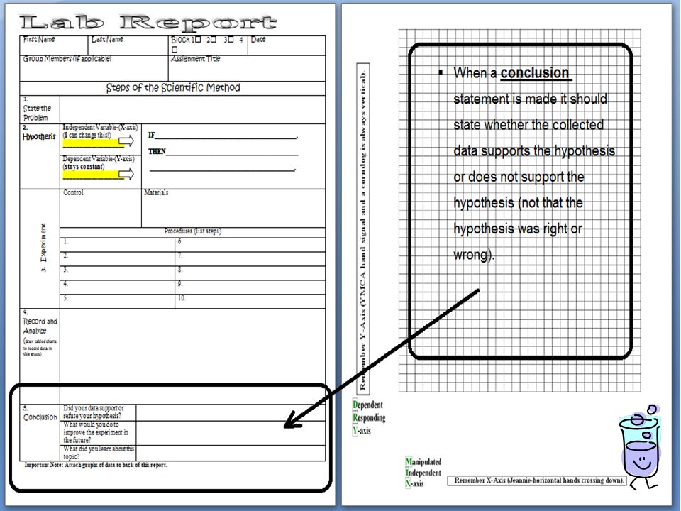
A valid conclusion is a summary of the findings of an experiment based on scientific observations, inferences, and collected data that states the relationship between the independent (manipulated) and dependent (responding) variables. When a conclusion statement is made it should state whether the collected data supports the hypothesis or does not support the hypothesis (not that the hypothesis was right or wrong).
.")
Similar presentations


>")


? Do Now: Copy the following: Line Graph - A graph that is used to display data that shows how one variable.>")

 Observe each of the pictures on the following 4 slides. Can you figure out what the people in the pictures have.>")


