Download presentation
Presentation is loading. Please wait.

1
Copper Ridge Academy English 3201

2
Support a business Self expression Share the beliefs of a group Brighten up a dull environment Send messages Tell a story Ask the viewer to enjoy its message

3
colour – appearance of objects (or light sources) described in terms of a person's perception of their hue and lightness (or brightness) and saturation Value is the lightness or darkness of a colour. Hue identifies a colour. Intensity is the brightness or dullness of a colour.

4
Red: passion and love, life, danger or anger Black: evil, death, or elegance Green: jealousy, energy, wealth, nature or new beginnings Yellow: cowardice, energy, or caution White: purity Blue: calm, sad, or order Pink: calm, soft, or femininity Brown: earth or nature Purple: royalty or Jesus’ crucifixion

5
contrast – perceptual effect of the juxtaposition of very different colors. It occurs when there is a visual difference between things or qualities being compared; degrees of dynamic imbalance between elements of a composition which draw the eye and demand resolution (dominance) to establish unity and overall balance in the design as a whole. Refers to dark and light or other differences used to create strong feelings in a visual; contrasting textures may be rough and smooth, colour hue or tint (name of the colour, such as blue or red), intensity (purity and strength of a colour), and value (the lightness or darkness of a colour); used to represent the way things really look (in hopes that they are noticed and considered) and also to create feelings.
 to establish unity and overall balance in the design as a whole. Refers to dark and light or other differences used to create strong feelings in a visual; contrasting textures may be rough and smooth, colour hue or tint (name of the colour, such as blue or red), intensity (purity and strength of a colour), and value (the lightness or darkness of a colour); used to represent the way things really look (in hopes that they are noticed and considered) and also to create feelings..")
6
“Man Nailed to a Fish” by Jim Maunder Contrast Colour Symbol

7
symbol – something that represents an idea, a process, or a physical entity. The purpose of a symbol is to communicate meaning. For example, a red octagon may be a symbol for "STOP".ideaprocessentity

8
proportion – the relationship of two or more elements in a design and how they compare with one another. Proportion is said to be harmonious when a correct or desirable relationship exists between the elements with respect to size, color, quantity, degree, or setting. Good proportion adds harmony, symmetry, or balance among the parts of a design. Proportion refers to the relative size and scale of the various elements in a design. The issue is the relationship between objects, or parts, of a whole. symmetry – balance in which the parts are visually equal; also called formal balance.

9
Contrast Colour Symmetry

10
lighting – illumination, can often establish mood or serve a symbolic purpose. shadow –an area where direct light from a light source cannot reach due to obstruction by an object.light

11
line – the visual path that enables the eye to move within the piece. Straight lines indicate order. Jagged lines suggest objects like broken glass, saw teeth, or lightning. Curved lines indicate motion or softness. Vertical lines directions seem strong; Horizontal lines seem calm or stable; and Diagonal lines seem unstable.

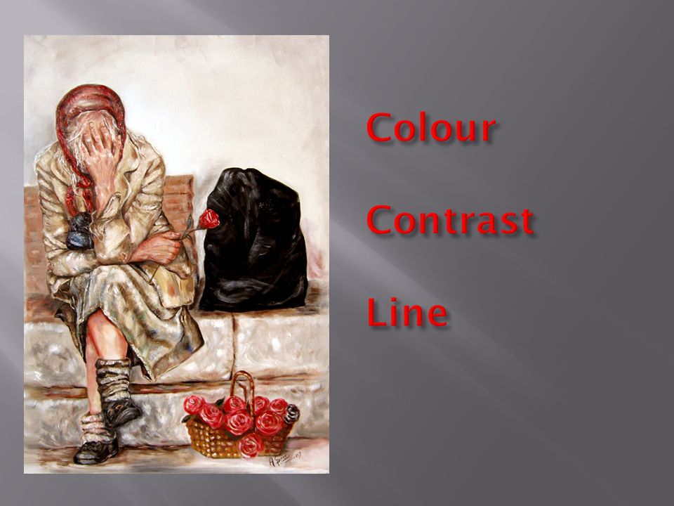
13
Colour Contrast Line

14
balance – the way shapes are arranged within a visual; when shapes are balanced, they create a feeling of order or harmony. Skylines or ridgelines against other land surfaces are the strongest visual elements of background. foreground – the part of a scene, landscape, etc., which is near the The surface patterns or objects and visual elements are important in the "foreground" portions of views.

15
dominant image – the central thought or object that stands out in a work. focal point – part of a visual that is the main area of interest. scale – the relative size of objects within visual; large objects attract the viewer’s attention first.

16
Occurs when one element in an artwork, or a combination of elements, attracts more attention than anything else in a composition. Emphasis is usually a focal point.

17
Drawings Paintings Prints Photographs Film and video Computer art Cartoons Editorial cartoons Posters Mixed media

18
Colour Focal Point Contrast Lighting

19
“Conscience” by Samantha Green Symmetry Contrast Proportion Balance

20
Symmetry Balance

21
composition – the act of combining parts or elements to form a whole in visual art, dance, music, etc. to create an intended effect or convey a message. The arrangement of visual elements within a picture; the way in which the parts of an artistic work are brought together into a visually satisfying whole.

22
Samantha Green

23
“Time” by Samantha Green

24
“Foot in Mouth” by Ross P. Kettle

25
“Journey Begun” by Sylvia Bendzsa

29
“The Run-Terry Fox”

30
“Migrant Mother” by Dorothea Lange

32
Image of the Holocaust

36
“I Want You For the U.S. Army” by James Flagg

37
“What’s Been Lost” by Banksy

38
Unity is as important in composing art as it is in daily living. Unity is created by proximity (creating groups of objects), similarity, and continuation (creating a flow of vision from one object to another).
, similarity, and continuation (creating a flow of vision from one object to another)..")
Similar presentations


. What is Composition Composition is the arrangement of shapes (forms) in an image – their position, relationship to one another.>")


