Download presentation
Presentation is loading. Please wait.

1
1 Basic Data Visualization

2
IPython An interactive shell to execute Python script. Run from a shell; ipython 2

3
IPython Notebook An interactive web-based Python coding environment. 3

4
4 CELL Click RUN or SHIFT+ENTER Add a new cell

5
5 OUTPUT CELL Move the selected cell below Move the selected cell above

6
6 Restart the running Python Save this notebook Change the cell type

7
7 After clicking the run button,

8
Information Visualization 8 Information visualization is increasingly getting its importance. A good visualization could provide more depth knowledge and intuition about data. Python provides a wonderful plotting library very similar to Matlab. Namely, matplotlib (pylab)
.")
9
Why python plotting? 9 Excel is doing super good! My reasons to use Python for plotting Python to process data. No need to use a Mouse. Vector Graphics (not in matlab) Python code is reusable with minimum efforts. Variety in the type of graphs and annotations Vast support from open source community.
 Python code is reusable with minimum efforts. Variety in the type of graphs and annotations Vast support from open source community..")
10
Basic Visualization 10 Provided Visualizations Line / Bar Graph Scatter Plot Box (Whisker) Plot The drawing ability is implemented in an external module.
 Plot The drawing ability is implemented in an external module.")
11
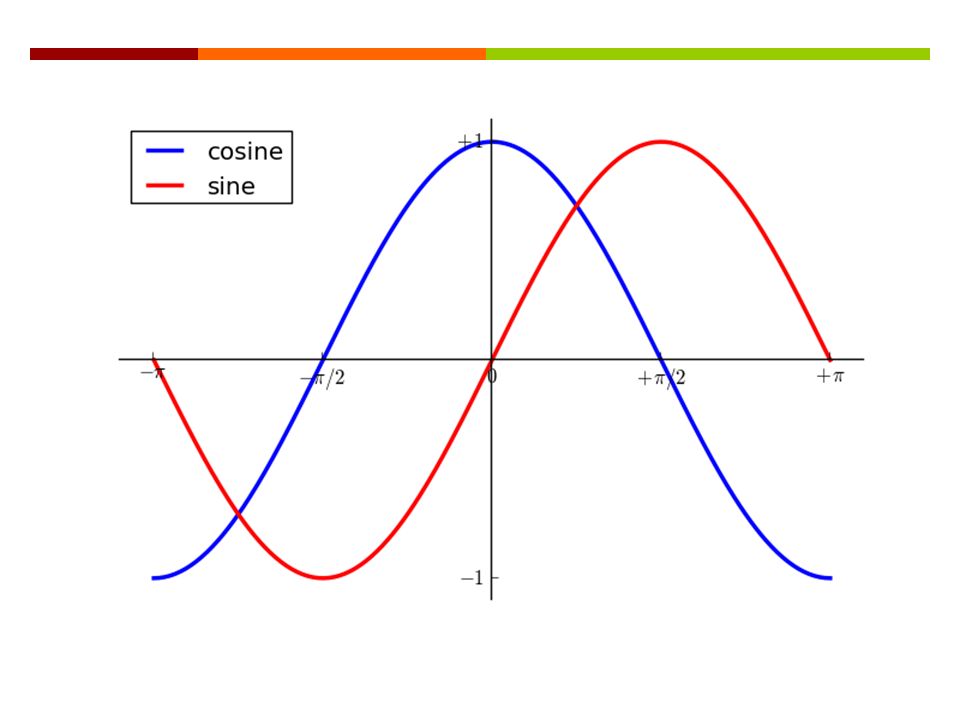
Basic NumPy 11 NumPy is a library to provide matrix operations. NumPy is a versatile tool for many scientific problems. import numpy as np X = np.linspace(-np.pi, np.pi, 256, endpoint=True) (C, S) = (np.cos(X), np.sin(X))
 (C, S) = (np.cos(X), np.sin(X)).")
12
12 Simple Plot

13
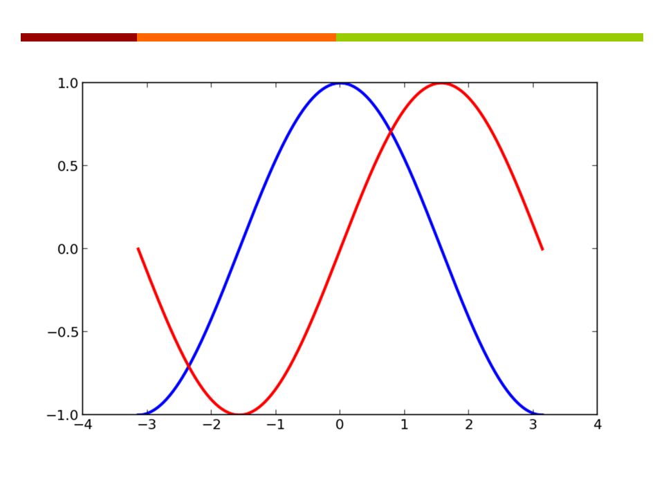
import pylab as pl import numpy as np X = np.linspace(-np.pi, np.pi, 256, endpoint=True) C, S = np.cos(X), np.sin(X) pl.plot(X, C) pl.plot(X, S) pl.show() 13 http://docs.scipy.org/doc/numpy/reference/generated/numpy.linspace.html http://matplotlib.org/1.3.1/api/pyplot_api.ht ml#matplotlib.pyplot.plot
 C, S = np.cos(X), np.sin(X) pl.plot(X, C) pl.plot(X, S) pl.show() ml#matplotlib.pyplot.plot")
15
Changing colors and line widths... pl.figure(figsize=(10, 6), dpi=80) pl.plot(X, C, color="blue", linewidth=2.5, linestyle="-") pl.plot(X, S, color="red", linewidth=2.5, linestyle="-")... 15
, dpi=80) pl.plot(X, C, color= blue , linewidth=2.5, linestyle= - ) pl.plot(X, S, color= red , linewidth=2.5, linestyle= - )")
17
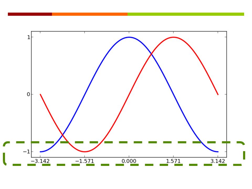
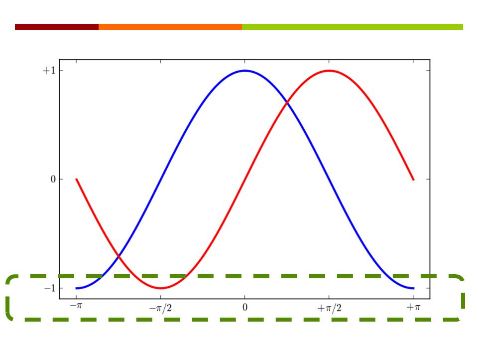
Setting limits... pl.xlim(X.min() * 1.1, X.max() * 1.1) pl.ylim(C.min() * 1.1, C.max() * 1.1)... 17 The minimum and the maximum of x axis The minimum and the maximum of y axis What if the minimum is positive? http://matplotlib.org/1.3.1/api/pyplot_api.ht ml#matplotlib.pyplot.xlim http://matplotlib.org/1.3.1/api/pyplot_api.ht ml#matplotlib.pyplot.ylim http://docs.scipy.org/doc/numpy/reference/ge nerated/numpy.ndarray.min.html

19
Setting limits... pl.xticks( [-np.pi, -np.pi/2, 0, np.pi/2, np.pi], [r'$-\pi$', r'$-\pi/2$', r'$0$', r'$+\pi/2$', r'$+\pi$']) pl.yticks( [-1, 0, +1], [r'$-1$', r'$0$', r'$+1$'])... 19 The tick numbers in x-axis The tick labels in x-axis http://matplotlib.org/1.3.1/api/pyplot_api.ht ml#matplotlib.pyplot.xticks http://matplotlib.org/1.3.1/api/pyplot_api.ht ml#matplotlib.pyplot.yticks
 pl.yticks( [-1, 0, +1], [r $-1$ , r $0$ , r $+1$ ]) The tick numbers in x-axis The tick labels in x-axis ml#matplotlib.pyplot.xticks ml#matplotlib.pyplot.yticks.")
21
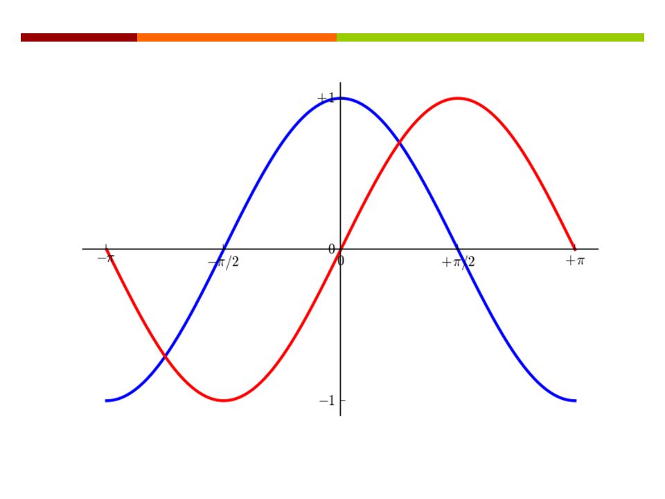
Moving spines... ax = pl.gca() # gca stands for 'get current axis' ax.spines['right'].set_color('none') ax.spines['top'].set_color('none') ax.xaxis.set_ticks_position('bottom') ax.spines['bottom'].set_position(('data',0)) ax.yaxis.set_ticks_position('left') ax.spines['left'].set_position(('data',0))... http://matplotlib.org/api/spines_api.html http://matplotlib.org/1.3.1/api/pyplot_api.ht ml#matplotlib.pyplot.gca
 # gca stands for get current axis ax.spines[ right ].set_color( none ) ax.spines[ top ].set_color( none ) ax.xaxis.set_ticks_position( bottom ) ax.spines[ bottom ].set_position(( data ,0)) ax.yaxis.set_ticks_position( left ) ax.spines[ left ].set_position(( data ,0)) ml#matplotlib.pyplot.gca.")
23
Moving spines... pl.plot(X, C, color="blue", linewidth=2.5, linestyle="-", label="cosine") pl.plot(X, S, color="red", linewidth=2.5, linestyle="-", label="sine”) pl.legend(loc='upper left')... http://matplotlib.org/1.3.1/api/pyplot_api.ht ml#matplotlib.pyplot.legend
 pl.plot(X, S, color= red , linewidth=2.5, linestyle= - , label= sine ) pl.legend(loc= upper left )... ml#matplotlib.pyplot.legend.")
26
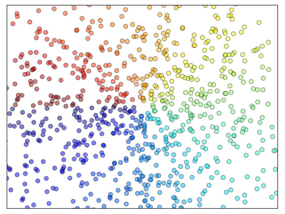
Scatter Plot n = 1024 X = np.random.normal(0,1,n) Y = np.random.normal(0,1,n) T = np.arctan2(Y, X) pl.axes([0.025, 0.025, 0.95, 0.95]) pl.scatter(X, Y, s=75, c=T, alpha=.5) 26 axes(): http://matplotlib.org/1.3.1/api/pyplot_api.html#matplotlib.pyplot.axeshttp://matplotlib.org/1.3.1/api/pyplot_api.html#matplotlib.pyplot.axes scatter(): http://matplotlib.org/1.3.1/api/pyplot_api.html#matplotlib.pyplot.scatterhttp://matplotlib.org/1.3.1/api/pyplot_api.html#matplotlib.pyplot.scatter
![Scatter Plot n = 1024 X = np.random.normal(0,1,n) Y = np.random.normal(0,1,n) T = np.arctan2(Y, X) pl.axes([0.025, 0.025, 0.95, 0.95]) pl.scatter(X, Y, s=75, c=T, alpha=.5) 26 axes(): scatter():](http://images.slideplayer.com/18/6103671/slides/slide_26.jpg "Scatter Plot n = 1024 X = np.random.normal(0,1,n) Y = np.random.normal(0,1,n) T = np.arctan2(Y, X) pl.axes([0.025, 0.025, 0.95, 0.95]) pl.scatter(X, Y, s=75, c=T, alpha=.5) 26 axes(): scatter():")
28
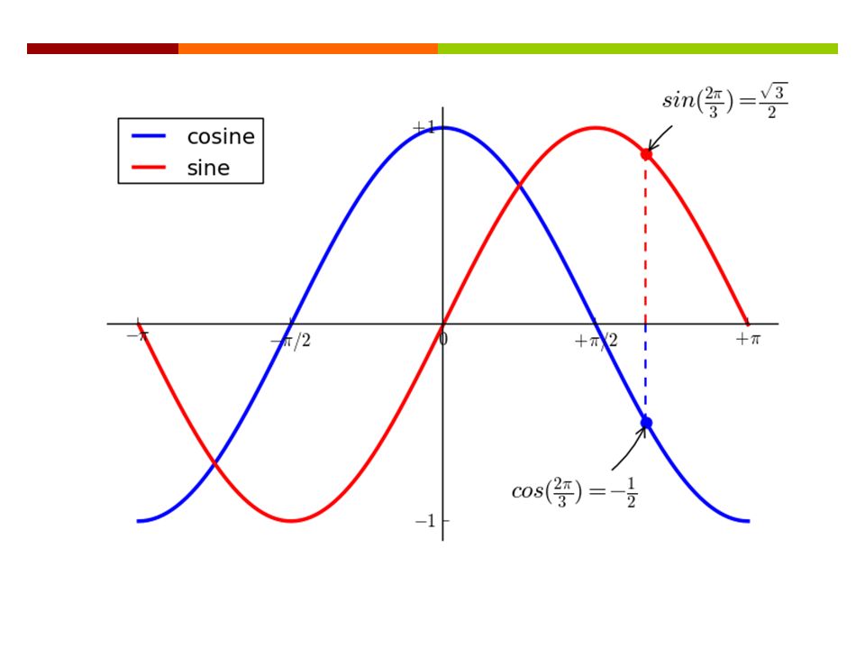
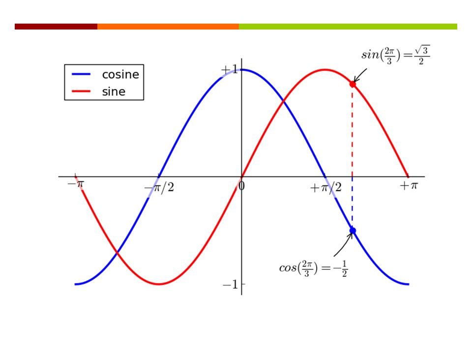
Annotate Some Points t = 2 * np.pi / 3 pl.plot([t, t], [0, np.cos(t)], color='blue', linewidth=2.5, linestyle="--") pl.scatter([t, ], [np.cos(t), ], 50, color='blue’) pl.annotate(r'$sin(\frac{2\pi}{3})=\frac{\sqrt{3}}{2}$', xy=(t, np.sin(t)), xycoords='data’, xytext=(+10, +30), textcoords='offset points', fontsize=16, arrowprops=dict(arrowstyle="->", connectionstyle="arc3,rad=.2")) Reference: http://matplotlib.org/1.3.1/api/pyplot_api.html#matplotlib.pyplot.annotate
![Annotate Some Points t = 2 * np.pi / 3 pl.plot([t, t], [0, np.cos(t)], color= blue , linewidth=2.5, linestyle= -- ) pl.scatter([t, ], [np.cos(t), ], 50, color= blue’) pl.annotate(r $sin(\frac{2\pi}{3})=\frac{\sqrt{3}}{2}$ , xy=(t, np.sin(t)), xycoords= data’, xytext=(+10, +30), textcoords= offset points , fontsize=16, arrowprops=dict(arrowstyle= -> , connectionstyle= arc3,rad=.2 )) Reference:](http://images.slideplayer.com/18/6103671/slides/slide_28.jpg "Annotate Some Points t = 2 * np.pi / 3 pl.plot([t, t], [0, np.cos(t)], color= blue , linewidth=2.5, linestyle= -- ) pl.scatter([t, ], [np.cos(t), ], 50, color= blue’) pl.annotate(r $sin(\frac{2\pi}{3})=\frac{\sqrt{3}}{2}$ , xy=(t, np.sin(t)), xycoords= data’, xytext=(+10, +30), textcoords= offset points , fontsize=16, arrowprops=dict(arrowstyle= -> , connectionstyle= arc3,rad=.2 )) Reference:")
29
Annotate Some Points pl.plot([t, t],[0, np.sin(t)], color='red', linewidth=2.5, linestyle="--") pl.scatter([t, ],[np.sin(t), ], 50, color='red’) pl.annotate(r'$cos(\frac{2\pi}{3})=-\frac{1}{2}$', xy=(t, np.cos(t)), xycoords='data’, xytext=(-90, -50), textcoords='offset points', fontsize=16, arrowprops=dict(arrowstyle="-> », connectionstyle="arc3,rad=.2")) 29
![Annotate Some Points pl.plot([t, t],[0, np.sin(t)], color= red , linewidth=2.5, linestyle= -- ) pl.scatter([t, ],[np.sin(t), ], 50, color= red’) pl.annotate(r $cos(\frac{2\pi}{3})=-\frac{1}{2}$ , xy=(t, np.cos(t)), xycoords= data’, xytext=(-90, -50), textcoords= offset points , fontsize=16, arrowprops=dict(arrowstyle= -> », connectionstyle= arc3,rad=.2 )) 29](http://images.slideplayer.com/18/6103671/slides/slide_29.jpg "Annotate Some Points pl.plot([t, t],[0, np.sin(t)], color= red , linewidth=2.5, linestyle= -- ) pl.scatter([t, ],[np.sin(t), ], 50, color= red’) pl.annotate(r $cos(\frac{2\pi}{3})=-\frac{1}{2}$ , xy=(t, np.cos(t)), xycoords= data’, xytext=(-90, -50), textcoords= offset points , fontsize=16, arrowprops=dict(arrowstyle= -> », connectionstyle= arc3,rad=.2 )) 29")
31
Transparent Tick Labels... for label in ax.get_xticklabels() \ + ax.get_yticklabels(): label.set_fontsize(16) label.set_bbox(dict(facecolor='white', edgecolor='None', alpha=0.65)) …
 \ + ax.get_yticklabels(): label.set_fontsize(16) label.set_bbox(dict(facecolor= white , edgecolor= None , alpha=0.65)) ….")
33
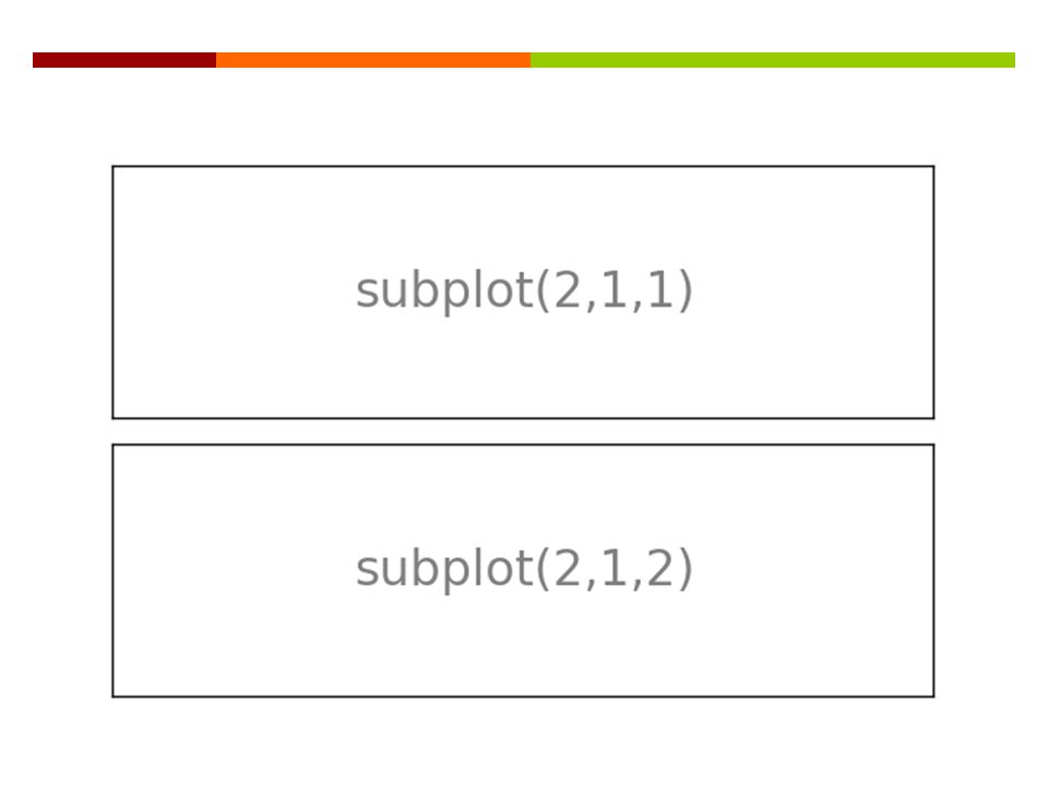
Subplot pl.figure(figsize=(6, 4)) pl.subplot(2, 1, 1) pl.xticks(()) pl.yticks(()) pl.text(0.5, 0.5, 'subplot(2,1,1)', ha='center', va='center’, size=24, alpha=.5) pl.subplot(2, 1, 2) pl.xticks(()) pl.yticks(()) pl.text(0.5, 0.5, 'subplot(2,1,2)', ha='center', va='center’, size=24, alpha=.5) pl.tight_layout() pl.show() 33
) pl.subplot(2, 1, 1) pl.xticks(()) pl.yticks(()) pl.text(0.5, 0.5, subplot(2,1,1) , ha= center , va= center’, size=24, alpha=.5) pl.subplot(2, 1, 2) pl.xticks(()) pl.yticks(()) pl.text(0.5, 0.5, subplot(2,1,2) , ha= center , va= center’, size=24, alpha=.5) pl.tight_layout() pl.show() 33")
35
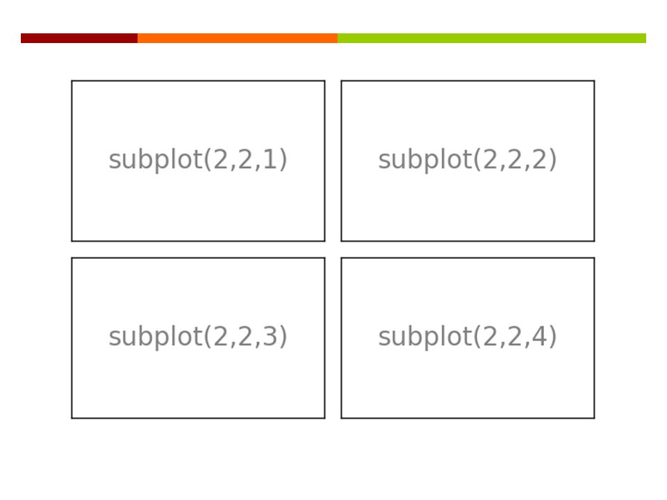
Subplot How to? 35

37
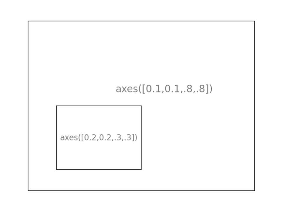
pl.axes([.1,.1,.8,.8]) pl.xticks(()) pl.yticks(()) pl.text(.6,.6, 'axes([0.1,0.1,.8,.8])', ha='center', va='center’, size=20, alpha=.5) pl.axes([.2,.2,.3,.3]) pl.xticks(()) pl.yticks(()) pl.text(.5,.5, 'axes([0.2,0.2,.3,.3])', ha='center', va='center’, size=16, alpha=.5) pl.show() 37 http://matplotlib.org/1.3.1/api/pyplot_api.html#matplotlib.pyplot.text
![pl.axes([.1,.1,.8,.8]) pl.xticks(()) pl.yticks(()) pl.text(.6,.6, axes([0.1,0.1,.8,.8]) , ha= center , va= center’, size=20, alpha=.5) pl.axes([.2,.2,.3,.3]) pl.xticks(()) pl.yticks(()) pl.text(.5,.5, axes([0.2,0.2,.3,.3]) , ha= center , va= center’, size=16, alpha=.5) pl.show() 37](http://images.slideplayer.com/18/6103671/slides/slide_37.jpg "pl.axes([.1,.1,.8,.8]) pl.xticks(()) pl.yticks(()) pl.text(.6,.6, axes([0.1,0.1,.8,.8]) , ha= center , va= center’, size=20, alpha=.5) pl.axes([.2,.2,.3,.3]) pl.xticks(()) pl.yticks(()) pl.text(.5,.5, axes([0.2,0.2,.3,.3]) , ha= center , va= center’, size=16, alpha=.5) pl.show() 37")
39
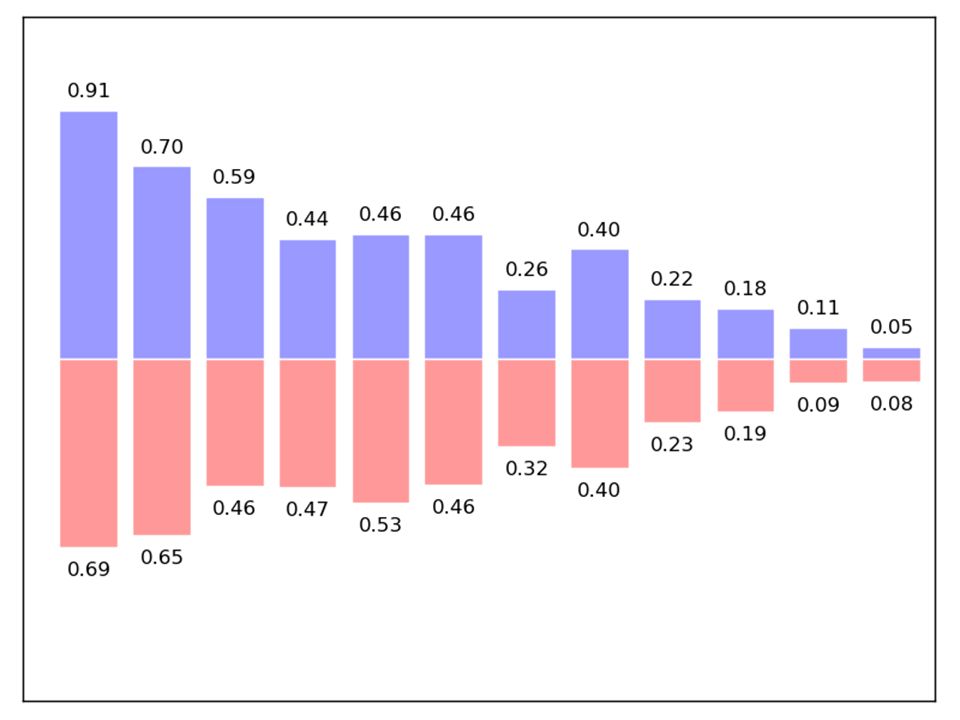
Bar Plots n = 12 X = np.arange(n) Y1 = (1 - X / float(n)) * np.random.uniform(0.5, 1.0, n) Y2 = (1 - X / float(n)) * np.random.uniform(0.5, 1.0, n) pl.bar(X, +Y1, facecolor='#9999ff', edgecolor='white') pl.bar(X, -Y2, facecolor='#ff9999', edgecolor='white’) for x, y in zip(X, Y1): pl.text(x + 0.4, y + 0.05, '%.2f' % y, ha='center', va='bottom’) pl.ylim(-1.25, +1.25) 39 http://matplotlib.org/1.3.1/api/pyplot_api.ht ml#matplotlib.pyplot.bar http://docs.scipy.org/doc/numpy/reference/ge nerated/numpy.arange.html
 Y1 = (1 - X / float(n)) * np.random.uniform(0.5, 1.0, n) Y2 = (1 - X / float(n)) * np.random.uniform(0.5, 1.0, n) pl.bar(X, +Y1, facecolor= #9999ff , edgecolor= white ) pl.bar(X, -Y2, facecolor= #ff9999 , edgecolor= white’) for x, y in zip(X, Y1): pl.text(x + 0.4, y , %.2f % y, ha= center , va= bottom’) pl.ylim(-1.25, +1.25) 39 ml#matplotlib.pyplot.bar nerated/numpy.arange.html")
40
40

41
Contour Plot def f(x, y): return (1 - x / 2 + x ** 5 + y ** 3) * np.exp(-x ** 2 -y ** 2) n = 256 x = np.linspace(-3, 3, n) y = np.linspace(-3, 3, n) X, Y = np.meshgrid(x, y) pl.contourf(X, Y, f(X, Y), 8, alpha=.75, cmap='jet') C = pl.contour(X, Y, f(X, Y), 8, colors='black', linewidth=.5) 41 http://docs.scipy.org/doc/numpy/reference/generate d/numpy.meshgrid.html http://matplotlib.org/1.3.1/api/pyplot_api.ht ml#matplotlib.pyplot.contourf
: return (1 - x / 2 + x ** 5 + y ** 3) * np.exp(-x ** 2 -y ** 2) n = 256 x = np.linspace(-3, 3, n) y = np.linspace(-3, 3, n) X, Y = np.meshgrid(x, y) pl.contourf(X, Y, f(X, Y), 8, alpha=.75, cmap= jet ) C = pl.contour(X, Y, f(X, Y), 8, colors= black , linewidth=.5) 41 d/numpy.meshgrid.html ml#matplotlib.pyplot.contourf")
42
42

43
Contour Plot def f(x, y): return (1 - x / 2 + x ** 5 + y ** 3) * np.exp(-x ** 2 - y ** 2) n = 10 x = np.linspace(-3, 3, 4 * n) y = np.linspace(-3, 3, 3 * n) X, Y = np.meshgrid(x, y) pl.imshow(f(X, Y)) 43 http://matplotlib.org/1.3.1/api/pyplot_api.ht ml#matplotlib.pyplot.imshow
: return (1 - x / 2 + x ** 5 + y ** 3) * np.exp(-x ** 2 - y ** 2) n = 10 x = np.linspace(-3, 3, 4 * n) y = np.linspace(-3, 3, 3 * n) X, Y = np.meshgrid(x, y) pl.imshow(f(X, Y)) 43 ml#matplotlib.pyplot.imshow")
44
44

45
Pie Chart Z = np.random.uniform(0, 1, 20) pl.pie(Z) 45 http://matplotlib.org/1.3.1/api/pyplot_api.ht ml#matplotlib.pyplot.pie
 pl.pie(Z) 45 ml#matplotlib.pyplot.pie")
46
46

47
Quiver Plot for Vector Field n = 8 X, Y = np.mgrid[0:n, 0:n] pl.quiver(X, Y) 47 http://matplotlib.org/1.3.1/api/pyplot_api.ht ml#matplotlib.pyplot.quiver
![Quiver Plot for Vector Field n = 8 X, Y = np.mgrid[0:n, 0:n] pl.quiver(X, Y) 47 ml#matplotlib.pyplot.quiver](http://images.slideplayer.com/18/6103671/slides/slide_47.jpg "Quiver Plot for Vector Field n = 8 X, Y = np.mgrid[0:n, 0:n] pl.quiver(X, Y) 47 ml#matplotlib.pyplot.quiver")
48
48

49
Grid Drawing ax.set_xlim(0,4) ax.set_ylim(0,3) ax.xaxis.set_major_locator(pl.MultipleLocator(1.0)) ax.xaxis.set_minor_locator(pl.MultipleLocator(0.1)) ax.yaxis.set_major_locator(pl.MultipleLocator(1.0)) ax.yaxis.set_minor_locator(pl.MultipleLocator(0.1)) ax.grid(which='major', axis='x', linewidth=0.75, linestyle='-', color='0.75') ax.grid(which='minor', axis='x', linewidth=0.25, linestyle='-', color='0.75') ax.grid(which='major', axis='y', linewidth=0.75, linestyle='-', color='0.75') ax.grid(which='minor', axis='y', linewidth=0.25, linestyle='-', color='0.75') ax.set_xticklabels([]) ax.set_yticklabels([]) 49
![Grid Drawing ax.set_xlim(0,4) ax.set_ylim(0,3) ax.xaxis.set_major_locator(pl.MultipleLocator(1.0)) ax.xaxis.set_minor_locator(pl.MultipleLocator(0.1)) ax.yaxis.set_major_locator(pl.MultipleLocator(1.0)) ax.yaxis.set_minor_locator(pl.MultipleLocator(0.1)) ax.grid(which= major , axis= x , linewidth=0.75, linestyle= - , color= 0.75 ) ax.grid(which= minor , axis= x , linewidth=0.25, linestyle= - , color= 0.75 ) ax.grid(which= major , axis= y , linewidth=0.75, linestyle= - , color= 0.75 ) ax.grid(which= minor , axis= y , linewidth=0.25, linestyle= - , color= 0.75 ) ax.set_xticklabels([]) ax.set_yticklabels([]) 49](http://images.slideplayer.com/18/6103671/slides/slide_49.jpg "Grid Drawing ax.set_xlim(0,4) ax.set_ylim(0,3) ax.xaxis.set_major_locator(pl.MultipleLocator(1.0)) ax.xaxis.set_minor_locator(pl.MultipleLocator(0.1)) ax.yaxis.set_major_locator(pl.MultipleLocator(1.0)) ax.yaxis.set_minor_locator(pl.MultipleLocator(0.1)) ax.grid(which= major , axis= x , linewidth=0.75, linestyle= - , color= 0.75 ) ax.grid(which= minor , axis= x , linewidth=0.25, linestyle= - , color= 0.75 ) ax.grid(which= major , axis= y , linewidth=0.75, linestyle= - , color= 0.75 ) ax.grid(which= minor , axis= y , linewidth=0.25, linestyle= - , color= 0.75 ) ax.set_xticklabels([]) ax.set_yticklabels([]) 49")
50
50

51
Polar Axis ax = pl.axes([0.025, 0.025, 0.95, 0.95], polar=True) N = 20 theta = np.arange(0., 2 * np.pi, 2 * np.pi / N) radii = 10 * np.random.rand(N) width = np.pi / 4 * np.random.rand(N) bars = pl.bar(theta, radii, width=width, bottom=0.0) for r, bar in zip(radii, bars): bar.set_facecolor(cm.jet(r / 10.)) bar.set_alpha(0.5) 51 http://matplotlib.org/1.3.1/api/pyplot_api.html#matplotlib.pypl ot.axes
![Polar Axis ax = pl.axes([0.025, 0.025, 0.95, 0.95], polar=True) N = 20 theta = np.arange(0., 2 * np.pi, 2 * np.pi / N) radii = 10 * np.random.rand(N) width = np.pi / 4 * np.random.rand(N) bars = pl.bar(theta, radii, width=width, bottom=0.0) for r, bar in zip(radii, bars): bar.set_facecolor(cm.jet(r / 10.)) bar.set_alpha(0.5) 51 ot.axes](http://images.slideplayer.com/18/6103671/slides/slide_51.jpg "Polar Axis ax = pl.axes([0.025, 0.025, 0.95, 0.95], polar=True) N = 20 theta = np.arange(0., 2 * np.pi, 2 * np.pi / N) radii = 10 * np.random.rand(N) width = np.pi / 4 * np.random.rand(N) bars = pl.bar(theta, radii, width=width, bottom=0.0) for r, bar in zip(radii, bars): bar.set_facecolor(cm.jet(r / 10.)) bar.set_alpha(0.5) 51 ot.axes")
52
52

53
3D Plot import numpy as np from mpl_toolkits.mplot3d import Axes3D fig = pl.figure() ax = Axes3D(fig) X = np.arange(-4, 4, 0.25) Y = np.arange(-4, 4, 0.25) X, Y = np.meshgrid(X, Y) R = np.sqrt(X ** 2 + Y ** 2) Z = np.sin(r) ax.plot_surface(X, Y, Z, rstride=1, cstride=1, cmap=pl.cm.hot) ax.contourf(X, Y, Z, zdir='z', offset=-2, cmap=pl.cm.hot) ax.set_zlim(-2, 2) pl.show() 53 http://matplotlib.org/1.3.1/mpl_toolkits/mplo t3d/tutorial.html
 ax = Axes3D(fig) X = np.arange(-4, 4, 0.25) Y = np.arange(-4, 4, 0.25) X, Y = np.meshgrid(X, Y) R = np.sqrt(X ** 2 + Y ** 2) Z = np.sin(r) ax.plot_surface(X, Y, Z, rstride=1, cstride=1, cmap=pl.cm.hot) ax.contourf(X, Y, Z, zdir= z , offset=-2, cmap=pl.cm.hot) ax.set_zlim(-2, 2) pl.show() 53 t3d/tutorial.html")
Similar presentations


>")


 Linköping University 2015-03-19.>")


 by: Deidrick Capers.>")
