Download presentation
Presentation is loading. Please wait.

1
Population Pyramids IB SL

2
Population Pyramids – The Basics
Population pyramids show a cross section of a population at a particular moment. They divide the population by gender i.e. male and female and by age. The age groups are called cohorts. Gender – male and female Age groups or cohorts – usually in 5 year age groups e.g

3
What Info Can We Get From A Population Pyramid?
As you can see from the population pyramid, the cohort for 20 – 24 year olds is smaller than the cohort for 15 – 19 year olds. Therefore this means that 20 – 25 years ago there was a decline in the birth rate, or that this cohort has been affected by an increased death rate, or that large numbers in this cohort have migrated (or a combination of any of these.) If one cohort is smaller than the one below it, this could be explained by: A decline in birth rate An increase in death rate Migration Any combination of these
 If one cohort is smaller than the one below it, this could be explained by: A decline in birth rate. An increase in death rate. Migration. Any combination of these.")
4
Can Population Pyramids Explain What Happened?
The simple answer is no, a population pyramid is a descriptive tool. It can only describe what is happening now and in the past in terms of the age and sex of the population. It doesn’t predict patterns in the future. It can’t explain patterns now or in the past. It doesn’t include other features of populations e.g. religion, ethnic group etc.

5
Use Your Common Sense! You can make educated guesses about what happened, but be aware that they are just guesses! Why is the female bar wider for 80+ year olds? It might be because females generally have a greater life expectancy than males so tend to live longer Why is there a bulge in the 35 – 49 cohort for both males and females? It might be because the older ones in this cohort (45 – 49) were born just after World War II when all of the men returned from war and so there was a ‘Baby Boom’ i.e. more babies were born. The younger ones in this cohort were born in the 1960s and so the increase might be due to more free attitudes towards sex. Why is there an indent in the 20 – 29 cohort? This may be due to a decreased Birth Rate in the 1980s due to more women having careers and so leaving having children until they are in their late 20s and 30s. This means that their fertility window is reduced.
 were born just after World War II when all of the men returned from war and so there was a ‘Baby Boom’ i.e. more babies were born. The younger ones in this cohort were born in the 1960s and so the increase might be due to more free attitudes towards sex. Why is there an indent in the 20 – 29 cohort This may be due to a decreased Birth Rate in the 1980s due to more women having careers and so leaving having children until they are in their late 20s and 30s. This means that their fertility window is reduced.")
6
Features of LEDC Pyramids
LEDC population pyramids have very narrow tops – this suggests a high Death Rate and a low life expectancy LEDC population pyramids have steeply sloping sides as many people in each successive cohort die – this suggests a high Death Rate LEDC population pyramids have many more people in the youthful pyramid base i.e. it looks more pyramid in shape compared to the MEDC pyramid LEDC population pyramids have fairly broad bases – this suggests a high Birth Rate

7
Features of MEDC Pyramids
MEDC population pyramids have fairly wide tops – which suggests that there is a low Death Rate and high life expectancy. Large numbers of people are living until 80+. MEDC population pyramids have gently sloping sides – this suggests that there is a low Death Rate. MEDC population pyramids have fairly narrow bottoms – which means a fairly low Birth Rate MEDC population pyramids tend to have more people in the top half of the pyramid and lower numbers of younger people – this gives a rather top heavy appearance.

8
Population in millions
Population pyramids are used to show information about the age and gender of people in a specific country. Male Female There is also a high Death Rate. In this country there is a high Birth Rate Population in millions This population pyramid is typical of countries in poorer parts of the world (LEDCs.)
")
9
In some LEDCs the government is encouraging couples to have smaller families. This means the birth rate has fallen.

10
Population in millions
Male Female Population in millions The largest category of people were born about 40 years ago. In this country the number of people in each age group is about the same. In this country there is a low Birth Rate and a low Death Rate. This population pyramid is typical of countries in the richer parts of the world (MEDCs.)
")
11
Population in millions
Male Female Population in millions In the future the elderly people will make up the largest section of the population in this country. In this country the birth rate is decreasing. This is happening more and more in many of the world’s richer countries.

12
Population in thousands
Male Female Population in thousands This country has a large number of temporary workers. These are people who migrate here especially to find a job.

13
Population pyramid for Mozambique.
Population pyramid for Iceland.

14
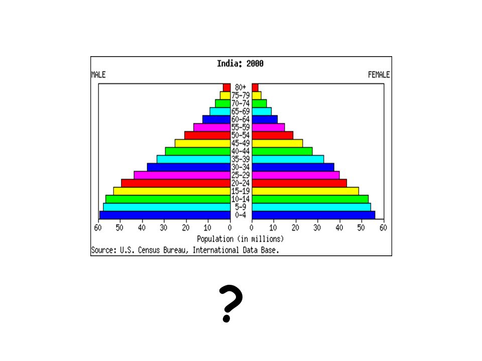
What happens next?

16
What is going to happen to Japan’s population in the future?
Why does this matter?

17
?
18
?
19
?

20
MEDC’s and LEDC’s Look at your 2 Population Pyramids and add the following labels to each pyramid (some can be used more than once).
.")
21
Which Labels Go Where? Primary school class sizes fall High birth rate
Low death rate Low birth rate High death rate New maternity hospital is needed New “shopmobility” needed More Golden Weddings Public health inspector happy at creation of new sewer. Parents start to think more about family planning Grandparents are rare Rise in taxes to pay for growing dependants Hospital in UK advertises in India for new staff. Grandparents take more responsibility for child care Mother sobs over grave of her 6th child dead from typhoid. Large number of elderly people at Bingo.

22
Answer The Following... Describe the population of each pyramid and suggest reasons for their shape. Suggest ideas for each pyramids population momentum (How each would look in 25 years time). Give a list of reasons (at least 5 per pyramid) to explain benefits and problems of their population projection.
. Give a list of reasons (at least 5 per pyramid) to explain benefits and problems of their population projection.")
23
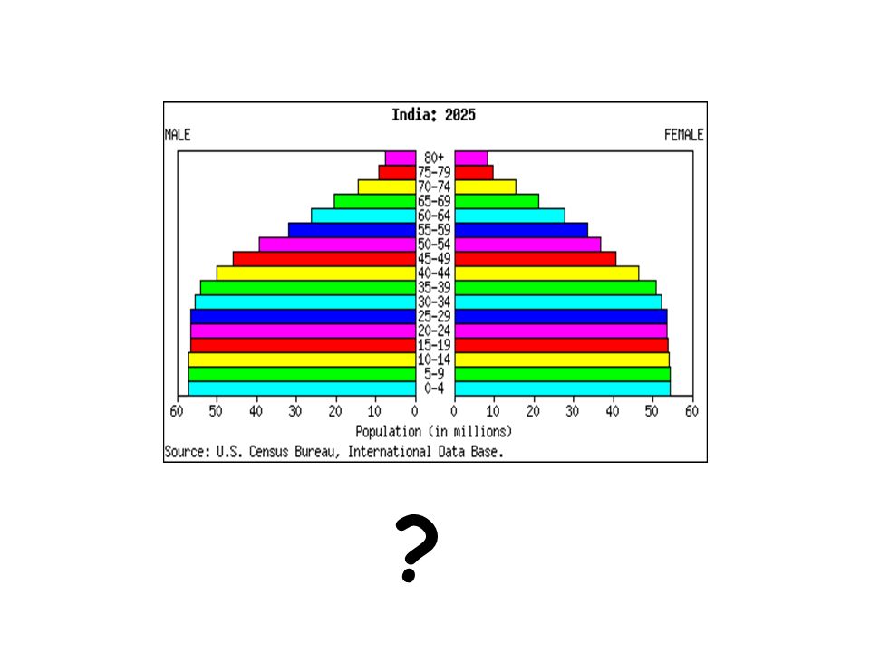
Is what you see, what you expected?
25 Years Later... Look at the 2 population pyramids for 2025 and compare them to your (2000) projections. Is what you see, what you expected?
 projections. Is what you see, what you expected")
24
Recap

25
Population pyramid of a country at a lesser stage of development
AQA Geography AS Level © Nelson Thornes 2008

26
Population pyramid of a country at a further stage of development
AQA Geography AS Level © Nelson Thornes 2008

27
Population change in the USA
AQA Geography AS Level © Nelson Thornes 2008

28
Impact of a natural disaster (a volcanic eruption) on a small island population
AQA Geography AS Level © Nelson Thornes 2008

29
Impact of extreme civil conflict
AQA Geography AS Level © Nelson Thornes 2008

30
Impact of a profound social and economic change, including economic decline
AQA Geography AS Level © Nelson Thornes 2008

31
Impact of a one child policy
AQA Geography AS Level © Nelson Thornes 2008

32
Impact of AIDS AQA Geography AS Level © Nelson Thornes 2008

33
Impact of migration AQA Geography AS Level © Nelson Thornes 2008

Similar presentations


