Download presentation
Presentation is loading. Please wait.

1
Graphing Data

2
OGT Benchmark SI-A Participate in and apply the processes of scientific investigation to create models and to design, conduct, evaluate and communicate the results of these investigations.

3
OGT Indicator SI-5 Develop oral and written presentations using clear language, accurate data, appropriate graphs, tables, maps and available technology.

4
OGT Indicator SI-6 Draw logical conclusions based on scientific knowledge and evidence from investigations.

5
1. Create a data table labeled with units.
Graphing Notes 1. Create a data table labeled with units. Time (s) Distance (m) Red Car Blue Car
 Distance (m) Red Car. Blue Car.")
6
2. Decide what type of graph
*Line (scatter) – shows changes over time, relationships or trends
 – shows changes over time, relationships or trends.")
7
*Bar – compares different things

8
*Pie (circle) – shows parts or % of a whole thing
 – shows parts or % of a whole thing")
9
3. For line graphs (and bars),. determine the range and scale
3. For line graphs (and bars), determine the range and scale of your variables * range – lowest number to highest number Start at zero if it’s reasonable Example: range of 5 to 50 – start with zero Example: range of 2000 to 3000 – don’t start with zero – most of your graph will be empty space
, determine the range and scale of your variables. * range – lowest number to highest number. Start at zero if it’s reasonable. Example: range of 5 to 50 – start with zero. Example: range of 2000 to 3000 – don’t start with zero – most of your graph will be empty space.")
10
* scale – labels for each line on the graph
Must be evenly spaced, counting by a reasonable number – 2, 5, 10, 25, 100, etc For line graphs, number the lines, not the spaces Example: - each line is worth 2

11
3. Label the horizontal axis with the independent variable and its unit – the independent variable is the one you set ahead of time

12
Label the vertical axis with the dependent variable and its unit – the dependent variable is the one you are testing for Choose a title for your graph. Plot your data points.

13
8. The graph can then be used to predict unmeasured data points.
Determine the trend in the data – draw a “best fit” line through your data points. 8. The graph can then be used to predict unmeasured data points. * interpolate points within your data range * extrapolate points beyond your data range

14
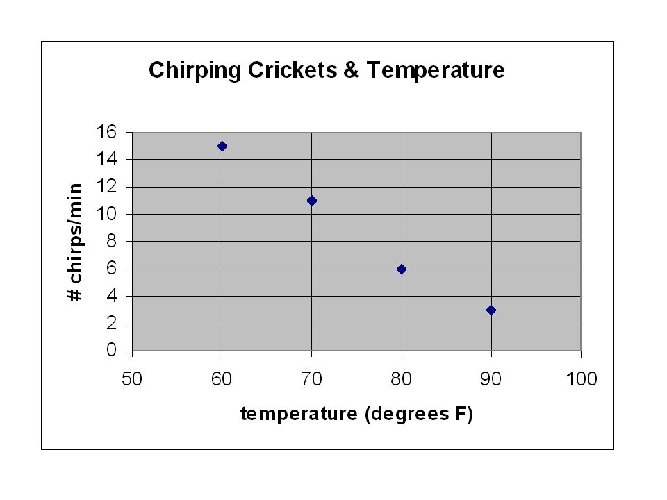
Graphing Example Determine the relationship between the number of times a cricket chirps in a minute and the air temperature. Temperature in degrees F # of cricket chirps/min 90 3 80 6 70 11 60 15

15
*Starting with zero, most of the graph is empty

17
* With a “best fit” trend line

18
*Use the graph to interpolate the # of chirps at 75 degrees F.
*Use the graph to extrapolate the # of chirps at 100 degrees F.

Similar presentations


 The Independent Variable. A change in this variable affects the y variable. >")


? Do Now: Copy the following: Line Graph - A graph that is used to display data that shows how one variable.>")


