Download presentation
Presentation is loading. Please wait.

1
Graphing in Science

2
Pie Graphs Bar Graphs Pie graphs are useful to show parts of a whole.
Bar graphs are useful to show comparison.

3
Line Graphs Lines graphs are used to show trends your data.
This is type used most often in science.

4
Plotting Variables in Science
Graphs in Science always contain two variables: Independent Variable The variable you change directly (you control) is the independent variable. Dependent Variable The variable that responds is called the dependent variable.
 is the independent variable. Dependent Variable. The variable that responds is called the dependent variable.")
5
Parts of a Graph • grid • x & y axis • variable • origin • curve • title • labels • plotted points ` ` ` ` ` ` `

6
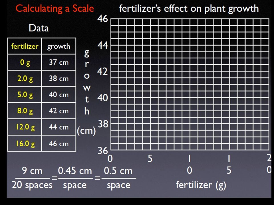
The Scale Just as every instrument has a calibration, every graph has a scale. The scale of a graph tells you the value each line on the graph. Before you can make a graph you must create a scale for both axes.

7
Guidelines for your scale:
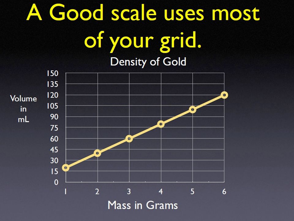
Chose a scale that is easy to read. Use 1, 2, 5, 10 or multiples of 10. Never use “odd” numbers like 3.25 or 11.6. For numbers less than 1, use 0.1, 0.2 or 0.5. Select a scale that nearly fills the page with your curve. Scales on your x-axis and y-axis are usually not the same. Always label your axes with both title and units. Example: Speed (m/s)
")
8
Formula for Best Scale • Subtract the highest and lowest data you wish to plot on your graph. Look at questions as well as data. Count the number of spaces on the axis. (Count the spaces - not the lines.) Divide the data spread you wish to plot by the number of spaces on the axis. Include units! Pick a value HIGHER than you get that is easy to use. Scales less than one: 0.1, 0.2, 0.5 Scales more than one: 1, 2, 5 and multiples of 5 or 10. DO NOT USE YOUR DATA AS A SCALE!!!!!!!
 Divide the data spread you wish to plot by the number of spaces on the axis. Include units! Pick a value HIGHER than you get that is easy to use. Scales less than one: 0.1, 0.2, 0.5. Scales more than one: 1, 2, 5 and multiples of 5 or 10. DO NOT USE YOUR DATA AS A SCALE!!!!!!!")
15
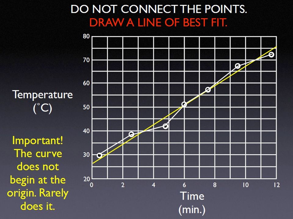
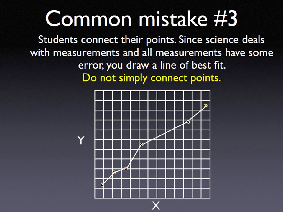
Drawing your Curve On any line graph, the line is called the curve.
The curve shows the relationship between the independent variable and the dependent variable.

16
3 Types of Line Curves Linear - Straight line going up or down.
As x increases, so does y. As x decreases, so does y. Hyperbola - curves as it falls. As x increases, y decreases quickly. Parabola - curves as it rises. As x increases, y increases quickly.

17
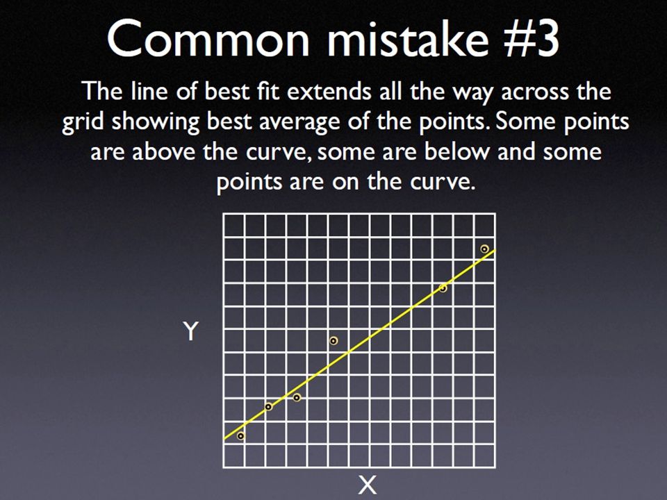
When drawing a curve: • Look at your data to determine if your curve is linear, a hyperbola or parabola. • Circle your plotted points so they stand out. • Do not connect your points - draw a line of best fit. • Extend your curve all the way across the grid - don’t stop at your first or last point. • Draw a linear curve with a ruler. For a hyperbola & parabola draw a smooth curve.

20
Interpolation & Extrapolation
Interpolate: To find the Value of a point inside your data points. Extrapolate: To find the value of a point outside of your data points. 49 39 How much growth would you get with 4.5 grams of fertilizer? How much growth would you get with 19 grams of fertilizer? interpolated extrapolated

Similar presentations


 highlight THEN….highlight the.>")
Distance(meters) Straight lines drawn with a ruler Independent Variable Dependent Variable Units.>")


.>")
