Download presentation
Presentation is loading. Please wait.

1
Tables, graphs, and diagrams Barbara Schimmer Jurmala, Latvia, 2006 Based on EPIET material

2
Contents Use of tables, graphs and graphics Graphics in descriptive epidemiology °describe Graphics in analytical epidemiology °compare Designing graphics

3
Background

4
Epidemiology Purpose Description °Time °Place °Person Clinical features Comparison °Odds ratios °Relative risks Methods Surveillance Outbreak investigations Other studies: clinical epidemiology field trials experimental epidemiology

5
Use of data tables and graphics? Process data Organise triage, cleaning Summarise aggregate Explore °trends °relationships °errors Present data Communicate Paper Poster Screen static animated

6
Paper vs. screen Paper Time unlimited Repetition Details notes? White, grey and black Screen Time < 1 min No repetition Less details Colours possible

7
Tables, graphics, and diagrams Self-explanatory Simple! Title (what, who, where, when) Define abbreviations and symbols Note data exclusions Reference the source
 Define abbreviations and symbols Note data exclusions Reference the source.")
8
Time

9
The epidemic curve 1

10
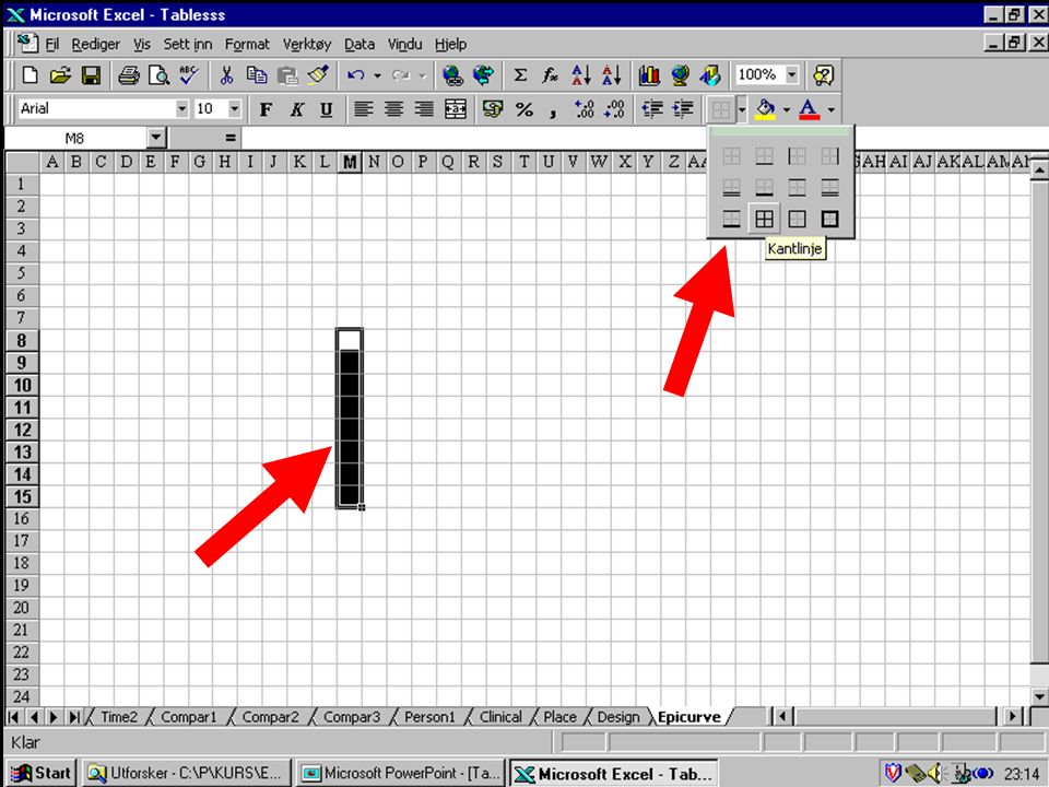
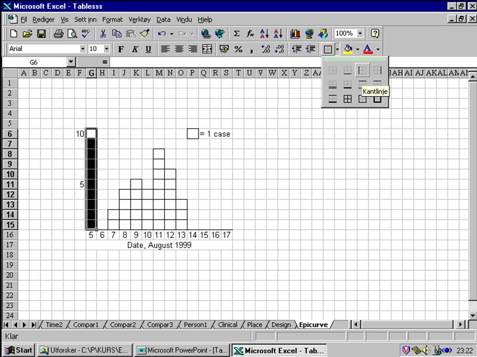
The epidemic curve 2 Histogram °Area proportional to number °No space between columns °One population X-axis = time °Start before epidemic, continue after °Interval 1/4 of incubation period Y-axis = number of cases °Usually one square = one case Easy to make in Excel

15
The arithmetic-scale line graph 1

16
The arithmetic-scale line graph 2 For time series Show actual changes in magnitude X-axis = time Y-axis = rate (or number) of cases °Start at 0 °Breaks possible, clearly marked
 of cases °Start at 0 °Breaks possible, clearly marked")
17
The semilogarithmic-scale line graph 1

18
The semilogaritmic-scale line graph 2 For time series when °interested in rate of change X-axis = time arithmetic Y-axis = rate (or number) of cases, logarithmic °Straight slope= constant rate of change °Steep slope= constant rapid change °Parallell lines= same rate of change °Change in slope = acceleration deceleration of rate °Start at lowest cycle, e.g. 0.1-1 or 1-10 °No breaks

19
In graphs... Labels for axes, scales and legends Legends or keys if >1 variable Scale divison, appropriate scale Units of measurements in title No grid, no numbers No 3D

20
Place

21
The one- variable table

22
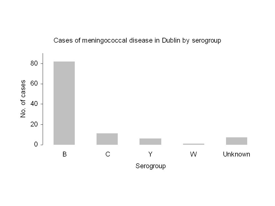
The spot map Figure 1. Cases of meningococcal disease in Dublin 1998 by place of residence. 1 dot = 1 case

23
The area dot (or dot density) map Figure 2. Cases of meningococcal disease in Dublin 1998 by area of residence. 1 dot = 1 case

24
The area map Figure 3. Incidence rate (per 100,000) of meningococcal disease in Dublin 1998 by area of residence.
 of meningococcal disease in Dublin 1998 by area of residence..")
25
Person

26
The two- variable table

27
Grouped bar chart

28
Stacked bar chart

29
Component bar chart

30
Bar charts Order °Natural °Decreasing or increasing Vertical or horizontal Same width of bars Length = frequency Space between bars and groups, but not within groups Tables are often better

31
Pie chart

32
Clinical features

33
Table

34
Birth weight of 36217 newborns

35
Anything wrong with the distribution ?

36
Anything else than the relation ?

37
Comparison

38
The 2x2 table for a cohort study

39
The 2x2 table for a case control study

40
Table from a case control study

41
Design

42
Think data-ink Every bit of ink should have a reason

43
Designing graphics Show the data Use ink for the data Remove unnecessary ink Remove gimmicks No 3D Careful with colours

44
Standard symbols in tables Avereage BMI by category of weight weightmenwomen 40-49 -. 50-5919,821,8 60-6923,124,8 70-7925,027,6 80-8927,430,5 90-9929,834,2 explanation of symbols - = we measured, no case in this category, we can´t say that it is 0. = we measured, but we cant calculate the average of 1 case

45
Standard symbols in tables Cause specific mortality Cause of deathmenwomen CVD5035 Pneumonia4530 CA prostatae10x CA cervicis uterix10 explanation of symbols x = not displayed for logical reasons

50
Summary Use of graphicsExplore and present PresentationPaper vs screen Description °Time- line graphs or epicurves °Place - maps or tables °Person- tables or bar charts °Clinical- tables Analysis °Comparison- 2x2 tables, other tables DesignSave your ink!

Similar presentations


 2.One of the objectives to investigate an outbreak is to identify the population.>")


