Download presentation
Presentation is loading. Please wait.

1
Making effective plots: 1.Don’t use default Excel plots! 2.Figure should highlight the key relationships in the data. 3.Should be clear - no extraneous legends, lines, only use annotations when they add real explanatory value. 4.Don’t use bells and whistles like 3-D when they don’t improve clarity. 5.Make sure fonts are large enough to be read both in print and on screen.

2
Symbols are legible and distinctive. The symbols are large enough to view and distinguish if the page is held at arms length. Lines connecting symbols are legible and distinguishable (where possible). Every figure has a figure caption that explains the overall purpose of the figure and the meaning of every symbol and line on the figure, if no legend was included in the figure. The plot is not overly busy. Too many symbols and lines on one plot are simply confusing. Where appropriate, symbols should have error bars. A good plot would be legible if it was shrunk down onto a 3 by 5 index card. This is also true for a good table. Tables are difficult to display in talks, but are vital for papers. They can compress information and avoid boring, repetitious discourse. They can also help to keep you organized. Tables for talks should be VERY simple. Try stacking plots that are related to avoid overly busy, single plots.
. Every figure has a figure caption that explains the overall purpose of the figure and the meaning of every symbol and line on the figure, if no legend was included in the figure. The plot is not overly busy. Too many symbols and lines on one plot are simply confusing. Where appropriate, symbols should have error bars. A good plot would be legible if it was shrunk down onto a 3 by 5 index card. This is also true for a good table. Tables are difficult to display in talks, but are vital for papers. They can compress information and avoid boring, repetitious discourse. They can also help to keep you organized. Tables for talks should be VERY simple. Try stacking plots that are related to avoid overly busy, single plots..")
3
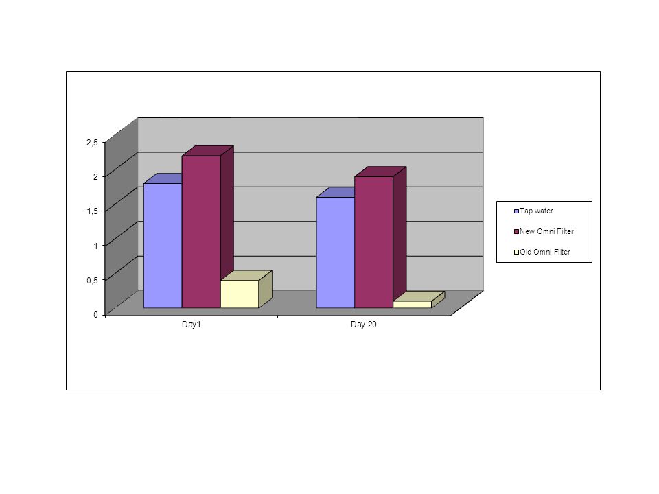
What is wrong with this?

4
What’s wrong here? (where to start…?

5
Chart for a paper

6
Chart for presentation

8
What’s wrong with this graph? Lines too thin Symbols pretty small Axis labels too small, not uniform size Poor choice of axis scales Zero on Y-axis is off graph origin

9
Improvements Lines thicker Symbols bigger Axis bigger font, bold, uniform Axis scales match data range, changed to log scales Added regression line and equation Y = 0.97X + 0.10, R2 = 0.745, n = 145

10
The much-abused Pie Graph (try to avoid them) (consider stacked bar graphs) Fonts too small Bad color choices: slices not distinguished by shading Too many data groups (categories)
 (consider stacked bar graphs) Fonts too small Bad color choices: slices not distinguished by shading Too many data groups (categories)")
11
Fixes Combined categories Better shading / color scheme Enlarged fonts Unboxed the legend (remove excess ink)
")
12
What is wrong with this?

13
What is effective from these variations?

14
Bar plots vs. box plots -Appropriate for counts without variation -Emphasis on comparing means -Error bars show some variation (if included) -Shows rough distribution of data, including outliers -Conveys much more information in same amount of space (customizable, but usually median, quartiles, 95% range, outliers)
 -Shows rough distribution of data, including outliers -Conveys much more information in same amount of space (customizable, but usually median, quartiles, 95% range, outliers).")
15
For presentations, use color, make thick lines, larger fonts

16
Use diagrams and cartoons to illustrate concepts and describe methods

Similar presentations


. Day….. 1.Misleading GraphsMisleading Graphs 2.Frequency Tables and Tally ChartsFrequency Tables and Tally Charts.>")


