Download presentation
Presentation is loading. Please wait.

2
Communication – 2: Presentations. Graphics. Design. Preben Aavitsland

3
Presentations

4
Talk to your audience Look at them (not at the screen) Loud and clear speech Hands out of pocket Hands away from face Use your hands Use manuscript only if you have to
 Loud and clear speech Hands out of pocket Hands away from face Use your hands Use manuscript only if you have to")
5
Respect the time 10 minutes = 10 minutes You will use: –80-100 words per minute –1 slide per minute

6
Visual aids Transparencies –interactive –best for lecture –handouts Computer presentations –most flexible –not always safe –handouts

7
Preparation of visual aids Text first, then visual aids The less fancy, the better –Only very careful use of fancy animation and colours in PowerPoint Always related to what you say

8
Visual data Tables, graphs, charts, maps The simpler the better Make them talk Walk the public through Use the pointer appropriately

9
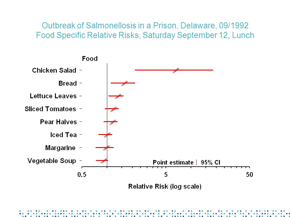
Food Specific Attack Rates, Outbreak of Salmonellosis, Prison X, Dover, Delaware, September 1992

11
Outbreak of Salmonellosis in a Prison, Delaware, 09/1992 Food Specific Relative Risks, Saturday September 12, Lunch

12
Graphical visual data Graphs, charts and maps One point per slide No 3D Appropriate colour palette

13
Palette for a quantitative variable

14
AIDS Annual Rates per 100,000 Population for Cases Reported May 1990 through April 1991

16
Visual reinforcements: bullet lists Leave them alone Use keywords < 12 lines < 5 words per line Break line prop- erly

17
Methods We conducted a retrospective cohort survey including all people attending the visit of the park A case was defined as a papular or papulo-vesicular pruritic rash, among participants, 12 hours or more after the exposure to seawater The Karaoke slide

18
Methods Survey –retrospective cohort –all participants Case definition –rash (papular or papulo-vesicular) –> 12 hours after exposure
 –> 12 hours after exposure")
20
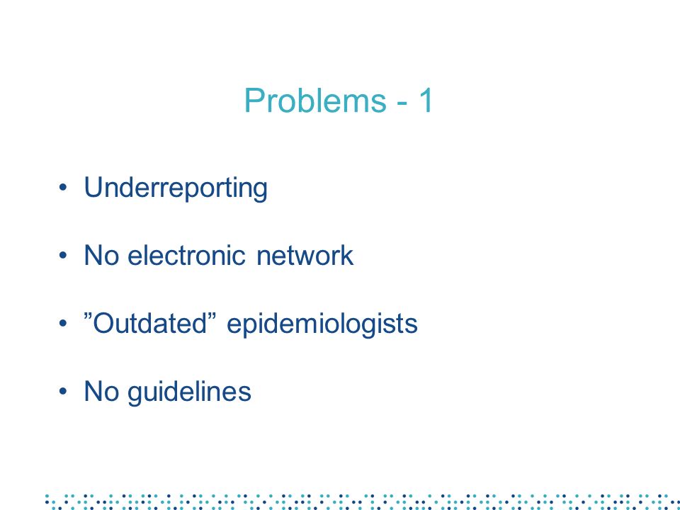
Problems - 1 Underreporting No electronic network Outdated epidemiologists No guidelines

21
Effective text attributes Sans serif font Bold type Lower case letters Good contrast ) ) ) ) Serif font Normal type UPPER CASE LETTERS Poor contrast ) ) ) ) PreferAvoid
 ) ) ) Serif font Normal type UPPER CASE LETTERS Poor contrast ) ) ) ) PreferAvoid")
22
INEFFECTIVE TEXT ATTRIBUTES SERIF FONT THIN FONT UPPER CASE LETTERS POOR CONTRAST

23
Ineffective text attributes : the bar code font

24
Poor contrast

26
Salmonella Environmental sources of the organism include water, soil, insects, factory surfaces, kitchen surfaces, animal faeces, raw meats, raw poultry, and raw seafood, to name only a few. Raw meats, poultry, eggs, milk and dairy products, fish, shrimp, frog legs, yeast, coconut, sauces and salad dressing, cake mixes, cream-filled desserts and toppings, dried gelatine, peanut butter, cocoa, and chocolate. Various Salmonella species have long been isolated from the outside of egg shells. The present situation with S. enteritidis is complicated by the presence of the organism inside the egg, in the yolk. This and other information strongly suggest vertical transmission, i.e., deposition of the organism in the yolk by an infected layer hen prior to shell deposition. Foods other than eggs have also caused outbreaks of S. Enteritidis disease.

27
Graphics

28
Contents Use of graphics Graphics in descriptive epidemiology –Time –Place –Person –Clinical features Graphics in analytical epidemiology –Comparison Designing graphics

29
Epidemiology Purpose Description –Time –Place –Person –Clinical features Comparison –Incidence rate ratio –Risk ratio –Odds ratio Methods Surveillance Outbreak investigations Other studies –Case-control studies –Cohort studies

30
Use of data graphics? Analyse data Organise Summarise Explore –trends –relationships –errors Present data Communicate Paper Poster Screen

31
The epidemic curve 1

32
The epidemic curve 2 Histogram –Area proportional to number –No space between columns –One population X-axis = time –Start before epidemic, continue after –Interval < 1/4 of incubation period Y-axis = number of cases –Usually one square = one case Easy to make in Excel

37
Finding the exposure period. Epidemic curve for an outbreak of hepatitis A 281420262814202617 Date 0 5 10 15 Number of cases one case 30 days 15 days 50 days Exposure

38
The arithmetic-scale line graph 1

39
The arithmetic-scale line graph 2 For time series Show actual changes in magnitude X-axis = time Y-axis = rate (or number) of cases –Start at 0 –Breaks possible, clearly marked
 of cases –Start at 0 –Breaks possible, clearly marked")
40
The semilogarithmic-scale line graph 1

41
The semilogaritmic-scale line graph 2 For time series when –interested in rate of change Y-axis = rate (or number) of cases, semilog. –Straight slope= constant rate of change –Steep slope= rapid change –Parallell lines= same rate of change –Start at lowest cycle, e.g. 0.1-1 or 1-10 –No breaks X-axis = time

42
Gonorrhoea - by race and ethnicity, United States, 1981-1993

43
Source: Summary of Notifiable Diseases, United States 1993 Gonorrhea - by race and ethnicity, United States, 1981-1993

44
In graphs... Labels for axes, scales and legends Legends or keys if >1 variable Scale divison, appropriate scale Units of measurements in title No grid, no numbers No 3D

45
Counts and rates of tuberculosis France, 1996 4-Week Period Ending 31/12/199652-Week Period Ending 31/12/1996 CountRate

46
Descriptive analysis of place: spot map or area map Spot map Count of cases does not represent risk but burden Areas have different populations Population may vary over time –Seasons –Population influx (refugees) Area map Rates allow to compare risk across areas Choice of administrative areas (Instability of rates in small areas) Choice of ranges to display data
 Area map Rates allow to compare risk across areas Choice of administrative areas (Instability of rates in small areas) Choice of ranges to display data")
47
The two- variable table

48
Grouped bar chart

49
Stacked bar chart

50
Component bar chart

51
Bar charts Order –Natural –Decreasing or increasing Vertical or horizontal Same width of bars Length = frequency Space between bars and groups, but not within groups Tables are often better

52
Pie chart

53
The 2x2 table for a cohort study

54
Table from a case-control study

55
Design of graphics

56
Think data-ink Every bit of ink should have a reason

57
Designing graphics Show the data Use ink for the data Remove unnecessary ink Remove gimmicks No 3D Careful with colours

Similar presentations


>")


