Download presentation
Presentation is loading. Please wait.

1
Section 1.3 Scatter Plots and Correlation

2
Graph a scatter plot and identify the data correlation. Use a graphing calculator to find the correlation coefficient and to make predictions using the line of best fit. Objectives:

3
Write down as many examples of real world situations that describe a relationship between two variables. What type of trends, if any, might you see? Example to get you started: Your age and height. There is an increasing trend. As your age increase, your height increases. Collin’s Writing (5 minutes):
:.")
4
A scatter plot is a graph of a collection of ordered pairs (x,y).
.")
5
Positive Correlation If the x-coordinates and the y-coordinates both increase, then it is POSITIVE CORRELATION.

6
Positive Correlation Age vs. Height As the child gets older, the child gets taller. Because both are going up, it is positive correlation. Age12345678 Height in inches 2531343640414755

7
Negative Correlation If the x-coordinates and the y-coordinates have one increasing and one decreasing, then it is NEGATIVE CORRELATION.

8
Negative Correlation Age of Family Car vs. Value As the car gets older, the car is worth less. This is negative correlation. Age of car 1 years2 years3 years4 years5 years Value$30,000$27,000$23,500$18,700$15,350

9
No Correlation If there is no pattern, and the points looked scattered, then it is NO CORRELATION.

10
No Correlation Shoe Size vs. Batting Average The shoe size does not make the player better or worse. This has no correlation.

11
Scatterplots Which scatterplots below show a linear trend? a) c)e) b) d)f) Negative Correlation Positive Correlation Constant Correlation
 c)e) b) d)f) Negative Correlation Positive Correlation Constant Correlation.")
12
Sometimes statisticians omit these points when studying data. An outlier is a point of the scatterplot that doesn’t fit the trend.

13
2000 Presidential Election

14
The line of best fit is the straight line that fits closest to the data. It may go through some, or none of the points. Try to have the same amount of points above and below the line. Line of Best Fit

15
Example: Plot the data on homework time and TV time on the graph TVHomework 30 min. 45 min. 120 min. 240 min. 90 min. 150 min. 180 min. 150 min. 90 min. 30 min. 120 min. 90 min. Time Watching TV Time on Homework 30 90 150 210 60 120 180 240 240 210 180 150 120 90 60 30

16
Now draw the line of best fit and describe any trends Time Watching TV Time on Homework 30 90 150 210 60 120 180 240 240 210 180 150 120 90 60 30 Trend is decreasing. Trend appears linear. Negative correlation.

17
Pg 27 Exercises 1, 5-9, 11, 12 Homework:

18
A correlation coefficient measures the correlation between the set of data. It is called r. It describes how close the points in a scatter plot cluster around the line of best fit. Correlation Coefficient

19
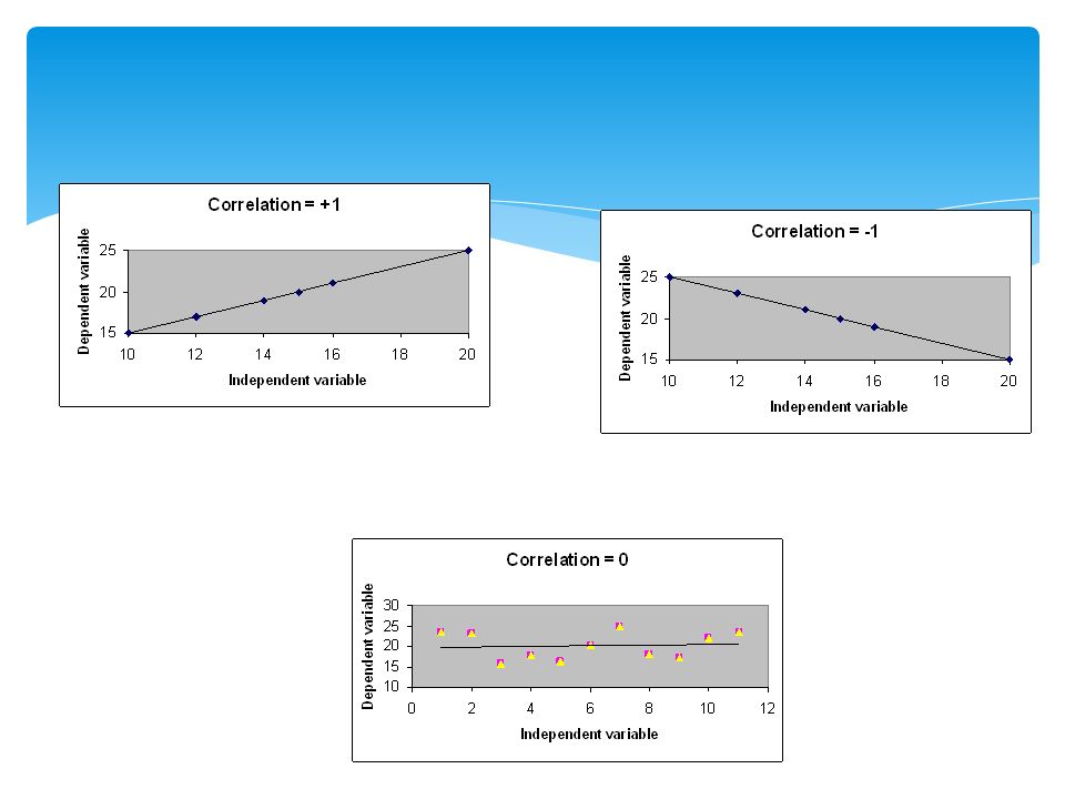
Range of Values for the Correlation Coefficient Strong negative relationship Strong positive relationship No linear relationship When all the points fit on the line, r = +1 or r = -1. When the points are random and no line can be considered, r = 0. The closer this number is to 1 or -1, the closer the points are to the line of best fit.

21
You tell me your best guess! r =.__ __

22
Example For seven random summer days, a person recorded the temperature and their water consumption. Temperature (F) Water Consumption (ounces) 7516 8320 85 25 8527 9232 9748 99 48
 Water Consumption (ounces)")
23
Example Now you want to plan an outdoor party. Predict the amount of water a person would drink when the temperature is 95 degrees F.

24
Finding the Solution: TI-83/84 Using the TI- 83/84 graphing calculator Enter the data. Graph a scatterplot of the data. Find the equation of the graph. Graph the regression line on a graph with the scatterplot.

25
1. Enter the Data into Lists Press STAT. Under EDIT, select 1: Edit. Enter x-values (input) into L1 Enter y-values (output) into L2. Note: If you need to clear out a list, for example list 1, place the cursor on L1 then hit CLEAR and ENTER.
 into L1 Enter y-values (output) into L2. Note: If you need to clear out a list, for example list 1, place the cursor on L1 then hit CLEAR and ENTER..")
26
2. Set up the Scatterplot. Press 2nd Y= (STAT PLOTS). Select 1: PLOT 1 and hit ENTER. Move the cursor to On and hit ENTER. Move the cursor to Type: and select the first graph under Type. Under Xlist: Enter L1. Under Ylist: Enter L2. Under Mark: select any of these.

27
3. View the Scatterplot To plot the points, press ZOOM and select 9: ZoomStat. The scatterplot will then be graphed.

28
Example Temperature (F) Water Consumption (ounces) 7516 8320 85 25 8527 9232 9748 99 48
 Water Consumption (ounces)")
29
The Graph We will now find the “line of best fit” called the REGRESSION LINE.

30
4. Find the regression line. Press STAT. Press CALC. Select 4: LinReg(ax + b). Press 2nd 1 (for List 1) Press the comma key, Press 2nd 2 (for List 2) Press ENTER.
. Press 2nd 1 (for List 1) Press the comma key, Press 2nd 2 (for List 2) Press ENTER..")
31
5. Interpreting and Visualizing Interpreting the result: y = ax + b The value of a is the slope The value of b is the y-intercept

32
5. Interpreting and Visualizing Write down the equation of the line in slope intercept form. y = 1.451162791x – 96.84518272 Press Y= and enter the equation under Y1. (Clear all other equations.) Press GRAPH and the line will be graphed through the data points.
 Press GRAPH and the line will be graphed through the data points..")
33
Interpretation in Context Regression Equation: y = 1.451162791x – 96.84518272 Water Consumption = 1.451162791(Temperature) – 96.84518272
 –")
34
Prediction Example Predict the amount of water a person would drink when the temperature is 95 degrees F. Solution: y = 1.451162791(95) – 96.84518272 = 41.01528243 ounces.
 – = ounces..")
35
Pg 27 – 29 Exercises 2, 3, 4, 10, 13, 14 – 26. 1.1 – 1.3 Quiz Monday Classwork:

Similar presentations


: Scatter Plots Standards: SDP 1.0 and 1.2 Objective: Determine the correlation of a scatter plot.>")


