Download presentation
Presentation is loading. Please wait.

1
Scatter Plots Objective: Determine the correlation of a scatter plot

2
Scatter Plot A scatter plot is a graph of a collection of ordered pairs (x,y). The graph looks like a bunch of dots, but some of the graphs are a general shape or move in a general direction.

3
Positive Correlation If the x-coordinates and the y-coordinates both increase, then it is POSITIVE CORRELATION. This means that both are going up, and they are related.

4
Positive Correlation If you look at the age of a child and the child’s height, you will find that as the child gets older, the child gets taller. Because both are going up, it is positive correlation. What type of correlation would you have if both values were going down? Age12345678 Height “ 2531343640414755

5
Negative Correlation If the x-coordinates and the y- coordinates have one increasing and one decreasing, then it is NEGATIVE CORRELATION. This means that 1 is going up and 1 is going down, making a downhill graph. This means the two are related as opposites.

6
Negative Correlation If you look at the age of your family’s car and its value, you will find as the car gets older, the car is worth less. This is negative correlation. Age of car 12345 Value$30,000$23,000$20,500$18,700$17,350

7
No Correlation If there seems to be no pattern, and the points looked scattered, then it is no correlation. This means the two are not related.

8
No Correlation If you look at the size shoe a baseball player wears, and their batting average, you will find that the shoe size does not make the player better or worse, then are not related.

9
Scatterplots Which scatterplots below show a linear trend? a) c)e) b) d)f) Negative Correlation Positive Correlation Constant Correlation
 c)e) b) d)f) Negative Correlation Positive Correlation Constant Correlation.")
10
Year Sport Utility Vehicles (SUVs) Sales in U.S. Sales (in Millions) 1991 1992 1993 1994 1995 1996 1997 1998 1999 0.9 1.1 1.4 1.6 1.7 2.1 2.4 2.7 3.2 1991 1993 1995 1997 1999 1992 1994 1996 1998 2000 x y Year Vehicle Sales (Millions) 5432154321 Objective - To plot data points in the coordinate plane and interpret scatter plots.
 x y Year Vehicle Sales (Millions) Objective - To plot data points in the coordinate plane and interpret scatter plots..")
11
1991 1993 1995 1997 1999 1992 1994 1996 1998 2000 x y Year Vehicle Sales (Millions) 5432154321 Trend is increasing. Scatterplot - a coordinate graph of data points. Trend appears linear. This trend line is referred As line of best fit. Positive correlation. Predict the sales in 2001.

12
Plot the data on the graph such that homework time is on the y-axis and TV time is on the x-axis.. Student Time Spent Watching TV Time Spent on Homework Sam Jon Lara Darren Megan Pia Crystal 30 min. 45 min. 120 min. 240 min. 90 min. 150 min. 180 min. 150 min. 90 min. 30 min. 90 min.

13
Plot the data on the graph such that homework time is on the y-axis and TV time is on the x-axis. TVHomework 30 min. 45 min. 120 min. 240 min. 90 min. 150 min. 180 min. 150 min. 90 min. 30 min. 120 min. 90 min. Time Watching TV Time on Homework 30 90 150 210 60 120 180 240 240 210 180 150 120 90 60 30

14
Describe the relationship between time spent on homework and time spent watching TV. Time Watching TV Time on Homework 30 90 150 210 60 120 180 240 240 210 180 150 120 90 60 30 Trend is decreasing. Trend appears linear. Negative correlation.

15
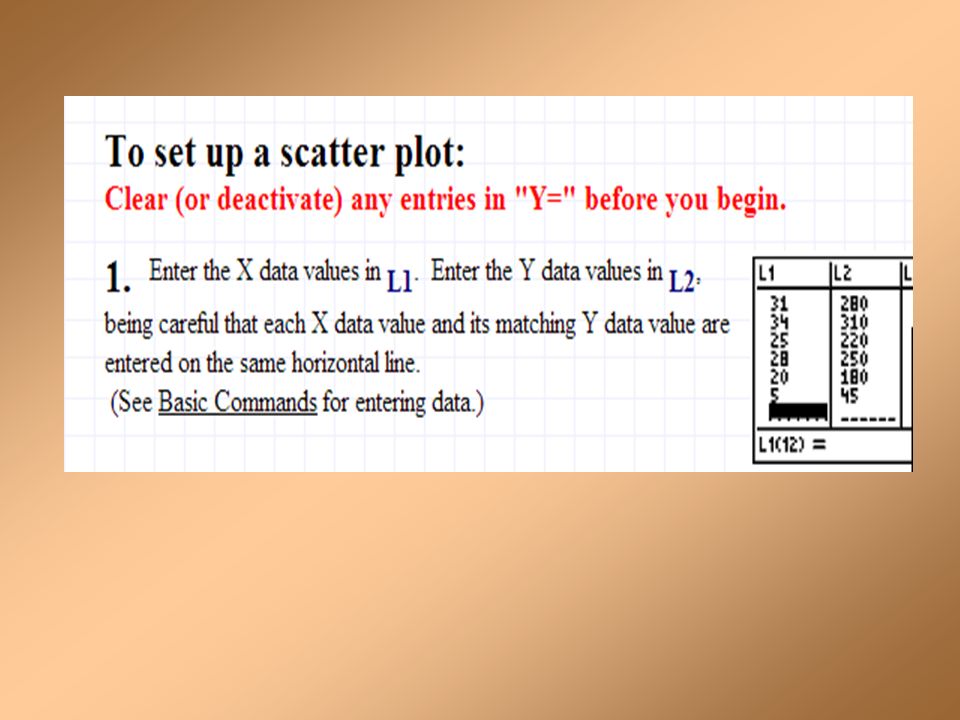
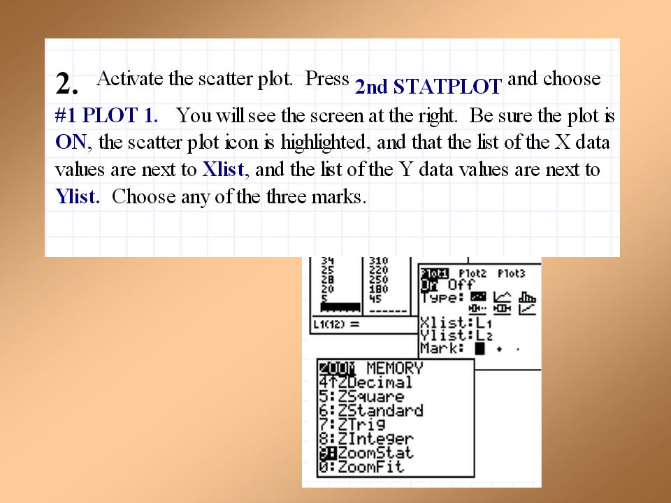
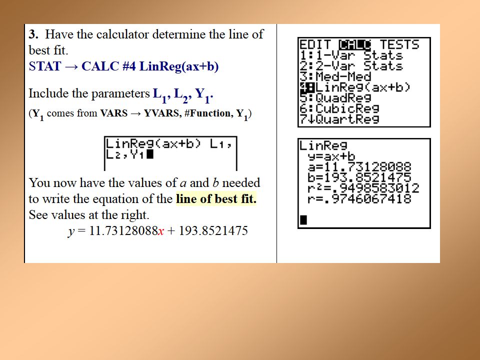
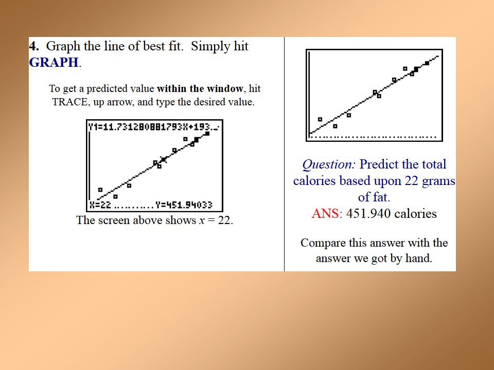
You can also use your graphing calculator to graph scatter plots and line of best fit!!!!!

25
Finding the line of best fit using a calculator

29
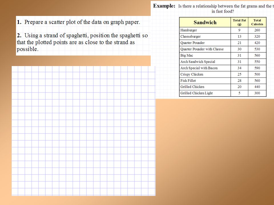
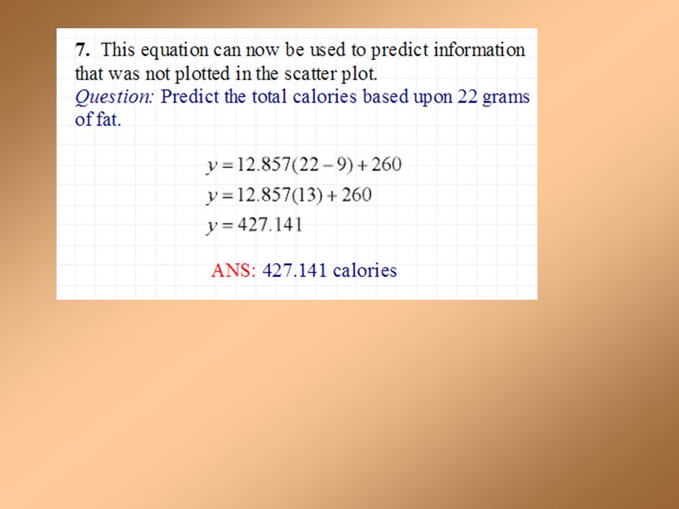
Example

Similar presentations


 does a scatterplot show? A graph that can show trends of information. Made with ordered.>")
 Think of how old you are in months, and your shoe size. 2.) Plot on.>")
: Scatter Plots Standards: SDP 1.0 and 1.2 Objective: Determine the correlation of a scatter plot.>")


 and shoe size (y-axis) on the graph. Add your coordinate point to the.>")
