Download presentation
Presentation is loading. Please wait.

1
Heather Mathieson Megan McKeever

3
1. Register / Log In is not visually prominent 2. Presentation lacks visual control 3. Scrolling list is difficult to read and dynamic pop-out box is distracting 4. Overwhelming / repetitive video content

5
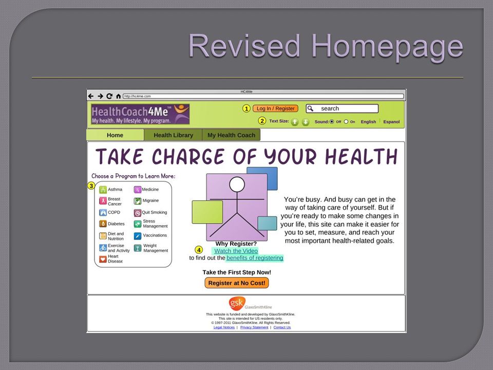
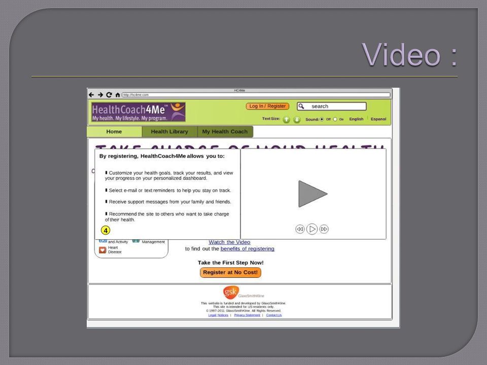
1. Register/Log in converted to a colored button to draw attention and ease access 2. Added buttons to allow users to adjust text size and turn sound on or off for users with visual impairment. Users can also view the site in Spanish or English with the language toggle. 3. Made option list static so users can focus on the choices offered and select an option 4. Reduced videos to one pop-out to draw attention to importance

8
1. Currently, when you click on ‘Register now’ in the upper right hand corner of the page, you are taken directly to a registration form. 2. There is too much text above the form, which could drive users away. 3. The form continues below the fold.

9
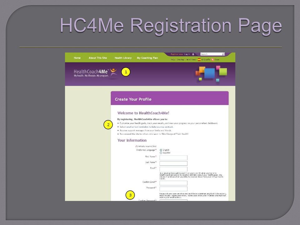
1. Similar, to Amazon, this page will greet you before you get to the lengthy registration form. Users can either sign in, or click to indicate they are a new user and will be taken to the registration form.

11
2. Extraneous text is removed. This list of benefits was moved to a pop-out from the home page. 3. Form is now split into two columns and there is no information below the fold. Items are also grouped for easier reading. * Orange buttons are consistently used to help users recognize log in and registration options.

13
1. No user control of presentation. Boxes are static and cannot be moved. 2. All information is not visible. Daily Questions dominate the page and the user’s personal goals are below the fold; users most scroll to find content.

15
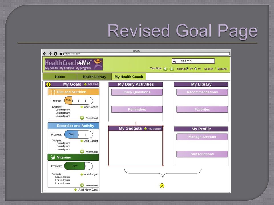
1. Similar to iGoogle, users can move around boxes, add gadgets, and reorganize their goal page. 2. All information is visible in a quick glance and users can click on each box/task for more information. * Users can also select more than two goals. (HC4Me currently allows users to work on no more than two goals.)
.")
16
When a user clicks on ‘add a goal’ they are taken to a ‘get started’ page: This page is just an extra click for users. It should be removed and users should be taken directly to the ‘select a goal’ page.

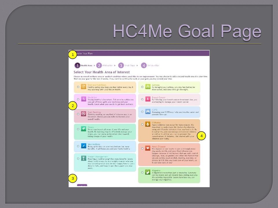
18
1. Additional steps notated by numbers are confusing. They may also drive users away, as it looks like there is much more work before they get their plan. 2. Users can currently only select one condition at a time. 3. The ‘next’ button is cut off by the fold. 4. There is too much text with each option. Users interested in improving those areas of health will not need a conditional definition.

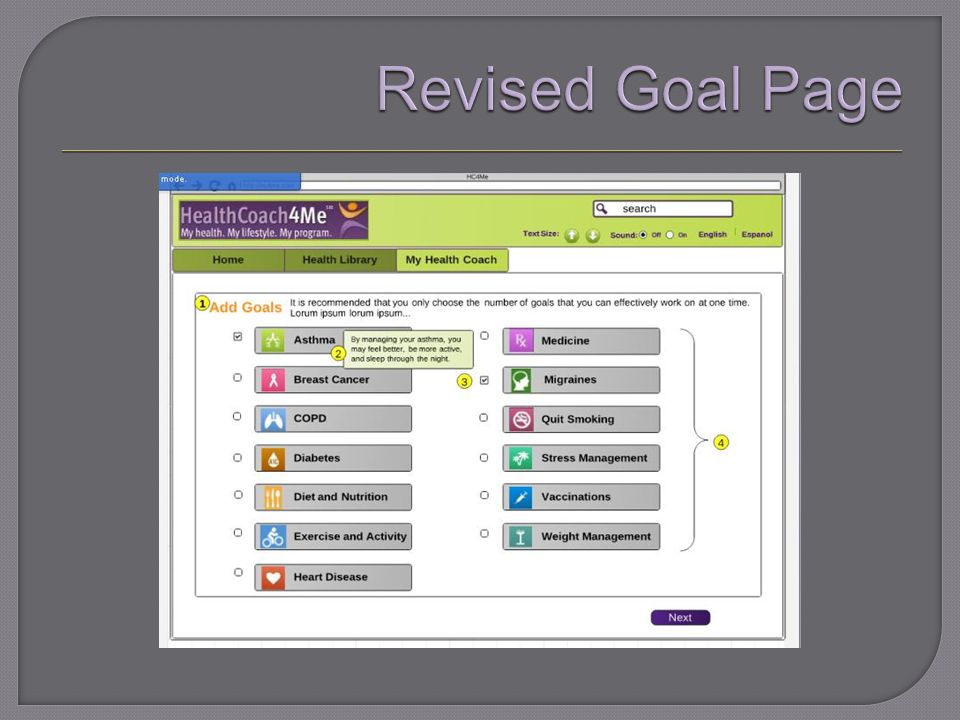
20
1. Simple instructions and minimal text to keep users interested. 2. Descriptions were removed from goal options to increase simplicity. Rollovers assist users with deciding which topic is of interest 3. Users can check more than one interest at a time. 4. All information now fits above the fold

22
1. List of items is hard to look through and information is not clearly sorted by tabs – HealthCoach items are mixed in 2. Within tabs, links are not identified as PDFs or tools.

24
1. Items are sorted alphabetically for ease of finding. 2. Information architecture work should be done to organize wealth of resources into categories. 3. Tools and PDFs are now clearly defined using buttons and links to differentiate. 4. “Add Favorites” buttons will allow users to store things for later retrieval; shows up in MyHealthCoach dashboard 5. Users are pointed to My Health Coach for “gadget” activities. Link goes to program-related page.

Similar presentations


. Assignments 1 Assignments are a refreshingly simple method for collecting student work. They are a simple and flexible.>")

