Download presentation
Presentation is loading. Please wait.

2
a few presentation “rules”

3
WHY TALK ABOUT “RULES?” 1.the “rules” aren’t so much rules as they are conventions—aspects people are used to and comfortable with 2.you have to know the rules to be able to break them 3.you have to know your audience to know whether or not it’s appropriate for you to break the rules

4
RULESET #1 do not copy and paste entire paragraphs into your slideshow; rather, whittle your arguments down to a few key points per slide include no more than three or four bullet points per slide use short—but descriptive!—phrases in your bullet points

5
RULESET #2 make sure each slide has a clear, descriptive heading use a large, readable font face and size for your headings, for instance, this slideshow is set up to use Arial 50 pt use a medium, readable font face and size for your bullet text, for instance, this slideshow is set up to use Arial 24 pt

6
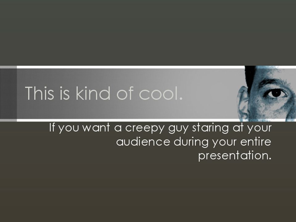
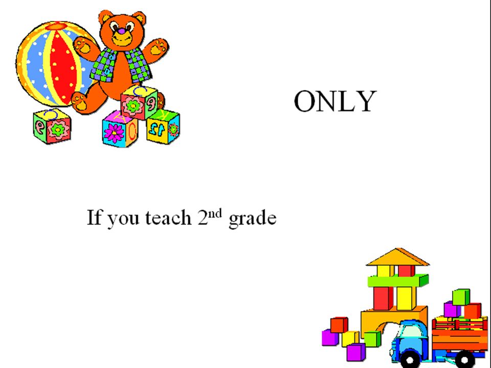
RULESET #3 adopt an overall design scheme that lends visual consistency to your slideshow avoid garish, distracting backgrounds (just because PowerPoint lets you use them doesn’t mean you should) make sure your visual content—photos, icons, clipart, etc.—complements the purpose and focus of your presentation think deeply about how your audience will respond to the visual elements of your presentation
 make sure your visual content—photos, icons, clipart, etc.—complements the purpose and focus of your presentation think deeply about how your audience will respond to the visual elements of your presentation")
7
RULESET #4 read and review and proof and proof and edit and polish and proof make sure there are no spelling errors, grammar errors, or typos in your slideshow--NONE. You’ll notice them as you present, you’ll get embarrassed, and you’ll wish you’d been more thorough.

8
RULESET #5 test your presentation! Don’t waste time and make yourself look like an idiot. –if you created it on a Mac using PowerPoint 2003, test it on a PC –if you created it on a PC using PowerPoint 2007, test it on PowerPoint 2000 and 2003

9
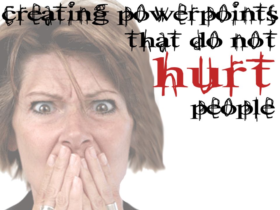
slideshows that hurt people And here they are…

17
COURIER DOWN IN FLAMES! February 1, 2004 U.S. State Department bans Courier New replaces font face with Times New Roman 14

26
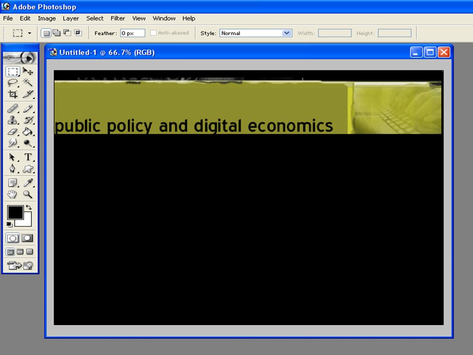
Creating Custom Design Schemes View Master Slide Master –Slide Master view allows you to choose your font faces, font color, and background color, and embed images –adjusting the Slide Master affects your entire PowerPoint presentation –REMEMBER: font faces don’t follow you from machine to machine (stick with system fonts or create title images in Photoshop and embed them in PowerPoint

27
Creating Your Own Slideshow Templates will generally require you to use additional applications beyond Microsoft PowerPoint

30
Slideshow Basics > Lessons Learned PowerPoint and other applications are incredibly powerful ways of visually and textually and orally presenting information A bad PowerPoint is worse than having no visual aid for a presentation but only if used well PowerPoint is a way of adding visual rhetoric to your presentation, but should not “harm” your audience

31
Your presentations While you will be presenting as if the material in your presentation--your rhetorical analysis--is what’s important, I will actually be grading you on the presentation itself note that you will only have approximately 5-7 minutes for your presentation, so plan your time carefully—practice and prepare Please have your presentation uploaded to the wiki (if smaller than 10mb) or saved to a thumb drive to save time.
 or saved to a thumb drive to save time.")
32
what I’m looking for Background - unique, visually rhetorical/purposeful Font choices - simple, appropriate Colors - rhetorically meaningful, appropriate CRAP principles - slides show evidence Text - appropriate amount per page Content - outlined well, organized well Visuals - enhance meaning, rhetorically purposeful Sound and motion - meaningful, not annoying Image transitions - meaningful, well done Screen captures - appropriate, helpful

33
And… Speaking - clear, audible Timing - well-practiced, rehearsed, including slides Audience - keeps audience engaged, interested Q & A - at end, time for questions about either rhetorical analysis or presentation

34
how to fail your presentation come to class unprepared—if you haven’t carefully prepared, if you present for 2 minutes or if you present for 20 minutes, and/or if it’s clear that you haven’t thought much about your presentation, you will lose points be rude to other presenters—if I see IM windows open,you are working on something, or if you’re typing away while someone else presents, you will lose points on your presentation

Similar presentations