Download presentation
Presentation is loading. Please wait.

1
Warm-UpJan. 27 Is this data quantitative or categorical?

2
Different Types of Graphs Doris Spencer Tables, charts and graphs are convenient ways to clearly show your data.

3
Purpose of Graphs To analyze data it is easier to use graphs and numerical summaries. They are the best tools for describing patterns in the data, as well as any deviations from those patterns.

4
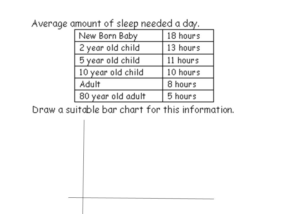
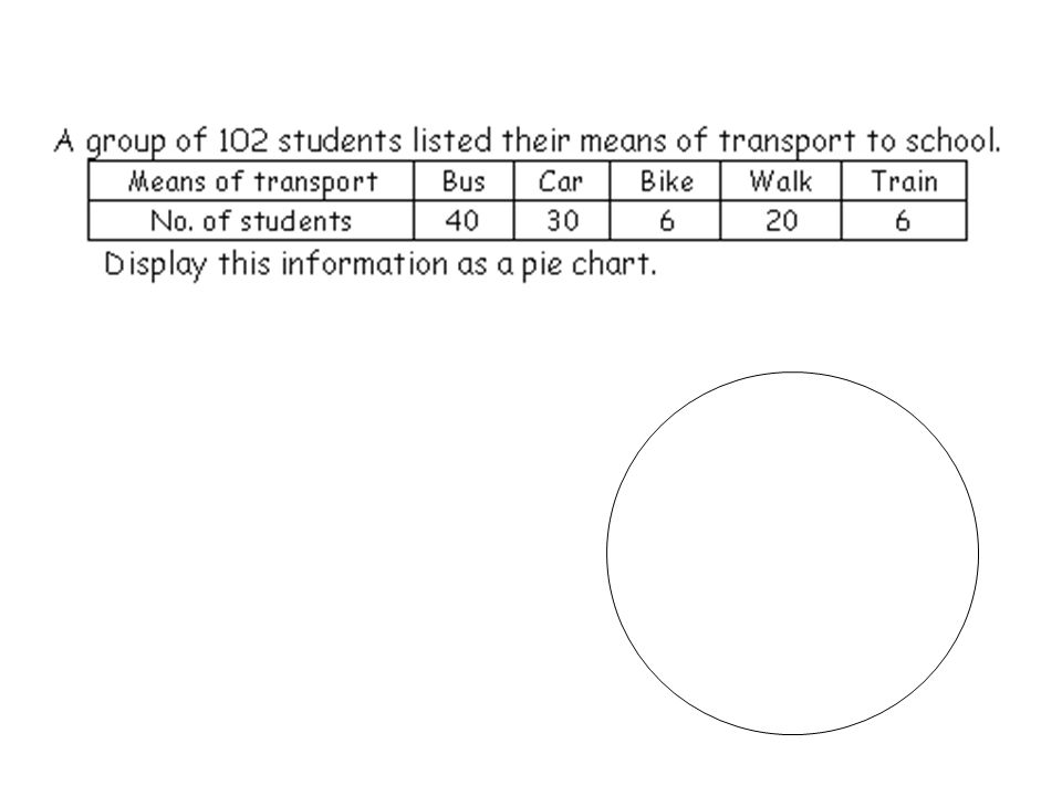
The cafeteria wanted to collect data on how much milk was sold in 1 week. The table below shows the results. We are going to take this data and display it in 3 different types of graphs.

5
Circle (or Pie) Graph There are three basic graph forms. Notice how each of the following examples are used to illustrate the data. Choose the best graph form to express your results. Bar Graph Line Graph

6
Bar Graph A bar graph is used to show relationships between groups. The two items being compared do not need to affect each other. It's a fast way to show big differences. Notice how easy it is to read a bar graph.

7
Circle Graph or Pie Graph A circle graph is used to show how a part of something relates to the whole. This kind of graph is needed to show percentages effectively. 21% 28% 41% 13% 27%

8
Bar Graph Line Graph Circle (Pie) Graph The same data displayed in 3 different types of graphs.
 Graph The same data displayed in 3 different types of graphs.")
9
On what day did they sell the most chocolate milk?

10
On what day was the least amount of chocolate milk sold? If there are 1150 students in the school how many students bought chocolate milk on Wednesday? 21% 28% 41% 13% 27%

11
Choosing the Right Graph Use a bar graph if you are not looking for trends (or patterns) over time; and the items (or categories) are not parts of a whole. Use a pie chart if you need to compare different parts of a whole, there is no time involved and there are not too many items (or categories). Use a line graph if you need to see how a quantity has changed over time. Line graphs enable us to find trends (or patterns) over time.
. Use a line graph if you need to see how a quantity has changed over time. Line graphs enable us to find trends (or patterns) over time..")
14
Step 1: To get data you have to first poll and ask a question of interest. Our question of interest is going to be do you have tattoos? ( yes or no responses ) This can best be graphed in a pie chart. YesNo
 This can best be graphed in a pie chart. YesNo.")
15
Our next question is going to be who has tattoos? This type of data can be graphed in a bar graph. MalesFemales

16
Out of the data we collected, which ones can be represented by a pie chart, or bar graph? Do you plan on attending college? How old are you? Do you have a job? Where do you work? How tall are you? What is your favorite color? What is your favorite place to shop? What is your favorite food?

19
Homework Worksheet

Similar presentations


 Variable: Any characteristic.>")
>")


