Download presentation
Presentation is loading. Please wait.

1
Represent sets of data using different visual displays.

2
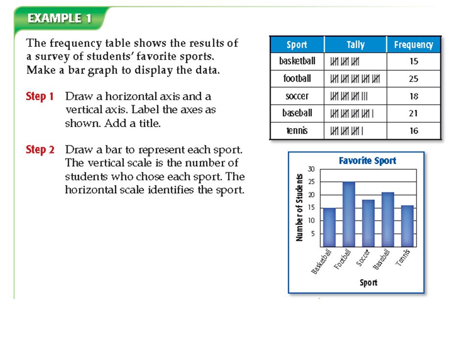
In a frequency table tally marks record and display the frequency of events. A bar graph compares categories of data with bars representing the frequency. A histogram is a type of bar graph used to display numerical data that have been organized into equal intervals. A line graph usually shows how data change over a period of time.

4
A histogram is a type of bar graph used to display numerical data that have been organized into equal intervals.

6
A line graph usually shows how data change over a period of time.

8
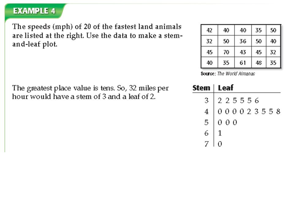
In a stem and-leaf plot, the greatest common place value is used for the stems. The numbers in the next greatest place value are used to form the leaves.

10
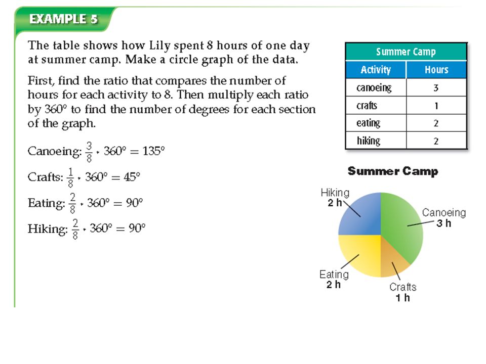
A circle graph is a graph that shows the relationship between parts of the data and the whole. The circle represents all of the data.

12
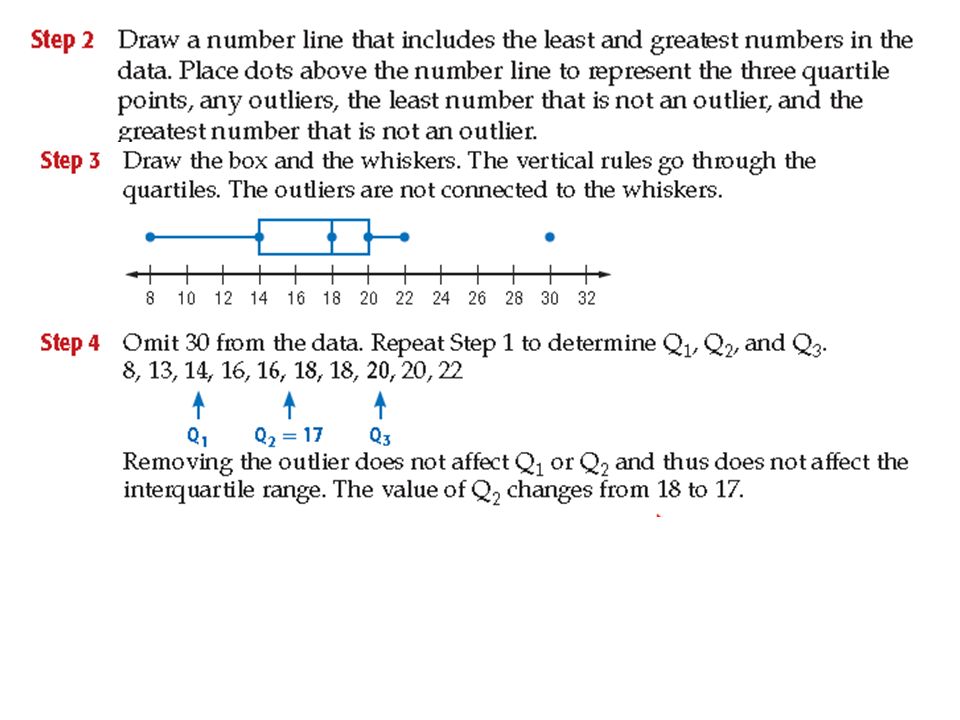
The box in a box-and whisker plot represents the interquartile range. The interquartile range is the difference between the upper and lower quartiles. Data that are more than 1.5 times the value of the interquartile range beyond the quartiles are called outliers.

Similar presentations


 Lower Extreme Lower Quartile Median Upper Quartile Upper Extreme Back.>")


2, 3, 3, 3,>")