Download presentation
Presentation is loading. Please wait.

1
Representing Data EQ: How do you determine the best way to represent a set of data?

2
Frequency Tables A frequency table shows how often something occurs A frequency table shows the category, tally, and frequency of items The best time to use a frequency table is to keep track and organize data

3
Frequency Tables Trip LocationTallyFrequency San Diego///3 Chicago//// //// /11 Boston//// //7 Denver////5

4
Bar Graphs A bar graph compares amounts A bar graph is best used to compare data A multiple bar graph also includes a key

5
Bar Graphs Single Bar Graph Multiple Bar Graph

6
Pictograph Uses pictures to represent numbers Has a key that tells the value of each picture The best time to use this graph is to compare data It is also very eye-catching and is often used in newspapers and magazines

7
Pictograph

8
Histogram A histogram is a special bar graph that shows how ranges of data change or how they differ There are no spaces between the bars A histogram is used to compare data

9
Histogram

10
Line Plots A line plot is a graph that shows frequency of data along a number line. In creating a line plot, you should include your entire range of numbers.

11
Line Plots It is best to use a line plot when you want to quickly analyze your data. Line plots allow you to easily identify your outliers- numbers that are significantly smaller or larger than the other values.

12
Line Plot Number of Pets in Each Household The numbers along the x axis represent the number of pets, the x’s represent the households with those number of pets

13
Line Plot

14
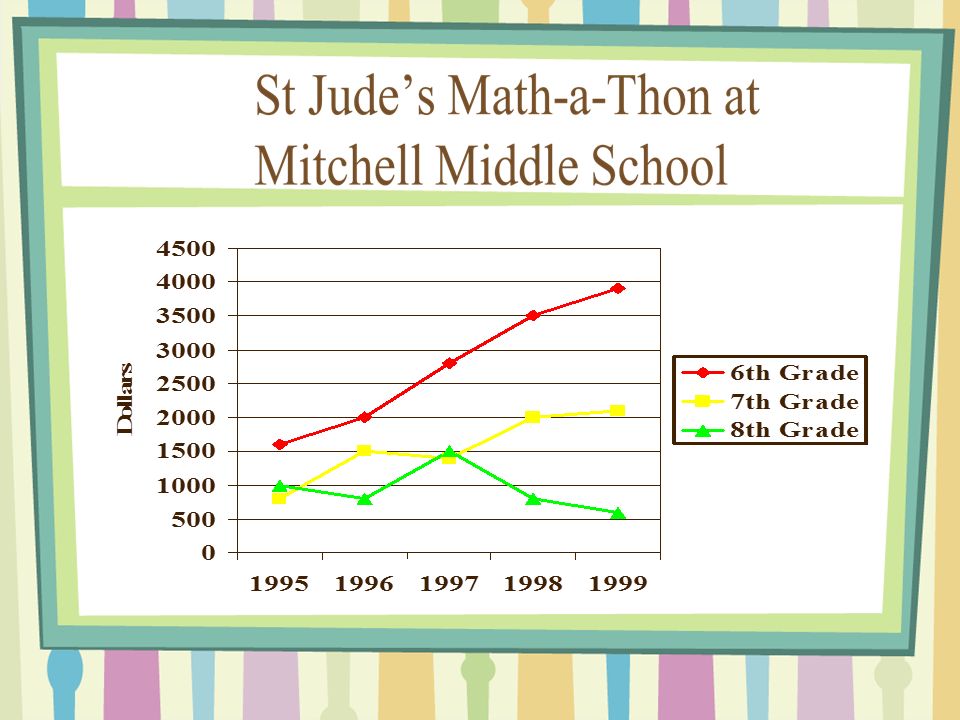
Line Graph A line graph shows how something has changed over time. By looking at the line graph you can determine if the data is increasing, decreasing, or staying the same over time. Line graphs help predict the outcome of an event.

15
Parts of a Line Graph Title of the graph, The x and y axes, labels of axes, and the equal intervals along the axes, and the representation of the data as points connected by a line.

16
Line Graph

18
Use the data in the table to create a line graph.

19
Circle Graph A circle graph shows the relationship between parts to a whole A circle graph is interpreted by comparing the “pieces of the pie” to one another Circle graphs are best used when comparing percentages The whole circle must total 100%

20
Circle Graphs

Similar presentations


. Day….. 1.Misleading GraphsMisleading Graphs 2.Frequency Tables and Tally ChartsFrequency Tables and Tally Charts.>")


 Label it. When would you use a line.>")


