Download presentation
Presentation is loading. Please wait.

1
Graphs

2
V. Data Analysis A. Range 1. Total value your data covers from lowest to highest 2. Range = highest value – lowest value ex. Data is 2 5 7 14 19 Range = 19 – 2 = 17

3
B. Average 1. The mean of all the data values collected 2. Avg = total of values # of values added ex: Data is 2 5 7 14 19 Avg = 2 + 5 + 7 + 14 + 19 = 47 = 9.4 5

4
VI. Graphs A. Visual way to organize and analyze data B. Types of graphs: 1.Line 2.Bar 3.Pie

5
C. Line graph 1. Used when one variable causes a second variable to increase or decrease in value 2. Often show changes over time

6
D. Bar graph 1. Compares categories of information 2. Good for surveys

7
E. Pie graphs 1. Compares categories of information usually written in percent 2. Slices must add up to 100%

8
Practice: Name these graph types

9
4.Which type of graph and why? Dog Breed% of dog owners who own this breed of dog Golden Retrievers30% German Shepherd20% Beagle20% Poodle20% Rottweiler10% Pie Graph Percent with total adding up to 100%

10
5. Which type of graph and why? Bar graph Comparison survey First Name# of Letters Jasmine7 Alejandra9 Kenji5 Lola4 Jordan6

11
F. Variables 2. Dependent variable – variable influenced by independent variable a. Always on y-axis (vertical line) b. No one controls 1.Independent variable – variable that might influence another variable a. scientist changes b. always on x-axis (horizontal line)
 b. No one controls 1.Independent variable – variable that might influence another variable a. scientist changes b. always on x-axis (horizontal line).")
12
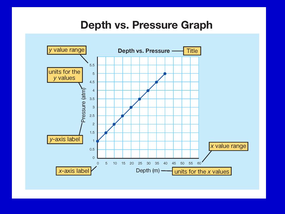
G. Making a line graph 1. Choose variables for your x and y-axis a. x variable causes change in y variable b. Label your axes with titles, numbers, and units 2. Make a scale a. Scale = range # of boxes = # data units per graphbox 3. Plot your data 4. Create a descriptive title putting the y variable first

14
Practice A student counted the total number of leaves in a group of duckweed plants over a 5 day period. Copy this data into your notes. DaysNumber of Leaves 015 120 225 340 460 580

15
1. What is the independent variable? 2. Which axis does it go on? 3. What is its range? 4. On a 10 x 10 box grid, what is its scale? 5. Number and label your axis. 0 1 2 3 4 5 6 7 8 Days

16
6. What is the dependent variable? 7. Which axis does it go on? 8. What is its range? 9. On a 10 x 10 box grid, what is its scale? 10. Number and label your axis. 100 90 80 70 60 50 40 30 20 10 0 Number of Leaves

17
11. Now plot your data points and draw a straight line through them. 12. Write a descriptive title for this graph. 13. When would the plants have 35 leaves? 14. How many leaves would the plants have after 7 days?

18
H. 3 Types of Graphing Relationships

19
1.Direct Relationship a. When one variable increases, the other increases. b. If one variable decreases, so does the other one. c. or draw this as example

20
2. Inverse Relationship a. When one variable increases, the other decreases b. draw this as example

21
3. No Relationship a. Data points are scattered all over draw this as example

22
DirectInverse

Similar presentations

>")

 Represents the passage of time and the numerical value of behavior. The Independent.>")


 The Independent Variable. A change in this variable affects the y variable. >")


? Do Now: Copy the following: Line Graph - A graph that is used to display data that shows how one variable.>")


