Download presentation
Presentation is loading. Please wait.

1
PRINCIPLES OF DESIGN

2
Principles of Design The Principles are concepts used to organize or arrange the structural elements of design. The way in which these principles are applied affects the expressive content, or the message of the work. The principles are: Balance Proportion Rhythm Emphasis Unity

3
Balance is the concept of visual equilibrium and relates to our physical sense of balance. Most successful compositions achieve balance in one of two ways: symmetrically or asymmetrically. Balance in a three dimensional object is easy to understand but to understand balance in a two dimensional composition, we must use our imaginations to carry this three dimensional analogy forward to the flat surface.

4
Types of Balance Symmetrical balance can be described as having equal "weight" on equal sides of a centrally placed fulcrum. It may also be referred to as formal balance. When the elements are arranged equally on either side of a central axis, the result is Bilateral symmetry. This axis may be horizontal or vertical.

5
Symmetry The word symmetry comes from the Greek roots syn, meaning with or together, and metron, meaning measure. Symmetrical balance is also called formal balance because a form (formula) is used -- a mirror image about a vertical axis. The results look formal, organized and orderly. This type of image has great appeal -- it makes for "good" shape relationship.
 is used -- a mirror image about a vertical axis. The results look formal, organized and orderly. This type of image has great appeal -- it makes for good shape relationship.")
6
Balancing the components of a painting can best be illustrated by weighing scales or a child's playground see-saw. In using this scale or see-saw, balance is not achieved through an actual physical weighing process, but through visual judgment on the part of the observer. In this respect, visual balance refers to a "felt" optical equilibrium between all parts of the painting. Horizontal Symmetry: When components are balanced left and right of a central axis they are balanced horizontally.

7
Vertical Symmetry: When they are balanced above and below they are said to be balanced vertically.

8
Radial Symmetry It is also possible to build formal balance by arranging elements equally around a central point , resulting in radial symmetry. So, when components are distributed around the center point, or spring out from a central line, this is referred to as radial balance.

9
Approximate Symmetry There is a variant of symmetrical balance called approximate symmetry in which equivalent but not identical forms are arranged around the fulcrum line.

10
Inverted Symmetry Inverted symmetry uses symmetry with one half inverted like a playing cards. This is an interesting variation on symmetry but can make for an awkward balance.

11
Biaxial Symmetry A symmetrical composition can have more than one axis of symmetry. Biaxial symmetry uses two axes of symmetry -- vertical and horizontal. These guarantee balance: top and bottom as well as left and right. The top and bottom can be the same as the left and right, or they can be different. The most regular and repetitive image occurs when they are the same

12
Asymmetrical Balance Asymmetrical balance, also called informal balance, is more complex and difficult to understand. It involves placement of objects in a way that will allow objects of varying visual weight to balance one another around a fulcrum point. For example, it is possible to balance a heavy weight with a cluster of lighter weights on equal sides of a fulcrum.

13
By Color Small areas of vibrant color can be used to balance larger areas of more neutral colors. The vivid red skirt on the left is balanced by the larger neutral pink dress. By Value Value refers to the darkness or lightness of objects. Black against white has a much stronger contrast than gray against white. To balance these two colors, you would need a larger area of gray to balance the stronger value of black.

14
Proportion Proportion refers to the relative size and scale of the various elements in a design. The issue is the relationship between objects or parts of a whole.

15
When the principle of proportion is applied to a work of art it is usually in the relationship of size. That is, the size of one element of the composition as compared to the size of another related element. In the instance of a relationship of size a comparison is made between the: height, width and depth of one element to that of another size of one area to the size of another area size of one element to the size of another element amount of space between two or more elements

16
In the two paintings above proportion emphasizes the distance of the ship and the vastness of the ball room.

17
Rhythm Movement is the path our eyes follow when we look at a work of art. The purpose of movement is to create unity in the artwork with eye travel. This can be achieved by using repetition, rhythm, and action. Movement ties the work together by relating the various components of a work. How Rhythm cab be created in a design? By arranging the composition elements in a certain way, an artist controls and forces the movement of the viewer's eyes in and around the composition with the painting. For example, the eye will travel along an actual path such as solid or dotted line, or it will move along more subtle paths such as from large elements to little elements, from dark elements to lighter elements, from color to non color, from unusual shapes to usual shapes, etc. Graduation of size, and repeated shapes and size of related elements subtly leads the eye as well.

18
Rhythm by action Rhythm by repetition of colour

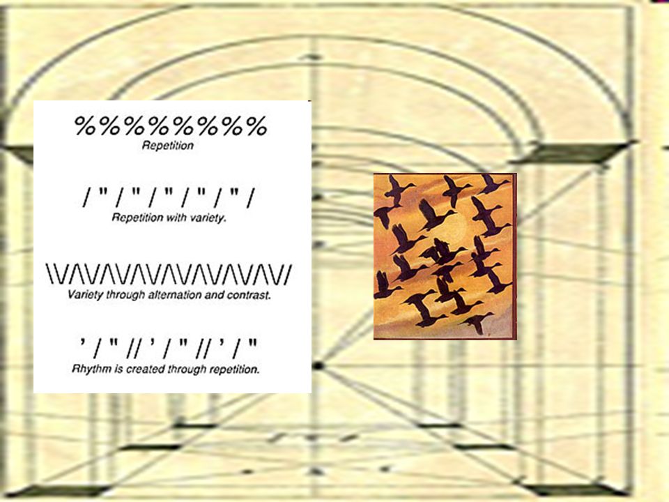
19
Ways to create rhythm in a Design
Rhythm is the result of repetition which leads the eye from one area to another. It can be produced by continuous repetition, by periodic repetition, or by regular alternation of one of more forms or lines. A single form may be slightly changed with each repetition or be repeated with periodic changes in size, color, texture, or value. A line may regularly vary in length, weight, or direction. Color may also be repeated in various parts of the composition in order to unify the various areas of the painting.

21
Emphasis is the stressing of a particular area of focus rather than the presentation of a maze of details of equal importance. When a composition has no emphasis nothing stands out.

22
Emphasis by changing shape
Emphasis by using neutral colour as a background Emphasis by using contrast

23
HARMONY OR UNITY Unity is the hallmark of a good design. It's the final result in a composition when all the design elements work harmoniously together giving the viewer a satisfying sense of belonging and relationship.

Similar presentations


 Scale (proportion) Focal area/ focal point/ focus/ emphasis.>")


>")

