Download presentation
Presentation is loading. Please wait.

2
Graphing Basics

3
Graphs are used to organize and analyze collected data. There are four types of graphs that are typically used in science: Data Table = used to organize collected data for easier analysis Line graph = used to show any change of data collected over time Bar graph = used to compare different variables in an experiment Pie or Circle graph = used to compare percentages

4
A Data Table is used to store and organize information. The power of a Data Table comes from the relationships that exist in its various parts. For example, every row (referred to as a "case") contains information that is related. Every column (referred to as a "field") contains information of a certain defined type (number, text, or formula). Effect of Temperature on Plant Growth Temper ature (C) Plant Growth (cm) 1014.2 1515.7 2017.1 2518.9
 contains information that is related. Every column (referred to as a field ) contains information of a certain defined type (number, text, or formula). Effect of Temperature on Plant Growth Temper ature (C) Plant Growth (cm)")
5
Students conducted an experiment testing the time it takes food coloring to mix with water. The results of the experiment are summarized in the table below. What is this data telling you? What is this data telling you? Data Tables

6
Bar Graphs A bar graph is a chart with rectangular bars of lengths usually relative to the amount of what they represent. Bar graphs are used for comparing two or more things. The bars can be horizontally or vertically oriented. What are the mistakes?

7
Bar graphs. What does the graph below tell you? What are the mistakes?

8
Line graphs Line graphs show change over a given amount of time. The Responding(also called dependant) variable is plotted on the “Y” axis (side). The time is always graphed on the “X’ Axis (bottom). The Manipulated(also called independant) variables are the lines on the graph.
 variable is plotted on the Y axis (side). The time is always graphed on the X’ Axis (bottom). The Manipulated(also called independant) variables are the lines on the graph..")
9
Line Graphs A line graph is uses the same principles as the coordinates grid in math. Since in science we usually use positive we only use the 1 st quadrant of the grid.

12
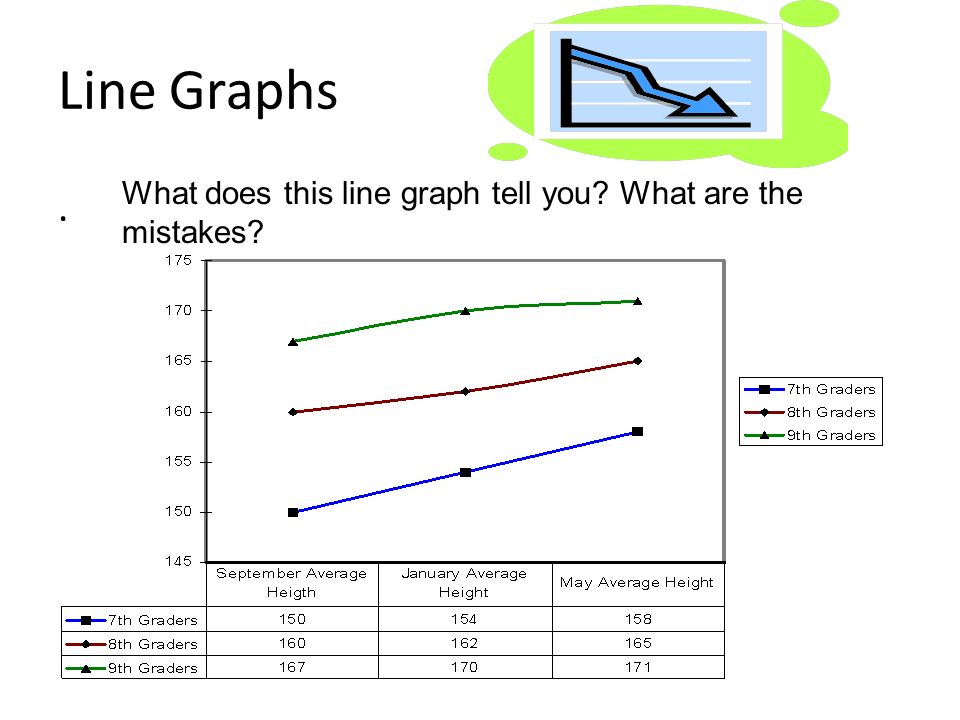
Line Graphs. What does this line graph tell you? What are the mistakes?

13
Water is placed over a burner and it boils. The graph above shows the temperature at each 2-minute interval. The experiment ended at 20 minutes. Using the graph above answer the following question. If the water were left to boil for 10 minutes more, how hot would it get? What are the mistakes on the graph?

14
Circle Graphs compare percentages of a given topic or group. Circle graphs can only be used when all data for a given group is available and none of the data is shared between members of that group. Example: You could not make a circle graph to represent what sport T.H. Bell students play because so many play more than one sport.

15
One circle graph represents 100 pieces or percentages. Each group is labeled according to how many of those pieces it makes up The size of the piece indicates what percentage of the whole a particular category makes up.

16
Pie or circle graphs. What does this line graph tell you?

Similar presentations


.>")

>")


 - parts of a whole: %>")


