Download presentation
Presentation is loading. Please wait.

1
Learning Targets: Review art element “value” Understand Color Theory and Mixing

2
Success criteria: I can… Explain uses for “value” Create a color wheel using color theory

3
Agenda 9/24/2015 Review “value and color” for tomorrow’s quiz Overview of next project: Islamic Geometric Design

4
ELEMENTS OF ART: Value and Color

5
Value refers to dark and light. Value contrast help us to see and understand a two-dimensional work of art. This type can be read because of the contrast of dark letters and light paper. Value contrast is also evident in colors, which enables us to read shapes in a painting. VALUE

6
A gray scale shows ten values of gray from light to dark. The farther apart the values are on the scale, the more value contrast can be noted. Values next to each other on the scale have the least contrast.

7
Jean Metzinger’s painting, “Tea Time”, has strong value contrasts. The painting is cubist in style with angular fractures and shapes. Line is used to create both geometric and curvilinear shapes. Follow the visual movement from the tea cup and hand at the bottom over a light-valued visual path upward to the face, which is the focal area.

8
Color and value are closely related. Some pure colors (yellow and orange) are light in value; other pure hues are dark in value (violet and blue). A black and white photo of a full color painting helps you see the values of the colors that an artist used.
 are light in value; other pure hues are dark in value (violet and blue). A black and white photo of a full color painting helps you see the values of the colors that an artist used..")
9
High key paintings are made mostly of light values and contain a minimum of value contrast. Light values often suggest happiness, light, joy, and airiness. Low key paintings make use of dark valued hues and generally contain little value contrast. Dark values often suggest sadness, depression, loneliness, and sometimes mystery.

10
Value Contrast is the difference between light and dark values. photographers use value contrasts to make black and white prints that are exciting and dramatic. Ansel Adamss

11
The focal area of a painting can be created by emphasizing dark and light value contrasts or intense color. This is true in realistic, abstract and nonobjective paintings.

12
Value Changes help us “feel” the roundness of a face or ball by showing us how light hits these forms and creates shadows on them.

13
COLOR Color depends on light because it is made of light. There must be light for us to see color. A red shirt will not look red in the dark, where there is no light. The whiter the light, the more true the colors will be. A yellow light on a full color painting will change the appearance of all the colors.

14
August Renoir (ren-’wahr) painted Fruits from the Midi to Emphasize the color and richness of the vegetables and fruit of Southern France.
 painted Fruits from the Midi to Emphasize the color and richness of the vegetables and fruit of Southern France.")
15
Cool green has warm reds and oranges in it to neutralize the background, making the purer colors glow and come forward. Blue and purple shadows (instead of gray and black) create a sense of form. Shadows are cool. Warm red shapes seem to come forward. White is an intense color (contains all colors) and comes forward in a painting Neutralized red shapes go back in space--------------------- Dark purple forms are used to develop strong value ------------ contrasts. Highlights on fruit are white. White is pure, light color.
 create a sense of form. Shadows are cool. Warm red shapes seem to come forward. White is an intense color (contains all colors) and comes forward in a painting Neutralized red shapes go back in space Dark purple forms are used to develop strong value contrasts. Highlights on fruit are white. White is pure, light color..")
16
Color is the most expressive element of art. We see white because of how light reflects off of surfaces.

17
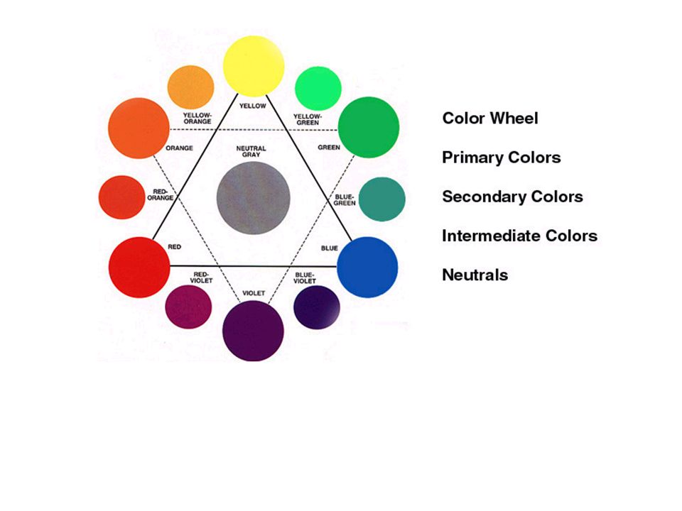
Add black to darken Pure color orange Add white to lighten Color value scale Gray value scale Value refers to the lightness or darkness of a hue. Pure colors have values of their own. Yellow is a light value; purple is dark. If white is added to a hue, a lighter value is achieved, and is called a tint. If black is added, the value is deeper and is called a shade.

Similar presentations

 VALUE: is the lightness or darkness of a color (maroon is a dark value.>")


