Download presentation
Presentation is loading. Please wait.

2
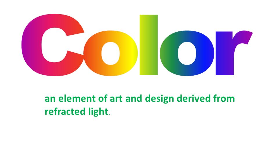
an element of art and design derived from refracted light.

3
HUE the name of a color in the color spectrum, such as red, blue, or yellow

4
VALUE the art element that describes the darkness or lightness of a color

5
Tints Tints are lightened color values. Always begin with white and add a bit of color to the white until the desired tint is obtained. This is an example of a value scale for the tints of blue.

6
Shades are darkened colors. Always begin with the color and add just a bit of black at a time to get the desired shade of a color. This is an example of a value scale for the shades of blue. Shades

7
INTENSITY the brightness or dullness of a hue High-intensity colors are pure and bright. Dull colors are low-intensity.

8
Color Wheel Color Values Color Schemes

9
The color wheel fits together like a puzzle - each color in a specific place. Being familiar with the color wheel not only helps you mix colors when painting, but in adding color to all your art creations.

10
Primary Colors Primary colors are not mixed from other elements and they generate all other colors. Red Yellow Blue

11
Secondary Colors By mixing two primary colors, a secondary color is created. Red + Yellow = Orange Yellow + Blue = Green Blue + Red = Purple

12
red-orange yellow-orange yellow-green Intermediate Colors An intermediate color is formed when a primary color is mixed with an adjacent secondary color - for instance, blue (a primary) is mixed with violet (a secondary) to produce blue-violet or blue is mixed with green for blue-green. Intermediate colors are sometimes called Tertiary colors blue-green blue-violet red-violet

13
Neutral Colors The principles of color mixing let us describe a variety of colors, but there are still many colors to explore. The neutral colors contain equal parts of each of the three primary colors. Black, white, gray and sometimes brown are considered "neutral”.

14
a systematic way of using the color wheel to put colors together… in your art work, putting together the clothes you wear, deciding what colors to paint your room, or creating a graphic design. monochromatic, complementary, analogous, warm and cool.

15
Monochromatic Color “Mono” means “one”, “chroma” means “color”… monochromatic color schemes have only one color and its values. The following slide shows a painting done in a monochromatic color scheme.

16
This painting has a monochromatic color scheme - blue and the values (tints and shades) of blue.
 of blue.")
17
Complementary Colors Complementary colors are opposite on the color wheel provided a high contrast - if you want to be noticed wear complementary colors!

18
This painting has complementary colors and their values - blues and oranges.

19
Analogous Colors The analogous color scheme is 3-5 colors adjacent to each other on the color wheel. This combination of colors provides very little contrast.

20
Analogous colors are illustrated here: yellows and oranges.

21
Warm Colors Warm colors are found on the color wheel. They are colors found in fire and the sun. Warm colors make objects look closer in a painting or drawing.

22
This is an illustration of the use of warm colors - reds, oranges and yellows.

23
Cool Colors Cool colors are found on the left side of the color wheel. They are the colors found in snow and ice and tend to recede in a composition.

24
Note the cool color scheme in this painting (greens, purples and blues).
.")
Similar presentations


 to the object (the apple),>")


. INTENSITY -brightness.>")


