Download presentation
Presentation is loading. Please wait.

1
The Seven Tools Of Quality Management
1 Flow charts 2 Check sheets 3 Scatter diagrams 4 Histograms 5 Pareto charts 6 Cause and effect diagrams (Fishbone/Ishikawa diagrams) 7 Control charts Note: There are seven new tools, to aid in senior management planning, in addition to the seven tools covered here.
 7 Control charts. Note: There are seven new tools, to aid in senior management planning, in addition to the seven tools covered here.")
2
Flow charts Uses: To document flow of a new or current process
To create common understanding of how a process works. To allow checking of sequence of activities To indicate problems To allow improvement of a process. To increase understanding of processes To identify linkages between processes. To assess compliance between actual and intended processes To identify gaps between procedures

3
Flow charts A flowchart is: How to use a flowchart:
A diagrammatic tool to show the sequential relationship between activities, or the path or paths a process follows. It can be used as an overview, with broad detail, or as a fine detail tool with precise and small steps in processes. How to use a flowchart: Read the chart from start to finish following all paths to their end. Read all notes and labels on the chart. Question each step in the process as required.

4
Flow charts Steps in Creating a flowchart
1 Determine who should be involved in drawing up the flowchart. 2. Involve all team members. 3 Allow time to create and check the chart. 4. Before drawing the chart, decide on the detail required 5. Have questions prepared to help draw the chart. 6 Identify the start and end-points, each decision point, each process, then join points together. You may wish to tape interviews with participants for future reference.

5
Flow charts Symbols used in a flowchart
Start End Decision point. Process Flow, the Question must direction of have a Yes or movement no answer.

7
Check sheets Uses To gather data
To provide clear record of data gathered To ensure that everyone will gather comparable data To provide data in a suitable form for further analysis To highlight if a problem exists A check sheet is: A form used to record how many times something has occurred. It is usually used by those involved in collecting raw data.

8
Check sheets How to use a check sheet:
Obtain the correct sheet for the purpose. Position yourself to clearly see what is going on. Conduct the observation at the required intervals. Place lines or strokes of a pen into appropriate box, groups of five make it easy to count the strokes Analyse the count of categories.

9
Check sheets Steps in creating a check sheet
1. Decide what data you need 2. Design a form to suit the people using it and the type of data to be collected 3. Test the check sheet, using someone not involved with designing the sheet 4. Revise the sheet as necessary 5. Design a tally check sheet to summarise the data from individual forms (if necessary)
")
10
Check sheets Tenant Times Late Jones 2 Smith 3 Malcolm 5 Henare
Hashimoto Peterson 3 Mene Gerbic 8

11
Check sheets 35 30 25 20 Number of 10.00 cm bars 15 10 5
Machine setting (cm) Number of cm bars
 Number of cm bars.")
12
Check sheets Defects in a laminated printed circuit board
DDDDD DDD S S DDDDD DDD S S WW SSS S WW LLLLL LL Defects in a laminated printed circuit board Key: L = lamination problem, W = wrong component, D = defective component, S = soldering problem

14
Scatter diagrams Uses To show relationships
To show strength of relationship

16
Scatter diagrams Is a graph which shows relationship between two variables. A graph without lines joining the dots. A graph that shows possible cause and effect relationships (regression)
")
17
Scatter diagrams How to use scatter diagrams: View the diagram for
shape trends (positive upwards, negative downwards) closeness of points to a line
 closeness of points to a line.")
18
Scatter diagrams Steps in creating a scatter diagram
Identify possible related variables Collect data Create scales for axes Plot the points Interpret the graph

19
Scatter diagrams

20
Histograms Uses To display statistical information.
To show frequency of occurrence, To see concentrations of values To sort data sets To see gaps or outliers in the data set. To see the shape of the data set, symmetry or skewing etc. To allow problem identification

21
Histograms A member of the Bar graph family. In quality management, histograms are used to plot discrete and continuous data. These graphs show frequency of occurrence of the group of data by the height or length of a rectangle, which represents a group or category of data. Created by people collecting and analysing data, and read by people who require to understand the relationships between data groups.

22
Histograms How to use Histogram:
View the diagram for uniformity of shape, asking these questions: are there one or more peaks? is the graph “normal’ in shape? is the data clumped together? is there a positive, negative or no skew? are there any unusual features? Calculate the spread, Note any outliers (values distant from the main group of values)
")
23
Histograms Steps in creating a Histogram Collect your data
Determine the range of the data Determine how many groups you need Group the data Construct the axes Draw the bars Label the graph

24
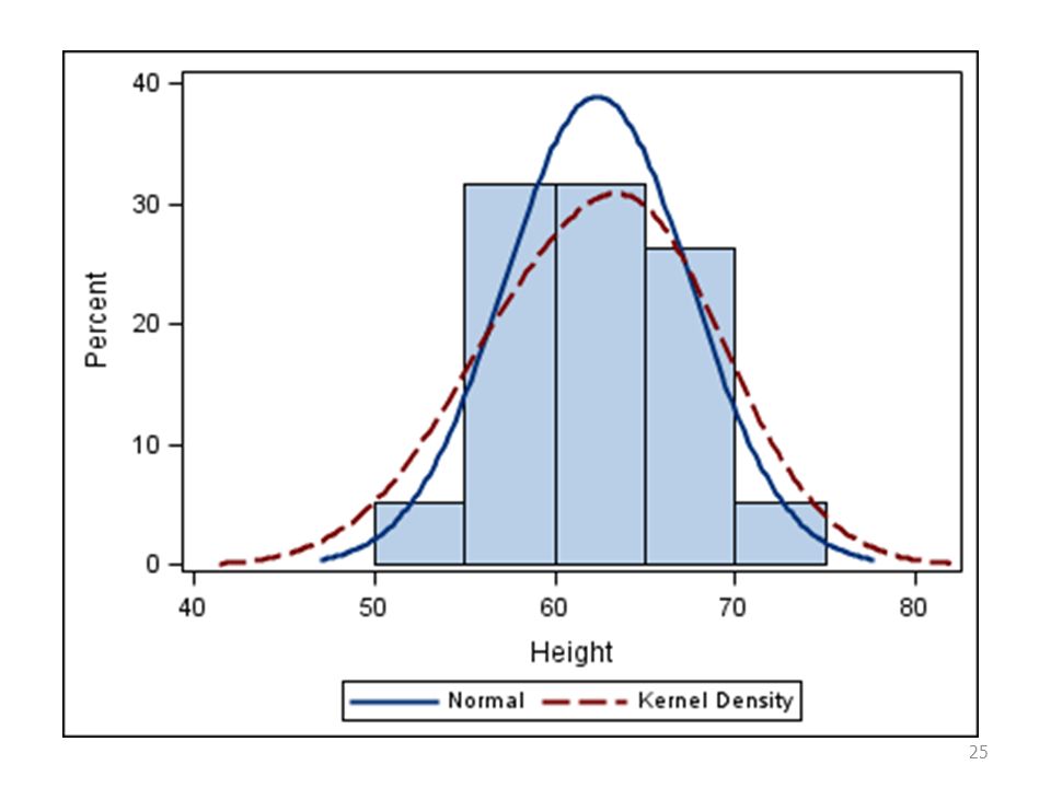
Histograms

26
Pareto charts Uses: Identifying the one or two situation categories in which most of a problem occurs. To focus attention on the major contributing factors. To show progress in quality improvement projects.

27
Pareto charts A Pareto diagram is:
A method of classifying importance or order of magnitude. It is a technique used to indicate the relative importance of occurrences. It can be regarded as an ordered or sorted Histogram. Managers at any level would read the diagram; people collecting data and performing the data analysis would prepare it.

28
Pareto charts How to use a Pareto diagram:
A Pareto diagram is a guide to action. It prioritises tasks or problems for you. View the diagram for shape, asking these questions: is there one dominant category? is the diagram the expected shape? Check the action to take, Instigate action on chosen activity.

29
Pareto charts Steps in creating a Pareto Diagram Create a Histogram
Sort the categories Read off the categories in order.

30
Pareto charts 40 35 30 25 20 15 10 5 B A D C G Other Defects Count

32
Cause and effect / fish bone / Ishikawa diagrams
Uses: To solve problems. To educate. To guide discussion. To actively seek causes. To collect data. To show relationships.

33
Cause and effect diagrams
A diagram showing the links between a problem and its possible causes. Has a problem stated in the box on the right side of the diagram and possible causes (under classification) on the left of the diagram. Common classifications are: Workers Materials, Methods Machines Environment
 on the left of the diagram. Common classifications are: Workers Materials, Methods Machines. Environment.")
34
Cause and effect diagrams
How to use a cause and effect diagram scan the diagram for an overview Read the diagram, problem, possible causes Read detail Seek more causes under the classifications Rank causes for likelihood of being the cause and degree of difficulty to rectify.

35
Cause and effect diagrams
Steps in creating a C&E diagram Gather team to create diagram Select the scene, ensure all understand the situation Identify the real problem Develop possible causes Classify causes into headings Agree probable causes Redraw diagram Repeat until satisfied

36
Cause and effect diagrams
Techniques used Brainstorming for ideas, problem identification and probable causes. Crawford slip method codes N, for not difficult to fix, V very difficult n, for not expensive, v very expensive Select items coded Nn to rectify and gain some quick improvement.

38
Cause and effect diagrams
Workers Materials Lack of training Lack of care Faulty roll steel Dents in end panel of control box Poor procedures Poor maintenance Parts dropped off conveyor Methods Machinery Poor set up

39
Run chart Uses: To indicate changes or differences in patterns over time. To compare data from the same process at different time-periods. To compare different sources of the same process during the same time-period.

40
Run chart A Run chart is:
A record of measurements presented in the order or sequence in which the data was taken. It can take the form of a scatter graph or a line graph. It has a time axis (the x-axis ) and a measurement axis (the y-axis).
 and a measurement axis (the y-axis).")
41
Run chart How to use a Run chart:
A Run Chart is a guide to action, an aid to making decisions. It displays the data in time order and so indicates trends. View the diagram for shape, asking these questions: is there a trend up or down? is the data showing a wide spread? is the data showing ‘normal’ variation? Investigate reason for shape, if necessary Make a choice based on data presented.

42
Run chart Steps in creating a run chart Decide process to be measured
Choose time period, x-axis Choose scale, y-axis Record data Analyse data Make decision of next action

43
Run chart run chart of number of defects in a batch from supplier 1
104 106 108 110 112 114 116 5 10 15 20 25 30 35 40 45 Batch number Number of defects in a batch

44
Run chart run chart of number of defects in a batch from supplier 2
104 106 108 110 112 114 116 5 10 15 20 25 30 35 40 45 Batch number Number of defects in a batch

45
Control charts Are similar to run charts but have control limits attached to gauge suitability to a process. See Powerpoint file control charts.ppt

47
Errors associated with Sampling and SPC
DECISION Search for defect Leave process as it is CONDITION in process and try to correct it Process is Type I error Correct decision working properly Process is defective Correct decision Type II error

Similar presentations