Download presentation
Presentation is loading. Please wait.

1
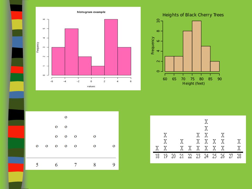
Histogram A frequency plot that shows the number of times a response or range of responses occurred in a data set.

2
It can only be used to show continuous data
What is a histogram? A histogram is like a bar chart, but there are some important differences. It can only be used to show continuous data The bars on a histogram touch. The bars found on a bar graph do not touch. It can only be used to show numerical data The data is always grouped.

3
Histogram: Pros and Cons
Advantages: Visually strong Good for determining the shape of the data Disadvantages: Cannot read exact values because data is grouped into categories More difficult to compare two data sets

4
How do you make a histogram?
Create a frequency table Count how many occurrences in the data Be sure to create equal intervals Label the x and y axis Choose a scale to label X and Y axis do not need to have the same scale Draw a bar for each interval. The height of the bar is the frequency for that interval. Bars must touch but not overlap.

5
Let’s try! A study collected the number of hours children watch TV. The collected the following number of hours: 8, 7, 5, 4, 9, 6, 3, 1, 7, 5, 4, 2, 3, 5, 2, 4, 3, 5, 7, 3, 6, 5, 3, 7, 2, 9, 6, 7, 8, 5, 4, 7, 3, 9, 4, 7, 3, 1, 2, 8, 5, 3, 7, 9, 5 1 6 2 7 3 8 4 9 5

6
Create the frequency table
Number of hours of TV III 6 II 1 IIII IIII 7 IIII 2 8 IIII IIII 3 9 IIII I 4 IIII III 5 Frequency Number of hours of TV 14 1-3 16 4-6 15 7-9

7
Label x and y axis (Choose your scale!) Draw the bars
 Draw the bars")
8
How To Compare Distributions
Analyzing Histograms and Dot Plots

9
Analyzing Histograms When you compare two or more data sets, focus on the following four features: Center Spread Shape Unusual Features

10
Analyzing Histograms and Dot Plots
Center (It is the MEDIAN)! EXAMPLE
! EXAMPLE")
11
To Find the Center: List out the numbers in order, smallest to largest, then find the median. 6,6,6,7,8,8,8,9,10,10,10,10,10,11,12 Center

12
Your Turn!

13
Analyzing Histograms and Dot Plots
Spread (RANGE) Highest – Lowest = Range Less Spread 4 EXAMPLES More Spread 8
 Highest – Lowest = Range. Less Spread. 4. EXAMPLES. More Spread. 8.")
14
You Try!

16
Analyzing Histograms and Dot Plots
Shape The shape of a distribution is described by symmetry, amount of skew, number of peaks, etc. Skewed Left EXAMPLES Symmetric, Unimodal Skewed Right

17
3 Overall Shapes: Normal/Symmetrical: Skewed left: Skewed right:
The shape is symmetrical around the middle. Skewed left: Most of the data is to the right, with a long tail to the left. Skewed right: Most of the data is to the left, with a long tail to the right.

18
You Try!

20
Analyzing Histograms Unusual Features Unusual features refer to
gaps: areas of the distribution where there are no observations and Outliers: a data point that stands out from the rest. (1.5 times the IQR) EXAMPLES Gap Outlier
 EXAMPLES. Gap. Outlier.")
21
You Try!

23
Graphical Displays for Data Homework
Classwork/HOMEWORK Graphical Displays for Data Homework

Similar presentations


 C2-4: Categorical and Quantitative Data.>")


