Download presentation
Presentation is loading. Please wait.

1
Science Fair Display Boards

2
Qualities of a Good Display
Professional Neat and Clean Good Visuals A Summary of the Project Good Craftsmanship Eye catching Organized and Balanced

3
Things to Include Title Abstract Question Hypothesis and Variables
Research Materials list Experimental Procedure Results: Data analysis & discussion including data chart(s) & graph(s) Conclusions (including ideas for future research)
 & graph(s) Conclusions (including ideas for future research)")
4
Visual Display First Impressions Count Boards should: Be Informative
Be Easy to Read Summarize the Study Use Space Wisely and Effectively Have visuals, graphs, charts, photographs

5
The Flow Organize the Board like a newspaper Board needs to make sense
Follow the Flow It should read left to right, top to bottom The layout and flow of text across the display board is vital in getting the information across in a meaningful way. When information is presented in a linear, chronological order, the information is easy to absorb with minimal effort. If the information is scattered and disjointed, simply finding and reading can be a pain, let alone the trouble of actually figuring out what is going on. English is read from left to right, top to bottom. So should the layout of the text. This may seem like a simple concept, but there have been many, many projects with total disregard to this aspect of presentation. Here is an example of good flow. Notice how the numbered sections go along a nice, predictable pattern.

6
Good Flow Think of the board almost like a pamphlet, but on a much larger scale. Remember, all the sections may not conform to the same height, but they can easily be made the same width. Poor Flow

7
Color Limit Color to 2 main colors and the third being a background color such as white Use color as an accent Use color as an organization tool Use Cool Colors (Blues, Greens, and Violets) They are soothing and calming, good choice for science Warm colors can act as an accent but be careful as warm colors distracts the eye Use Simple and low tone color Color is very important in the display of ideas. Color can convey a sense of professionalism, neatness, and organization when used correctly. Conversely, when used incorrectly, color can show immaturity and disinterest and can even turn people away before they even know what the project is about. Remember, no one will notice if proper colors are used; however, everyone will notice if poor color choices are made. Limit color choice to two main colors with white being the third (background).The colors should be used to accentuate the information, not be the center of attention. Using too many colors can be distracting to the eye and shows more interest in playing “coloring book” than doing a serious science project. But remember to use some. Don’t just have a blank white background with nothing on it, that’s boring. Color temperatureColors are divided into two different types: warm and cool. Warm colors; reds, yellows, and oranges, are typically more aggressive to the eyes and can be distracting. Cool colors; blues, greens, and violets are soothing and calming, a very appropriate choice for science. No need to aggravate the eye when trying to teach the mind.
 They are soothing and calming, good choice for science. Warm colors can act as an accent but be careful as warm colors distracts the eye. Use Simple and low tone color. Color is very important in the display of ideas. Color can convey a sense of professionalism, neatness, and organization when used correctly. Conversely, when used incorrectly, color can show immaturity and disinterest and can even turn people away before they even know what the project is about. Remember, no one will notice if proper colors are used; however, everyone will notice if poor color choices are made. Limit color choice to two main colors with white being the third (background).The colors should be used to accentuate the information, not be the center of attention. Using too many colors can be distracting to the eye and shows more interest in playing coloring book than doing a serious science project. But remember to use some. Don’t just have a blank white background with nothing on it, that’s boring. Color temperatureColors are divided into two different types: warm and cool. Warm colors; reds, yellows, and oranges, are typically more aggressive to the eyes and can be distracting. Cool colors; blues, greens, and violets are soothing and calming, a very appropriate choice for science. No need to aggravate the eye when trying to teach the mind.")
8
Comparison of Color Color choices should be muted tones.Choose colors that are simple and low tone. Bright, garish colors are for party invitations, not science layouts. Also, avoid using bold colors, they can be too strong for the eye. Here is an example of good color, taken from a Microsoft PowerPoint slide. The colors used are professional and simple. They do not distract the eye nor are they too bright. And now, here is the same slide, but with bad color. Notice how the colors are aggressive and offensive to the eye.

9
Text and Color Make Text and background color distinct and unique
Make text large enough to be easily read – at least 16 points

10
Avoid large area of unused white space – simply make the text larger
Balance Text and pictures should be evenly spaced Much like color, people won’t notice good balance. And very much like color, they will notice, very quickly, poor balance. Though this is a lesser point, it is still important. When designing the layout, try to make sure that any one area of the display isn’t all pictures (including graphs) or all text. If it is all pictures, it seems like nothing is really going on, and if it is all text, well... it is a daunting task to have to read through an endless amount of text (affectionately known as a “text wall”). Here is an example of good balance. Notice all the pictures and text are evenly spread out across the layout. This gives the eye a chance to move about from one idea to another easily without getting lost in information. Now, here is an example of poor balance. Notice how the display is lopsided and not attractive. Pictures and graphs are a vital part of the display and can get across a great deal of information at a glance. (a picture’s worth a thousand words right?) However, too many pictures and people won’t know what’s going on. Pictures and graphs should never account for more than 50% of the display. If they don’t all fit within this constraint, make them smaller. If they still don’t fit, print off all the charts and place them in a book and only put the most important ones on the display. Remember, there is much information that needs to be written down that cannot be expressed in picture form, like the hypothesis, procedure, safety, and many others. Only data can be expressed as pictures. Good Balance Poor Balance Avoid large area of unused white space – simply make the text larger
 or all text. If it is all pictures, it seems like nothing is really going on, and if it is all text, well... it is a daunting task to have to read through an endless amount of text (affectionately known as a text wall ). Here is an example of good balance. Notice all the pictures and text are evenly spread out across the layout. This gives the eye a chance to move about from one idea to another easily without getting lost in information. Now, here is an example of poor balance. Notice how the display is lopsided and not attractive. Pictures and graphs are a vital part of the display and can get across a great deal of information at a glance. (a picture’s worth a thousand words right ) However, too many pictures and people won’t know what’s going on. Pictures and graphs should never account for more than 50% of the display. If they don’t all fit within this constraint, make them smaller. If they still don’t fit, print off all the charts and place them in a book and only put the most important ones on the display. Remember, there is much information that needs to be written down that cannot be expressed in picture form, like the hypothesis, procedure, safety, and many others. Only data can be expressed as pictures. Good Balance Poor Balance. Avoid large area of unused white space – simply make the text larger.")
11
Project Title Get people’s attention
Letters Large enough to be seen from 30 to 40 feet away Needs to look Professional Always at the TOP in the CENTER and Horizontal The title of the project is important for obvious reasons. People have to know what the project is about. To get people's attention, all that is really needed is letters large enough to be seen from feet away. However, making the title look professional is a little more involved. The title should be centered in the middle of the main board, at the top. That way, everyone can see it no matter who is standing in front of the display. If it is half way down, it splits the main board into two parts, ruining the flow of the design: If it is at the bottom, no one will see it, and it will go unnoticed. Also avoid having vertical text. It is harder to read and parts of it can be obscured by people or demonstrations.

12
Title Comparison

13
Let’s Analyze the Titles

14
Types of Layouts Title on the board Title above the board
The Flow of the information is universal How the design elements are arrange is where the individual personality shows through Title on the board Title above the board

15
Layout Variations Compare the use of white space in each layout
Top two uses space efficiently Bottom one has too much white space Compare the use of white space in each layout

16
The Display Boards are Summaries
Use the following tips Bulleted Lists: Like this one, bullet points break up long paragraphs into readable segments. Big font: Using a larger font will not only make your poster more readable, it will force you to remove non-vital information. Paragraphs: Don't go more than 3 or 4 lines without making a new paragraph. People will get lost. Whitespace: Put a blank line between paragraphs to visually divide pages into smaller bites. Sentence Fragments: Can help get your point across in fewer words. Complete sentences are not always necessary!

17
Poor Display

18
Samples

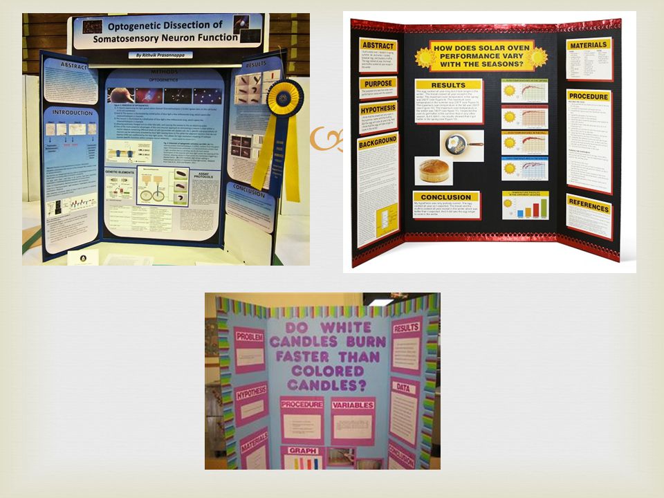
20
More Samples

21
Final Samples

22
Resources Intel Student Handbook

Similar presentations


![TITLE SHOULD BE ALL CAPS AND AROUND 75 FONT Author’s names should be around 62 pt font Emporia State University, Department of [enter department name here]](/15/4594565/big_thumb.jpg "TITLE SHOULD BE ALL CAPS AND AROUND 75 FONT Author’s names should be around 62 pt font Emporia State University, Department of [enter department name here]>")


 The question that asks what you want to find out Hypothesis Materials __________.>")


