Download presentation
Presentation is loading. Please wait.

1
IS 247 Information Visualization and Presentation 10 May 2002 James Reffell Moryma Aydelott Jean-Anne Fitzpatrick The NewsHound Project Presents:

2
Project Overview Goals –Exploration of themes in web-based news over time and by geographic region Purposes and target audiences –For professional media critics, a overview tool that complements existing resources (Google, Lexis- Nexis) –For news enthusiasts, an exploration tool that is both informative and fun
 –For news enthusiasts, an exploration tool that is both informative and fun")
3
Today’s presentation Describe and demonstrate our system –Brief overview –Visualization aspects of system Discuss and present concepts for future work

4
Data and Metadata Data: –Text of international news web site front pages, collected daily Metadata: –Geographical: region and country associated with each site –Temporal: date associated with each page System features –Filtering: by date range and by geography / site –Aggregation: by date and by geography

5
Implementation Data collection and initial HTML/text processing in Perl MySQL database for hierarchical geographic metadata Remaining functions in Java / JSP: –Indexing and search using Lucene –Custom routines for data aggregation and scaling –Chart applets using Kavachart

6
Related work News: –ThemeScape / NewsMaps –Galaxy of News Text data: –Conversation map –SeeSoft General visualization principles: –Tufte –Kosslyn, McKinlay, Bertin

7
Approach: What we didn’t do An extremely novel visualization

8
Enron Andersen

9
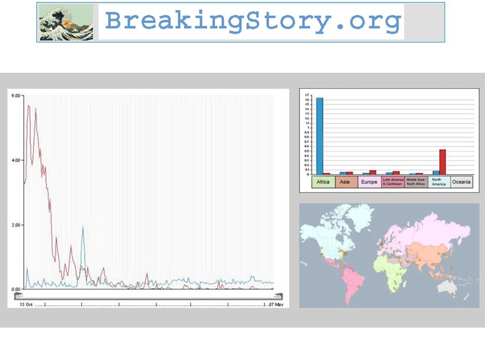
Approach: What we did Line charts –A familiar and readily understandable visualization, applied to a novel data set –Overview with access to details (text and numerical data) on demand Small multiples –Comparison –Detection of outliers Multiple views combining graphical and tabular data –Single chart plus query preview table –Small multiple charts plus summary table –Full text with KWIC highlighting Visual elements of UI design –Pre-attentive cues (color) –Gestalt cues (grouping)
 on demand Small multiples –Comparison –Detection of outliers Multiple views combining graphical and tabular data –Single chart plus query preview table –Small multiple charts plus summary table –Full text with KWIC highlighting Visual elements of UI design –Pre-attentive cues (color) –Gestalt cues (grouping)")
13
System Demo http://www.breakingstory.org

14
User Testing User testing focused on interaction design, but also encompassed visualization Questions: –Did users understand what chart data represented? –Was the single chart representation comprehensible and useful? –Were multiple charts comprehensible and useful? –How closely should the full text view match the source site layout? (Results: not at first, yes, yes, perfectly or not at all)
.")
15
Design Changes Major user test finding related to visualization: need to normalize data across charts (references per page per day, rather than just references per day) Other visualization-related changes: –Y-axis values on small chart view –Improved X-axis scales, varied by time range –Highlighting entire sentence on full text view –Change icon to provide visual cue about availability of multiple query terms per chart
 Other visualization-related changes: –Y-axis values on small chart view –Improved X-axis scales, varied by time range –Highlighting entire sentence on full text view –Change icon to provide visual cue about availability of multiple query terms per chart")
16
Future work Many possibilities for visualization of this data! System expansion possible in many areas (e.g., search capabilities, natural language processing, breadth or depth of corpus). Each of these changes would impact the visualization design. One concept for visualization we’ve explored in detail: combining line chart with additional views, dynamic interaction
. Each of these changes would impact the visualization design. One concept for visualization we’ve explored in detail: combining line chart with additional views, dynamic interaction.")
22
Conclusions Affordances of visual representation complement text Even for “simple” visualizations, understanding core principles aids design Interaction design and visualization design may compete for attention, but both improve the resulting system

23
Questions? For more information on the NewsHound project, go to our project website: http://dream.sims.berkeley.edu/newshound http://dream.sims.berkeley.edu/newshound To explore the Breaking Story system, go to: www.breakingstory.org www.breakingstory.org To see a more comprehensive demo of the system, come to our final project presentation on Tuesday!

Similar presentations


 Peter McLachlan, Tamara Munzner Eleftherios Koutsofios, Stephen North AT&T Research Symposium August, 2007.>")


 design User interface and experience.>")
 Advanced English Pablo Sherman The etymology of language.>")


