Download presentation
Presentation is loading. Please wait.

1
Lab 2

2
Exploring the Data with Graphs During data mining, it is often useful to explore the data by creating visual summaries. Clementine offers several different types of graphs to choose from, depending on the kind of data that you want to summarise.

3
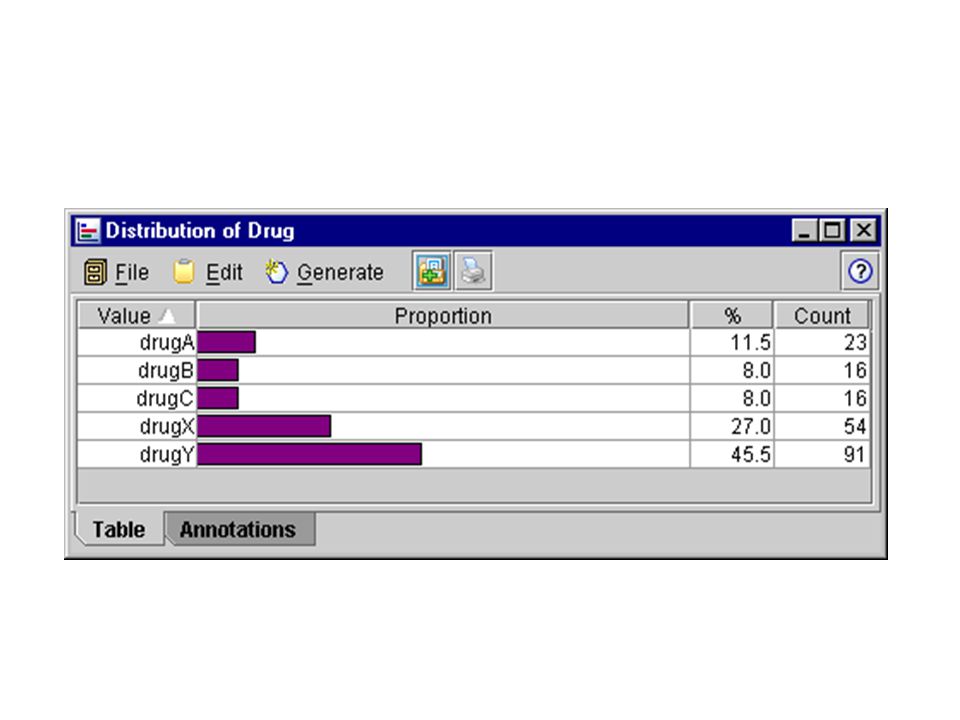
For example, to find out what proportion of the patients responded to each drug, use a Distribution node

5
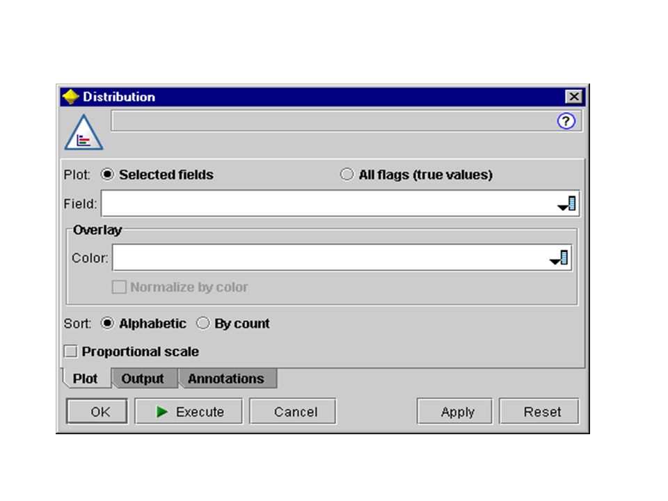
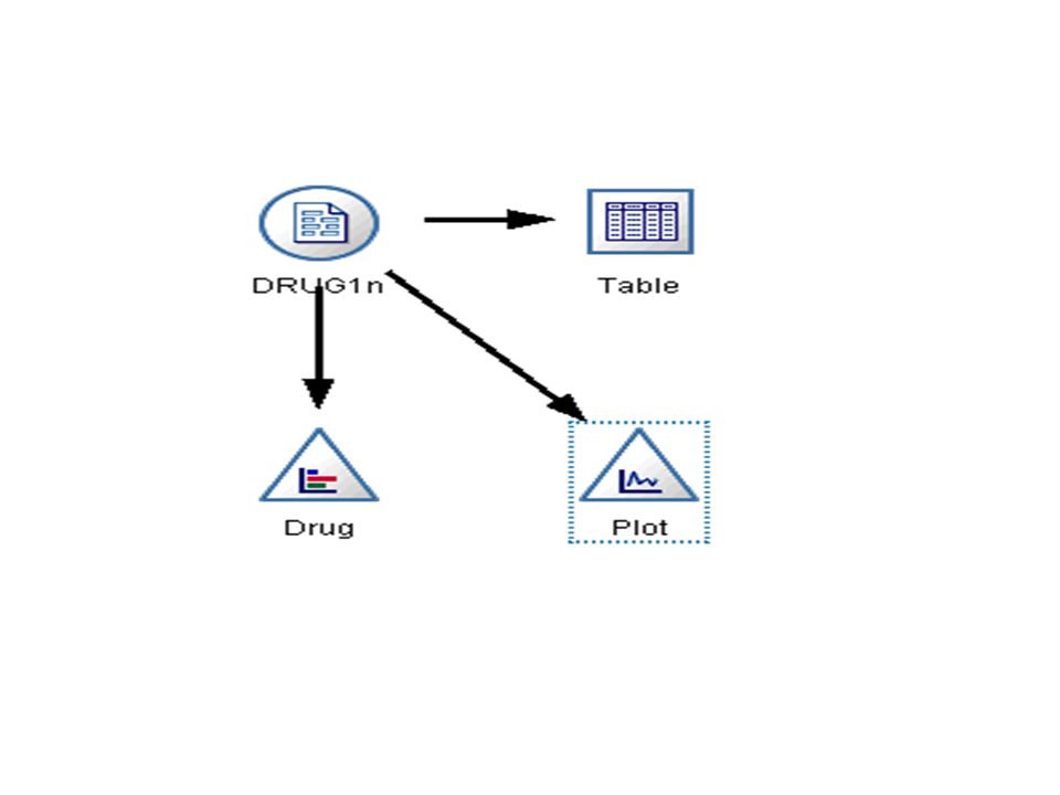
Place a Distribution node in the workspace and connect it to the Source node (don't forget to use your middle mouse button). Then double-click the Distribution node to open its dialog box and set the options for display

7
Select Drug as the target field whose distribution you want to show. Then, click Execute from the dialog box

9
The distribution graph helps you see the "shape" of the data. It shows that patients responded to drug Y most often and to drugs B and C least often

11
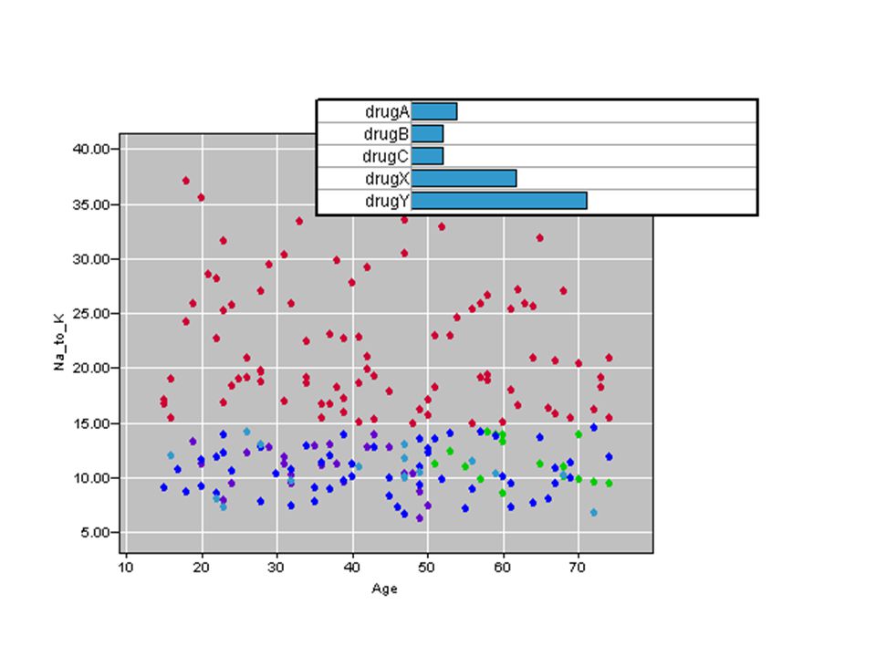
Exploring the Data with Graphs Now let's look more closely at what factors might influence Drug, the target variable. As a researcher, you know that the concentrations of sodium and potassium in the blood are important factors. So let's create another graph, this time looking at how the Na and K values influence the choice of drug.

12
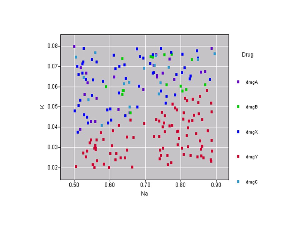
Since these are both numeric values, you can create a scatterplot of sodium versus potassium, using the drug categories as a color overlay.

13
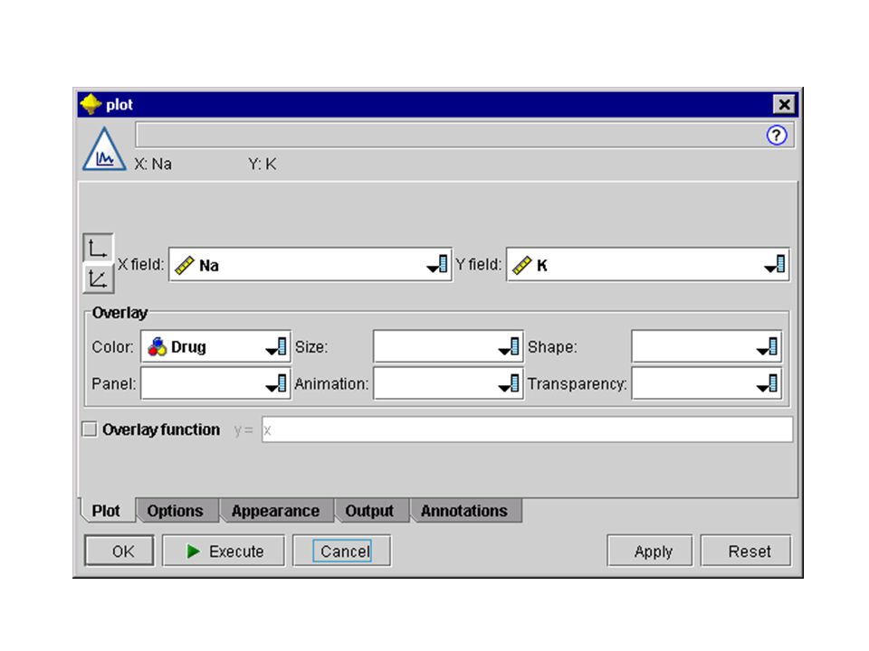
Place a Plot node in the workspace and connect it to the Source node. (Remember to drag with your middle mouse button.) Then, double-click the Plot node to open its dialog box.
 Then, double-click the Plot node to open its dialog box..")
15
Select K as the X field, Na as the Y field, and Drug as the overlay field. Then, click Execute.

17
Note: You can also create the plot by clicking the Execute button in the dialog box.

18
The plot clearly shows a threshold above which the correct drug is always drug Y and below which the correct drug is never drug Y. This threshold is a ratio--the ratio of sodium (Na) to potassium (K).
 to potassium (K)..")
20
So far, you have been exploring the data using graphs. Next, we'll move on to data preparation where we'll perform a common data mining operation--deriving a new field.

21
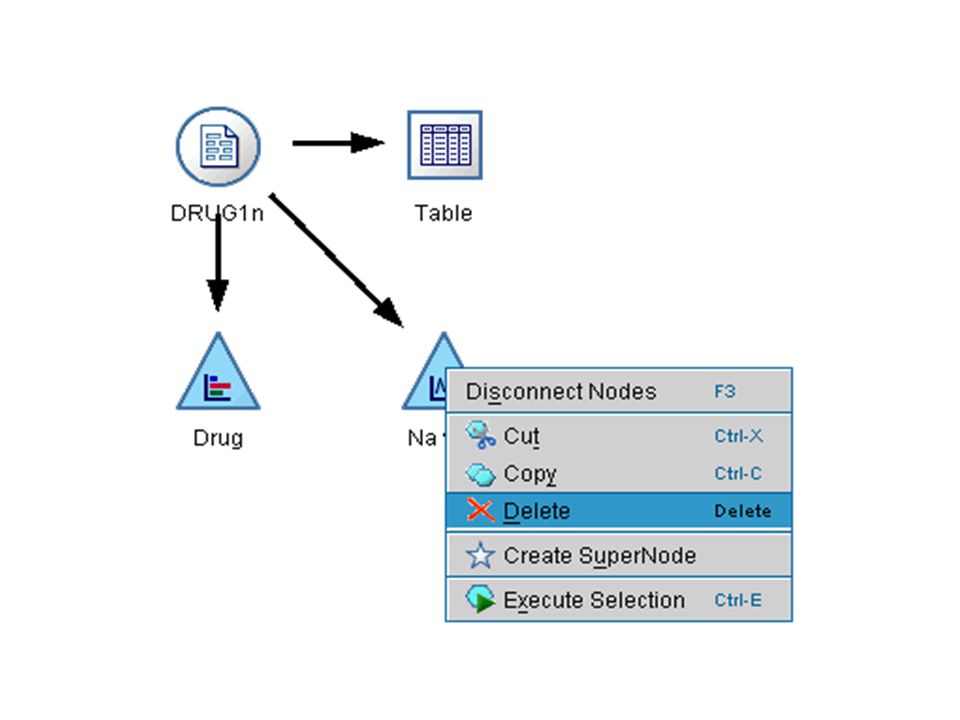
Before moving on, you may want to clean up the workspace. Delete the two Graph nodes and the Table node. To delete a node, right-click on it and choose Delete from the context menu. Or, select multiple nodes with your mouse and press the Delete key.

23
Since the ratio of sodium to potassium seems to predict when to use drug Y, you should derive a field that contains the value of this ratio for each record. This field might be useful later when you build a model to predict when to use each of the five drugs.

25
To derive a new field, start by inserting a Derive node into the stream.

27
Remember, you can automatically connect nodes by first selecting the Source node in the canvas and then double-clicking the Derive node from the palettes.

28
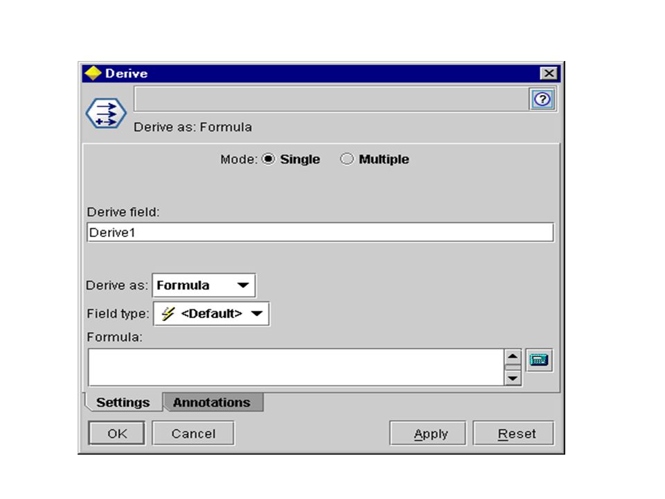
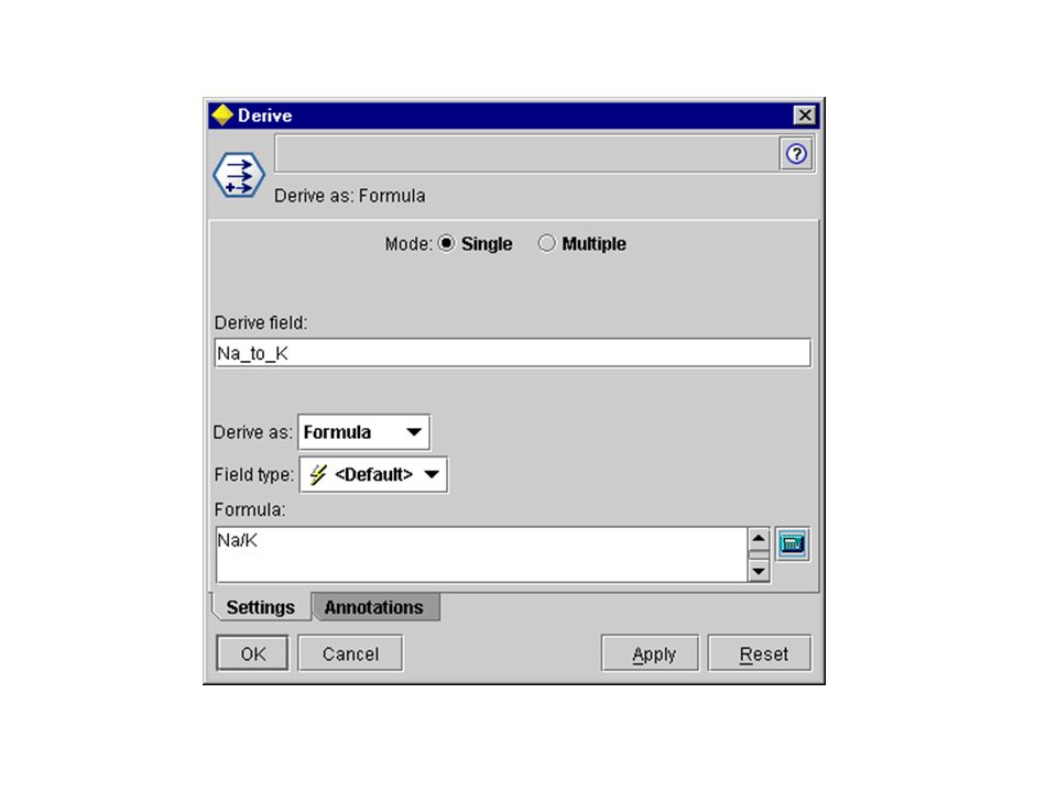
Then, double-click the Derive node to open its dialog box and specify a method for creating the new field.

30
Name the new field Na_to_K. Since you obtain the new field by dividing the sodium value by the potassium value, enter Na/K for the formula. You can also create a formula by clicking the icon just to the right of the field

32
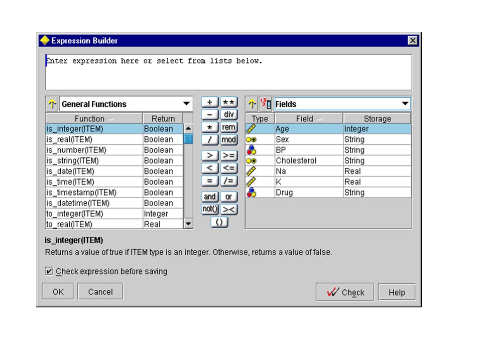
This opens the Expression Builder, a way to interactively create expressions using built-in lists of functions, operands, and fields and their values.

34
Using the Expression Builder is covered in-depth later in this guide. Click here to jump ahead now.

35
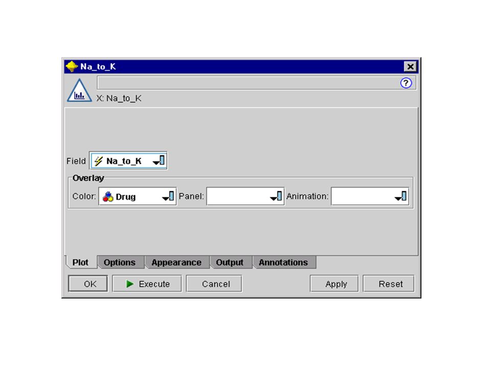
You can check the distribution of your new field by attaching a Histogram node to the Derive node. In the Histogram node dialog box, specify Na_to_K as the field to be plotted and Drug as the overlay field.

37
When you execute the stream, you should get the graph shown here. Based on the display, you can conclude that when the Na_to_K value is about 15 or above, drug Y is the drug of choice.

39
So far, by exploring and manipulating the data, you have been able to form some hypotheses. The ratio of sodium to potassium in the blood seems to affect the choice of drug. But you cannot fully explain all of the relationships yet.

40
This is where modeling will likely provide some answers.

Similar presentations