Download presentation
Presentation is loading. Please wait.

1
Prepared by Dr. Ahmed Azmy

2
SPACE Space is the relative position of one two or three-dimensional object to another.

3
SPACE

5
5 Space constantly encompasses our being. Through the volume of space, we move, see forms, hear sounds, feel breezes, smell the fragrances of a flower garden in bloom. It is a material substance like wood or stone. Yet it is an inherently formless vapor. Its visual forms, its dimensions and scale, the quality of its light all of these qualities depends on our perception of the spatial boundaries defined by elements of form. As space begins to be captured, enclosed, modeled, and organized by the elements of mass, architecture comes into being. Form and Space: the Unity of opposites

6
SPACE Space is one of the most important considerations an architect must think about while designing a building, because the sizes of rooms and hallways, the height of ceilings and the ease of entering and exiting each living area must carefully match the function of the building. Architects chose dimensions of rooms to match the number of people who will occupy the space and the amount of activity that will occur in it. To make a building more interesting, architects will experiment with aesthetic qualities of space by varying the width and height of rooms through which people will move.

7
SPACE

12
Architects also speak of space as the amount of land that will be occupied by a building on a site. The remaining area is called open space.

13
SPACE

14
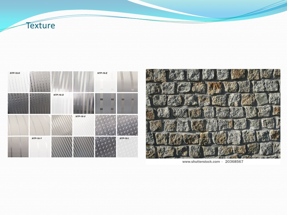
Texture Refers to surface quality, its smoothness, roughness, and softness. May be Tactile (can be felt with the fingers) or Visual (suggested by the way the artist has painted a certain area of a picture.
 or Visual (suggested by the way the artist has painted a certain area of a picture..")
15
Texture Texture is both a visual and a tactile phenomenon. Tactile textures are real; we can actually feel their surfaces with our fingers.

16
Texture Visual textures are illusionary; they simply give the impression of real textures

17
Texture

19
Texture often refers to the material that something is made of : Examples include: Roughness Smoothness Coarseness Fineness

21
Expression : Natural, Hard, Cold and Strength Granite Expression : Warm, Craftsmanship, Permanency, Heaviness and Practical Brick

22
Expression : Natural, Organic and warm Wood Expression : Efficiency, lightness, Temporality, cold, Hard and Purity of line steel

23
Expression : Cold, Clean, Fragile and Open Glass Expression : Freedom, Stability, Permanency and Solidity Concrete

24
a) seeking material unity (large number of different materials tend to create a sense of disunity ) b) atmosphere or feeling (expression) c) texture compatibility (association among materials) d) surrounding buildings (uses and patterns) Selection of materials should be done with a high degree of coordination:
 seeking material unity (large number of different materials tend to create a sense of disunity ) b) atmosphere or feeling (expression) c) texture compatibility (association among materials) d) surrounding buildings (uses and patterns) Selection of materials should be done with a high degree of coordination:")
25
Texture An architect creates texture in building by certain choices of materials. Heavy, jagged stone may be used in a building to give it a rough texture, whereas delicate, carved woods can give a structure a light and airy look.

26
Texture

30
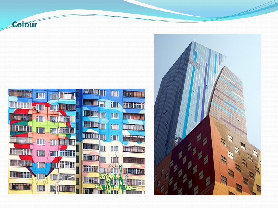
Colour Colour is the response of the eye to differing wavelengths of radiation within the visible spectrum. Can strengthen or diminish interest in a project. Influences the final appearance of any design. To create effective designs, a designer must understand the nature and relationship of colors.

31
Colour There are many different kinds of colour systems, and many different theories on colour. Primary Colors: RED YELLOW BLUE Secondary Colors: Can be made from equal mixtures of 2 primary colors GREENcombination of yellow and blue VIOLETcombination of blue and red ORANGEcombination of red and yellow Tertiary Colors: A combination of a primary color and a neighboring secondary color RED&ORANGE, YELLOW&ORANGE, YELLOW&GREEN BLUE&VIOLET, BLUE&GREEN

32
Colour 1. Hue Where the colour is positioned on the colour wheel. A color wheel a chart used to show the relationship between colors. Terms such as red, blue-green, and mauve all define the hue of a given colour Properties of Colour

33
2- Value The general lightness or darkness of a colour. In general, how close to black or white a given colour is.

34
3- Saturation The intensity or level of chrome, of a colour. The more gray a colour has in it, the less chrome it has. Properties of Colour

35
Colour Monochromatic Scheme: This colour scheme involves the use of only one hue. The hue can vary in value, and black or white may be added to create various shades or tints. Colour Schemes

36
Analogous Scheme: This colour scheme involves the use of colours that are located adjacent on the colour wheel. The hues may vary in value. The colour scheme for this site is analogous, with the colours varying only slightly from each other.

37
Colour Schemes Complementary Scheme: This colour scheme involves the use of colours that are located opposite on the colour wheel such as red and green, yellow and purple, or orange and blue. Complementary colours produce a very exciting, dynamic pattern.

38
Colour Warm and Cool Colours

39
Warm Colors that create a feeling of warmth, informality, cheer and happiness are: RED, ORANGE, and YELLOW. Warm Colours

40
Cool Colour Cool Colors that create a feeling of quiet, formality, restfulness and coolness are: BLUE and GREEN

41
Colour Architects use colour in the choice of materials used to construct a building. However, the architect must consider the colour effect of every element of a building's construction, from the earthy colours of primary construction materials like wood, stone, brick and marble, to the expansive variety of colours available for paint, doors, windows, siding, and trim.

42
Colour

46
LIGHT AND DARK Values can be exercised in all colors. The range of the values can be changed by adding white to lighten or tint a color. Adding black will create a shade of the original color which will appear darker.

47
LIGHT AND DARK

49
Light and dark are relative perceptions of light. Architects use the concept of light and dark as they create visual interest on a building by choosing shapes that create a sensation of depth. When some shapes stick out, they leave others in shadow. Narrow openings often appear dark, flat spaces look light. LIGHT AND DARK

52
Materials can be used to vary the light quality of a building. LIGHT AND DARK

Similar presentations


. What is Composition Composition is the arrangement of shapes (forms) in an image – their position, relationship to one another.>")


