Download presentation
Presentation is loading. Please wait.

2
We know about inserting numbers in Excel and how to sum and average numbers. Insert these numbers and in Cell A9, find the average of the numbers. In cell A9 insert the above formula in the function box. Remember that you always begin a formula with “=“ followed by the formula itself with a left parenthesis starting the formula and a right parenthesis ending the formula

3
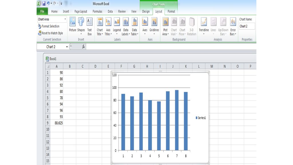
Types of Charts Insert Ribbon Tab Numbers and Average
Step 1: Find the average of all numbers Step 2: Highlight all of the numbers Step 3: Once all numbers are highlighted, click on the Insert Ribbon Tab. The graphs should now appear Types of Charts Insert Ribbon Tab Numbers and Average

4
Step 4: Click on the Column Ribbon; you’ll see other types of charts but are all column charts
Step 5: Click on the first choice and you should have a chart that looks like . . .

5
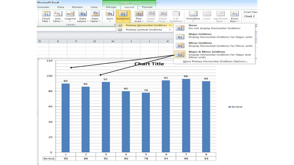
Some things you can do with this chart
And the chart, as it stands, doesn’t tell anything about the chart itself. Lets change it so it can be read so that it can be understood. Some things you can do with this chart

7
Notice you can select where you want the Data Labels
There are labels at the bottom of the table; you can place these labels other places in the chart

9
Plot Area; the inside of the chart next to the columns
Chart Area; the outside of the chart. If you right-click, the instruction will be at the bottom

10
Formatting the Plot Area; click on one of the selections

11
By clicking on the columns, you will see the small circles at the top of the columns. You can now change the color or even insert a picture in the column(s)
.")
12
I can now change both the plot area and chart area if I wish. TRY IT!!

13
I can now change both the plot area and chart area if I wish. TRY IT!!

14
I clicked on picture and clip art and inserted a basketball

15
For this picture, I clicked on plot area, “no fill” and clip art “basketball” for the plot area. Remember the plot area is part of the chart area.

16
Okay, so far in Excel we have learned how to use formulas and the different parts of Excel. We have now been able to create charts. Now lets do one of the most important topics that has been presented: Being able to transfer something from one program to another. For example, the chart is now complete. However, I want to put this same chart in a word document or in a PowerPoint presentation. To do this, right-click the chart. Click on copy. Decide where you want to put this chart, whether it be in a word document or a presentation. Open that document. Click on paste and you will have now inserted that chart in another Microsoft Program (PowerPoint, Word, etc.) Try it!!!
 Try it!!!.")
17
Now lets combine categories to show how a legend works:

18
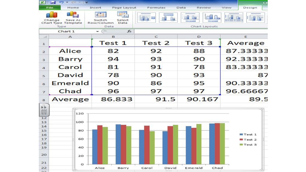
Today we’ll work with six students and test scores for each student
Today we’ll work with six students and test scores for each student. We’ll calculate average not only for each student but for each test. Enter the following information:

19
Calculate the average score for each test (tests 1, 2, and 3) and calculate the average for student
 and calculate the average for student")
20
Calculate the average score for each test (tests 1, 2, and 3) and calculate the average for student
 and calculate the average for student")
21
Highlight the test 1, 2 and 3 columns along with the scores
Highlight the test 1, 2 and 3 columns along with the scores. While holding down the control key (bottom left corner), highlight column A with all of the rows.
, highlight column A with all of the rows.")
22
With these two different sections highlighted, go back to the Insert Ribbon Tab. Go to Charts and click on the “Columns” section. Once clicked, you should see a column chart created with a test legend to the side.

24
With a few adjustments and applying some of the topics we learned yesterday, you can now make your chart look like this. Notice the legend at the right, the increased font size of the scores, and the data table and increased font size of the table.

Similar presentations


pop1pop2pop3pop4pop5 3238273518 3143293419 2734223721 3440.>")


>")


