Download presentation
Presentation is loading. Please wait.

1
my childhood view of my homeland my children’s view of their homeland What happened in between?

4
Satellite ocean altimetry derived Gravity Field

5
THE TOPOGRAPHY OF MARS (MOLA data) MOLA SCIENCE & INSTRUMENT TEAMS
 MOLA SCIENCE & INSTRUMENT TEAMS")
6
Venus: run-away greenhouse effect

7
Venus Orbiting Imaging Radar on Magellan, 1990 – 1994 (burnt in atmosphere)
")
8
Our Solar System Family Portrait

9
走馬看花訪行星

10
Human’s first satellite, Sputnik I, USSR, October 4, 1957

11
German V-2 Rocket WW-II

12
From left to right: Dr. William H. Pickering, Director of JPL; Dr. James Van Allen, a scientist from University of Iowa; and Dr. Wernher von Braun raise a full-size model of America's first satellite, Explorer I, above their heads following a successful launch on January 31, 1958.

13
NASA (National Aeronautics and Space Administration)
")
15
GEO LEO MEO A “Snapshot” of the hundreds of Earth’s artificial satellites: LEO = low Earth orbit; MEO = medium Earth orbit; GEO = geosynchronous

17
Remote Sensing Passive 被動式 –eye, ear, camera, TV, infrared sensor, microwave radiometer, GPS receiver, seismometer, telescopes Active 主動式 –bat, dolphin/whale, sonar, radar, lidar, altimeter, scatterometer, SAR, ultrasound, x-ray tomography

18
Electromagnetic Spectrum

19
Most EM waves cannot penetrate the Earth’s atmosphere, except: radio/microwave, and visible light (and hence our eyes were developed). The latter are called the two atmospheric “windows” (hence the two types of ground telescopes).
..")
20
Black-Body Radiation Planck’s law: (replacing Rayleigh-Jeans (wrong) law, leading to quantum theory, 1900.) Wein’s law: The spectrum of BBR has a maximum, whose wavelength is inversely proportional to its absolute temperature: λ max 1/T Stefan-Boltzmann law: BBR total intensity = σ T 4 Everything above absolute zero temperature (0° Kelvin) emits electromagnetic waves, called black-body radiation (BBR).
 law, leading to quantum theory, 1900.) Wein’s law: The spectrum of BBR has a maximum, whose wavelength is inversely proportional to its absolute temperature: λ max 1/T Stefan-Boltzmann law: BBR total intensity = σ T 4 Everything above absolute zero temperature (0° Kelvin) emits electromagnetic waves, called black-body radiation (BBR).")
21
Reflected EM radiation, remotely sensed by an ordinary camera sensitive to visible light. Black-body radiation (EM), remotely sensed by an Infrared camera sensitive to “thermal” radiation indicating temperature. Note the differences in the two images, for the plastic bag (transparent to infrared), and for the glasses (opaque to infrared, hence “greenhouse effect”).
, remotely sensed by an Infrared camera sensitive to thermal radiation indicating temperature. Note the differences in the two images, for the plastic bag (transparent to infrared), and for the glasses (opaque to infrared, hence greenhouse effect )..")
23
NASA’s 40 Years in Earth Science... 1960’s TIROS Weather Satellite 1970’s Landsat 1980’s Earth Radiation Budget 1990’s Upper Atmosphere Research

24
Large Earth Science Missions Focus on Longer-term Observation of Key Earth System Interactions Terra Chem Aqua LANDSAT 7

25
Small Earth Science Missions: Complement Larger Missions, Demonstrate New Technologies, and Focus on Specific Earth Processes and Observations QuikSCAT Advanced Land Imager EO-1 * ICEsatJason-1 SRTM

26
The “A Train”

27
海平面, 你隱藏了多少秘密 ?

29
M 2 Lunar Tide in the Ocean (GOT99, courtesy R. Ray)
")
30
Surface Ocean Currents (driven by prevailing wind field under geostrophy)
")
31
El Niño (11/1997)La Niña (10/1998)
La Niña (10/1998)")
32
El Niño (11/1997)
")
33
Simulated vs. Observed Tsunami (12/26/04 Sumatra earthquake) 2 hours after 3:15 hours after
 2 hours after 3:15 hours after")
34
Hurricane / Typhoon / Cyclone Geostrophy (pressure gradient force balanced out by the Coriolis force) Counterclockwise in the Northern Hemisphere (North Atlantic, USA/Cuba) Clockwise in the Southern Hemisphere (2004/6, Brazil, MODIS)
 Counterclockwise in the Northern Hemisphere (North Atlantic, USA/Cuba) Clockwise in the Southern Hemisphere (2004/6, Brazil, MODIS)")
35
(Global Warming Art; http://www.globalwarmingart.com/wiki/Image:Tropical_Storm_Map_png)http://www.globalwarmingart.com/wiki/Image:Tropical_Storm_Map_png

36
2007 年 IPCC 所公布的數據 平均海平面的變化量( mm ) IPCC 2007 年報告所引用的數據
 IPCC 2007 年報告所引用的數據")
37
Global Sea Level Rise From Topex/Poseidon (courtesy S. Nerem)
")
38
Arctic sea ice = 0 slr Greenland ice = ~7 m slr Potential sea level rise (slr) Antacrtica ice = ~70 m slr
 Antacrtica ice = ~70 m slr")
39
Minimum (summertime) sea ice in the Artic Sea (NASA/GSFC)
 sea ice in the Artic Sea (NASA/GSFC)")
43
Milankovitch Cycles

44
At the glacial maximum (~10,000 years ago), the sea level was ~120 m lower than today’s, and red was land then.
, the sea level was ~120 m lower than today’s, and red was land then.")
45
嘉義北回歸線標 哥倫布遇見北美原住民

48
Greenhouse Effect

49
Changing Sea Ice along the Antarctic Peninsula 正在改變中的南極海冰 Image Location Image Location http://earthobservatory.nasa.gov/IOTD/view.php?id=36497 Posted January 9, 2009

50
Changing weather conditions left their mark on sea ice along the Antarctic Peninsula in late 2008 and early 2009. In mid-December 2008, melt water resting on the sea ice colored it sky blue. At the beginning of 2009, however, the sea ice appeared snowy white, and cracks had begun along the ice margin. The Moderate Resolution Imaging Spectroradiometer (MODIS) on NASA’s Terra satellite captured these images on December 13, 2008 (top), and January 2, 2009 (bottom). Both images show the northern portion of the Antarctic Peninsula. In the image acquired on December 13, a layer of melt water rests on the surface of the sea ice. This sea ice is fast ice that has held fast to the coastline, not moving with winds nor ocean currents. The previous summer on the Antarctic Peninsula had been cold enough to allow this ice to persist, and snowfall may also have accumulated on the ice since that time. The water could result from melted snow, melted ice, or a combination. In the image acquired on January 2, the sky-blue hue is gone, indicating that the melt water had either drained through cracks in the ice, or refrozen. The full-resolution image of this scene shows the formation of new sea ice in areas to the south, suggesting that refrozen sea ice is more likely. A storm or cold front passing through the region could drop temperatures just enough to form new sea ice. Although the melt water was gone, the sea ice was cracked, and several fissures appeared along the northeastern ice edge. Along Antarctica’s perimeter, sea ice grows dramatically in the winter and shrinks just as dramatically in the summer. The appearance of melt water on the sea ice in December 2008—late spring in the Southern Hemisphere—was not so much an indication of climate change as an indication of seasonal change. The Antarctic Peninsula has, however, experienced changes suggesting a warming climate. In contrast to sea ice, which may come and go each year, ice shelves are long-lasting slabs of ice attached to coastlines. Historically, the Larsen Ice Shelf on the Antarctic Peninsula has been divided into four sections from north to south: A, B, C, and D. The Larsen A disintegrated in 1995, and the Larsen B disintegrated in 2002. (More recently, the Wilkins Ice Shelf, farther south along the peninsula, experienced both summertime and wintertime breakups.) When an ice shelf breaks away from a coastline, it often leaves something behind, and a remnant of the Larsen Ice Shelf appears in these images. The remnant shelf is easier to spot in the December 13 image, where it contrasts with the blue melt ponds. The remaining shelf connects with Robertson Island in the east.
 on NASA’s Terra satellite captured these images on December 13, 2008 (top), and January 2, 2009 (bottom). Both images show the northern portion of the Antarctic Peninsula. In the image acquired on December 13, a layer of melt water rests on the surface of the sea ice. This sea ice is fast ice that has held fast to the coastline, not moving with winds nor ocean currents. The previous summer on the Antarctic Peninsula had been cold enough to allow this ice to persist, and snowfall may also have accumulated on the ice since that time. The water could result from melted snow, melted ice, or a combination. In the image acquired on January 2, the sky-blue hue is gone, indicating that the melt water had either drained through cracks in the ice, or refrozen. The full-resolution image of this scene shows the formation of new sea ice in areas to the south, suggesting that refrozen sea ice is more likely. A storm or cold front passing through the region could drop temperatures just enough to form new sea ice. Although the melt water was gone, the sea ice was cracked, and several fissures appeared along the northeastern ice edge. Along Antarctica’s perimeter, sea ice grows dramatically in the winter and shrinks just as dramatically in the summer. The appearance of melt water on the sea ice in December 2008—late spring in the Southern Hemisphere—was not so much an indication of climate change as an indication of seasonal change. The Antarctic Peninsula has, however, experienced changes suggesting a warming climate. In contrast to sea ice, which may come and go each year, ice shelves are long-lasting slabs of ice attached to coastlines. Historically, the Larsen Ice Shelf on the Antarctic Peninsula has been divided into four sections from north to south: A, B, C, and D. The Larsen A disintegrated in 1995, and the Larsen B disintegrated in (More recently, the Wilkins Ice Shelf, farther south along the peninsula, experienced both summertime and wintertime breakups.) When an ice shelf breaks away from a coastline, it often leaves something behind, and a remnant of the Larsen Ice Shelf appears in these images. The remnant shelf is easier to spot in the December 13 image, where it contrasts with the blue melt ponds. The remaining shelf connects with Robertson Island in the east..")
51
Arctic Sea Ice Younger than Normal 北極海冰有年輕化的趨勢 http://earthobservatory.nasa.gov/IOTD/view.php?id=8596 Posted March 25, 2008

52
In the Arctic, sea ice extent fluctuates with the seasons. It reaches its peak extent in March, near the end of Northern Hemisphere winter, and its minimum extent in September, at the end of the summer thaw. In September 2007, Arctic sea ice extent was the smallest area on record since satellites began collecting measurements about 30 years ago. Although a cold winter allowed sea ice to re-cover much of the Arctic in the months that followed, this pair of images reveals that conditions were far from normal. The February 2008 ice pack (right) contained much more young ice than the long-term average (left). In the past, more ice survived the summer melt season and had the chance to thicken over the following winter. This perennial ice generally gets thicker each winter, which makes it more likely to survive the next summer. The area and thickness of sea ice that survives the summer has been declining over the past decade. Whereas perennial ice used to cover 50-60 percent of the Arctic, it covered less than 30 percent in 2008—down 10 percent from 2007. The ice that remains is also getting younger. In the mid- to late 1980s, over 20 percent of Arctic sea ice was at least six years old; in February 2008, just 6 percent of the ice was six years old or older. Independent of human-caused global warming, the extent and thickness of Arctic sea ice can vary as a result of natural ocean and atmospheric cycles. One important cycle is the Arctic Oscillation, which seesaws between a positive and negative phase over three-to-seven-year periods. During the positive phase, persistent lower than normal atmospheric pressure over the polar latitudes steers winds and storms away from the Arctic; winds tend to flush sea ice out of the Arctic basin to lower latitudes, where it melts. In the negative phase of the oscillation, persistent higher than normal pressure over the pole brings winds and storms toward the Arctic basin, and keeps sea ice circulating within the Arctic, allowing the ice to build up. According to polar scientist Walt Meier of the National Snow and Ice Data Center, sea ice extent did go up and down with the phases of the Arctic Oscillation throughout much of the 1970s and through the mid-1980s. Since the 1990s, however, human-caused global warming appears to be driving the losses of perennial sea ice. For the past ten years or so, the Arctic Oscillation has been mostly neutral or negative, says Meier, but sea ice has continued on a downward slide.
 contained much more young ice than the long-term average (left). In the past, more ice survived the summer melt season and had the chance to thicken over the following winter. This perennial ice generally gets thicker each winter, which makes it more likely to survive the next summer. The area and thickness of sea ice that survives the summer has been declining over the past decade. Whereas perennial ice used to cover percent of the Arctic, it covered less than 30 percent in 2008—down 10 percent from The ice that remains is also getting younger. In the mid- to late 1980s, over 20 percent of Arctic sea ice was at least six years old; in February 2008, just 6 percent of the ice was six years old or older. Independent of human-caused global warming, the extent and thickness of Arctic sea ice can vary as a result of natural ocean and atmospheric cycles. One important cycle is the Arctic Oscillation, which seesaws between a positive and negative phase over three-to-seven-year periods. During the positive phase, persistent lower than normal atmospheric pressure over the polar latitudes steers winds and storms away from the Arctic; winds tend to flush sea ice out of the Arctic basin to lower latitudes, where it melts. In the negative phase of the oscillation, persistent higher than normal pressure over the pole brings winds and storms toward the Arctic basin, and keeps sea ice circulating within the Arctic, allowing the ice to build up. According to polar scientist Walt Meier of the National Snow and Ice Data Center, sea ice extent did go up and down with the phases of the Arctic Oscillation throughout much of the 1970s and through the mid-1980s. Since the 1990s, however, human-caused global warming appears to be driving the losses of perennial sea ice. For the past ten years or so, the Arctic Oscillation has been mostly neutral or negative, says Meier, but sea ice has continued on a downward slide..")
53
Global Temperature Anomalies: 2007 2007 年全球溫度異常 Posted January 24, 2008 http://earthobservatory.nasa.gov/IOTD/view.php?id=8423

54
In 2007, a moderately strong La Niña event put a chill on the eastern Pacific Ocean, and the Sun was near the low spot in its 11-year cycle of variability. Nevertheless, global average surface temperature in 2007 was still tied for the second warmest year in the instrumental record compiled by scientists at NASA’s Goddard Institute for Space Studies, which goes back to 1880. The record warmest year was 2005, with 1998—now tied with 2007—in second place. The global average temperature anomaly for 2007 was 0.57 degrees Celsius (about 1 degree Fahrenheit) above the 1950-1980 baseline. This image shows the spatial patterns of temperature anomalies across the planet in 2007. Warm anomalies (compared to the baseline) are red, places where temperatures were the same as the baseline are white, and cold anomalies are blue. The cold anomaly in the Pacific Ocean shows the impact of La Niña, which was particularly strong in the second half of 2007. During La Niña events, the trade winds that blow steadily westward across the Pacific near the equator get stronger. These strong winds drag the sun-warmed surface water into the Western Pacific. Cold water from deep in the ocean wells up off the coast of South America and spreads westward along the equator. The cold anomaly over part of Antarctica is also linked to La Niña through a regional climate phenomenon called the Antarctic Oscillation. A single year of data on its own can’t be used to either prove or disprove a trend like global warming. However, as the NASA GISS scientists point out in their summary for 2007, the temperature anomaly of 2007 “continues the strong warming trend of the past thirty years that has been confidently attributed to the effect of increasing human-made greenhouse gases. The eight warmest years in the GISS record have all occurred since 1998, and the 14 warmest years in the record have all occurred since 1990.”
 above the baseline. This image shows the spatial patterns of temperature anomalies across the planet in Warm anomalies (compared to the baseline) are red, places where temperatures were the same as the baseline are white, and cold anomalies are blue. The cold anomaly in the Pacific Ocean shows the impact of La Niña, which was particularly strong in the second half of During La Niña events, the trade winds that blow steadily westward across the Pacific near the equator get stronger. These strong winds drag the sun-warmed surface water into the Western Pacific. Cold water from deep in the ocean wells up off the coast of South America and spreads westward along the equator. The cold anomaly over part of Antarctica is also linked to La Niña through a regional climate phenomenon called the Antarctic Oscillation. A single year of data on its own can’t be used to either prove or disprove a trend like global warming. However, as the NASA GISS scientists point out in their summary for 2007, the temperature anomaly of 2007 continues the strong warming trend of the past thirty years that has been confidently attributed to the effect of increasing human-made greenhouse gases. The eight warmest years in the GISS record have all occurred since 1998, and the 14 warmest years in the record have all occurred since")
55
La Nina Still Going in January 2008 2008 年 1 月仍然持續的反聖嬰現象 Posted January 24, 2008 http://earthobservatory.nasa.gov/IOTD/view.php?id=8402

56
La Niña conditions often follow El Niño in the cycle known as the El Niño/Southern Oscillation (ENSO). La Niña episodes are marked by stronger-than-normal easterly trade winds and below-normal sea surface temperatures in the eastern tropical Pacific Ocean. These changes in ocean temperature and atmospheric circulation have worldwide implications for weather patterns. La Niña conditions appeared in February 2007 and strengthened in October and November. La Niña conditions often peak in January, as they appeared to do in January 2008. This image shows the temperature anomaly for the top millimeter of the Pacific Ocean’s surface—the skin temperature—on January 14, 2008, based on data from the Advanced Microwave Scanning Radiometer (AMSR-E) flying on NASA’s Aqua satellite. In this image, January 14, 2008, temperatures are compared to the long-term average measured by a series of sensors that flew on NOAA Pathfinder satellites from 1985 to 1997. A strong band of blue (cool) water appears along the Equator, fanning out near North and South America. Patches of orange to red (warm) conditions appear north and south of this strong blue band. As of January 2008, the U.S. National Oceanic and Atmospheric Administration (NOAA) predicted that La Niña conditions would continue until spring, with a possible weakening in February 2008. Cool ocean temperatures can impede cloud growth, leading to reduced rainfall from South America to Indonesia. In the continental United States, La Niña affects the jet stream, which in turn affects weather. Typical La Niña winter weather patterns include very cool, wet conditions in the Pacific Northwest, especially cold winter conditions on the Great Plains, and unusually dry conditions in the Southwest and Southeast. Because La Niña conditions can persist for years, such adverse weather conditions can continue. In short, continued La Niña conditions were expected to prolong the droughts in the American Southeast and Southwest. Daily, 8-day, and monthly sea surface temperature anomaly images from AMSR-E are available from NASA Earth Observations (NEO).
 flying on NASA’s Aqua satellite. In this image, January 14, 2008, temperatures are compared to the long-term average measured by a series of sensors that flew on NOAA Pathfinder satellites from 1985 to A strong band of blue (cool) water appears along the Equator, fanning out near North and South America. Patches of orange to red (warm) conditions appear north and south of this strong blue band. As of January 2008, the U.S. National Oceanic and Atmospheric Administration (NOAA) predicted that La Niña conditions would continue until spring, with a possible weakening in February Cool ocean temperatures can impede cloud growth, leading to reduced rainfall from South America to Indonesia. In the continental United States, La Niña affects the jet stream, which in turn affects weather. Typical La Niña winter weather patterns include very cool, wet conditions in the Pacific Northwest, especially cold winter conditions on the Great Plains, and unusually dry conditions in the Southwest and Southeast. Because La Niña conditions can persist for years, such adverse weather conditions can continue. In short, continued La Niña conditions were expected to prolong the droughts in the American Southeast and Southwest. Daily, 8-day, and monthly sea surface temperature anomaly images from AMSR-E are available from NASA Earth Observations (NEO)..")
57
Both Routes Around Arctic Open at Summer‘s End 夏天結束後將出現兩條通往北極的路徑 Posted December 9, 2008 http://earthobservatory.nasa.gov/IOTD/view.php?id=9078

58
As of the first week of September 2008, Arctic sea ice extent had not fallen below the record low observed in 2007, but the season set a new kind of record. For the first time in probably half a century—and definitely since satellite observations began about three decades ago— sea ice retreated enough to create open (not ice- free) waters all the way around the northern ice pack. Open water is defined by the World Meteorological Organization for the purposes of navigation as areas where the ice covers less than one-tenth of the surface. This image shows Arctic sea ice concentration on September 8, 2008, as observed by the Advanced Microwave Scanning Radiometer–Earth Observing System (AMSR-E) sensor on NASA’s Aqua satellite. The observations are collected on a pixel by pixel basis over the Arctic. The percentage of a 12.5-square- kilometer pixel covered by ice is shown in shades of dark blue (no ice) to white (100 percent ice). The gray line around the Arctic basin shows the median minimum extent of sea ice from 1979-2000. (The median of a data set is the middle value if you arrange the numbers in order from smallest to largest.) The southern portions of the Northwest Passage through the Arctic (the western route from Europe to Asia through the islands of northern Canada) opened in early August. Then in early September, ice scientists confirmed that the waters around the Russian coastline—the Northern Sea Route— were navigable, but still treacherous, with shifting floes of thick, multi-year ice, that could coalesce rapidly. The image shows that the widest avenue through the Northwest Passage, Parry Channel, still harbored some ice, but the more circuitous, southern waterways were clear. On the other side of the Arctic Ocean, the passage around Russia’s Taymyr Peninsula, normally locked in by ice, was similarly open. According to a press release from the U.S. National Ice Center, “This is the first recorded occurrence of the Northwest Passage and Northern Sea Route both being open at the same time.”
 waters all the way around the northern ice pack. Open water is defined by the World Meteorological Organization for the purposes of navigation as areas where the ice covers less than one-tenth of the surface. This image shows Arctic sea ice concentration on September 8, 2008, as observed by the Advanced Microwave Scanning Radiometer–Earth Observing System (AMSR-E) sensor on NASA’s Aqua satellite. The observations are collected on a pixel by pixel basis over the Arctic. The percentage of a 12.5-square- kilometer pixel covered by ice is shown in shades of dark blue (no ice) to white (100 percent ice). The gray line around the Arctic basin shows the median minimum extent of sea ice from (The median of a data set is the middle value if you arrange the numbers in order from smallest to largest.) The southern portions of the Northwest Passage through the Arctic (the western route from Europe to Asia through the islands of northern Canada) opened in early August. Then in early September, ice scientists confirmed that the waters around the Russian coastline—the Northern Sea Route— were navigable, but still treacherous, with shifting floes of thick, multi-year ice, that could coalesce rapidly. The image shows that the widest avenue through the Northwest Passage, Parry Channel, still harbored some ice, but the more circuitous, southern waterways were clear. On the other side of the Arctic Ocean, the passage around Russia’s Taymyr Peninsula, normally locked in by ice, was similarly open. According to a press release from the U.S. National Ice Center, This is the first recorded occurrence of the Northwest Passage and Northern Sea Route both being open at the same time. .")
59
First Global Water Vapor Map from OSTM 第一張由 OSTM 偵測的全球水氣分布圖 Posted July 29, 2008 http://earthobservatory.nasa.gov/IOTD/view.php?id=8955

60
In mid-June 2008, NASA launched the latest of a series of satellites that scientists use to measure sea level from space. The Ocean Surface Topography Mission (OSTM)/Jason-2 uses a radar altimeter to map the height of the ocean surface. The radar sends a pulse of energy down to the ocean surface and listens for the echo. The time delay and intensity of the echo reveal the altitude of the sea surface. Because water vapor delays the time it takes for the radar pulse to travel to the ocean surface and back, the satellite also carries a sensor to measure atmospheric moisture. The image above shows the first results from this sensor, the Advanced Microwave Radiometer: a global map of the amount of water vapor in the atmosphere beneath the satellite from June 22–28, 2008. The time span was the first week of operations for OSTM’s science instruments. In this image, white and light blue show dry areas; dark blue shows moist regions. In moist regions, such as over the Indian and tropical Pacific Oceans, the radar signal would have been slowed, exaggerating the time delay and making the sea surface appear lower than it really was. By measuring water vapor, scientists can correct for its influence on the radar echo. Like the altimeter, the radiometer looks straight down at the ocean surface. It senses three microwave wavelengths: the thermal signatures emitted by water vapor, clouds, and the ocean surface when it is roughed up by wind. The measurements at these three wavelengths are used together to derive the total amount of water vapor present in the atmosphere in the altimeter’s line of sight. OSTM/Jason-2 is flying in the same orbit as its predecessor, Jason-1, but 55 seconds behind. This positioning allows mission personnel to compare nearly simultaneous measurements of the new and old satellites to make sure the new one is working as expected. A comparison of this map with the measurements made by the sensors on Jason-1 shows good agreement: the new sensor is working well. When its calibration and validation period is complete, OSTM/Jason-2 will remain in the orbit now occupied by Jason-1 and will continue the long-term record of ocean surface topography begun by Topex/Poseidon in 1992 and carried on by Jason-1. Jason-1 will be moved to a new orbit beside OSTM/Jason-2 to provide additional measurements of ocean surface topography for as long as the older spacecraft remains healthy.
/Jason-2 uses a radar altimeter to map the height of the ocean surface. The radar sends a pulse of energy down to the ocean surface and listens for the echo. The time delay and intensity of the echo reveal the altitude of the sea surface. Because water vapor delays the time it takes for the radar pulse to travel to the ocean surface and back, the satellite also carries a sensor to measure atmospheric moisture. The image above shows the first results from this sensor, the Advanced Microwave Radiometer: a global map of the amount of water vapor in the atmosphere beneath the satellite from June 22–28, The time span was the first week of operations for OSTM’s science instruments. In this image, white and light blue show dry areas; dark blue shows moist regions. In moist regions, such as over the Indian and tropical Pacific Oceans, the radar signal would have been slowed, exaggerating the time delay and making the sea surface appear lower than it really was. By measuring water vapor, scientists can correct for its influence on the radar echo. Like the altimeter, the radiometer looks straight down at the ocean surface. It senses three microwave wavelengths: the thermal signatures emitted by water vapor, clouds, and the ocean surface when it is roughed up by wind. The measurements at these three wavelengths are used together to derive the total amount of water vapor present in the atmosphere in the altimeter’s line of sight. OSTM/Jason-2 is flying in the same orbit as its predecessor, Jason-1, but 55 seconds behind. This positioning allows mission personnel to compare nearly simultaneous measurements of the new and old satellites to make sure the new one is working as expected. A comparison of this map with the measurements made by the sensors on Jason-1 shows good agreement: the new sensor is working well. When its calibration and validation period is complete, OSTM/Jason-2 will remain in the orbit now occupied by Jason-1 and will continue the long-term record of ocean surface topography begun by Topex/Poseidon in 1992 and carried on by Jason-1. Jason-1 will be moved to a new orbit beside OSTM/Jason-2 to provide additional measurements of ocean surface topography for as long as the older spacecraft remains healthy..")
61
Regional Patterns of Sea Level Change 1993~2007 1993~1997 海平面的區域性變化 Posted July 29, 2008 http://earthobservatory.nasa.gov/IOTD/view.php?id=8875

62
Unlike the water in a sink or a bathtub, the water level in Earth’s oceans is not the same everywhere; sea level varies with location and time. On time spans of hours to days, sea level is influenced by tides, winds, and waves, including storm surges. Sea level rises when oceans warm, and it drops when they cool (because water expands when it heats up and contracts when it cools). Regional variations in sea level can persist for many years, even a decade. Underlying all these changes is the slower rise and fall in global average sea level as ice ages recede and advance over millenia. This map shows global patterns of changes in sea level (sea surface height) measured by satellite- based altimeters (Topex and Jason 1 satellites) from 1993 through the end of 2007. Places where the sea surface height increased up to 225 millimeters (about 8.9 inches) are shown in dark red; places where sea level dropped are blue. The most widespread change in sea level over this time period was an increase in the Western Pacific sea surface height. During the period spanned by this image, a climate pattern called the Pacific Decadal Oscillation was in its warm phase, and sea surface temperatures were above average in much of the basin. Thermal expansion during this warm phase would be consistent with a rise in sea level. Other changes reflect shifts in large-scale ocean currents. For example, the sea level rose in the North Atlantic Ocean south of Greenland. The rise is related to a weakening of an ocean current known as the North Atlantic Subpolar Gyre. The subpolar gyre is a counter-clockwise current in the North Atlantic whose descending branch flows southward along the southeast coast of Greenland. When the gyre is strong, it carries cold, salty water deep into the ocean, where it flows back toward the equator. When the current weakens, temperatures warm and sea level rises. Other areas in the image that suggest a decadal-scale change in ocean currents include the mid- Atlantic off the east coast of the United States, where the line of blue (drop in sea level) could indicate a change in the average latitude or velocity of the Gulf Stream Current. A sea level rise occurred in the area of the western Pacific east of Japan that is influenced by the Kuroshio Current, which is the analogue of North America’s Gulf Stream. Finally, a scattering of dark red dots across the Southern Ocean between Africa and Australia may signify a change in the Antarctic Circumpolar Current. Changes in the location or velocity of ocean currents over the span of decades can be part of a natural cycle, or they may indicate the beginning of a long-term change in a current as a result of human-caused climate change. Satellite observations of sea level from satellites such as Topex, Jason 1, and the recently launched Jason 2, are critical tools for scientists trying to understand how global warming will affect ocean heat storage and global sea level rise over many decades.
. Regional variations in sea level can persist for many years, even a decade. Underlying all these changes is the slower rise and fall in global average sea level as ice ages recede and advance over millenia. This map shows global patterns of changes in sea level (sea surface height) measured by satellite- based altimeters (Topex and Jason 1 satellites) from 1993 through the end of Places where the sea surface height increased up to 225 millimeters (about 8.9 inches) are shown in dark red; places where sea level dropped are blue. The most widespread change in sea level over this time period was an increase in the Western Pacific sea surface height. During the period spanned by this image, a climate pattern called the Pacific Decadal Oscillation was in its warm phase, and sea surface temperatures were above average in much of the basin. Thermal expansion during this warm phase would be consistent with a rise in sea level. Other changes reflect shifts in large-scale ocean currents. For example, the sea level rose in the North Atlantic Ocean south of Greenland. The rise is related to a weakening of an ocean current known as the North Atlantic Subpolar Gyre. The subpolar gyre is a counter-clockwise current in the North Atlantic whose descending branch flows southward along the southeast coast of Greenland. When the gyre is strong, it carries cold, salty water deep into the ocean, where it flows back toward the equator. When the current weakens, temperatures warm and sea level rises. Other areas in the image that suggest a decadal-scale change in ocean currents include the mid- Atlantic off the east coast of the United States, where the line of blue (drop in sea level) could indicate a change in the average latitude or velocity of the Gulf Stream Current. A sea level rise occurred in the area of the western Pacific east of Japan that is influenced by the Kuroshio Current, which is the analogue of North America’s Gulf Stream. Finally, a scattering of dark red dots across the Southern Ocean between Africa and Australia may signify a change in the Antarctic Circumpolar Current. Changes in the location or velocity of ocean currents over the span of decades can be part of a natural cycle, or they may indicate the beginning of a long-term change in a current as a result of human-caused climate change. Satellite observations of sea level from satellites such as Topex, Jason 1, and the recently launched Jason 2, are critical tools for scientists trying to understand how global warming will affect ocean heat storage and global sea level rise over many decades..")
63
2007 San Francisco Bay Oil Spill 舊金山灣的石油外洩 http://earthobservatory.nasa.gov/IOTD/view.php?id=36104 Posted December 9, 2008

64
On November 7, 2007, a freighter leaving a port in the Oakland Channel struck one of the piers supporting the San Francisco-Oakland Bay Bridge. The damaged ship leaked nearly 53,000 gallons of oil into San Francisco Bay. The oil first spread southward, but the bay is influenced by tides, and when the tides changed, the oil spread north and west, blackening beaches throughout the bay. Oil passed beneath the Golden Gate Bridge and out into the Pacific Ocean, polluting shorelines from Point Reyes National Seashore in the north to Pacifica Beach in the south. This image from Canada’s Radarsat satellite shows the spread of the oil on November 12, five days after the spill. Oil spills on open water can be very difficult to see in photo-like satellite imagery because the oil can form into thin ribbons or numerous small blobs that imperceptibly darken the water’s already dark surface. In radar imagery, however, the oil becomes more obvious. South of the Bay Bridge, the oil is stretched into long ribbons, while north of the bridge, the oil is spread more uniformly over the surface, encircling Angel Island. By the time this image was acquired, the oil had spread out to the Pacific and was visible in places along more than 30 kilometers of shoreline. Several boats or ships (bright white specks) are visible south of the Bay Bridge, and they may be part of the clean up effort. In radar imagery, the rougher and more textured a surface is, the brighter it looks. Land surfaces are generally brighter than water, urban land surfaces are generally brighter than natural ones, and rough water is brighter than calm water. Oil reduces the surface tension on the water, “smoothing” it and making it darker. The oil-covered water takes on the look of calmer, inland waters, such as the wetlands that occupy the Don Edwards San Francisco Bay National Wildlife Refuge (lower right). Although San Francisco Bay is densely developed and has a busy shipping industry, the area is still rich in marine wildlife and birds. Volunteers helped to capture, clean, and release hundreds of affected birds and other wildlife in the weeks following the spill, but thousands more died from exposure to the oil. The negative impact on the bay's wildlife may linger for years.
 are visible south of the Bay Bridge, and they may be part of the clean up effort. In radar imagery, the rougher and more textured a surface is, the brighter it looks. Land surfaces are generally brighter than water, urban land surfaces are generally brighter than natural ones, and rough water is brighter than calm water. Oil reduces the surface tension on the water, smoothing it and making it darker. The oil-covered water takes on the look of calmer, inland waters, such as the wetlands that occupy the Don Edwards San Francisco Bay National Wildlife Refuge (lower right). Although San Francisco Bay is densely developed and has a busy shipping industry, the area is still rich in marine wildlife and birds. Volunteers helped to capture, clean, and release hundreds of affected birds and other wildlife in the weeks following the spill, but thousands more died from exposure to the oil. The negative impact on the bay s wildlife may linger for years..")
65
The Rising Sea Level 上升中的海平面 Posted June 9, 2006 http://earthobservatory.nasa.gov/IOTD/view.php?id=6638

66
Rising or falling sea level can reshape the world’s coastlines and affect some of the most densely populated areas on Earth. Not surprisingly, scientists want to understand sea level as thoroughly as possible. They have discovered that the ocean’s behavior is not uniform all over the world; neither are the factors that affect sea level. When sea level rises, it can do so for a few reasons. It can rise due to thermal expansion—the tendency of warm water to take up more space than cooler water. It can rise due to the addition of water, for instance from melting glaciers. It can also rise due to changes in salinity; fresh water is less dense than salt water and therefore takes up slightly more space than an equal mass of salt water. Besides understanding the causes of sea level changes, scientist want to accurately gauge the rate of sea level rise. Relying on data from satellites and floats (mechanical devices drifting in the ocean), a group of oceanographers announced in June 2006 that sea level rose, on average, 3 millimeters (0.1 inches) per year between 1993 and 2005. This graph shows the increase in mean sea level, measured in millimeters. Researchers attributed about half of that increase to melting ice and the other half to thermal expansion as the ocean absorbs excess energy. To measure sea level, oceanographers at NASA’s Jet Propulsion Laboratory relied on satellite measurements of sea surface height (which increases as temperature increases) taken by TOPEX/Poseidon and later by Jason-1. Complementing the Jason-1 satellite data were temperature and salinity measurements from the Argo float program. By using measurements from a variety of sources, oceanographers can form a clearer picture of the ocean’s behavior in different parts of the world. Another tool useful in the study of sea level is NASA’s Gravity Recovery and Climate Experiment (GRACE). GRACE precisely measures surface height not only of the world’s ocean, but also the giant bodies of ice that feed it. If ice mass height drops and ocean level rises, GRACE can measure both changes simultaneously. GRACE observations determined that from 2002 to 2005, Antarctic ice lost enough mass to raise global sea level by 1.5 millimeters (0.05 inches). President George W. Bush declared June 4-10, 2006, National Oceans Week, encouraging Americans to learn more about the ocean and sustain it for future generations. See the White House Press Release for more information.
, a group of oceanographers announced in June 2006 that sea level rose, on average, 3 millimeters (0.1 inches) per year between 1993 and This graph shows the increase in mean sea level, measured in millimeters. Researchers attributed about half of that increase to melting ice and the other half to thermal expansion as the ocean absorbs excess energy. To measure sea level, oceanographers at NASA’s Jet Propulsion Laboratory relied on satellite measurements of sea surface height (which increases as temperature increases) taken by TOPEX/Poseidon and later by Jason-1. Complementing the Jason-1 satellite data were temperature and salinity measurements from the Argo float program. By using measurements from a variety of sources, oceanographers can form a clearer picture of the ocean’s behavior in different parts of the world. Another tool useful in the study of sea level is NASA’s Gravity Recovery and Climate Experiment (GRACE). GRACE precisely measures surface height not only of the world’s ocean, but also the giant bodies of ice that feed it. If ice mass height drops and ocean level rises, GRACE can measure both changes simultaneously. GRACE observations determined that from 2002 to 2005, Antarctic ice lost enough mass to raise global sea level by 1.5 millimeters (0.05 inches). President George W. Bush declared June 4-10, 2006, National Oceans Week, encouraging Americans to learn more about the ocean and sustain it for future generations. See the White House Press Release for more information..")
67
Continued Sea Ice Decline in 2005 持續減少的海冰 Posted September 29, 2005 http://earthobservatory.nasa.gov/IOTD/view.php?id=5887

68
Since 1978, satellites have made continuous observations of Arctic sea ice. In that time, sensors have found an overall decline in its extent. Beginning in 2002, this decline steepened, with early onset of springtime melt north of Siberia and Alaska. Beyond summertime melt, Arctic sea ice further surprised researchers in the winter of 2004- 2005. “Even if sea ice retreated a lot one summer, it would make a comeback the following winter, when temperatures fall well below freezing,” explains Florence Fetterer of the National Snow and Ice Data Center (NSIDC). “But in the winter of 2004-2005, sea ice didn't approach the previous wintertime level.” With the exception of May 2005, every month between December 2004 and September 2005 saw the lowest monthly average since the satellite record began. This graph shows the five-day mean sea ice extent for July through September for the years 2002 through 2005. All four years were below the average sea ice extent for 1979-2000 (gray line). In fact, recent sea ice extent falls below the 1979-2000 average by an area twice the size of Texas. On September 19, 2005 (the latest date shown on this graph), Arctic sea ice extent fell to 5.35 million square kilometers (2.06 million square miles). It continued to decline until September 21, 2005, when it dropped to 5.32 million square kilometers (2.05 million square miles). This new low was 670,000 square kilometers (approximately 258,000 square miles) below the previous record low in 2002. From 1979 through 2001, the rate of September Arctic sea ice decline was just over 6.5 percent per decade. The September 2002 minimum increased this rate to 7.3 percent. Incorporating the sea ice extent projection for 2005 increased the rate to approximately 8 percent per decade. Patterns of natural variability play a part in Arctic sea ice decline. The Arctic Oscillation is a major atmospheric circulation pattern that can take a positive or negative mode. In its positive mode, it sets up winds that tend to break up sea ice and flush it out of the Arctic, and the thin ice left behind is more likely to melt. In its strongly positive phase in the early to mid-1990s, the oscillation may have made sea ice more vulnerable to summertime melt. Since the late 1990s, however, the Arctic Oscillation has exhibited a more neutral mode, while sea ice has continued to decline. Sea ice decline has persisted through different patterns of precipitation, wind, and local temperature variation. Researchers have found marked declines in sea ice difficult to explain without considering overall Arctic warming. Sea ice decline is likely to affect future temperatures in the region. Because it is white or light in color, sea ice reflects much of the Sun’s radiation back into space, whereas dark ocean water absorbs more of the Sun’s energy. As sea ice melts, more exposed ocean water changes the Earth’s albedo, or fraction of energy reflected away from the planet. The increased absorption of energy further warms the planet. “Feedbacks in the system are starting to take hold,” says NSIDC’s lead scientist Ted Scambos. “There doesn't appear to be a way to turn this around, or even slow it down,” in a warming climate. Claire Parkinson, senior scientist of NASA Goddard Space Flight Center points out a potential mitigating factor, noting that “the reduced sea ice coverage will lead to more wintertime heat loss from the ocean to the atmosphere, and perhaps, therefore, to colder water temperatures and further ice growth.” Still, recent trends caused concern. Walt Meier of NSIDC remarks, “Having four years in a row with such low ice extents has never been seen before in the satellite record. It clearly indicates a downward trend, not just a short-term anomaly.”
. But in the winter of , sea ice didn t approach the previous wintertime level. With the exception of May 2005, every month between December 2004 and September 2005 saw the lowest monthly average since the satellite record began. This graph shows the five-day mean sea ice extent for July through September for the years 2002 through All four years were below the average sea ice extent for (gray line). In fact, recent sea ice extent falls below the average by an area twice the size of Texas. On September 19, 2005 (the latest date shown on this graph), Arctic sea ice extent fell to 5.35 million square kilometers (2.06 million square miles). It continued to decline until September 21, 2005, when it dropped to 5.32 million square kilometers (2.05 million square miles). This new low was 670,000 square kilometers (approximately 258,000 square miles) below the previous record low in From 1979 through 2001, the rate of September Arctic sea ice decline was just over 6.5 percent per decade. The September 2002 minimum increased this rate to 7.3 percent. Incorporating the sea ice extent projection for 2005 increased the rate to approximately 8 percent per decade. Patterns of natural variability play a part in Arctic sea ice decline. The Arctic Oscillation is a major atmospheric circulation pattern that can take a positive or negative mode. In its positive mode, it sets up winds that tend to break up sea ice and flush it out of the Arctic, and the thin ice left behind is more likely to melt. In its strongly positive phase in the early to mid-1990s, the oscillation may have made sea ice more vulnerable to summertime melt. Since the late 1990s, however, the Arctic Oscillation has exhibited a more neutral mode, while sea ice has continued to decline. Sea ice decline has persisted through different patterns of precipitation, wind, and local temperature variation. Researchers have found marked declines in sea ice difficult to explain without considering overall Arctic warming. Sea ice decline is likely to affect future temperatures in the region. Because it is white or light in color, sea ice reflects much of the Sun’s radiation back into space, whereas dark ocean water absorbs more of the Sun’s energy. As sea ice melts, more exposed ocean water changes the Earth’s albedo, or fraction of energy reflected away from the planet. The increased absorption of energy further warms the planet. Feedbacks in the system are starting to take hold, says NSIDC’s lead scientist Ted Scambos. There doesn t appear to be a way to turn this around, or even slow it down, in a warming climate. Claire Parkinson, senior scientist of NASA Goddard Space Flight Center points out a potential mitigating factor, noting that the reduced sea ice coverage will lead to more wintertime heat loss from the ocean to the atmosphere, and perhaps, therefore, to colder water temperatures and further ice growth. Still, recent trends caused concern. Walt Meier of NSIDC remarks, Having four years in a row with such low ice extents has never been seen before in the satellite record. It clearly indicates a downward trend, not just a short-term anomaly. .")
69
Hurricane Ileana Ileana 颶風 Posted August 26, 2006 http://earthobservatory.nasa.gov/IOTD/view.php?id=6879

70
Hurricane Ileana started as all tropical cyclones do, as a depression—an area of low atmospheric pressure. After forming August 21, 2006, the depression quickly developed into a tropical storm, the threshold for earning a name. As happens with some tropical storms, but for reasons not completely well understood to date, Ileana rose all the way to hurricane strength in less than 24 hours. This photo-like image was acquired by the Moderate Resolution Imaging Spectroradiometer (MODIS) on the Aqua satellite on August 23, 2006, at 2:00 p.m. local time (21:00 UTC). Hurricane Ileana at the time of this image had a well- defined spiral shape and arm structure, with apparent strong thunderstorms (puffy clouds) in regions of the arm structure. The storm also had a well-defined, cloud-filled (or “closed”) eye at its center. At the time of this satellite observation, Hurricane Ileana had sustained winds of around 200 kilometers per hour (120 miles per hour), according to the University of Hawaii’s Tropical Storm Information Center.
 on the Aqua satellite on August 23, 2006, at 2:00 p.m. local time (21:00 UTC). Hurricane Ileana at the time of this image had a well- defined spiral shape and arm structure, with apparent strong thunderstorms (puffy clouds) in regions of the arm structure. The storm also had a well-defined, cloud-filled (or closed ) eye at its center. At the time of this satellite observation, Hurricane Ileana had sustained winds of around 200 kilometers per hour (120 miles per hour), according to the University of Hawaii’s Tropical Storm Information Center..")
71
Tropical Cyclone Boloetse Boloetse 熱帶性氣旋 Posted February 7, 2006 http://earthobservatory.nasa.gov/IOTD/view.php?id=6264

72
Tropical Cyclone Boloetse crossed the island of Madagascar as a tropical storm in late January 2006, with moderately strong rains. The storm intensity declined to tropical-depression strength as it crossed the mountainous ridgeline that runs along the eastern shore of Madagascar. However, once the storm system reached the warm waters of the Mozambique Channel, the tropical depression reorganized and built up enough strength to become a tropical cyclone. The Moderate Resolution Imaging Spectroradiometer (MODIS) on the Aqua satellite observed Tropical Cyclone Boloetse in the Mozambique Channel on February 3, 2006, at 11:00 UTC (2:00 p.m. local time). At that time, the cyclone was beginning a south and eastward track, and it was predicted to strike a glancing blow along the southwestern corner of Madagascar as it moved back out into the Indian Ocean. The cyclone had sustained winds of around 165 kilometers per hour (105 miles per hour), classifying it as a Category 2 storm on the Saffir-Simpson scale. Storms of this strength typically cause moderate damage to coastal areas with storm surges around 1.5 to 2 meters (4 to 7 feet). Winds are sufficient to damage temporary structures such as trailers and sheds, and remove roofs from some permanent buildings. MODIS continued watching Boloetse, producing new images on February 4 and February 5.
 on the Aqua satellite observed Tropical Cyclone Boloetse in the Mozambique Channel on February 3, 2006, at 11:00 UTC (2:00 p.m. local time). At that time, the cyclone was beginning a south and eastward track, and it was predicted to strike a glancing blow along the southwestern corner of Madagascar as it moved back out into the Indian Ocean. The cyclone had sustained winds of around 165 kilometers per hour (105 miles per hour), classifying it as a Category 2 storm on the Saffir-Simpson scale. Storms of this strength typically cause moderate damage to coastal areas with storm surges around 1.5 to 2 meters (4 to 7 feet). Winds are sufficient to damage temporary structures such as trailers and sheds, and remove roofs from some permanent buildings. MODIS continued watching Boloetse, producing new images on February 4 and February 5..")
73
A Stormy Atlantic 熱鬧又猛烈的大西洋 Posted September 4, 2008 http://earthobservatory.nasa.gov/IOTD/view.php?id=9063

74
The Atlantic hurricane season typically peaks in early to mid-September after the ocean’s surface has had time to heat up in the summer sun. As if on cue, a string of storms formed over the Atlantic as September approached during the 2008 hurricane season. When the GOES satellite captured this view of the atmosphere at 1:45 p.m. Eastern Daylight Time on September 3, four storms were lined up across the Atlantic, and one had developed in the Eastern Pacific. GOES’ view of the clouds are overlaid on the NASA Blue Marble. Near the African coast, Tropical Storm Josephine was slowly losing power under the influence of dry air and contrary winds. The storm is little more than a cluster of clouds in this image. Hurricane Ike is the most well-established storm in the image. The tight circle of bright clouds was an intensifying tropical storm that would reach hurricane status with winds near 130 kilometers per hour (80 miles per hour) within two hours of the time the image was taken. Ike is the fifth hurricane of the Atlantic season, and the National Hurricane Center predicts that it could become a major hurricane in four or five more days. Next in line is Tropical Storm Hanna. Formerly a hurricane, Hanna weakened into a tropical storm on September 2. The sprawling storm was intensifying as it moved northwest over the Bahamas. It was forecast to become a hurricane again before coming ashore over the southeastern United States. The final two storms are tropical depressions. Gustav sits nearly stationary over Arkansas. Despite having been over land for two days, the storm maintains its circular shape. It was drenching the Mississippi Valley with flood-inducing rain. The National Hurricane Center issued warnings for floods, high winds, and tornadoes. More benign is Tropical Depression Karina, west of Baja California. The storm formed on September 2 and was quickly degenerating by September 3. It was not forecast to threaten land.
 within two hours of the time the image was taken. Ike is the fifth hurricane of the Atlantic season, and the National Hurricane Center predicts that it could become a major hurricane in four or five more days. Next in line is Tropical Storm Hanna. Formerly a hurricane, Hanna weakened into a tropical storm on September 2. The sprawling storm was intensifying as it moved northwest over the Bahamas. It was forecast to become a hurricane again before coming ashore over the southeastern United States. The final two storms are tropical depressions. Gustav sits nearly stationary over Arkansas. Despite having been over land for two days, the storm maintains its circular shape. It was drenching the Mississippi Valley with flood-inducing rain. The National Hurricane Center issued warnings for floods, high winds, and tornadoes. More benign is Tropical Depression Karina, west of Baja California. The storm formed on September 2 and was quickly degenerating by September 3. It was not forecast to threaten land..")
75
A World of Chlorophyll 全球的葉綠素分佈 Posted July 11, 2006 http://earthobservatory.nasa.gov/IOTD/view.php?id=6735

76
Bright greens, yellows, and reds indicate that the northern oceans were alive with plant life in the spring of 2006. This image shows chlorophyll concentrations as measured by the Sea-viewing Wide Field-of-view Sensor (SeaWiFS) satellite and the Moderate Resolution Imaging Spectroradiometer (MODIS) on NASA’s Aqua satellite between March 21 and June 20, 2006. Observations of global chlorophyll patterns tell scientists where ocean surface plants are growing, which is an indicator of where marine ecosystems are thriving. These surface plants, called phytoplankton, are the base of the food chain, and regions that support large phytoplankton blooms also tend to support a diverse marine population. Such global maps also give scientists an idea of how much carbon the plants are soaking up, which is important in understanding the global carbon budget. Phytoplankton live in the surface waters of the ocean, where they soak up sunlight and carbon dioxide and convert them into food. In addition to light, the plants also need nutrients like iron and nitrogen, which come from run-off in rivers, wind-blown dust, or from the ocean floor, carried to the surface on upwelling currents. Not surprisingly, high chlorophyll concentrations line the coasts where such nutrients wash into the ocean from the land. Upwelling is also more common in coastal regions, where the temperature difference between land and ocean fuels the winds that stir the ocean surface and drive upwelling. Phytoplankton were also thriving in the northern oceans during the spring. During the winter, ocean waters are cold at the surface. This means that the temperature difference between surface waters and deep waters is small, and the water can mix vertically. Rising deep water brings nutrients to the surface across the North. When sunlight returns to the far north in the spring, the surface waters have both light and nutrients, and plants thrive. As the plants use available nutrients, the annual bloom fades away until the right conditions return the next year. The second global pattern in chlorophyll can be seen near the Equator, particularly in the Pacific Ocean. Because of the spinning of the Earth, ocean waters move to the right of winds in the Northern Hemisphere and to the left in the Southern Hemisphere. East-blowing winds along the Equator push water North in the Northern Hemisphere, and South in the Southern Hemisphere. This leaves a sort of wake in the ocean along the Equator where cool water rises to replace the wind- blown surface water. A turquoise streak along the Equator shows that phytoplankton were growing along this area of equatorial upwelling.
 satellite and the Moderate Resolution Imaging Spectroradiometer (MODIS) on NASA’s Aqua satellite between March 21 and June 20, Observations of global chlorophyll patterns tell scientists where ocean surface plants are growing, which is an indicator of where marine ecosystems are thriving. These surface plants, called phytoplankton, are the base of the food chain, and regions that support large phytoplankton blooms also tend to support a diverse marine population. Such global maps also give scientists an idea of how much carbon the plants are soaking up, which is important in understanding the global carbon budget. Phytoplankton live in the surface waters of the ocean, where they soak up sunlight and carbon dioxide and convert them into food. In addition to light, the plants also need nutrients like iron and nitrogen, which come from run-off in rivers, wind-blown dust, or from the ocean floor, carried to the surface on upwelling currents. Not surprisingly, high chlorophyll concentrations line the coasts where such nutrients wash into the ocean from the land. Upwelling is also more common in coastal regions, where the temperature difference between land and ocean fuels the winds that stir the ocean surface and drive upwelling. Phytoplankton were also thriving in the northern oceans during the spring. During the winter, ocean waters are cold at the surface. This means that the temperature difference between surface waters and deep waters is small, and the water can mix vertically. Rising deep water brings nutrients to the surface across the North. When sunlight returns to the far north in the spring, the surface waters have both light and nutrients, and plants thrive. As the plants use available nutrients, the annual bloom fades away until the right conditions return the next year. The second global pattern in chlorophyll can be seen near the Equator, particularly in the Pacific Ocean. Because of the spinning of the Earth, ocean waters move to the right of winds in the Northern Hemisphere and to the left in the Southern Hemisphere. East-blowing winds along the Equator push water North in the Northern Hemisphere, and South in the Southern Hemisphere. This leaves a sort of wake in the ocean along the Equator where cool water rises to replace the wind- blown surface water. A turquoise streak along the Equator shows that phytoplankton were growing along this area of equatorial upwelling..")
77
Nines Years of Ocean Chlorophyll 九年間的海洋葉綠素變化 Posted September 22, 2006 http://earthobservatory.nasa.gov/IOTD/view.php?id=6956

78
When we think about Earth’s sources of oxygen, we usually think of vast forests such as the Amazon, but about half of the oxygen we breathe comes from elsewhere; it’s produced by phytoplankton. Phytoplankton are tiny, single-celled plants that live in the ocean, and they serve as the base of the oceanic food chain. Yet as important as phytoplankton are to life on Earth, their interaction with our planet has only recently been studied on a global scale. The satellite sensor that has pioneered the study of phytoplankton globally is the Sea-viewing Wide Field-of-View Sensor (SeaWiFS). SeaWiFS launched on August 1, 1997, and began taking measurements of the world ocean in September 1997. To convert sunlight to chemical energy, ocean plants use chlorophyll, the same chemical that gives terrestrial plants their green color. By measuring chlorophyll, SeaWiFS can determine the distribution and intensity of phytoplankton in the world ocean. In honor of the recent 9th anniversary of SeaWiFS operations, NASA scientists put together this 9-year average of global chlorophyll observations from the sensor.(SeaWiFS). The image shows chlorophyll measured by SeaWiFS from September 18, 1997, through July 31, 2006. Chlorophyll is shown in milligrams (a milligram is one-thousandth of a gram) per cubic meter of seawater. The greatest concentrations appear in yellow, and the sparsest appear in deep blue. Since this image shows values averaged over nearly nine years, greater amounts of chlorophyll are observed in areas with recurring blooms. Some of the greatest concentrations appear along coastlines. Consistently high concentrations appear at the high latitudes, and medium level concentrations appear over much of the ocean, particularly along the El Niño/La Niña route in the Pacific. Marine biologists often refer to the darkest blue areas as “deserts,” because the concentration of key nutrients in the water is usually so low that phytoplankton can’t grow.El NiñoLa Niña Prior to the launch of SeaWiFS, scientists could only study phytoplankton on a relatively small scale. By measuring chlorophyll on a global scale over time, this sensor has been able to track how phytoplankton thrive and diminish as light and nutrient levels change. Massive phytoplankton blooms spread across the North Atlantic in the Northern Hemisphere each spring, and intense blooms also occur in the South Atlantic off the Patagonian Shelf of South America during spring in the Southern Hemisphere. Blooms fostered by changes in nutrient-rich water, though less regular, are also dramatic, especially when El Niño gives way to La Niña, and cold, nutrient-rich waters well up across the Pacific. SeaWiFS data have also demonstrated that Atlantic Ocean hurricanes cause ocean desert to bloom; the swirling hurricane raking over the ocean surface draws nutrient-rich water up from deeper in the ocean—fertilizing the marine desert.
. SeaWiFS launched on August 1, 1997, and began taking measurements of the world ocean in September To convert sunlight to chemical energy, ocean plants use chlorophyll, the same chemical that gives terrestrial plants their green color. By measuring chlorophyll, SeaWiFS can determine the distribution and intensity of phytoplankton in the world ocean. In honor of the recent 9th anniversary of SeaWiFS operations, NASA scientists put together this 9-year average of global chlorophyll observations from the sensor.(SeaWiFS). The image shows chlorophyll measured by SeaWiFS from September 18, 1997, through July 31, Chlorophyll is shown in milligrams (a milligram is one-thousandth of a gram) per cubic meter of seawater. The greatest concentrations appear in yellow, and the sparsest appear in deep blue. Since this image shows values averaged over nearly nine years, greater amounts of chlorophyll are observed in areas with recurring blooms. Some of the greatest concentrations appear along coastlines. Consistently high concentrations appear at the high latitudes, and medium level concentrations appear over much of the ocean, particularly along the El Niño/La Niña route in the Pacific. Marine biologists often refer to the darkest blue areas as deserts, because the concentration of key nutrients in the water is usually so low that phytoplankton can’t grow.El NiñoLa Niña Prior to the launch of SeaWiFS, scientists could only study phytoplankton on a relatively small scale. By measuring chlorophyll on a global scale over time, this sensor has been able to track how phytoplankton thrive and diminish as light and nutrient levels change. Massive phytoplankton blooms spread across the North Atlantic in the Northern Hemisphere each spring, and intense blooms also occur in the South Atlantic off the Patagonian Shelf of South America during spring in the Southern Hemisphere. Blooms fostered by changes in nutrient-rich water, though less regular, are also dramatic, especially when El Niño gives way to La Niña, and cold, nutrient-rich waters well up across the Pacific. SeaWiFS data have also demonstrated that Atlantic Ocean hurricanes cause ocean desert to bloom; the swirling hurricane raking over the ocean surface draws nutrient-rich water up from deeper in the ocean—fertilizing the marine desert..")
79
Phytoplankton in the Arabian Sea 阿拉伯海中的浮游生物 Posted February 26, 2005 http://earthobservatory.nasa.gov/IOTD/view.php?id=5283

80
Ribbons and swirls of yellow trace out regions of high chlorophyll concentration in the Arabian Sea in this Moderate Resolution Imaging Spectroradiometer (MODIS) image, taken by NASA’s Aqua satellite on February 22, 2005. High chlorophyll concentrations indicate that tiny ocean plants, called phytoplankton, are thriving near the ocean’s surface. The plants can both nourish and destroy a marine ecosystem. Phytoplankton are a major source of food for many marine animals. Regions that produce large amounts of phytoplankton also tend to support a thriving fish population. But when phytoplankton concentrations get to be too great, they can create “dead zones” in the ocean-oxygen-poor regions where few, if any, fish can survive. Dead zones occur when phytoplankton die and begin to sink to the sea floor. Bacteria break down the plants, and if the concentration of decaying plants is high enough, the bacteria can consume all of the oxygen in the region. Satellite images such as this Aqua MODIS image help monitor phytoplankton concentrations in the world’s oceans. While high concentrations in this image do not necessarily point to dead zones, they can show where potential problems exist. Regions where no data exist because of cloud cover or other reasons are white, while land is grey. Some of the high chlorophyll concentrations seen here may be related to recent floods along the coast of Pakistan. Flood water sweeps minerals from the land into the ocean, providing iron and other nutrients for phytoplankton to grow. Wind-blown dust is another source of nutrients for phytoplankton, and MODIS observed dust storms over the Arabian Sea on February 19 and February 17. These storms may have contributed to the growth of the phytoplankton.

81
Ocean Vortex off Western Australia 澳洲西方的海洋渦流 Posted June 10, 2006 http://earthobservatory.nasa.gov/IOTD/view.php?id=6645

82
Scientists recently discovered a huge spinning vortex in the Indian Ocean off the coast of Western Australia near Perth. The circling current is sweeping fish larvae and coastal plants out to sea, says Anya Waite, the biological oceanographer from the University of Western Australia who led the team. The Moderate Resolution Imaging Spectroradiometer (MODIS) on NASA’s Aqua satellite detected the vortex on June 5, 2006, by the high concentrations of chlorophyll from coastal plankton (tiny plants) in the water. In the top image, the high chlorophyll concentrations are yellow against an aquamarine background of lower concentrations. The vortex creates a yellow loop around a blue and yellow oval center where chlorophyll concentrations are lower. The vortex measured about 200 kilometers across and 1,000 meters deep, reported the team that discovered it. The circular current was spinning at 5 kilometers per hour (3 miles per hour).(MODIS)Aqua The vortex is an offshoot of the Leeuwin Current, a river of warm water that sweeps south along the coast of Western Australia. The warm current is visible in the lower sea surface temperature image, also taken by MODIS on June 5, as a warm pink streak against the cooler purple of the surrounding ocean. The vortex forms a pink oval. Below the vortex, where water temperatures drop with the change in latitude, the warm current is especially obvious. In general, loops and eddies in the Leeuwin Current, such as the one that formed the vortex, are common. Like other eddies, the vortex could have a mixed impact on the ecosystem. “Essentially, the eddy could either be a death trap for larval fish, or a nursery for them,” says Waite. “For most finfish larvae, offshore transport away from their adult habitat is probably detrimental. But it’s possible that long-lived rock lobster larvae can benefit from the enhanced offshore productivity in eddies, increasing their survival rate in the open ocean.” The Leeuwin Current is unlike the currents that run along the west coasts of Southern Africa and South America, the other large land masses at this latitude. In the Atlantic and Pacific Oceans, strong currents from the Southern Ocean carry cold water along the west coasts of Africa and South America. The cold current allows water from the ocean floor to rush to the surface, carrying iron and other nutrients. These nutrients nourish the phytoplankton (ocean plants) that form the base of the marine food chain. As a result, the coastal waters of Chile and southern Africa are productive fisheries, teaming with life. The Leeuwin Current, on the other hand, is warm and keeps denser cool water from welling up. As a result, the waters off Western Australia are relatively poor in nutrients and can’t support the same type of ecosystems as South America and Africa. The warm waters do allow tropical plants and animals to survive much farther south than they might otherwise.
 on NASA’s Aqua satellite detected the vortex on June 5, 2006, by the high concentrations of chlorophyll from coastal plankton (tiny plants) in the water. In the top image, the high chlorophyll concentrations are yellow against an aquamarine background of lower concentrations. The vortex creates a yellow loop around a blue and yellow oval center where chlorophyll concentrations are lower. The vortex measured about 200 kilometers across and 1,000 meters deep, reported the team that discovered it. The circular current was spinning at 5 kilometers per hour (3 miles per hour).(MODIS)Aqua The vortex is an offshoot of the Leeuwin Current, a river of warm water that sweeps south along the coast of Western Australia. The warm current is visible in the lower sea surface temperature image, also taken by MODIS on June 5, as a warm pink streak against the cooler purple of the surrounding ocean. The vortex forms a pink oval. Below the vortex, where water temperatures drop with the change in latitude, the warm current is especially obvious. In general, loops and eddies in the Leeuwin Current, such as the one that formed the vortex, are common. Like other eddies, the vortex could have a mixed impact on the ecosystem. Essentially, the eddy could either be a death trap for larval fish, or a nursery for them, says Waite. For most finfish larvae, offshore transport away from their adult habitat is probably detrimental. But it’s possible that long-lived rock lobster larvae can benefit from the enhanced offshore productivity in eddies, increasing their survival rate in the open ocean. The Leeuwin Current is unlike the currents that run along the west coasts of Southern Africa and South America, the other large land masses at this latitude. In the Atlantic and Pacific Oceans, strong currents from the Southern Ocean carry cold water along the west coasts of Africa and South America. The cold current allows water from the ocean floor to rush to the surface, carrying iron and other nutrients. These nutrients nourish the phytoplankton (ocean plants) that form the base of the marine food chain. As a result, the coastal waters of Chile and southern Africa are productive fisheries, teaming with life. The Leeuwin Current, on the other hand, is warm and keeps denser cool water from welling up. As a result, the waters off Western Australia are relatively poor in nutrients and can’t support the same type of ecosystems as South America and Africa. The warm waters do allow tropical plants and animals to survive much farther south than they might otherwise..")
83
Tsunami Strikes Java 襲擊爪哇群島的海嘯 Posted July 18, 2006 http://earthobservatory.nasa.gov/IOTD/view.php?id=6756

84
At 5:07 p.m. local time on July 17, 2006, a tsunami struck the Indonesian island of Java. Bringing water approximately 2 meters (6 feet) high, the tsunami destroyed buildings and damaged fishing boats. According to Reuters news service, at least 80 people had been killed. The tsunami resulted from a nearby earthquake. Estimates for the quake’s severity ranged from 6.8 to 7.7 on the Richter scale. This image shows the region’s bathymetry. Just as a topographic map shows the height of land surface features above sea level, bathymetry shows the depth below sea level. In this image, darker blue corresponds with greater depth. The water is shallowest closest to the islands, getting considerably deeper east of Borneo, and south of Java and Sumatra. The epicenter of the earthquake is approximately 250 kilometers off the coast of Java. Marked in yellow, the epicenter appears along a ridge where the ocean floor rises fairly abruptly from greater depths. Flat gray areas indicate landmasses. According to News@Nature.com, Java received an alert from the newly installed tsunami early warning system, and this might have saved some lives. Other news sources speculated that memories of the severe tsunami on December 26, 2004, might have spurred locals to seek higher ground as soon as they felt the first tremor. Hours after the tsunami struck, however, the number of casualties remained unknown.
 high, the tsunami destroyed buildings and damaged fishing boats. According to Reuters news service, at least 80 people had been killed. The tsunami resulted from a nearby earthquake. Estimates for the quake’s severity ranged from 6.8 to 7.7 on the Richter scale. This image shows the region’s bathymetry. Just as a topographic map shows the height of land surface features above sea level, bathymetry shows the depth below sea level. In this image, darker blue corresponds with greater depth. The water is shallowest closest to the islands, getting considerably deeper east of Borneo, and south of Java and Sumatra. The epicenter of the earthquake is approximately 250 kilometers off the coast of Java. Marked in yellow, the epicenter appears along a ridge where the ocean floor rises fairly abruptly from greater depths. Flat gray areas indicate landmasses. According to Java received an alert from the newly installed tsunami early warning system, and this might have saved some lives. Other news sources speculated that memories of the severe tsunami on December 26, 2004, might have spurred locals to seek higher ground as soon as they felt the first tremor. Hours after the tsunami struck, however, the number of casualties remained unknown..")
85
Antarctic Temperature Trend 1982~2004 1982~2004 年南極的氣溫趨勢 Posted April 27, 2006 http://earthobservatory.nasa.gov/IOTD/view.php?id=6502

86
(Editor’s note: This image was first published on April 27, 2006, and it was based on data from 1981-2004. A more recent version was published on November 21, 2007. The new version extended the data range through 2007, and was based on a revised analysis that included better inter-calibration among all the satellite records that are part of the time series.) Cold, snowy, and stuck at the “bottom” of the Earth, Antarctica might seem like a dull place. But this big continent can produce a surprisingly dynamic range of conditions. One example of this range is temperature trends. Although Antarctica warmed around the perimeter from 1982 to 2004, where huge icebergs calved and some ice shelves disintegrated, it cooled closer to the pole. This image shows trends in skin temperatures—temperatures from roughly the top millimeter of the land or sea surface—not air temperatures. The data were collected by the Advanced Very High Resolution Radiometer (AVHRR) sensors that were flown on several National Oceanic and Atmospheric Administration (NOAA) satellites. The data come from the AVHRR’s thermal infrared channel—a portion of the light spectrum we can sense as heat but that human eyes cannot see. This image shows temperature trends for the icy continent from 1982 to 2004. Red indicates areas where temperatures generally increased during that period, and blue shows where temperatures predominantly decreased. The area of strongest cooling appears at the South Pole, and the region of strongest warming lies along the Antarctic Peninsula. In some instances, bright red spots or streaks along the edge of the continent show where icebergs calved or ice shelves disintegrated, meaning the satellite began seeing warmer ocean water where there had previously been ice. One example of this is the bright red line along the edge of the Ross Ice Shelf. Why is Antarctica getting colder in the middle when it’s warming up around the edge? One possible explanation is that the warmer temperatures in the surrounding ocean have produced more precipitation in the continent’s interior, and this increased snowfall has cooled the high-altitude region around the pole. Another possible explanation involves ozone. Ozone in the Earth’s stratosphere absorbs ultraviolet radiation, and absorbing this energy warms the stratosphere. Loss of UV-absorbing ozone may have cooled the stratosphere and strengthened the polar vortex, a pattern of spinning winds around the South Pole. The vortex acts like an atmospheric barrier, preventing warmer, coastal air from moving in to the continent’s interior. A stronger polar vortex might explain the cooling trend in the interior of Antarctica.
 Cold, snowy, and stuck at the bottom of the Earth, Antarctica might seem like a dull place. But this big continent can produce a surprisingly dynamic range of conditions. One example of this range is temperature trends. Although Antarctica warmed around the perimeter from 1982 to 2004, where huge icebergs calved and some ice shelves disintegrated, it cooled closer to the pole. This image shows trends in skin temperatures—temperatures from roughly the top millimeter of the land or sea surface—not air temperatures. The data were collected by the Advanced Very High Resolution Radiometer (AVHRR) sensors that were flown on several National Oceanic and Atmospheric Administration (NOAA) satellites. The data come from the AVHRR’s thermal infrared channel—a portion of the light spectrum we can sense as heat but that human eyes cannot see. This image shows temperature trends for the icy continent from 1982 to Red indicates areas where temperatures generally increased during that period, and blue shows where temperatures predominantly decreased. The area of strongest cooling appears at the South Pole, and the region of strongest warming lies along the Antarctic Peninsula. In some instances, bright red spots or streaks along the edge of the continent show where icebergs calved or ice shelves disintegrated, meaning the satellite began seeing warmer ocean water where there had previously been ice. One example of this is the bright red line along the edge of the Ross Ice Shelf. Why is Antarctica getting colder in the middle when it’s warming up around the edge. One possible explanation is that the warmer temperatures in the surrounding ocean have produced more precipitation in the continent’s interior, and this increased snowfall has cooled the high-altitude region around the pole. Another possible explanation involves ozone. Ozone in the Earth’s stratosphere absorbs ultraviolet radiation, and absorbing this energy warms the stratosphere. Loss of UV-absorbing ozone may have cooled the stratosphere and strengthened the polar vortex, a pattern of spinning winds around the South Pole. The vortex acts like an atmospheric barrier, preventing warmer, coastal air from moving in to the continent’s interior. A stronger polar vortex might explain the cooling trend in the interior of Antarctica..")
87
Earth Viewed by Apollo 8 Apollo 8 看見的美麗地球 Posted November 27, 2008 http://earthobservatory.nasa.gov/IOTD/view.php?id=36019

88
Before humanity ventured to the Moon, our view of our home planet consisted of what we could see from horizon to horizon. It was not until this stunning photo (along with many others) came back to Earth with the Apollo 8 astronauts in late December 1968 that we saw Earth as a vibrant, delicate, blue and white globe framed by the velvety blackness of space. From the great distance of the Moon, nearly the entire Western Hemisphere is visible. Clouds cover much of North America in the upper left, but the distinctive coastline of the southeastern United States and the Florida peninsula are clearly visible. A break in the clouds in the far north provides a glimpse of eastern Canada and the mouth of the St. Lawrence River. The whole of South America is visible, its southern tip, Tierra del Fuego, hidden beneath clouds at the bottom of the globe. This photo clearly shows the impact of the Andes Mountains on the continent’s weather and vegetation. The mountains, which run down the western side of South America, are barriers to westward moving storms. To the west of the mountains is Earth’s driest desert, the Atacama Desert, and to the east is its largest rainforest, the Amazon Rainforest. The contrast is clear in this photo: the only clear land in South America is the brown desert along the west coast. The rest of the continent is cloudy. The western edge of the image is ringed by the blue Pacific Ocean. In the east is the bulge of West Africa. The landscape gradually fades to black night—evening from space. The photo was taken on December 22, 1968, so the line of night slants toward the west in the north where days are shorter during the winter. Only 24 people have seen Earth this way firsthand, but their photographs of the planet are familiar to millions. Before the Apollo program, early space exploration let human eyes view the planet from orbit, seeing for the first time the curvature of the Earth and its thin atmosphere. In 1966, a lunar probe sent back a black-and-white image of a cloudy Earth rising over the Moon’s surface, providing the first view of our home planet as a whole. But it is the hundreds of Apollo photographs that provide the familiar, inspiring view of the Blue Marble. The images represent far more than pretty pictures. Since the photos were taken, humanity’s gradual exploration of space has taught us a great deal about our home planet. From space, we have learned that Earth is a complex system, its atmosphere, ocean, land, life, and energy melding together into a single organism. We have learned important lessons about our climate, and how it is changing. We observed the global sea level rise and Arctic sea ice melt in response to warming oceans. We have come to understand how pollution is transported around the globe. We watched the ozone hole develop over Antarctica and took steps to remedy it. These are just a few of the important discoveries that the perspective from space has enabled. It may be said that the perspective from space revolutionized Earth science. To mark NASA’s 50th year of operation, the Earth Observatory asked a number of Earth scientists what going into space has done for Earth science. Their responses are summarized in Earth Perspectives. While all described significant scientific advances, most also mentioned the intense appreciation they have developed for the Earth by seeing it from afar.
 came back to Earth with the Apollo 8 astronauts in late December 1968 that we saw Earth as a vibrant, delicate, blue and white globe framed by the velvety blackness of space. From the great distance of the Moon, nearly the entire Western Hemisphere is visible. Clouds cover much of North America in the upper left, but the distinctive coastline of the southeastern United States and the Florida peninsula are clearly visible. A break in the clouds in the far north provides a glimpse of eastern Canada and the mouth of the St. Lawrence River. The whole of South America is visible, its southern tip, Tierra del Fuego, hidden beneath clouds at the bottom of the globe. This photo clearly shows the impact of the Andes Mountains on the continent’s weather and vegetation. The mountains, which run down the western side of South America, are barriers to westward moving storms. To the west of the mountains is Earth’s driest desert, the Atacama Desert, and to the east is its largest rainforest, the Amazon Rainforest. The contrast is clear in this photo: the only clear land in South America is the brown desert along the west coast. The rest of the continent is cloudy. The western edge of the image is ringed by the blue Pacific Ocean. In the east is the bulge of West Africa. The landscape gradually fades to black night—evening from space. The photo was taken on December 22, 1968, so the line of night slants toward the west in the north where days are shorter during the winter. Only 24 people have seen Earth this way firsthand, but their photographs of the planet are familiar to millions. Before the Apollo program, early space exploration let human eyes view the planet from orbit, seeing for the first time the curvature of the Earth and its thin atmosphere. In 1966, a lunar probe sent back a black-and-white image of a cloudy Earth rising over the Moon’s surface, providing the first view of our home planet as a whole. But it is the hundreds of Apollo photographs that provide the familiar, inspiring view of the Blue Marble. The images represent far more than pretty pictures. Since the photos were taken, humanity’s gradual exploration of space has taught us a great deal about our home planet. From space, we have learned that Earth is a complex system, its atmosphere, ocean, land, life, and energy melding together into a single organism. We have learned important lessons about our climate, and how it is changing. We observed the global sea level rise and Arctic sea ice melt in response to warming oceans. We have come to understand how pollution is transported around the globe. We watched the ozone hole develop over Antarctica and took steps to remedy it. These are just a few of the important discoveries that the perspective from space has enabled. It may be said that the perspective from space revolutionized Earth science. To mark NASA’s 50th year of operation, the Earth Observatory asked a number of Earth scientists what going into space has done for Earth science. Their responses are summarized in Earth Perspectives. While all described significant scientific advances, most also mentioned the intense appreciation they have developed for the Earth by seeing it from afar..")
Similar presentations

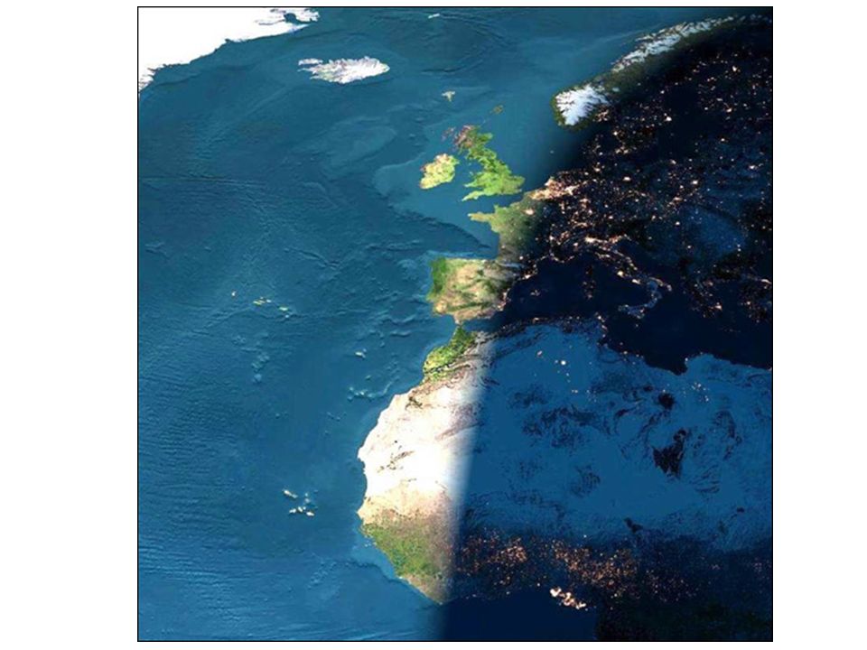
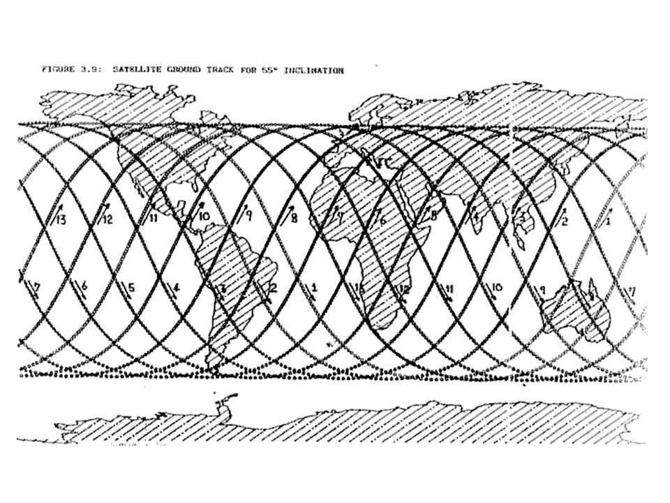
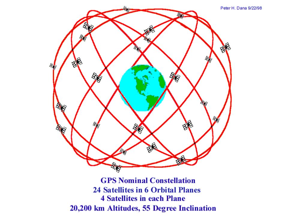
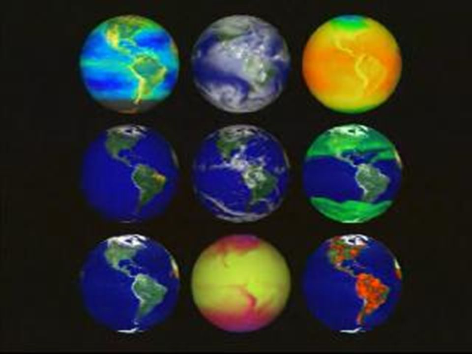
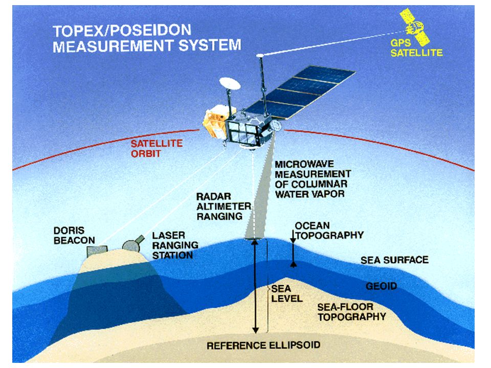
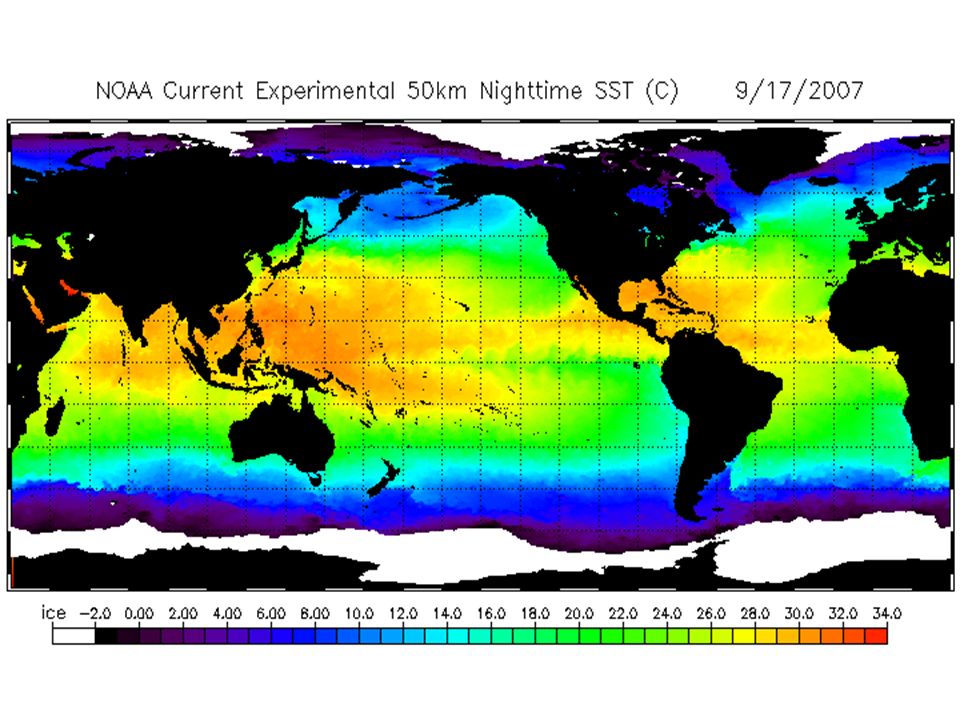

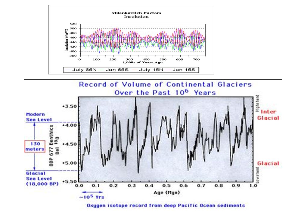

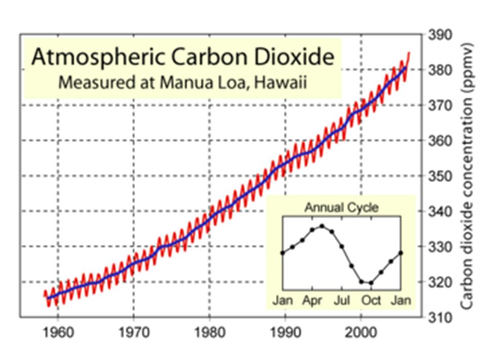


 Physical Oceanography>")


