Download presentation
Presentation is loading. Please wait.

1
STAT 424/524 Statistical Design for Process Improvement
Lecture 1 An Overview of Statistical Process Control

2
Book online

3
Homework #1 & #2 # 1: Do Problems 1.1, 1.3, 1.5, 1.7
#2: Do 1.12 and Derive the table 1.9 on page 36 of the text (also on slide 20), using the following formula:
, using the following formula:")
4
STAT 424/524-001 Statistical Design for Process Improvement Fall 2008
1.1 Introduction Diligence, a good attitude, and hard work are not sufficient for achieving quality control. Statistical process control (SPC) is a way of quality control, which enables us to seek steady improvement in the quality of a product. It is an effective method of monitoring a process through the use of control charts. Statistical Process Control was pioneered by Walter A. Shewhart in the early 1920s. W. Edwards Deming later applied SPC methods in the United States during World War II. STAT 424/ Statistical Design for Process Improvement Fall 2008
 is a way of quality control, which enables us to seek steady improvement in the quality of a product. It is an effective method of monitoring a process through the use of control charts. Statistical Process Control was pioneered by Walter A. Shewhart in the early 1920s. W. Edwards Deming later applied SPC methods in the United States during World War II. STAT 424/ Statistical Design for Process Improvement Fall")
5
Differences between Quality Control and Quality Assurance
Suppose that you are a PhD student about to graduate and applying for an academic position. If you were a product, your supervisor would be the quality control manager, and a search committee who is reviewing your application would be quality assurance manager. Read the following.

6
Core Steps of a Statistical Process Control
Flowcharting of the production process Random sampling and measurement at regular temporal intervals at numerous stages of the production process The use of “Pareto glitches” discovered in this sampling to backtrack in time to discover their causes so that they can be improved.

7
Self Reading Section 1.2 to 1.7

8
1.8 White Balls, Black Balls
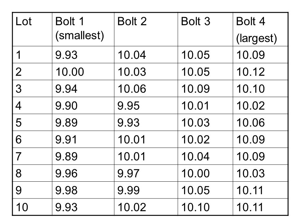
Recall that the second core step of a statistics process control is random sampling and measurement at regular temporal intervals at numerous stages of the production process. The following data table shows measurements of thickness in centimeters of 40 bolts in ten lots of 4 each.

9
Lot Bolt 1 (smallest) Bolt 2 Bolt 3 Bolt 4 (largest) 1 9.93 10.04 10.05 10.09 2 10.00 10.03 10.12 3 9.94 10.06 10.10 4 9.90 9.95 10.01 10.02 5 9.89 6 9.91 7 8 9.96 9.97 9 9.98 9.99 10.11 10
10
Data Display We construct a run chart of thickness against lot number for each bolt.

11
Question: Is the process in control?

12
A SAS Program

13
One Bad Lot We add to each of the 4 measurements in lot 10. The new graph is generated.

14
One Bad Bolt We add only to the 4th measurements in lot 10. The new graph is generated.

15
Run Chart of Means We have constructed run charts of original measurements. We can also construct run charts of a summary statistic, say the lot mean. To do this, we first find the mean for each lot. Then we plot the means against corresponding lots. The run chart of the lot mean for the first data set is shown below.

17
We add 0. 500 to each of the 4 measurements in lot 10
We add to each of the 4 measurements in lot 10. The new run chart is generated.

18
1.9 The Basic Paradigm of Statistical Process Control
We considered ten lots of 4 bolts each. We saw that there is variation within each lot and variation across lots (in terms of lot average). A major task in SPC is to seek significantly outlying lots, good or bad. Once found, such lots can then be investigated to find out why they deviate from others. This is the basic paradigm of SPC: 1. Find a Pareto glitch (a non-standard lot); 2. Discover the causes of the glitch; 3. Use this information to improve the production process. The variability across lots is the key notion in search for Pareto glitches.
. A major task in SPC is to seek significantly outlying lots, good or bad. Once found, such lots can then be investigated to find out why they deviate from others. This is the basic paradigm of SPC: 1. Find a Pareto glitch (a non-standard lot); 2. Discover the causes of the glitch; 3. Use this information to improve the production process. The variability across lots is the key notion in search for Pareto glitches.")
19
1.10 Basic Statistical Procedures in Statistical Process Control
Let’s use the original thickness data. Lot Bolt 1 Bolt 2 Bolt 3 Bolt 4 1 9.93 10.04 10.05 10.09 2 10.00 10.03 10.12 3 9.94 10.06 10.10 4 9.90 9.95 10.01 10.02 5 9.89 6 9.91 7 8 9.96 9.97 9 9.98 9.99 10.11 10

20
Control Chart on Lot Means
To construct control charts for lot means, first calculate the mean and standard deviation of each lot. Then find the mean of means, and mean of standard deviations, Finally find the acceptance interval on the mean that is given by where can be read from the following table.

21
Multiplication Factors for Different Lot Sizes
B3(n) B4(n) A3(n) 2 3 4 5 6 7 8 9 10 15 20 25 0.000 0.030 0.118 0.185 0.239 0.284 0.428 0.510 0.565 3.267 2.568 2.266 2.089 1.970 1.882 1.815 1.761 1.716 1.572 1.490 1.435 2.659 1.954 1.628 1.427 1.287 1.182 1.099 1.032 0.975 0.789 0.680 0.606
 B4(n) A3(n)")
22
Mean Control Chart for Thickness Data
For the thickness data, we calculate the lot means and standard deviations. Click here. The acceptance interval is where the is called the Lower Control Limit (LCL), and the Upper Control Limit (UCL). Does any mean appear to be out of control?
, and the Upper Control Limit (UCL). Does any mean appear to be out of control")
23
STAT 424/524-001 Statistical Design for Process Improvement Fall 2008

24
Control Chart on Standard Deviation

25
Standard Deviation Control Chart for Thickness Data
LCL = UCL = 2.266(0.0664) = 0.15
 =")
26
STAT 424/524-001 Statistical Design for Process Improvement Fall 2008

27
Lot x-bar s 1 2 3 4 5 6 7 8 9 10 11 12 13 14 15 16 17 18 19 20 146.21 146.18 146.22 146.31 146.20 146.15 145.93 145.96 145.88 145.98 146.08 146.12 146.26 146.32 146.00 145.83 145.76 145.90 145.94 145.97 0.12 0.09 0.13 0.10 0.08 0.11 0.18 0.16 0.21 0.32 0.19 0.17 Creating Control Charts for Means and Standard Deviations Based on Summary Statistics Refer to the problem 1.4 on page 48 of Thompson’s text. The summary statistics are reproduced here:

28
PROC SHEWHART HISTORY = problem1_4; xschart A*lot; RUN;
DATA problem1_4; INPUT lot Ax An = 5; CARDS; ; SYMBOL v = dot c = red; PROC SHEWHART HISTORY = problem1_4; xschart A*lot; RUN;

30
1.11 Acceptance Sampling Data, which are characterized as defective or not, are called acceptance/rejection data or failure data. Suppose that a bolt is considered defective if it is smaller than 9.92 or greater than Then the first data set considered can be converted to acceptance/rejection data as follows.

31
1 = Defective 0 = nondefective
Lot Bolt 1 (smallest) Bolt 2 Bolt 3 Bolt 4 (largest) 1 9.93 10.04 10.05 10.09 2 10.00 10.03 10.12 3 9.94 10.06 10.10 4 9.90 9.95 10.01 10.02 5 9.89 6 9.91 7 8 9.96 9.97 9 9.98 9.99 10.11 10 Lot Bolt 1 (smallest) Bolt 2 Bolt 3 Bolt 4 (largest) 1 2 3 4 5 6 7 8 9 10 1 = Defective 0 = nondefective
 Bolt 2. Bolt 3. Bolt 4. (largest) Lot. Bolt 1 (smallest) Bolt 2. Bolt 3. Bolt 4. (largest) = Defective 0 = nondefective.")
32
Overall Proportion of Defectives
In order to apply a SPC procedure to acceptance/rejection data, we note the proportion of defectives in each lot. The overall proportion of defectives is a key statistic, which is calculated by averaging the lot proportions of defectives. In the previous acceptance/rejection data set, the 10 lot proportions of defectives are 0.25, 0.25, 0.50, 0.25, 0.25, 0.50, 0.50, 0.00, 0.25, 0.50 which yields the overall proportion of defectives ( )/10 =
/10 =")
33
Control Limits on the Proportion of Defectives
The lower and upper control limits are The rationale to choose the two limits will be discussed in section 1.13. For our acceptance/rejection data, we have

34
Control Charts on the Proportion of Defectives
Control charts on the proportion of defectives are called p-charts. One may create p-charts from count data or summary data. STAT 424/ Statistical Design for Process Improvement Fall 2008

35
Creating p Charts from Count Data
An electronics company manufactures circuits in batches of 500 and uses a p chart to monitor the proportion of failing circuits. Thirty batches are examined, and the failures in each batch are counted. The following statements create a SAS data set named CIRCUITS, which contains the failure counts, as shown below. data circuits; input batch fail datalines; ; run; STAT 424/ Statistical Design for Process Improvement Fall 2008

36
STAT 424/524-001 Statistical Design for Process Improvement Fall 2008
SAS Statements that Create the p-Chart symbol color = salmon; title 'p Chart for the Proportion of Failing Circuits'; proc shewhart data=circuits; pchart fail*batch / subgroupn = 500 cframe = lib cinfill = bwh coutfill = yellow cconnect = salmon; run; STAT 424/ Statistical Design for Process Improvement Fall 2008

37
Creating p Charts from Summary Data
The previous example illustrates how you can create p charts using raw data (counts of nonconforming items). However, in many applications, the data are provided in summarized form as proportions or percentages of nonconforming items. This example illustrates how you can use the PCHART statement with data of this type. data cirprop; input batch pfailed sampsize=500; datalines; ; STAT 424/ Statistical Design for Process Improvement Fall 2008
. However, in many applications, the data are provided in summarized form as proportions or percentages of nonconforming items. This example illustrates how you can use the PCHART statement with data of this type. data cirprop; input batch pfailed sampsize=500; datalines; ; STAT 424/ Statistical Design for Process Improvement Fall")
38
STAT 424/524-001 Statistical Design for Process Improvement Fall 2008
title 'p Chart for the Proportion of Failing Circuits'; symbol v=dot; proc shewhart data=cirprop; pchart pfailed*batch / subgroupn=sampsize dataunit =proportion; label pfailed = 'Proportion for FAIL'; run; STAT 424/ Statistical Design for Process Improvement Fall 2008

39
What Data to Use, Failure Data or Measurement Data?
The use of failure data is a very blunt instrument when compared to the use of measurement data. This is because of information loss when items are characterized as defective or not, ignoring specific measurements.

40
Control Charts in Minitab
STAT 424/ Statistical Design for Process Improvement Fall 2008

41
1.12 The Case for Understanding Variation
Variation within any process, let alone a system of processes, is inevitable. Large variation adds to complexity and inefficiency of a system. Reducing variation of a process is an important issue.

42
Two Different Sources of Variation
According to Walter Shewhart, there are two qualitatively different sources of variation: Common cause variation (aka random variation or noise) Special cause variation (aka assignable variation) It is the special cause variation that leads to Pareto glitches (also called signals), which can be detected using control charts. Special cause variation is caused by known factors that result in a non-random disruption of output. The special cause variation can be removed through the proper use of control charts.
 Special cause variation (aka assignable variation) It is the special cause variation that leads to Pareto glitches (also called signals), which can be detected using control charts. Special cause variation is caused by known factors that result in a non-random disruption of output. The special cause variation can be removed through the proper use of control charts.")
43
Processes That Are in Control
A process that is already in a state of statistical control is not subject to special cause variation, but only subject to common cause or inherent variation, which is always present and can not be reduced unless the process itself is redesigned. An in-control process is predictable, but may not have to perform satisfactorily. The first data set shown before are from an in-control process, but improvement of the process is still welcome.

44
Two Types of Error Error of the first kind (aka tampering): Treating common causes as special ones. Error of the second kind: Treating special causes as common ones – disregarding signals.

45
Process Capability An in-control process reveals only common cause variation. This variation is measured by process capability. Reduction of common cause variation requires improvement of the process itself.

46
Improvement of a Stable Process
Shewhart and Deming developed the Plan – Do – Study – Act (PDSA) cycle for improvement of a stable process. In order to improve a stable process, one has to PLAN it. Such a plan is recommended to be based on a mathematical model of the process under scrutiny. DOE is also needed. Then DO it on a small scale; that is, run it on a pilot study. Then STUDY or check if the changed process is in control. Finally, ACT accordingly: adopt the change if successful or try some other.
 cycle for improvement of a stable process. In order to improve a stable process, one has to PLAN it. Such a plan is recommended to be based on a mathematical model of the process under scrutiny. DOE is also needed. Then DO it on a small scale; that is, run it on a pilot study. Then STUDY or check if the changed process is in control. Finally, ACT accordingly: adopt the change if successful or try some other.")
47
1.3 Statistical Coda The control limits on the mean is based on the following Central Limit Theorem: If the number of previous lots is large, say 25 or more, the average of the lot means, will give an excellent estimate of μ, and the average of the sample standard deviations, is a good estimate of σ when multiplied by an unbiasing factor a(n),
,")
48
Now replacing μ and σ by their estimates yields the control limits on the mean:

49
Similarly, the CLT for the sample standard deviation gives
It can be shown that Now replacing E(s) and sd(s) by their estimates yields the control limits on the standard deviation:
 and sd(s) by their estimates yields the control limits on the standard deviation:")
50
Finally, for failure data, the CLT also applies for large lot size n to give

51
STAT 424/524 Statistical Design for Process Improvement
Lecture 2 Acceptance-Rejection SPC

52
Homework # 3 Page 71-74: problems 1 to 6

53
Sections 2.1 and 2.2 Self reading

54
2.3 Basic Tests with Equal Lot Size
***** Consider the following failure data; DATA table2_1; Lot +1; INPUT prop = defectives/100; DATALINES; ; PROC PRINT DATA = table2_1 (obs = 5);
;")
55
The SAS System Obs Lot defective prop 1 3 0.03 2 0.02 5 0.05 4 0.00 6 0.06

56
symbol v = dot c = red; PROC GPLOT DATA = TABLE2_1; PLOT prop*Lot; run; quit;

58
Control Limits on the Number of Defectives
Let n be the equal lot size and p be the proportion of defectives in the product. Let X = number of defectives in a lot. Then X ~ B(n, p); that is X follows a binomial distribution with parameters n and p. By the CLT,
; that is X follows a binomial distribution with parameters n and p. By the CLT,")
59
Control Limits on the Number of Defectives (cont’d)
By the empirical rule in statistics, Z is between – 3 and 3; that is, Solving for X gets the Lower Control Limit and Upper Control Limit for the number of defectives:

60
Control Limits on the Number of Defectives (cont’d)
Since the LCL might be negative, UCL might be greater than 1, modified LCL and UCL are A control chart based on the above LCL and UCL is called a np chart.

61
symbol color = salmon; title ‘np Chart for the Proportion Defectives'; proc shewhart data = table2_1; npchart defectives*Lot / subgroupn = 100 cframe = lib cinfill = bwh coutfill = yellow cconnect = salmon; run;

62
p Charts Control limits on the proportion defectives have the form:
The corresponding charts are called p charts.

63
symbol color = salmon; title 'p Chart for the Proportion Defectives'; proc shewhart data = table2_1; pchart defectives*Lot / subgroupn = 100 cframe = lib cinfill = bwh coutfill = yellow cconnect = salmon; run;

64
2.4 Testing with Unequal Lot Sizes
If the lot sizes are unequal, the control limit for the proportion defectives has to be calculated for each lot separately. The control limits for the p chart assume now the forms

65
Page 64 DATA table2_2; Month +1; INPUT Patients Infections@@;
DATALINES; ;

66
proc shewhart data = table2_2;
pchart Infections*Month / subgroupn = Patients outtable = CLtable ; run; DATA page64; MERGE table2_2 CLtable (KEEP = _SUBP_ _UCLP_); PROC print; RUN; quit;
; PROC print; RUN; quit;")
67
2.5 Testing with Open-Ended Count Data
Let X denote the number of items returned per week say. X roughly has a Poisson distribution, i.e.,

68
Control Limits on the Number Returned Items
For Poisson distribution, the mean equals the variance. The control limits of the number returned items are A chart with these control limits is called a c chart. A c chart should not be used if lots are of unequal sizes, instead, use u chart.

69
data table2_4; Week +1; input numReturned datalines; ; proc print; run;

70
c Charts proc shewhart data=table2_4; cchart numReturned*Week; run;
symbol color = red h = .8; title1 'c Chart for Number of Returned Items Per Week'; proc shewhart data=table2_4; cchart numReturned*Week; run;

71
u Charts Suppose the sample size in lot k is nk, and the number defects in lot k is ck, then the number of defects per unit in lot k is uk = ck/nk. The control limits on the average number of defects per unit are

72
Example In a fabric manufacturing process, each roll of fabric is 30 meters long, and an inspection unit is defined as one square meter. Thus, there are 30 inspection units in each subgroup sample. Suppose now that the length of each piece of fabric varies. The following statements create a SAS data set (FABRICS) that contains the number of fabric defects and size (in square meters) of 25 pieces of fabric:
 that contains the number of fabric defects and size (in square meters) of 25 pieces of fabric:.")
73
data fabrics; input roll defects sqmeters datalines; ;

74
The variable ROLL contains the roll number, the variable DEFECTS contains the number of defects in each piece of fabric, and the variable SQMETERS contains the size of each piece. The following statements request a u chart for the number of defects per square meter: symbol color = vig; title 'u Chart for Fabric Defects per Square Meter'; proc shewhart data=fabrics; uchart defects*roll / subgroupn = sqmeters cframe = steel cinfill = ligr coutfill = yellow cconnect = vig outlimits = flimits; run;

76
data abc; input do i=1 to 5; input output; end; drop i; cards; ; proc print data=abc noobs; run;

77
Constructing Control Charts With Summary Data In SAS
data abc; input lot Ax As; An = 5; cards; ; title ’Mean and Standard Deviation Charts for Diameters’; symbol v=dot; proc shewhart history=abc; xschart A*lot; run; quit;

78
STAT 424/524 Statistical Design for Process Improvement
Lecture 3 The development of mean and standard deviation control charts

79
Homework # 4 Page : problems 3.1(a), 3.4, 12, 13, 14
, 3.4, 12, 13, 14")
80
3.1 Introduction In a process of manufacturing bolts, which are required to have a 10 cm diameter, we often actually observe bolts of diameter other than 10 cm. This is a consequence of flaws in the production process. These imperfections might be excessive lubricant temperature, bearing vibration, or nonstandard raw materials, etc. In SPC, these flaws can often be modeled as follows: Let Y = observed diameter. Then Y ~ N(µ, σ2).
.")
81
To model a process clearly taking account of possible individual flaws, we write the observed measurement in lot t, Y(t), as Here we have assumed additive flaws, representing k assignable causes. There may be, in any lot t, as many as 2k possible combinations of flaws contributing to Y(t).
.")
82
Let I be a subcollection of {1, 2, 3,..., k}. Then
In the special case where each distribution is normal, In the above discussion, X0 accounts for the common cause while other X’s represents special causes. The major task of SPC is to identify these special causes and to take steps which remove them.

83
3.2 A Contaminated Production Process
Continue our discuss in section 1. Let X0 ~ N(µ0, σ02), where µ0 = 10 and σ02 = 0.01. In addition, we have one special cause due to intermittent lubricant heating, say X1 which is N(0.4, 0.02), and another due bearing vibration, say X2 which is N(- 0.2, 0.08), with probability of occurrence p1 = 0.01 and p2 = 0.005, respectively. So, for a sampled lot t, Y(t) can be written as
, where µ0 = 10 and σ02 = In addition, we have one special cause due to intermittent lubricant heating, say X1 which is N(0.4, 0.02), and another due bearing vibration, say X2 which is N(- 0.2, 0.08), with probability of occurrence p1 = 0.01 and p2 = 0.005, respectively. So, for a sampled lot t, Y(t) can be written as.")
84
Or, Y(t) has the following distribution
One can verify that

85
3.3 Estimation of Parameters of the “Norm” Process
The “norm” process refers to a uncontaminated process whose mean and variance can be estimated respectively by Properties: Both are unbiased Both are asymptotically normal.

86
Estimating the Process Standard Deviation, σ
An intuitive estimator for σ is the square root of A more commonly used estimator is the average of lot standard deviations

87
The Famous Result

88
One can thus show that So, an unbiased estimator of the process standard deviation, σ, is

89
One can also show that This is because So, another unbiased estimator of the process standard deviation, σ, is

90
Which One is More Efficient?

92
Using the (Adjusted) Average of Lot Ranges to Estimate the Process Standard Deviation
 Average of Lot Ranges to Estimate the Process Standard Deviation")
93
Using the (Adjusted) Median of Lot Standard Deviations to Estimate the Process Standard Deviation
 Median of Lot Standard Deviations to Estimate the Process Standard Deviation")
94
3.4 Robust Estimators for Uncontaminated Process Parameters
Suppose that the proportion of good lots is p and the proportion of bad lots is 1 – p. Suppose that data in a good lot come from a normal distribution with mean µ0 and standard deviation σ0. Suppose that data in a bad lot come from a normal distribution with mean µ1 and standard deviation σ1.

95
How can we construct a control chart for lot means, based on data from the above contaminated distribution? A solution: The control limits are

96
A Simulation Study Let’s generate 90 lots of size 5 each. A lot is good with probability p = 70%. Data in a good lot are from N(10, 0.01). Data in a bad lot are from N(9.8, 0.09). Data simulated in Excel.
. Data simulated in Excel.")
97
A SAS Program: Generate Good and Bad Lots
data table3_3; retain mu0 10;retain mu1 9.8;retain sigma0 0.1;retain sigma1 0.3; do Lot = 1 to 90; u = ranuni(12345); if (u < 0.7) then do j = 1 to 5; x = mu0 + sigma0*rannor(1); /*good lot data*/ output; end; else x = mu1 + sigma1*rannor(1); /*bad lot data*/ keep Lot x; Run; proc print; run; symbol v = dot c = red; proc shewhart; xschart x*Lot; run; quit;
; if (u < 0.7) then. do j = 1 to 5; x = mu0 + sigma0*rannor(1); /*good lot data*/ output; end; else. x = mu1 + sigma1*rannor(1); /*bad lot data*/ keep Lot x; Run; proc print; run; symbol v = dot c = red; proc shewhart; xschart x*Lot; run; quit;")
98
R Program: Generate Data from Good and Bad Lots
mu0 = 100 mu1 = 9.8 sigma0 = 0.01 sigma1 = 0.09 p = 0.7 n = 90 k=5 x = matrix(0,n,k) for(i in 1:n){ u <- runif(1) if (u < p) x[i,] = rnorm(k, mu0, sigma0) # from good lot else x[i,] = rnorm(k, mu1, sigma1) # from bad lot } x
 for(i in 1:n){ u <- runif(1) if (u < p) x[i,] = rnorm(k, mu0, sigma0) # from good lot. else x[i,] = rnorm(k, mu1, sigma1) # from bad lot. } x.")
99
3. 5 A Process with Mean Drift 3
3.5 A Process with Mean Drift 3.6 A Process with Upward Drift in Variance Skip

100
3.7 Charts for Individual Measurements
Grouping as many measurements as possible into a lot is important in order to get more accurate estimates of the population mean and standard deviation. This is not possible in some situations. The reason typically is that either the production rate is too slow or the production is performed under precisely the same conditions over short time intervals.

101
Construct Control Charts for Individual Measurements
Let’s consider 90 observations coming from N(10, 0.01) with probability 0.855, N(10, 0.01) with probability 0.095, N(10, 0.01) with probability 0.045, and N(10, 0.01) with probability We construct a scatterplot of the 90 measurements against corresponding lot numbers. The control limits are
 with probability 0.855, N(10, 0.01) with probability 0.095, N(10, 0.01) with probability 0.045, and. N(10, 0.01) with probability We construct a scatterplot of the 90 measurements against corresponding lot numbers. The control limits are.")
102
Moving Ranges Control Charts for Individual Measurements
A better control charts for Individual Measurements are based on artificial lots of size 2 or 3 and calculate the so-called moving ranges. Given N individual measurements, X1, X2, ...,XN, the ith moving range of n observations is defined as the difference between the largest and the smallest value in the ith artificial lot formed from the n measurements Xi, Xi+1 , ...,Xi+n-1, where i = 1, 2, ..., N – n + 1.

103
The average of N – n +1 moving ranges is
The moving range control chart has D3(n) and D4(n) are given in Table 3.9 of the text, p115.
 and D4(n) are given in Table 3.9 of the text, p115.")
104
The average of N – 1 moving ranges is
Given N individual measurements, X1, X2, ...,XN, the N – 1 moving ranges of n = 2 observations are defined as MR1 = |X2 - X1|, MR2 = |X3 – X2|,..., MRN-1 = |XN – XN-1|. The average of N – 1 moving ranges is

105
X Charts based on Moving Ranges
For given individual measurements, X1, X2, ...,XN, the X chart is constructed by estimating the population standard deviation σ, the product of b2 and the the average of the moving ranges. The control limits are

106
SAS Code for X Charts based on Moving Ranges
data table3_6; mu0 = 10; mu1 = 10.4; mu2 = 9.8; mu3 = 10.2; sigma0 = 0.1; sigma1 = sqrt(0.03); sigma2 = 0.3; sigma3 = sqrt(0.11); do Lot = 1 to 90; u = ranuni(12345); if (u < 0.855) then do; x = mu0 + sigma0*rannor(1); output; end; else if (u < 0.95) then x = mu1 + sigma1*rannor(1); else if (u < 0.995) then x = mu2 + sigma2*rannor(1); else x = mu3 + sigma3*rannor(1); keep Lot x; Run; proc print; Run; symbol v = dot c = red; proc shewhart; xchart x*Lot; run; quit;
; sigma2 = 0.3; sigma3 = sqrt(0.11); do Lot = 1 to 90; u = ranuni(12345); if (u < 0.855) then. do; x = mu0 + sigma0*rannor(1); output; end; else if (u < 0.95) then. x = mu1 + sigma1*rannor(1); else if (u < 0.995) then. x = mu2 + sigma2*rannor(1); else. x = mu3 + sigma3*rannor(1); keep Lot x; Run; proc print; Run; symbol v = dot c = red; proc shewhart; xchart x*Lot; run; quit;")
107
3.8 Process Capability We have discussed some control charts for detecting Pareto glitches in a process. Whether an in control process meets some technological specification is another important issue. It is summary statistics for lots that are examined for the purpose of controlling a process, while individual measurements are compared to specifications. The capability of an in-control process in relation to technological specifications is measured by some indices.

108
The Cp Index

109
The Cp Index for Nonnormal Data

110
The Cpk Index The index Cp does not account for process centering.
To account for process centering, use

111
Solution From the table,
Example Use Table 3.10 on textbook page 121. Calculate Cp and Cpk. Suppose that the diameter was specified to 6.75 mm with tolerances +/- 0.1 mm; that is LSL = 6.65 mm and USL = 6.85 mm. Solution From the table,

113
SAS: proc capability data amps;
label decibels = 'Amplification in Decibels (dB)'; input decibels datalines; ; run; title 'Boosting Power of Telephone Amplifiers'; legend2 FRAME CFRAME=ligr CBORDER=black POSITION=center; proc capability data=amps noprint alpha=0.10; var decibels; spec target = 5 lsl = 4 usl = 6 ltarget = 2 llsl = 3 lusl = 4 ctarget = red clsl = yellow cusl = yellow; histogram decibels / cframe = ligr cfill = steel cbarline = white legend = legend2; inset cpklcl cpk cpkucl / header = '90% Confidence Interval' cframe = black ctext = black cfill = ywh format = 6.3; run;
 ; input decibels datalines; ; run; title Boosting Power of Telephone Amplifiers ; legend2 FRAME CFRAME=ligr CBORDER=black POSITION=center; proc capability data=amps noprint alpha=0.10; var decibels; spec target = 5 lsl = 4 usl = 6. ltarget = 2 llsl = 3 lusl = 4. ctarget = red clsl = yellow cusl = yellow; histogram decibels / cframe = ligr cfill = steel cbarline = white legend = legend2; inset cpklcl cpk cpkucl / header = 90% Confidence Interval cframe = black. ctext = black cfill = ywh format = 6.3; run;")
115
The following statements can be used to produce a table of process capability indices including the index Cpk: ods select indices; proc capability data=amps alpha=0.10; spec target = 5 lsl = 4 usl = 6 ltarget = 2 llsl = 3 lusl = 4; var decibels; run;

116
STAT 424/524 Statistical Design for Process Improvement
Lecture 4 Sequential Approaches

117
Homework # 5 Page 166: problems 4.1 (do the first part only) and 4.10
 and 4.10")
118
4.1 Introduction The first three chapters deal with Shewhart control charts, which are useful in detecting special cause variation. A major disadvantage of a Shewhart control chart is that it uses only the information about the process contained in the last sample observation and it ignores any information given by the entire sequence of points. This feature makes the Shewhart control charts insensitive to small process shift. This chapter deal with two alternatives to the Shewhart control charts: cumulative sum (CUSUM) control charts and Exponentially Weighted Moving Average (EWMA) control charts, both are sensitive to small process drifts.
 control charts and Exponentially Weighted Moving Average (EWMA) control charts, both are sensitive to small process drifts.")
119
4.2 The Sequential Likelihood Ratio Test
Suppose we have a time ordered data set x1, x2, …, xn coming from a distribution with density f(x; ). We may wish to test whether the true parameter is 0 or 1. A natural criterion for deciding between the two parameters is the log-likelihood ratio:
. We may wish to test whether the true parameter is 0 or 1. A natural criterion for deciding between the two parameters is the log-likelihood ratio:")
120
Decision Rule We propose the following decision rule:
When z ≤ ln(k0), (x1, x2, …, xn) being said in region Gn0, we decide for 0; When z ≥ ln(k1), (x1, x2, …, xn) being said in region Gn1, we decide for 1; Otherwise, we are in region Gn, and we continue sampling.
, (x1, x2, …, xn) being said in region Gn0, we decide for 0; When z ≥ ln(k1), (x1, x2, …, xn) being said in region Gn1, we decide for 1; Otherwise, we are in region Gn, and we continue sampling.")
121
Before we make our decision, our sample (x1, x2, …, xn) falls in one of three regions:
Gn0, Gn1, and Gn. Denote the true parameter by . The probability of ever declaring for 0 is given by L() = P(G10|) + P(G20|) + … By the definition of Gn0, we have
 = P(G10|) + P(G20|) + … By the definition of Gn0, we have.")
122
Let us suppose that if is truly equal to 0, we wish to have L(0) = 1 - .
Here and are customarily referred to as Type I and Type II errors. Then, we must have = L(1) ≤ k0L(0) = k0(1 - ). So, By a similar argument for Gn1, we have In practice, choose
 ≤ k0L(0) = k0(1 - ). So, By a similar argument for Gn1, we have. In practice, choose.")
123
We can show that the actual Type I and Type II errors, say . and
We can show that the actual Type I and Type II errors, say * and * satisfy

124
4.3 CUSUM Test for Shift of the Mean
To detect a shift of the mean of a production process from 0 to some other value 1, we consider a sequential test. We assume that the process variance is known and does not change. We propose a test on the basis of the log-likelihood ratio of N sample means, each sample being of size n. The test statistic is

125
The test statistic R1 is based on a cumulative sum
The test statistic R1 is based on a cumulative sum. It is not so much oriented to detecting “Pareto glitches”, but rather to discovering a persistent change in the mean.

126
For given Type I and Type II errors, say = 0. 01 and = 0
For given Type I and Type II errors, say = 0.01 and = 0.01, by the sequential test procedure, The CUSUM chart is a plot of R1, based on data up to the jth sample, versus j, j = 1, 2, …, N, added with control limits ln(k0) and ln(k1).
 and ln(k1).")
127
data table3_6; retain mu0 10 mu mu2 9.8 mu3 10.2; retain sigma0 0.1 sigma sigma2 0.3 sigma ; array x(5) x1 x2 x3 x4 x5; do Lot = 1 to 90; u = ranuni(12345); if (u < 0.855) then do; do i = 1 to 5; x[i] = mu0 + sigma0*rannor(1); end; output; end; else if (u < 0.95) then do; x[i] = mu1 + sigma1*rannor(1); else if (u < 0.995) then do; x[i] = mu2 + sigma2*rannor(1); else do; x[i] = mu3 + sigma3*rannor(1); end; Keep Lot x1-x5; Run; proc print;run; Data means; set table3_6; sum + mean(of x1-x5); m= sum/Lot; R1 = Lot*(5/0.1)*(m - ( )/2); LCL = ; UCL = 4.595; Keep Lot R1 LCL UCL; Run; symbol1 v = dot c = blue r = 1; symbol2 v = dot c = red r = 1; symbol3 v = dot c = blue r = 1; proc gplot data = means; plot (LCL R1 UCL)*Lot/overlay; label R1 = “R1 statistic”; run; data long; set table3_6; Lot = _N_; array x{5} x1-x5; do i=1 to 5; y = x{i}; output; end; keep Lot y; Run; Proc cusum data = long; xchart y*Lot/mu0 = 10.0 sigma0 = 0.1 delta = 1 alpha = 0.1 vaxis = -20 to 80; Run; quit;
 x1 x2 x3 x4 x5; do Lot = 1 to 90; u = ranuni(12345); if (u < 0.855) then do; do i = 1 to 5; x[i] = mu0 + sigma0*rannor(1); end; output; end; else if (u < 0.95) then do; x[i] = mu1 + sigma1*rannor(1); else if (u < 0.995) then do; x[i] = mu2 + sigma2*rannor(1); else do; x[i] = mu3 + sigma3*rannor(1); end; Keep Lot x1-x5; Run; proc print;run; Data means; set table3_6; sum + mean(of x1-x5); m= sum/Lot; R1 = Lot*(5/0.1)*(m - ( )/2); LCL = ; UCL = 4.595; Keep Lot R1 LCL UCL; Run; symbol1 v = dot c = blue r = 1; symbol2 v = dot c = red r = 1; symbol3 v = dot c = blue r = 1; proc gplot data = means; plot (LCL R1 UCL)*Lot/overlay; label R1 = R1 statistic ; run; data long; set table3_6; Lot = _N_; array x{5} x1-x5; do i=1 to 5; y = x{i}; output; end; keep Lot y; Run; Proc cusum data = long; xchart y*Lot/mu0 = sigma0 = 0.1. delta = 1. alpha = 0.1. vaxis = -20 to 80; Run; quit;")
128
4.4 Shewhart CUSUM Charts A popular empirical alternative to the CUSUM chart is the Shewhart CUSUM chart. This chart is based on the pooled cumulative/running means Suppose that all the lot means are iid with common lot mean 0 and lot variance 02/n. Then A Shewhart CUSUM Chart for mean shift is one that plots zi against I, along with the horizontal lines 3 and – 3.

129
Shewhart CUSUM Charts Data means2; set table3_6;
sum + mean(of x1-x5); m = sum/Lot; R2 = sqrt(Lot*5)/0.1*(m-10); LCL = -3; UCL = 3; Keep Lot sum m R2 LCL UCL; Run; proc print; run; symbol1 v = dot c = black r = 1; symbol2 v = dot c = red r = 1; symbol3 v = dot c = red r = 1; proc gplot data = means2; plot (R2 LCL UCL)*Lot/overlay; label R2 = “R2 statistic”; run; quit;
; m = sum/Lot; R2 = sqrt(Lot*5)/0.1*(m-10); LCL = -3; UCL = 3; Keep Lot sum m R2 LCL UCL; Run; proc print; run; symbol1 v = dot c = black r = 1; symbol2 v = dot c = red r = 1; symbol3 v = dot c = red r = 1; proc gplot data = means2; plot (R2 LCL UCL)*Lot/overlay; label R2 = R2 statistic ; run; quit;")
130
4.8 Acceptance-Rejection CUSUMs
Let p denote the proportion of defective goods from a production system. Let p0 denote the target proportion deemed appropriate. When p rises to p1, intervention will be introduced. Let nj denote the size of lot j. Then the likelihood ratio is given by

132
CUSUM Test for Defect Data
To detect a process drift in mean, plot R5 versus Lot = N. To horizontal lines R5 = and R5 = are also plotted. Any point in the plot that is above the line R5 = indicates a process drift in proportion.

133
data table4_8; Lot = _N_; input defective size = 100; cards; ; run; data new; set table4_8; p1 = 0.05; p0 = 0.03; xsum + defective; nsum + size; R5 = log(p1/p0)*xsum + log((1-p1)/(1-p0))*(nsum - xsum); LCL = ; UCL = 4.596; keep Lot R5 LCL UCL; run; proc print; run; symbol1 v = dot c = black r = 1; symbol2 v = dot c = red r = 1; symbol3 v = dot c = red r = 1; proc gplot data = new; plot (R5 LCL UCL)*Lot/overlay; quit;
*xsum + log((1-p1)/(1-p0))*(nsum - xsum); LCL = ; UCL = 4.596; keep Lot R5 LCL UCL; run; proc print; run; symbol1 v = dot c = black r = 1; symbol2 v = dot c = red r = 1; symbol3 v = dot c = red r = 1; proc gplot data = new; plot (R5 LCL UCL)*Lot/overlay; quit;")
134
Shewhart CUSUM Test for Defect Data
Plot R6 against Lot, along with the two lines R6 = - 3 and R6 = 3.

135
data table4_8; Lot = _N_; input defective size = 100; cards; ; run; data new; set table4_8; p1 = 0.05; p0 = 0.03; xsum + defective; nsum + size; R6 = (xsum - p0*nsum)/sqrt(nsum*p0*(1-p0)); LCL = -3; UCL = 3; keep Lot R6 LCL UCL; run; proc print; run; symbol1 v = dot c = black r = 1; symbol2 v = dot c = red r = 1; symbol3 v = dot c = red r = 1; proc gplot data = new; plot (R6 LCL UCL)*Lot/overlay; quit;
/sqrt(nsum*p0*(1-p0)); LCL = -3; UCL = 3; keep Lot R6 LCL UCL; run; proc print; run; symbol1 v = dot c = black r = 1; symbol2 v = dot c = red r = 1; symbol3 v = dot c = red r = 1; proc gplot data = new; plot (R6 LCL UCL)*Lot/overlay; quit;")
136
STAT 424/524 Statistical Design for Process Improvement
Lecture 5 Exploratory Techniques for Preliminary Analysis

137
Homework # 6 Page 220: problems 2, 4, 5, 6

138
5.2 The Schematic Plot: The Boxplot
Maximum observation Upper fence (not drawn) 1.5 (IQR) above 75th percentile 1.5 (IQR) 75th percentile + Mean (specified with SYMBOL1 statement) Interquartile Range (IQR Median 25th percentile 1.5 (IQR) Whisker Minimum observation Lower fence (not drawn) 1.5 (IQR) below 25th percentile BOXSTYLE = schematic ( or schematicid, or schematicidfar, if id statement used) Observations that are outside the fences point to Pareto glitches.
 1.5 (IQR) above 75th percentile. 1.5 (IQR) 75th percentile. + Mean (specified with SYMBOL1. statement) Interquartile. Range (IQR. Median. 25th percentile. 1.5 (IQR) Whisker. Minimum observation. Lower fence (not drawn) 1.5 (IQR) below 25th percentile. BOXSTYLE = schematic ( or schematicid, or schematicidfar, if id statement used) Observations that are outside the fences point to Pareto glitches.")
139
data myData; retain mu0 10 mu mu2 9.8 mu3 10.2; retain sigma0 0.1 sigma sigma2 0.3 sigma ; array x(5) x1 x2 x3 x4 x5; do Lot = 1 to 90; u = ranuni(12345); if (u < 0.855) then do; do i = 1 to 5; x[i] = mu0 + sigma0*rannor(1); end; output; end; else if (u < 0.95) then do; x[i] = mu1 + sigma1*rannor(1); end;output; end; else if (u < 0.995) then do; x[i] = mu2 + sigma2*rannor(1); else do; x[i] = mu3 + sigma3*rannor(1); output; end; keep Lot x1-x5;Run; Data mean; set myData; lotMean = mean (of x1-x5); x = "-"; keep Lot lotMean x; Run; Symbol v = plus c = blue; title “ Box Plot of Lot Means”; proc boxplot; /* create side-by-side boxplot*/ plot lotMean*x/ boxstyle=schematicidfar idsymbol=circle; /* identify obs. out of fences or extremes*/ id Lot; label x = ''; run;
 x1 x2 x3 x4 x5; do Lot = 1 to 90; u = ranuni(12345); if (u < 0.855) then do; do i = 1 to 5; x[i] = mu0 + sigma0*rannor(1); end; output; end; else if (u < 0.95) then do; x[i] = mu1 + sigma1*rannor(1); end;output; end; else if (u < 0.995) then do; x[i] = mu2 + sigma2*rannor(1); else do; x[i] = mu3 + sigma3*rannor(1); output; end; keep Lot x1-x5;Run; Data mean; set myData; lotMean = mean (of x1-x5); x = - ; keep Lot lotMean x; Run; Symbol v = plus c = blue; title Box Plot of Lot Means ; proc boxplot; /* create side-by-side boxplot*/ plot lotMean*x/ boxstyle=schematicidfar idsymbol=circle; /* identify obs. out of fences or extremes*/ id Lot; label x = ; run;")
140
5.3 Smoothing by Threes Signal is usually contaminated with noise. John Tukey developed the so-called 3R smooth method which somehow removes the jitters and enables one to better approximate the signal.

141
3R: SAS or R Program

142
5.4 Bootstrapping Most of the standard testing in SPC is based on the assumption that lot means are normally distributed. This assumption is questionable because measurements may not be normal and lot sizes are usually small, say less than 10. To avoid the normality assumption, one use resampling. Bootstrapping is one of the resampling methods.

143
Bootstrapping Means Suppose we have a data set of size n. We wish to construct a bootstrap confidence interval for the mean of the distribution from which the data were taken. There are at least four methods for bootstrapping the mean.

144
The Percentile Method The procedure is as follows:
Select with replacement n of the original observations. Such a sample is called a bootstrap sample. Computer the mean of this bootstrap sample. Repeat the resampling procedure B = 10,000 times. The B means are denoted as Order theses means from smallest to largest. Denote the 250th largest value and the 9750th largest value as a and b, respectively, then the 95% percentile bootstrap confidence interval of the mean is [a, b].

145
R program for the Percentile Method
boot = function(x, B){ n = length(x) A = matrix(0, B, n) for (i in 1:B){ A[i, ] = sample(x, n, replace = T) } A x=c(2,5,1,8,3,2) D = boot(x, 10000) y = apply(D, 1, mean) ## y holds means confidenceInterval= c(y[250], y[9750])
{ n = length(x) A = matrix(0, B, n) for (i in 1:B){ A[i, ] = sample(x, n, replace = T) } A. x=c(2,5,1,8,3,2) D = boot(x, 10000) y = apply(D, 1, mean) ## y holds means. confidenceInterval= c(y[250], y[9750])")
146
Lunneborg's Method Denote the mean of the original sample by
Clifford Lunneborg proposed to use as the 95% confidence interval of the mean.

147
The Bootstrapped t Method
Denote the B bootstrap standard deviations as Calculate the B t values Order these t values from smallest to largest. Denote the 250th as a and the 9750th as b. Then the 95% bootstrapped t confidence interval is

148
The BCa Method A better confidence interval for a parameter is constructed using the BCa (“bias correction and acceleration”) method. One may be concerned with two problems. One is that the sample estimate may be a biased estimate of the population parameter. Another problem is that the standard deviation of the sample estimate usually depends on the unknown parameter we are trying to estimate. To deal with the two problems, Bradley Efron proposed the BCA method. For details, refer to this paper.

149
5.5 Pareto and Ishikawa Diagrams
The Pareto diagram tells top management where it is most appropriate to spend resources in finding problems. The Ishikawa diagram, also known as fishbone diagram or cause and effect diagram, is favored by some as a tool for finding the ultimate cause of a system failure. See an example of such a diagram on page 197.

150
Create Pareto Charts Using SAS
data failure3; input cause$1-16 count; cards; Contamination 14 Corrosion 2 Doping Metallization 2 Miscellaneous 3 Oxide Defect 8 Silicon Defec 1 ; run; title 'Analysis of IC Failures'; symbol color = salmon; proc pareto data=failure3; vbar cause / freq = count scale = count interbar = 1.0 last = 'Miscellaneous' nlegend = 'Total Circuits' cframenleg = ywh cframe = green cbars = vigb ; run;

151
5.6 A Bayesian Pareto Analysis for System Optimization of the Space Station

152
STAT 424 Statistical Design for Process Improvement
Lecture 6 Introductory Statistical Inference and Regression Analysis

153
1.1 Elementary Statistical Inference
Population Sample Statistical inference: the endeavor that uses sample data to make decision about a population. Statistic Estimators and estimates Random variable

154
Unbiasedness and Efficiency

155
where the Fisher information I(θ) is defined by
Suppose θ is an unknown parameter which is to be estimated from measurements x, distributed according to some probability density function f(x;θ). It can be shown that the variance of any unbiased estimator of θ is bounded by the inverse of the Fisher information I(θ): where the Fisher information I(θ) is defined by and is the natural logarithm of the likelihood function and E denotes the expected value. The efficiency of is defined to be the following ratio: The sample mean and sample median of a normal sample are both unbiased estimators of the population mean. The sample mean is more efficient. (Cramér–Rao lower bound)
. It can be shown that the variance of any unbiased estimator of θ is bounded by the inverse of the Fisher information I(θ): where the Fisher information I(θ) is defined by. and is the natural logarithm of the likelihood function and E denotes the expected value. The efficiency of is defined to be the following ratio: The sample mean and sample median of a normal sample are both unbiased estimators of the population mean. The sample mean is more efficient. (Cramér–Rao lower bound)")
156
Point and Interval Estimation
When we estimate a parameter θ by , we say is a point estimator of θ. Alternatively, we use interval to locate the unknown parameter θ. Such an interval contains the unknown parameter with some probability 1 – α. The interval is called a 1 – α confidence interval. A 95% confidence interval means that, when the random sampling procedure is repeated 1000 times, among the 1000 confidence intervals, about 950 will cover the known parameter θ.

157
Confidence Intervals for the Mean of a Normal Population
We consider a population that is normally distributed as N(µ, σ2). If the variance σ2 is known, then the exact 1 – α confidence interval for µ is But, σ is usually unknown. We estimate it by the sample standard deviation s. A new exact 1 – α confidence interval for µ is
. If the variance σ2 is known, then the exact 1 – α confidence interval for µ is. But, σ is usually unknown. We estimate it by the sample standard deviation s. A new exact 1 – α confidence interval for µ is.")
158
Normal-theory Based Confidence Interval for a Parameter θ
The point estimator is usually normally distributed when sample size n is large (>30), even for a non-normal population. A 1 – α confidence interval is then constructed as
, even for a non-normal population. A 1 – α confidence interval is then constructed as.")
159
Examples data Heights; label Height = 'Height (in)'; input Height @@;
datalines; ; run; title 'Analysis of Female Heights'; proc univariate data=Heights mu0 = 65 alpha = normal ; var Height; histogram Height; qqplot Height; probplot Height;

160
Confidence Interval for Difference between Two Means of Normal Populations with Unequal Known Variance

161
Confidence Interval for Difference between Two Means of Normal Populations with Equal Unknown Variance

162
Confidence Interval for Difference between Two Means (Equal Unknown Variances), When Sample Sizes Are Large
, When Sample Sizes Are Large")
163
Examples

164
Confidence Interval for a Proportion

165
SAS Procedure for a Proportion: PROC FREQ
data Color; input Region Eyes $ Hair $ Count label Eyes ='Eye Color' Hair ='Hair Color' Region='Geographic Region'; datalines; 1 blue fair blue red blue medium 24 1 blue dark green fair green red 7 1 green medium green dark brown fair 34 1 brown red brown medium brown dark 40 1 brown black blue fair blue red 21 2 blue medium blue dark blue black 6 2 green fair green red green medium 37 2 green dark brown fair brown red 42 2 brown medium brown dark brown black 13 ; proc freq data=Color order=freq; weight Count; tables Eyes / binomial alpha=.1; tables Hair / binomial(p=.28); title 'Hair and Eye Color of European Children'; run;
; title Hair and Eye Color of European Children ; run;")
166
Confidence Interval for the Difference between Two Proportions (Independent Samples)
")
167
Confidence Interval for the Difference between Two Proportions (Paired Samples)
")
168
Examples

169
Tests of Hypotheses The null hypothesis The alternative hypothesis
Type I and type II errors Level of significance

170
One Sample t-Test title 'One-Sample t Test'; data time; input time @@;
datalines; ; run; proc ttest h0=80 alpha = 0.05; var time;

171
Two-Sample t-Test: Comparing Group Means
Equal variance case: Unequal variance case:

172
Two-Sample t-Test: Comparing Group Means
title 'Comparing Group Means'; data OnyiahExample1_14; input machine $ speed datalines; ; run; proc ttest; /* produce results for both equal and unequal variances*/ class machine; var speed; Question: How can you find the p-value for one-sided test? Use symmetry.

173
Paired Comparison: Paired t-Test
Pairs (i) Before Treatment After Treatment Differences (di) Y Y Y11 - Y12 Y Y Y21 – Y22 Y Y Y31 – Y32 . N Yn Yn Yn1 - Yn2
 Before Treatment After Treatment Differences (di) 1 Y11 Y12 Y11 - Y12. 2 Y21 Y22 Y21 – Y22. 3 Y31 Y32 Y31 – Y32. . N Yn1 Yn2 Yn1 - Yn2.")
174
Two-Sample Paired t-Test: Comparing Group Means
title 'Paired Comparison'; data pressure; input SBPbefore SBPafter d = SBPbefore - SBPafter; datalines; ; Run; proc univariate; var d; proc ttest; paired SBPbefore*SBPafter; run;

175
Operating Characteristic (OC) Curves
 Curves")
176
Find the Power of the Test for a Population Mean
Assume that we have the following: H0: = (1500 is called the claimed value) H1: < 1500 Sample size: n = 20 Significance level: = 0.05 The population standard deviation is known = 110. Question: (1) Find the power of the test, which is the probability of rejecting the null hypothesis, given that the population mean is actually 1450 (called alternative value). (2) Find powers corresponding to any alternative . Plot the power against .
 H1: < Sample size: n = 20. Significance level: = The population standard deviation is known = 110. Question: (1) Find the power of the test, which is the probability of. rejecting the null hypothesis, given that the population. mean is actually 1450 (called alternative value). (2) Find powers corresponding to any alternative . Plot the. power against .")
177
Since the test is left-tailed, the rejection region is the left tail on the number line. The borderline value is - z = That is, the rejection can be written as Replace 0 = 1500, = 110, and n = 20 to solve the above inequalities: When is actually 1450, follows a normal distribution with mean 1450 and standard deviation The power is

178
R codes for Power Calculation and Plot
power.mean = function(mu0=1500,mu1=1450,sigma=110, n=20, level = 0.05, tail=c("left", "two", "right")){ s = sigma/sqrt(n) if (tail == "two") { E = qnorm(1-level/2)*s; c1 = mu0 - E; c2 = mu0 + E pL = pnorm(c1, mu1, s); pR = pnorm(c2, mu1, s); power = 1 - pR + pL } else if (tail == "left") { E = qnorm(1 - level)*s; c1 = mu0 - E pL = pnorm(c1, mu1, s); power = pL } else { E = qnorm(1 - level)*s; c2 = mu0 + E; pR = pnorm(c2, mu1, s); power = 1 - pR } return(power) } power.mean(mu0 = 1500, mu1 = 1450, sigma = 110, n = 20, level = 0.05, tail = "left") mu0 = 1500; mu= seq(1350, 1550, by = 1); n = 20; level = 0.05; tail = "left" power = power.mean(mu0 = mu0, mu1 = mu, n = n, level = level, tail = tail) plot(mu, power, type = "l", xlab = expression(mu), col = "blue", lwd = 3) n1 = 30 power = power.mean(mu0 = mu0, mu1 = mu, n = n1, level = level, tail = tail) lines(mu, power, type = "l", col = "red", lwd = 3); abline(v=1500) legend(1352, 0.3, legend=c(paste("Claimed =", mu0), paste("Level =", level), paste("Sample Size =", n), paste("Sample Size =", n1)), text.col = c(1,1,4,2))
){ s = sigma/sqrt(n) if (tail == two ) { E = qnorm(1-level/2)*s; c1 = mu0 - E; c2 = mu0 + E. pL = pnorm(c1, mu1, s); pR = pnorm(c2, mu1, s); power = 1 - pR + pL } else if (tail == left ) { E = qnorm(1 - level)*s; c1 = mu0 - E. pL = pnorm(c1, mu1, s); power = pL } else { E = qnorm(1 - level)*s; c2 = mu0 + E; pR = pnorm(c2, mu1, s); power = 1 - pR } return(power) } power.mean(mu0 = 1500, mu1 = 1450, sigma = 110, n = 20, level = 0.05, tail = left ) mu0 = 1500; mu= seq(1350, 1550, by = 1); n = 20; level = 0.05; tail = left power = power.mean(mu0 = mu0, mu1 = mu, n = n, level = level, tail = tail) plot(mu, power, type = l , xlab = expression(mu), col = blue , lwd = 3) n1 = 30. power = power.mean(mu0 = mu0, mu1 = mu, n = n1, level = level, tail = tail) lines(mu, power, type = l , col = red , lwd = 3); abline(v=1500) legend(1352, 0.3, legend=c(paste( Claimed = , mu0), paste( Level = , level), paste( Sample Size = , n), paste( Sample Size = , n1)), text.col = c(1,1,4,2))")
179
1.2 Regression Analysis Suppose that the true relationship between a response variable y and a set of predictor variable x1, x2, …, xp is y = f(x1, x2, …, xp). But, due to measurement error, y may be observed as y = f(x1, x2, …, xp) + (*) If the assumption that is distributed as N(0, 2), then it is said that we have a normal regression model. If f(x1, x2, …, xn) = 0 + 1x1 + 2x2 + … + pxp, then the model is called a normal linear regression model.
. But, due to measurement error, y may be observed as. y = f(x1, x2, …, xp) + . (*) If the assumption that is distributed as N(0, 2), then it is said that we have a normal regression model. If f(x1, x2, …, xn) = 0 + 1x1 + 2x2 + … + pxp, then the model is called a normal linear regression model.")
180
The Ordinary Least Squares Method
Suppose that n observations (xi1, xi2, …, xip, yi), i = 1, 2, …, n are available from an experiment or a pure observational study. Then the model (*) can be written as yi = f(xi1, xi2, …, xip) + i, i = 1, 2, …, n. Suppose that f has a known form. To estimate the function f, a traditional method is the least squares method. The method starts from minimizing the error sum of squares
, i = 1, 2, …, n are available from an experiment or a pure observational study. Then the model (*) can be written as. yi = f(xi1, xi2, …, xip) + i, i = 1, 2, …, n. Suppose that f has a known form. To estimate the function f, a traditional method is the least squares method. The method starts from minimizing the error sum of squares.")
181
Suppose that the true relationship between y and the set of predictor variable x1, x2, …, xp is y = f(x1, x2, …, xp) = 0 + 1x1 + 2x2 + … + pxp. The least squares method leads to the following estimate for = (0, 1, 2 …, p)
")
182
Inference about

183
Simple Linear Regression
If p = 1, = (0, 1), and The straight line is called the regression line. Ordinary least squares produces the following features: The line goes through the point . The sum of the residuals is equal to zero. The linear combination of the residuals in which the coefficients are the x-values is equal to zero. The estimates are unbiased.
, and. The straight line is called the regression line. Ordinary least squares produces the following features: The line goes through the point . The sum of the residuals is equal to zero. The linear combination of the residuals in which the coefficients are the x-values is equal to zero. The estimates are unbiased.")
184
Simple Linear Regression: Sampling Distributions for
Assume iid normal errors, that is, i ~ NID(0, 2). It can be shown that
. It can be shown that.")
185
Inferences for 0 and 1 Confidence intervals
Hypothesis Testing: H0: 1 = 10 vs. H0: 1 ≠ 10

186
ANOVA Table: Partition of the Total Variance
Sources Sum of squares Degrees of freedom Mean squares F-ratio Regression SSR = 1 MSR = SSR/1 MSR/MSE Error SSE = SST - SSR n - 2 MSE = SSE/(n – 2) Total SST = Syy n – 1 Question: How the F-ratio is related to the R2?
 Total SST = Syy n – 1 Question: How the F-ratio is related to the R2")
187
Checking Model Adequacy: Diagnosis by Residual Plots
Residuals: For inferences to be valid in a regression analysis, three assumptions about the error terms are key. These assumptions are The error terms are independent (independence), the error terms are normally distributed (normality), The error terms have a constant variance (homoscedasticity). In linear regression analysis, we also assume that the response y and the predictor variables x1, x2, …, xp are linearly related (linearity). Any possible departure from the above assumptions could ruin the adequacy of the assumed model. We shall examine the following types of departures from the assumed model.
, the error terms are normally distributed (normality), The error terms have a constant variance (homoscedasticity). In linear regression analysis, we also assume that the response y and the predictor variables x1, x2, …, xp are linearly related (linearity). Any possible departure from the above assumptions could ruin the adequacy of the assumed model. We shall examine the following types of departures from the assumed model.")
188
Types of departures from the assumed model.
We shall examine the following types of departures from the assumed model. The regression function is nonlinear. The errors are not normally distributed. The error are not independent. The errors do not have a constant variance. The model fits all but one or a few outliers.

189
The Common Residual Plots for Assumption Checking
The plot of the residuals against the fitted value. (why not the response?) (linearity and constant variance) The plot of the residuals against each predictor variable in the model. (constant variance) The plot of the residuals against each predictor variable NOT in the model. Normal Probability Plot of the Residuals. Time Series Plot of the Residuals - plot the residuals against time or index. The time series plot of the residuals are strongly recommended whenever data are obtained in a time sequence. The purpose is to see if there is any correlation between the error terms over time (the error terms are not independent). When the error terms are independent, we expect the residuals to fluctuate in a more or less random pattern around the base line 0. (Independence) Residuals against the preceding residual. If all assumptions are satisfied, no systematic pattern in plots should be seen (except for NPP).
 (linearity and constant variance) The plot of the residuals against each predictor variable in the model. (constant variance) The plot of the residuals against each predictor variable NOT in the model. Normal Probability Plot of the Residuals. Time Series Plot of the Residuals - plot the residuals against time or index. The time series plot of the residuals are strongly recommended whenever data are obtained in a time sequence. The purpose is to see if there is any correlation between the error terms over time (the error terms are not independent). When the error terms are independent, we expect the residuals to fluctuate in a more or less random pattern around the base line 0. (Independence) Residuals against the preceding residual. If all assumptions are satisfied, no systematic pattern in plots should be seen (except for NPP).")
190
Checking Model Adequacy: Lack of Fit Test
H0: The model fits the data adequately vs. H1: The model does not fit the data For this check to be possible, we need repeated measurements at the same level of the control/predictor variable x. Suppose that the responses are as follows: y11, y12, …, y1n correspond to the same x1 y21, y22, …, y2n correspond to the same x2 …… ym1, ym2, …, ymn1 correspond to the same xm The test is carried out by partitioning the error/residual sum of square into two components, the sum of square due to Lack of Fit and the Pure experimental Error: SSE = SSLOF SSPE., where df: n – 2 = LOF = n – 2 - pe + pe = (n1 – 1) +…+ (nm – 1) = n - m Let MSSLOF = SSLOF/ LOF and MSSPE = SSPE/ PE, then F = MSSLOF/MSSPE =is chi-square with df LOF and pe. Another ANOVA!
 +…+ (nm – 1) = n - m. Let MSSLOF = SSLOF/ LOF and MSSPE = SSPE/ PE, then F = MSSLOF/MSSPE =is chi-square with df LOF and pe. Another ANOVA!")
191
ANOVA for Lack of Fit Sources df SS MS F Lack of Fit dflof = n – p – 1 – dfpe SSlof = SSE – SSpe MSlof = SSlof/dflof MSlof/MSpe Pure Error dfpe SSpe MSpe = SSpe/dfpe Residual n – p -1 SSE Note: If we don’t fit the correct form of the model, F tends to be larger than 1.

192
Example 1.21 Page 49 The cooking of a type of beans depends on quantity , temperature, and pressure. A pilot study was carried out 15 times under different cooking conditions, and the following data on the cooking times of the beans were obtained. Determine the equation of the linear relationship between time and the three variables. data example1_21; input quantity temperature degree cards; ; run; proc print; quit; Proc reg data= example1_21; model time = quantity temperature degree/dwprob corrb collin r influence ; output out=resdat p=pred r=resid rstudent=rstud; Proc univariate normal plot; var resid; Title ‘Check of Normality of Residuals’; Run; Proc Freq data=resdat; tables rstud; Title ‘Check for Outliers’; run; Proc ARIMA data=resdat; identify var=resid; Title ‘Check of Autocorrelation of the errors’;

193
Polynomial Regression
This is a special linear regression, which includes higher-order terms of the predictor variable.

194
Example 1.23 Page 61 The yield of a chemical process are dependent on the percentage of reactant added. For such an experiment, reactant concentrations and the yields (x and y) are given below though the SAS code: data example1_23; input x cards; ; run; proc glm; model y = x x*x x*x*x; Run;
 are given below though the SAS code: data example1_23; input x cards; ; run; proc glm; model y = x x*x x*x*x; Run;")
195
Fitting Orthogonal Polynomials
In situations where the levels of the factor are equally spaced, fitting polynomial models by the method of least squares is greatly simplified. If there are k levels of the factor, it’s possible to extract polynomial effects up through order k – 1. Given a variable x, we create k polynomials of order 0, 1, 2, …, k, respectively, as follows: z0 = P0(x) = 1 z1 = P1(x) = c10 + c11x (linear) z2 = P2(x) = c20 + c21x + c22x2 (quadratic) z3 = P3(x) = c30 + c31x + c32x2 + c33x3 (cubic) z4 = P4(x) = c40 + c41x + c42x2 + c43x3 + c44x4 (quartic) …… zk = Pk(x) = ck0 + ck1x + … + ckkxk These polynomials are orthogonal, meaning that Once we have found these polynomials, we can determine the values of the k uncorrelated variables z1, z2, z3,…, zk. For each k ≥ 3, the values of z1, z2, z3,…, zk have been tabulated, and are called orthogonal contrast coefficients. For the chemical process example (example1.23), x takes values of 1.5, 2.5, 3.5, 4.5, 5.5, 6.5, which are equally spaced. The x values along with the orthogonal contrast coefficients are given below though the SAS data: Now, instead of fitting a polynomial of order 3, we can fit a multiple linear model on z1, z2, z3. Data orthog; input x cards; ; run; Proc print; run; quit;
 = 1. z1 = P1(x) = c10 + c11x (linear) z2 = P2(x) = c20 + c21x + c22x2 (quadratic) z3 = P3(x) = c30 + c31x + c32x2 + c33x3 (cubic) z4 = P4(x) = c40 + c41x + c42x2 + c43x3 + c44x4 (quartic) …… zk = Pk(x) = ck0 + ck1x + … + ckkxk. These polynomials are orthogonal, meaning that. Once we have found these polynomials, we can determine the values of the k uncorrelated variables z1, z2, z3,…, zk. For each k ≥ 3, the values of z1, z2, z3,…, zk have been tabulated, and are called orthogonal contrast coefficients. For the chemical process example (example1.23), x takes values of 1.5, 2.5, 3.5, 4.5, 5.5, 6.5, which are equally spaced. The x values along with the orthogonal contrast coefficients are given below though the SAS data: Now, instead of fitting a polynomial of. order 3, we can fit a multiple linear model. on z1, z2, z3. Data orthog; input x cards; ; run; Proc print; run; quit;")
196
Revisit Example 1.23 Page 61: Fit an Orthogonal Polynomial
Data orthog; input x y cards; ; run; Proc print; run; proc reg data = orthog; model y = z1-z3; Run;quit; /*One can also use a GLM procedure to fit an orthogonal polynomial. This is shown below.*/ data example1_23; input x cards; ;run; Proc GLM data = example1_23; class x; model y = x/solution; contrast 'linear' x ; contrast 'quadratic' x ; contrast 'cubic' x ; *contrast 'quartic' x ; *contrast 'quintic' x ; run; quit;

197
Another Example: Tensile Strength Experiment
A product development engineer is interested in maximizing the tensile strength of a new synthetic fiber that will be used to make cloth for men’s shirts. The engineer knows from previous experience that the strength is affected by the percentage of cotton in the fiber. The engineer decides to test specimens at five levels of cotton percentage. Here are the data, given through SAS:

198
data cotton; do x = 15 to 35 by 5; do i = 1 to 5; input drop I; output; end; end; cards; ; run; Proc print; run; Proc GLM data = cotton; class x; model y = x/solution; contrast 'linear' x ; contrast 'quadratic' x ; contrast 'cubic' x ; contrast 'quartic' x ; run; quit; proc glm data = cotton; model y = x x*x x*x*x; Run; quit;

199
Use of Dummy Variables in Regression Models
In regression analysis, predictor variables can be continuous, categorical, or both. Categorical variables are variables such as Sex: male/female Political affiliation: republican/democratic/Independent Employment status: employed/unemployed In a regression analysis, categorical variables can be represented using dummy variables. A dummy variable is a variable that takes on the values 0 or 1.

200
Examples of Dummy Variables
What happens if we have more than two categories?

201
Dummy Variables for Categorical Variables of 3 or More Categories
If a categorical variable has c categories, where c > 2, we need to construct c – 1 dummy variables. Why NOT c? Consider the categorical variable, political affiliation. We can create the following two dummy variables:

202
Interpretation of Regression Model with Dummy Variables
Consider a data set which shows the ages and heights of 100 children. To regress height on age and gender, we use a regression model of the following form

203
Consider another data set which shows the salaries, ages, and political affiliations of 80 public high school teachers in MN. To regress salary on political affiliation, age, and gender, we use a regression model of the following form

204
Interpretation of the Coefficient of the Dummy Variable
Wherever a dummy variable is used, the coefficient of the dummy variable represents the difference from the baseline category. Can you identify those base categories in previous examples? Thus, in the example of children’s height, if 1 > 0, the interpretation of 1 is that a boy is generally taller than a girl by 1.

205
If You Have Log-Transformed Your Response Variable, …
If the assumptions for a linear regression model are not well satisfied, log-transformation on the response variable is often suggested. Then how can we interpret the coefficient of a dummy variable? Suppose the model is ln(y) = 0 + 1x1 + 2x2 + , where y is the height of a child, x1 is a dummy variable taking on 0 for a girl and 1 for a boy, x2 is age. Interpretation of 1: the percentage increase in height for a boy compared to a girl is 100[exp(1) – 1]%.
 = 0 + 1x1 + 2x2 + , where y is the height of a child, x1 is a dummy variable taking on 0 for a girl and 1 for a boy, x2 is age. Interpretation of 1: the percentage increase in height for a boy compared to a girl is 100[exp(1) – 1]%.")
206
A Worked Example: House Selling Price
Data (also see next slide) proc reg data = house; model price = size NW; /* NW is a dummy variable for Quadrant(region); NW = 1 for NW and 0 o.w. */ plot price*size = NW; run; proc glm data = house; class Region; /* PROC GLM can handle categorical variables, while REG can’t*/ model price = size Region/solution; /* model without interaction; parallel lines*/ model price = size *Region/solution; /*Model with interaction; lines cross*/ Run; symbol1 v = dot I = rlcli95 c = blue r = 1; /* add regression lines and 95% confidence limits*/ symbol2 v = dot i = rl c = red r = 1; Proc GPLOT ; plot price*size = Region/regeqn; /* request regression equations*/ Quit;
 proc reg data = house; model price = size NW; /* NW is a dummy variable for Quadrant(region); NW = 1 for NW and 0 o.w. */ plot price*size = NW; run; proc glm data = house; class Region; /* PROC GLM can handle categorical variables, while REG can’t*/ model price = size Region/solution; /* model without interaction; parallel lines*/ model price = size *Region/solution; /*Model with interaction; lines cross*/ Run; symbol1 v = dot I = rlcli95 c = blue r = 1; /* add regression lines and 95% confidence limits*/ symbol2 v = dot i = rl c = red r = 1; Proc GPLOT ; plot price*size = Region/regeqn; /* request regression equations*/ Quit;")
207
data house; input House Taxes Bedrooms Baths Quadrant$ Region$ NW price size cards; NW NW NW NW NW NW SW Other NW NW NW NW NW NW NW NW NW NW NW NW NE Other NW NW NW NW NW NW NW NW NW NW NE Other SE Other NW NW NW NW NW NW NE Other NE Other NW NW NW NW NW NW NW NW NW NW NW NW NE Other NW NW NE Other NW NW NW NW NW NW NW NW NW NW NW NW NW NW SW Other NW NW NW NW NW NW NW NW NE Other NW NW NW NW NE Other NE Other NW NW NE Other NW NW SW Other NE Other NW NW NW NW NW NW NW NW NW NW NW NW NW NW NW NW NW NW NE Other NW NW NW NW NE Other NE Other NW NW NW NW NW NW SW Other NW NW NW NW NW NW NW NW NW NW NW NW NW NW NE Other SW Other NW NW NW NW NW NW NW NW SW Other NW NW NW NW NW NW NE Other NW NW NW NW NW NW NW NW NW NW NW NW SW Other NW NW NE Other NW NW ; run; proc print; quit;

208
STAT 424 Statistical Design for Process Improvement
Lecture 7 Experiments, the completely randomized design- classical and regression approaches

209
Homework #8 Page 162: 2.1 to 2.14

210
2.1 Experiments An experimental study assigns to each subject a certain experimental condition (called treatment) and then observe the outcome on the response variable. By contrast, an observational study merely observe the values on the response variable and the explanatory variable for the sampled subjects without doing anything to them. An advantage of experimental studies over observational studies is that cause and effect can be established through experimental studies. Observational studies can only establish association between variables. Association does not imply causation.
 and then observe the outcome on the response variable. By contrast, an observational study merely observe the values on the response variable and the explanatory variable for the sampled subjects without doing anything to them. An advantage of experimental studies over observational studies is that cause and effect can be established through experimental studies. Observational studies can only establish association between variables. Association does not imply causation.")
211
Three Most Important Reasons For Using Statistical Approaches to Deal With Experimental Studies
The heterogeneity of the experimental material; The presence of a number of data variability sources; The difficulty of reproducing the experimental conditions.

212
Fundamental Steps in a Statistical Project
Problem definition Objective of the study and major assumptions System identification A system is a collection of elements acting and interacting in order to perform a common function. Identifying the independent variables or factors and dependent variables or responses is key. Statistical model formulation A model is an ideal representation of a system. Model: observation = components with special causes + component with a common cause. Data collection Statistical analysis and results

213
Data Collection For each of the experimental conditions of a system, data are collected in order to assess the significance of each term having an assignable cause (special cause) in the statistical model. The assignable cause can be either a factor or an interaction among several factors.
 in the statistical model. The assignable cause can be either a factor or an interaction among several factors.")
214
Statistical Analysis Estimate the effects of treatments and their interactions. Test whether these effects are significant.

215
Three Basic Principles of Experimental Studies
Randomization The purpose of randomization is to allow the random errors in a sample of observations corresponding to the same experimental condition to be considered as if they were statistically independent. Randomization reduces bias. Replication When a sample is taken for each of the experimental conditions of a system, the experiment is said to be replicated. Usually, all the samples have the same size in order to keep the design balanced. Balanced designs have several attractive features. Blocking or Local Control The purpose of local control is to group all or a set of experimental conditions into homogeneous blocks, so that the comparison between two conditions in the same group is not influenced by systematic changes in the experimental materials.

216
Confounding When two explanatory variables are both associated with a response variable but are also associated with each other, there is said to be confounding. Statistical methods can analyze the effect of an explanatory variable after adjusting for confounding variables. Examples of such methods are Including the confounding variables as covariates in a model Stratification: if a variable is a possible confounder, then stratify the data by that variable into groups. If results are different across groups, the variable must be viewed as a confounder.

217
One-Way Experimental Layout
In a single-factor experiment, subjects are randomly assigned to three or more treatments. This design is called a completely randomized design or one-way experimental layout. This design is also called a one-way classification. For example, to compare three different diets, A, B, and C, 60 people are available and are randomly assigned to the three diets so that each treatment group contains 20 people. How to assign? Have slips of 20 A’s, 20 B’s, and 20 C’s in a bowl. Each person picks one.

218
Fixed Versus Random Factors
A fixed factor is a factor whose levels are the only ones of interest. A random factor is a factor whose levels may be regarded as a sample from some large population of levels. The distinction is important in statistical analysis, since it will affect the variance of estimators, thus the results of significance tests. Example of fixed factors: Sex, Age, Marital Status, Education. Examples of random factors: subjects, litters, days. Fixed or random: If a factor has many potential levels, treat it as random.

219
Completely Randomized Design (CRD): Design and Analysis
A completely randomized design is the scheme in which treatments are assigned to units by chance. In addition, units should be run in random order throughout the experiment. Each treatment can have any number of units although balance (an equal number of units for each treatment) is desirable. The aim of a completely randomized design usually to compare the effects of different treatments on a response.
 is desirable. The aim of a completely randomized design usually. to compare the effects of different treatments on a. response.")
220
Completely Randomized Design (CRD): Design and Analysis (Cont’d)
Consider a factor of k levels. Suppose we have the following data configuration: treatment treatment 2 … treatment k y y … yk1 y y … yk2 … y1n y2n … yknk

221
Completely Randomized Design (CRD): Design and Analysis (Cont’d)
To conduct statistical analysis, we assume the following analysis of variance model (ANOVA) model for the CRD: yij = + i + ij, i = 1, 2, …, k, j = 1, 2, …, ni. where is called the grand/overall mean, i is the effect of the ith treatment, and ij the error term. The sum, + i, denoted i, is called the mean of the ith treatment group. Note that is common to all observations, but i is common to the observations in ith treatment group.
 model for the CRD: yij = + i + ij, i = 1, 2, …, k, j = 1, 2, …, ni. where is called the grand/overall mean, i is the effect of the ith treatment, and ij the error term. The sum, + i, denoted i, is called the mean of the ith treatment group. Note that is common to all observations, but i is common to the observations in ith treatment group.")
222
Completely Randomized Design (CRD): Design and Analysis (Cont’d)
To fit the ANOVA model, we make the following assumptions: The error terms are independent and identically distributed (iid) as N(0, 2). Depending on whether the factor is random or fixed, we may fit a one-way random effects ANOVA model or a one-way fixed effects ANOVA model.
 as N(0, 2). Depending on whether the factor is random or fixed, we may fit a one-way random effects ANOVA model or a one-way fixed effects ANOVA model.")
223
One-Way Fixed Effects ANOVA Mode
The model: yij = + i + ij, i = 1, 2, …, k, j = 1, 2, …, ni. where ij ~ NID(0, 2). For the model to be identifiable, we impose the constraint If the sample sizes are all the same, the constrain becomes The constraint will certainly affect the estimates of the parameters and j. But there are some functions of parameters that are not affected by the choice of linear constraints. These include the k group means and the difference between any two group means.
. For the model to be identifiable, we impose the constraint. If the sample sizes are all the same, the constrain becomes. The constraint will certainly affect the estimates of the parameters and j. But there are some functions of parameters that are not affected by the choice of linear constraints. These include the k group means and the difference between any two group means.")
224
Estimating the Model Parameters
Use the least squares method: To estimate the parameters, we minimize Q with respect to and i, where The estimates of parameters are as follows:

225
The ANOVA Table Source df SS MS F Between groups or treatments k – 1 SST MST MST/MSE Within groups or treatments N – k SSE MSE Total N – 1 SSTT Where

226
Some Useful Results The following can be shown:

227
Example: TO test the different between mean test scores of students on a math exam. Students are taught by 3 different professors. DATA MATH; INPUT CALC PROF$ GRADE; CARDS; 1 A 65 1 B 70 1 C 90 1 B 85 1 B 95 1 C 100 1 A 75 1 C 89 2 B 87 2 A 73 2 C 75 2 A 55 2 B 79 2 C 98 2 A 82 ; PROC ANOVA DATA=MATH; CLASS PROF; MODEL GRADE=PROF; MEANS PROF/SCHEFFE; /*Perform multiple comparison test*/ TITLE "ONE-WAY ANOVA TO TEST THE EFFECT OF HAVING A DIFFERENT PROFESSOR ON MEAN TEST GRADES"; RUN; QUIT;

228
PROC ANOVA or PROC GLM? PROC ANOVA handles only balanced ANOVA designs. PROC GLM handles any ANOVA/regression/ANCOVA design. PROC ANOVA uses less computational resources than PROC GLM , but PROC GLM is safer in the hands of beginners.

229
What If the F-Test Is Significant?
If treatment means are not the same, a follow-up analysis can be conducted to answer questions such as Which treatment is the best? Which treatment is the worst? Is it possible to divide treatment into homogeneous groups, each consisting of treatments that are not significantly different from one another?

230
Fisher’s Least Significant Difference (LSD) Test: Pairwise t-Test
For treatments i and j, we wish to test H0: µi = µj against H1: µi ≠ µj. We use Fisher’s LSD method, described as follows.

231
The Test Score Example The design is balanced and the common sample size is 5. All LSD’s are the same. The common LSD is (justify it). Groups A, B, and C have means 70, 83.2, and 90.4, respectively. Mean differences: between A and B is 13.2 < LSD, not significant between A and C is 20 > LSD, significant between B and C is 7.2 < LSD, not significant We can group A and B, and B and C.

232
Comparison-wise Or Experiment-wise Error Rate
Suppose an experimenter wishes to calculate m confidence intervals, each having a (1 - *) confidence level. Then each interval will be individually correct with probability (1 - *). Let Sj be the event that the jth confidence interval will be correct and NSj the event that it will be incorrect, j = 1,2,…,m. Then P(S1S2…Sm) ≥ 1 – ΣjP(NSj) = 1 - m*. That is, the probability that the m intervals will simultaneously be correct is at least 1 - m*. m* is called the overall significance level or experiment-wise error rate. If one choose to control the experiment-wise error rate at , the individual error rate has to be controlled at /m.
 confidence level. Then each interval will be individually correct with probability (1 - *). Let Sj be the event that the jth confidence interval will be correct and NSj the event that it will be incorrect, j = 1,2,…,m. Then. P(S1S2…Sm) ≥ 1 – ΣjP(NSj) = 1 - m*. That is, the probability that the m intervals will simultaneously be correct is at least 1 - m*. m* is called the overall significance level or experiment-wise error rate. If one choose to control the experiment-wise error rate at , the individual error rate has to be controlled at /m.")
233
Example 2.2 (Onyiah, p94-97): Five different methods proposed for extracting a nutrient from a fruit are compared. The amount of nutrient extracted is recorded. DATA nutrient; DO method = 1 to 5; DO k = 1 to 10; INPUT OUTPUT; END; DROP k; CARDS; ; proc print;run;quit; PROC ANOVA DATA = nutrient; CLASS method; MODEL amount = method; MEANS method/LSD BON SCHEFFE SIDAK DUNCAN LINES CLM CLDIFF ALPHA = 0.05; TITLE "ONE-WAY ANOVA TO TEST THE EFFECT OF USING A DIFFERENT METHOD ON MEAN NUTRIENT AMOUNT"; RUN; QUIT; Scheffe’s Test:

234
Checking Model Assumptions
Residual plots Normal probability plot Testing homogeneity of variances (p.113): Bartlett’s test: Levene’s test:
: Bartlett’s test: Levene’s test:")
235
Study of Treatment Effects through the Use of Orthogonal Contrasts
When considering k, say k = 4, treatments, one may be interested in testing any of the following hypotheses: H0: 1 = 3 H0: 31 = 2 + 3 + 4 H0: 1 + 2 = 3 + 4 These hypotheses are all special cases of the hypothesis H0: C = c11 + c22 + c33 + c44 = 0, such that c1 + c2 + c3 + c4 = 0. C = c11 + c22 + c33 + c44, with c1 + c2 + c3 + c4 is called a contrast.

236
Point Estimate, Confidence Interval, and Hypotheses for Contrasts
In general, we consider k treatments with means 1, 2, …, k. Let C = c11 + c22 + … + ckk be a contrast with c1 + c2 + … + ck = 0. The best point estimate of C is which is distributed as The 1 - confidence interval of C is

237
To test H0: C = c11 + c22 + … + ckk = 0 against H1: C = c11 + c22 + … + ckk ≠ 0, we use the t statistic

238
Orthogonal Contrasts A contrast is a linear combination of all factor level means with coefficients that sum to zero. Two contrasts are orthogonal if the weighted sum of the products of corresponding coefficients (i.e. coefficients for the same means) adds to zero. For balanced design (equal same sizes), all weights are 1. If a factor has c levels, then the maximum number of orthogonal contrasts is c - 1.
 adds to zero. For balanced design (equal same sizes), all weights are 1. If a factor has c levels, then the maximum number of orthogonal contrasts is c - 1.")
239
An example of Orthogonal Contrasts
The tensile strength of a new synthetic fiber that will be used to make cloth for men’s shirt is to be tested. In particular, the engineer is interested in the percent of cotton used in the blend of the materials for the fiber. ”He suspects increasing cotton will increase the strength”. For various levels of cotton use, he measures the strength of “five” shirts. The results are given in the following table 15% % % % % Treat the percent of cotton as a factor, which has 5 levels 15%, 20%, 25%, 30%, 35%. The maximum number of orthogonal contrasts is 5 – 1 = 4. One may be interested in the following 4 contrasts: C1 = 1 - 2, C2 = 1 + 2 - 3 - 4, C3 = 3 - 4, C4 = 1 + 2 + 3 + 4, - 45

240
Tensile Example Cont’d
Look at another set of 4 contrasts: C1 = μ1 – μ3 C2 = μ4 - μ5 C3 = μ1 + μ3 - μ4 - μ5 C4 = 4μ2 - μ1 - μ3 - μ4 - μ5 Are these 4 contrasts? Are they orthogonal? Percent of Cotton C1 C2 C3 C4 15% % % % %

241
Decomposition of the Treatment Sum of Squares Using Orthogonal Contrasts
In ANOVA tables, one source of variation is due to use of different treatments and is measured by the treatment sum of squares (SSR, or SSTR). For a factor of c levels, the SSTR has c – 1 degrees of freedom and can be decomposed into c – 1 contrast sum of square terms, each having 1 degree of freedom.
. For a factor of c levels, the SSTR has c – 1 degrees of freedom and can be decomposed into c – 1 contrast sum of square terms, each having 1 degree of freedom.")
242
SAS Codes for the Tensile Example: ANOVA with Orthogonal Contrasts Sum of Squares
DATA tensile; do percent = 15 to 35 by 5; do i = 1 to 5; input drop I; output; end; end; cards; ; run; Proc print; run; proc glm; class percent; model strength = percent; contrast 'c1' percent ; contrast 'c2' percent ; contrast 'c3' percent ; contrast 'c4' percent ; run; quit;

243
Source DF Squares Mean Square F Value Pr > F
Model <.0001 Error Corrected Total Contrast DF Contrast SS Mean Square F Value Pr > F c c <.0001 c c

244
Fitting Response Curves Using Orthogonal Contrasts
When a factor has levels that are quantitative in nature, one may first use the anova model to test whether the factor has an effect on the response. If an effect does exist, one then can fit a polynomial response curve with the quantitative factor as the predictor variable. To avoid the multi-collinearity problem, one may use orthogonal contrasts.

245
SAS Codes for the Tensile Example: Fitting An Orthogonal Polynomial with Orthogonal Contrasts
DATA tensile; do percent = 15 to 35 by 5; do i = 1 to 5; input drop I; output; end; end; cards; ; run; Proc print; run; proc glm; class percent; model strength = percent; contrast ‘linear' percent ; contrast ‘quadratic' percent ; contrast ‘cubic' percent ; contrast ‘quartic' percent ; run; quit;

246
Regression Models for the One-Way Completely Randomized Design (CRD)
For a one-way CRD involving a factor with k levels, statistical analysis can be carried out through a regression model in which the predictors are all dummy variables. The k – 1 dummy variables can be defined in two ways.

247
Effect Coding Model One way to define the k – 1 dummy variables is given as follows: Let the response variable be y. Then a regression model for one-way CRD is With this coding method, the regression model reduces to y = + i + = i + , for level i ≠ k, and y = - 1 - 2 - … - k-1 + , for level k. Here = (1 + … + 2 + k)/k, i = i - , i = 1, 2, …, k – 1.
/k, i = i - , i = 1, 2, …, k – 1.")
248
Reference Cell Coding Model
Another way to define the k – 1 dummy variables is given as follows: A regression model for one-way CRD is With this coding method, the regression model reduces to y = + i + = i + , for level i ≠ k, and y = + , for level k. Here = k, i = i - , i = 1, 2, …, k – 1.

249
Which Coding Scheme to Use?
The two coding methods produce coefficients ( and 1, 2, …, k-1) that have different interpretations. It does not matter which coding method is used, since both produce the same ANOVA table. Also, the differences between any two effects stay the same.
 that have different interpretations. It does not matter which coding method is used, since both produce the same ANOVA table. Also, the differences between any two effects stay the same.")
250
Cell Reference Coding Method
Effects Coding Method Cell Reference Coding Method DATA nutrient; /*Onyiah, P 94 Example 2.2*/ DO method =1 to 5; x1 = (method =1) - (method = 5); x2 = (method =2) - (method = 5); x3 = (method =3) - (method = 5); x4 = (method =4) - (method = 5); DO k = 1 to 10; INPUT OUTPUT; END; DROP k; CARDS; ; proc print;run; proc reg; model amount = x1-x4; Run; quit; DATA nutrient; /*Onyiah, P 94 Example 2.2*/ DO method =1 to 5; x1 = (method =1); x2 = (method =2); x3 = (method =3); x4 = (method =4); DO k = 1 to 10; INPUT OUTPUT; END; DROP k; CARDS; ; proc print;run; proc reg; model amount = x1-x4; Run; quit;
 - (method = 5); x2 = (method =2) - (method = 5); x3 = (method =3) - (method = 5); x4 = (method =4) - (method = 5); DO k = 1 to 10; INPUT OUTPUT; END; DROP k; CARDS; ; proc print;run; proc reg; model amount = x1-x4; Run; quit; DATA nutrient; /*Onyiah, P 94 Example 2.2*/ DO method =1 to 5; x1 = (method =1); x2 = (method =2); x3 = (method =3); x4 = (method =4); DO k = 1 to 10; INPUT OUTPUT; END; DROP k; CARDS; ; proc print;run; proc reg; model amount = x1-x4; Run; quit;")
251
Regression Models for the One-Way CRD Using Orthogonal Contrasts (Helmert Coding)
We have introduced the effects coding method and cell reference coding method for one-way. A third method is the Helmert coding method. To create k – 1 dummy variables for a factor of k levels, The Helmert coding method produces orthogonal dummy variables.

252
Helmert Coding Method (Page 151) Another way: Helmert Coding Method
DATA nutrient; /*Onyiah, P 94 Example 2.2*/ array x[4] x1-x4; DO method =1 to 5; DO i = 1 to 4; x[i] = (5 - i)*(method =i) - (method > i); END; DO k = 1 to 10; INPUT OUTPUT; DROP i k; CARDS; ; proc print;run; proc reg; model amount = x1-x4; Run; quit; DATA nutrient; /*Onyiah, P 94 Example 2.2*/ *array x[4] x1-x4; DO method =1 to 5; x1 = 4*(method =1) - (method > 1); x2 = 3*(method =2) - (method > 2); x3 = 2*(method =3) - (method > 3); x4 = 1*(method =4) - (method > 4); DO k = 1 to 10; INPUT OUTPUT; END; DROP k; CARDS; ; proc print;run; proc reg; model amount = x1-x4; Run; quit;
*(method =i) - (method > i); END; DO k = 1 to 10; INPUT OUTPUT; DROP i k; CARDS; ; proc print;run; proc reg; model amount = x1-x4; Run; quit; DATA nutrient; /*Onyiah, P 94 Example 2.2*/ *array x[4] x1-x4; DO method =1 to 5; x1 = 4*(method =1) - (method > 1); x2 = 3*(method =2) - (method > 2); x3 = 2*(method =3) - (method > 3); x4 = 1*(method =4) - (method > 4); DO k = 1 to 10; INPUT OUTPUT; END; DROP k; CARDS; ; proc print;run; proc reg; model amount = x1-x4; Run; quit;")
253
The Random Effects Model
In a single factor completely randomized design, if the levels of the factor are randomly selected from a population, then we say that the factor is random. When inference is made, the randomness of the factor should be taken into account. An appropriate linear statistical model is

254
The random effects model has only 3 parameters, , 2, and 2.
A meaningful significance test is H0: 2 =0 against H1: 2 ≠ 0 2 =0 implies that all treatments are identical, while 2 ≠ 0 implies that variability exists among treatments. The sum of squares identity is still valid: SSTT = SST + SSE, that is, the total variability in the observations can be partitioned into a component that measures the variation among treatments (SST) and a component that measures the variation within treatments (SSE).
 and a component that measures the variation within treatments (SSE).")
255
Some Useful Results SST/(2 + c2 ) ~ 2 with a – 1 degrees of freedom with c given below. SSE/2 ~ 2 with N – a degrees of freedom. SST and SSE are independent. Under the null hypothesis H0: 2 = 0, the ratio

256
Estimating The Variance Components 2 and 2.
An unbiased estimator of 2 is MSE An unbiased estimator of 2 is (MST – MSE)/c. Unfortunately, (MST – MSE)/c can be negative, which can happen when 2 is close to zero or the model itself is questionable. The two estimators do not require the normality assumption.
/c. Unfortunately, (MST – MSE)/c can be negative, which can happen when 2 is close to zero or the model itself is questionable. The two estimators do not require the normality assumption.")
257
Analysis of Variance (ANOVA) Table
The same as for the fixed effects model.

258
The Confidence Interval for the Intra-class Correlation Coefficient
1 – confidence interval for 2/2 is (L, U), where = 2/(2 + 2) is called the Intra-class Correlation Coefficient. Its 1 – confidence interval is (L/(1 + L), U/(1 + U)).
, where. = 2/(2 + 2) is called the Intra-class Correlation Coefficient. Its 1 – confidence interval is (L/(1 + L), U/(1 + U)).")
259
STAT 424 Statistical Design for Process Improvement
Lecture 8 Lecture 8 Two-Facotr Factorial Experiments and Repeated Measures Designs

260
Homework #9 Page 214: 3.1 to 3.11

261
3.1 Full Two-Factor Factorial Experiments
A factorial experiment is an experiment whose design consists of two or more factors. A factorial experiment allows studying the effect of each factor on the response variable, as well as the effects of interactions between factors on the response variable. Consider a factorial experiment involving two factors A and B, A having a levels and B having b levels. There are ab treatment combinations in total. This design is called an axb factorial design.

262
Data Configuration for Two-Factor Factorial Designs
Levels of Factor B B1 B2 … Bb y y … y1b1 y y … y1b2 … y11n y12n … y1bn y y … y2b1 y y … y2b2 y21n y22n … y2bn …………………….. ya ya … yab1 ya ya … yab2 ya1n ya2n … yabn A1 A2 Levels of Factor B . Aa

263
Two-Way Fixed Effects ANOVA Model
Yijk = + i + j + ()ij + ijk, i = 1,2,.., a; j = 1, 2, …, b; k = 1, 2, …, n, where is the overall mean, i is the (main) effect of the ith level of the factor A, j is the (main) effect of the jth level of the factor B, and ()ij is the effect of the interaction of the ith level of factor A and the jth level of the factor B. Assume that ijk~ NID(0, 2). Constraints must be imposed to ensure identifiability of the above model. One set of constraints is
ij + ijk, i = 1,2,.., a; j = 1, 2, …, b; k = 1, 2, …, n, where is the overall mean, i is the (main) effect of the ith level of the factor A, j is the (main) effect of the jth level of the factor B, and ()ij is the effect of the interaction of the ith level of factor A and the jth level of the factor B. Assume that ijk~ NID(0, 2). Constraints must be imposed to ensure identifiability of the above model. One set of constraints is.")
264
Some Notation

265
ANOVA Table for Two-Way ANOVA Models
Source of Variation SS df MS F A SSA a – MSA=SSA/(a – 1) MSA/MSE B SSB b – MSB=SSB/(b – 1) MSB/MSE AB SSAB (a – 1)(b – 1) MSAB=SSAB/(a – 1)(b – 1) MSAB/MSE Error SSE ab(n – 1) MSE=SSE/ab(n – 1) Total SSTT abn – 1 Note: To test H0: i = 0, for all i against H1: i ≠ 0, for at least one i, use F = MSA/MSE, which, under H0, has an F-distribution with degrees of freedom a – 1 and ab(n – 1). To test H0: j = 0, for all j against H1: j ≠ 0, for at least one j, use F = MSB/MSE, which, under H0, has an F-distribution with degrees of freedom b – 1 and ab(n – 1). To test H0: ()ij = 0, for all i and j against H1: ()ij ≠ 0, for at least one (i,j) combination, use F = MSAB/MSE, which, under H0, has an F-distribution with degrees of freedom (a – 1)(b – 1) and ab(n – 1).
 MSA/MSE. B SSB b – 1 MSB=SSB/(b – 1) MSB/MSE. AB SSAB (a – 1)(b – 1) MSAB=SSAB/(a – 1)(b – 1) MSAB/MSE. Error SSE ab(n – 1) MSE=SSE/ab(n – 1) Total SSTT abn – 1. Note: To test H0: i = 0, for all i against H1: i ≠ 0, for at least one i, use F = MSA/MSE, which, under H0, has an F-distribution with degrees of freedom a – 1 and ab(n – 1). To test H0: j = 0, for all j against H1: j ≠ 0, for at least one j, use F = MSB/MSE, which, under H0, has an F-distribution with degrees of freedom b – 1 and ab(n – 1). To test H0: ()ij = 0, for all i and j against H1: ()ij ≠ 0, for at least one (i,j) combination, use F = MSAB/MSE, which, under H0, has an F-distribution with degrees of freedom (a – 1)(b – 1) and ab(n – 1).")
266
Using SAS: An Example Data Example3_1; do machinist = 1 to 5;
do machine = 1 to 4; do k = 1 to 3; input output; end; drop k; cards; ; Run; Proc print; run; quit; proc anova; class machinist machine; model time = machinist|machine; run; proc glm; quit;

267
Replication A design has replication if there are multiple observations for some of the treatment combinations. Without replication, there is only one observation per treatment combination. As a consequence all the data would be used to estimate a saturated model, and there are no degrees of freedom left over for inference. The saturated model will predict t the data exactly and all residuals would be 0. There are situations where replication is impossible. Without replication, there is little choice but to adopt an additive model.

268
Producing Interaction Diagrams Using Cell Means
proc glm; class machinist machine; model time = machinist|machine; means machinist|machine; ods output means = outmeans; run; proc print data = outmeans; run; Symbol1 i = join v = dot; Proc gplot data = outmeans; plot Mean_time*machinist = machine; title "Interaction plot"; run; Produce both cell means and marginal means.

269
Producing Main Effects Diagrams Using Marginal Means
Proc gplot data = outmeans; where Effect = 'machinist'; plot Mean_time*machinist; title "Main effect plot for factor machinist"; run; where Effect = 'machine'; plot Mean_time*machine; title "Main effect plot for factor machine"; Run; quit;

270
Simple Effects (Page 185) data a; do a= 1 to 3; do b= 1 to 2;
do rep=1 to 20; int=rannor(123); y=int+(3*a)+(6*b)+(4.2*a*b)+ rannor(456); output; end; proc print; run; proc glm data=a; class a b; model y= a|b; lsmeans a*b /slice=b; /*A within the levels of B*/ lsmeans a*b/slice=a pdiff; run; quit;
; y=int+(3*a)+(6*b)+(4.2*a*b)+ rannor(456); output; end; proc print; run; proc glm data=a; class a b; model y= a|b; lsmeans a*b /slice=b; /*A within the levels of B*/ lsmeans a*b/slice=a pdiff; run; quit;")
271
Reproducing Table 3.11 On Page 189
proc glm data= Example3_1; class machinist machine; model time = machinist | machine; lsmeans machinist*machine /slice=machine; run; quit; Data Example3_1; do machinist = 1 to 5; do machine = 1 to 4; do k = 1 to 3; input output; end; drop k; cards; ; Run;

272
Testing for Homogeneity of Variances
Homogeneity of Variance testing is only available for one-way anova model. In the proc glm, specify the option hovtest with the means statement. Hovtest can be any one of the following: BAR, BARTLETT, BF, LEVENE, OBRIEN.

273
Testing for Homogeneity of Variances, p180
Data Example3_1; do machinist = 1 to 5; do machine = 1 to 4; comb = machinist||machine; do k = 1 to 3; input output; end; drop k; cards; ; Run; Proc print; run; quit; proc glm; class comb; model time = comb; means comb/hovtest=bartlett; run; proc print data = outmeans; run;

274
Two-factor Random Effects Models
The model is

275
Mean Sums of Squares and Their Expected Values

276
Estimates of the Variance Components

277
Testing Random Effects

278
Example 3.2, Page 192 This example studies the effect of two factors A and B on the yield of an industrial process. Both A and B have three levels. The data are given through the SAS code in next slide. data example3_2; do A = 1 to 3; do B = 1 to 3; do k = 1 to 4; input output; end; cards; ; Run;

279
Testing Random Effects Using SAS
proc glm; class A B; model y = A|B; test h = A B e = A*B; /* This tells SAS to test effects of factors A and B, and in the F test, the denomenator is MSAB! */ random A|B/test; /* Implement the same thing as the above, but more explicit. The structure of the expected mean squares terms is shown. */ run; quit;

280
What the SAS Says Although an F value is computed for all sums of squares in the analysis using the residual MS as an error term, you may request additional F tests using other effects as error terms. You need a TEST statement when a nonstandard error structure (as in a split-plot design) exists. Note, however, that this may not be appropriate if the design is unbalanced, since in most unbalanced designs with nonstandard error structures, mean squares are not necessarily independent with equal expectations under the null hypothesis.
 exists. Note, however, that this may not be appropriate if the design is unbalanced, since in most unbalanced designs with nonstandard error structures, mean squares are not necessarily independent with equal expectations under the null hypothesis.")
281
Two-Factor Mixed Effects ANOVA Model

283
Testing Random Effects

284
Estimates of the Variance Components

285
Estimates of the Fixed Effects

286
Testing Mixed Effects Using SAS
We use the same data as in the previous example, but assume that factor A is fixed and the factor B as well as the interaction are random. proc glm; class A B; model y = A|B; test h = B e = A*B; /* This tells SAS to test effects of random factor B, and in the F test, the denomenator is MSAB! */ random B A*B/test; /* Implement the same thing as the above, but more explicit. The structure of the expected mean squares terms is shown. */ run; quit;

287
One-Way Repeated Measures Design (1-Way RMD)
In the social and behavioral sciences, experimental units are frequently people. Because of differences in experience, training, or background, the variation in the responses of different people to the same treatment may be very large in some experimental situations. Unless controlled, this variability between people would become part of the experimental error, and in some cases, it would significantly inflate the error mean square, making it more difficult to detect real differences between treatments. It is possible to control this variability between people by using a design in which each of the treatments is used on each person/subject. Such a design is called a repeated measures design.

288
Data Configuration for a Repeated Measures Design(RMD)
Suppose that a repeated measures design involves the study of a factor of a levels and each treatment is to be used exactly once on each of b subjects Treatment Subject Treatment total … b 1 2 . a Subject total Y y … y1b Y y … y2b Ya ya … yab Y y … y.b Y1. Y2. Ya. Y..

289
The Model Suppose that a repeated measures design involves the study of a factor of a levels and each treatment is to be used exactly once on each of b subjects. The model for the design is yij = + j + j + ij i = 1, 2, …, a; j = 1, 2, …, b, where ij ~ NID(0, 2). Treat the b subjects as b levels of a block factor called subject. Then the factor subject is a random factor. Assume j ~ NID(0, 2), j = 1, 2, …, b. Also assume that {j} and {ij} are independent.
. Treat the b subjects as b levels of a block factor called subject. Then the factor subject is a random factor. Assume j ~ NID(0, 2), j = 1, 2, …, b. Also assume that {j} and {ij} are independent.")
Similar presentations


 www.csd.abdn.ac.uk/~jhunter/teaching/CS1512/lectures/ © J R W Hunter,>")

