Download presentation
Presentation is loading. Please wait.

1
World Consumption Graphs By: Emma H.

3
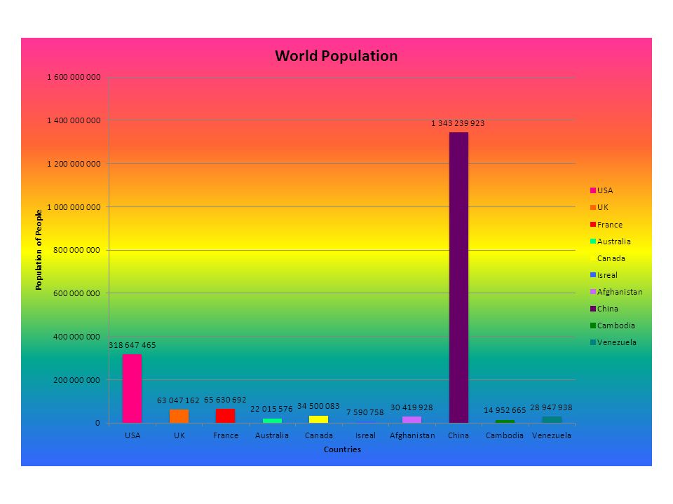
1.What country has the largest column? What are the reasons that you think that this country has the highest amount? The country that has the largest column is China. That is because is has a large area. It may also have many jobs and resources which would attract people to that country. 2. What country has the smallest/lowest? What reasons would cause this country to have a low amount? Israel has the smallest bar. That may be because it is a developing country. It probably has less jobs and is smaller than most other countries. Many people way not want to live there because it is not yet developed. 3. Look at the 5 th and 6 th ranked countries. Are they developed, developing, or one of each? Why do you think that they are where they are in the rankings? Use data to help you answer the question. Canada and Afghanistan are the fifth and sixth ranked countries. Canada is developed, but Afghanistan is still developing. They are probably ranked there because they have an okay economy and enough room to fit a good amount of people. They have a much smaller population compared to other countries like China. They don’t have as much land as China though. 4. Look at the 7 th and 8 th ranked countries. Are they developing countries? If so, what do they need to do in order to get to the top half of the rankings? Use data from any information to help you answer the question. Venezuela and Australia are the seventh and eight ranked countries. Afghanistan is developed, but Australia is developed. Venezuela could used mixed-development to fit more people into their country. They could also try to open companies and more businesses to attract more people to the country because of job opportunities. 5. Name another country (other than the US) that stands out to you on the chart. Describe the country and what type of impact it has on world consumption. China’s bar on the graph stands out the most. It towers over the others because it has the largest population by far. It is still a developing country, but has many jobs and they also have a good amount of doctors compared to some other developing countries.
 that stands out to you on the chart. Describe the country and what type of impact it has on world consumption. China’s bar on the graph stands out the most. It towers over the others because it has the largest population by far. It is still a developing country, but has many jobs and they also have a good amount of doctors compared to some other developing countries..")
5
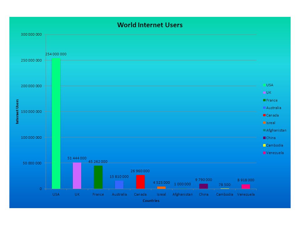
1.What country has the largest column? What are the reasons that you think that this country has the highest amount? The tallest bar is the United States. That is because they are a developed country and use technology more than other countries. 2. What country has the smallest/lowest? What reasons would cause this country to have a low amount? Cambodia has the tiniest column. That is because they are developing and many people cannot get access to the internet. 3. Look at the 5 th and 6 th ranked countries. Are they developed, developing, or one of each? Why do you think that they are where they are in the rankings? Use data to help you answer the question. China and Australia are the fifth and sixth ranked countries. Australia is developed, but China is developing. They probably have many internet users because they have a large population and many of the people use technology to get day to day things done. 4. Look at the 7 th and 8 th ranked countries. Are they developing countries? If so, what do they need to do in order to get to the top half of the rankings? Use data from any information to help you answer the question. Venezuela is the seventh ranked country. Israel is the eight ranked country on the chart. They are both developing. They could have more internet users by working on spreading the internet throughout the country. They could work on make is more accessible and affordable for people to get internet and computers. 5. Name another country (other than the US) that stands out to you on the chart. Describe the country and what type of impact it has on world consumption. The United Kingdom stands out on the chart. They are the second tallest bar on the graph. They are developed and use many people can afford and have access to the internet. The literacy rate is 99% and that shows that they must be a smart country and are able to develop new technology.
 that stands out to you on the chart. Describe the country and what type of impact it has on world consumption. The United Kingdom stands out on the chart. They are the second tallest bar on the graph. They are developed and use many people can afford and have access to the internet. The literacy rate is 99% and that shows that they must be a smart country and are able to develop new technology..")
7
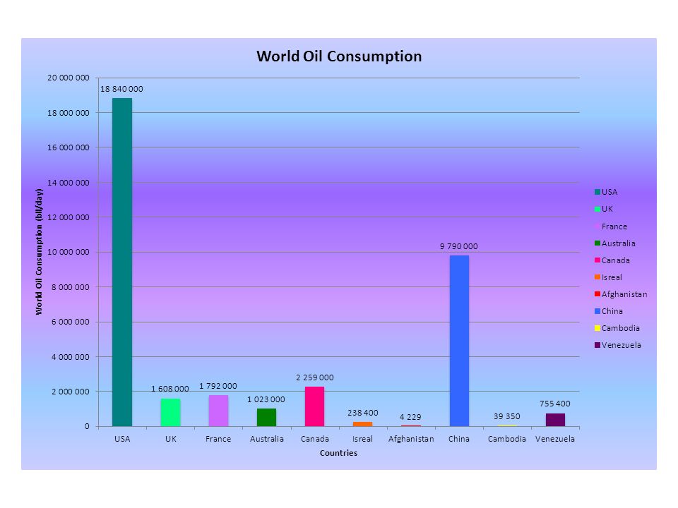
1.What country has the largest column? What are the reasons that you think that this country has the highest amount? The largest bar is the US. That is because they are developed. They have more people driving cars and using oil and gas to travel than people in other countries. 2. What country has the smallest/lowest? What reasons would cause this country to have a low amount? Afghanistan uses the least amount of oil. That is because they are developing and people travel less by car, bus, or plane than in other countries. Many people walk or use other sources of transportation to get places. 3. Look at the 5 th and 6 th ranked countries. Are they developed, developing, or one of each? Why do you think that they are where they are in the rankings? Use data to help you answer the question. Australia and the UK are the sixth and fifth ranked countries, and they are both developed. They have many people relying on oil to get around and that is why they use so much oil and gas. 4. Look at the 7 th and 8 th ranked countries. Are they developing countries? If so, what do they need to do in order to get to the top half of the rankings? Use data from any information to help you answer the question. Venezuela and Israel are the seventh and eight ranking countries. They could get more oil consumption by developing cars and other products that need to use oil. 5. Name another country (other than the US) that stands out to you on the chart. Describe the country and what type of impact it has on world consumption. Venezuela and Israel are the seventh and eight ranking countries. They could get more oil consumption by developing cars and other products that need to use oil.
 that stands out to you on the chart. Describe the country and what type of impact it has on world consumption. Venezuela and Israel are the seventh and eight ranking countries. They could get more oil consumption by developing cars and other products that need to use oil..")
Similar presentations


What country has the largest column? What are the reasons that you think that this country has the highest amount? 2)China has the largest column because.>")


. What country has the largest column? What are the reasons that you think that this country.>")


